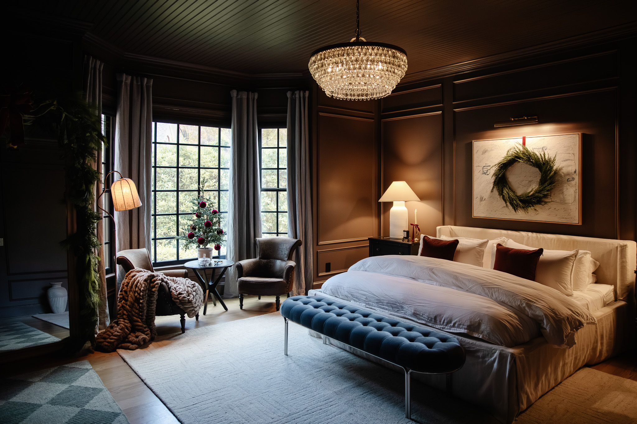
Throughout this Color School series, we’ve covered every color of the rainbow – red, orange, yellow, green, blue, purple, and pink. But as much as I love color and use it throughout my home, it’s all made possible by the building blocks of reliable blacks, whites, and neutrals. These classic tones are the reprieve and connectors throughout my home, which is totally intentional. Color is fun, but too much fun can wear you down to the point of boredom or even disgust, so in this lesson, we’ll explore why and how to use neutrals as the foundation of your home.

Shop this kitchen view

This lesson is a part of our Color School series! Be sure to check out our past lessons if you want to feel more confident in your color-making decisions.


Follow along with this Color School series and receive exclusive bonus content and tips directly to your inbox by signing up for our email newsletter. Psst, it’s free; no strings attached!
What Are Neutrals?
For the sake of simplification, let’s consider every hue not found on the color wheel a neutral – whites, tans, beiges, taupes, browns, greys, and blacks. Most materials like stone, marble, brass, nickel, wicker, wood, and more fall into the “neutral” category, although these all have colorful undertones, as do most neutrals. Got it? Good.
Start with a Neutral Foundation
One of the most common sentiments I’ve received throughout Color School is something along the lines of, “I want to use more color in my home, but I’m afraid I’ll get sick of it.” If this is you, you’re not alone, and I have a few tips to help you through this obstacle.
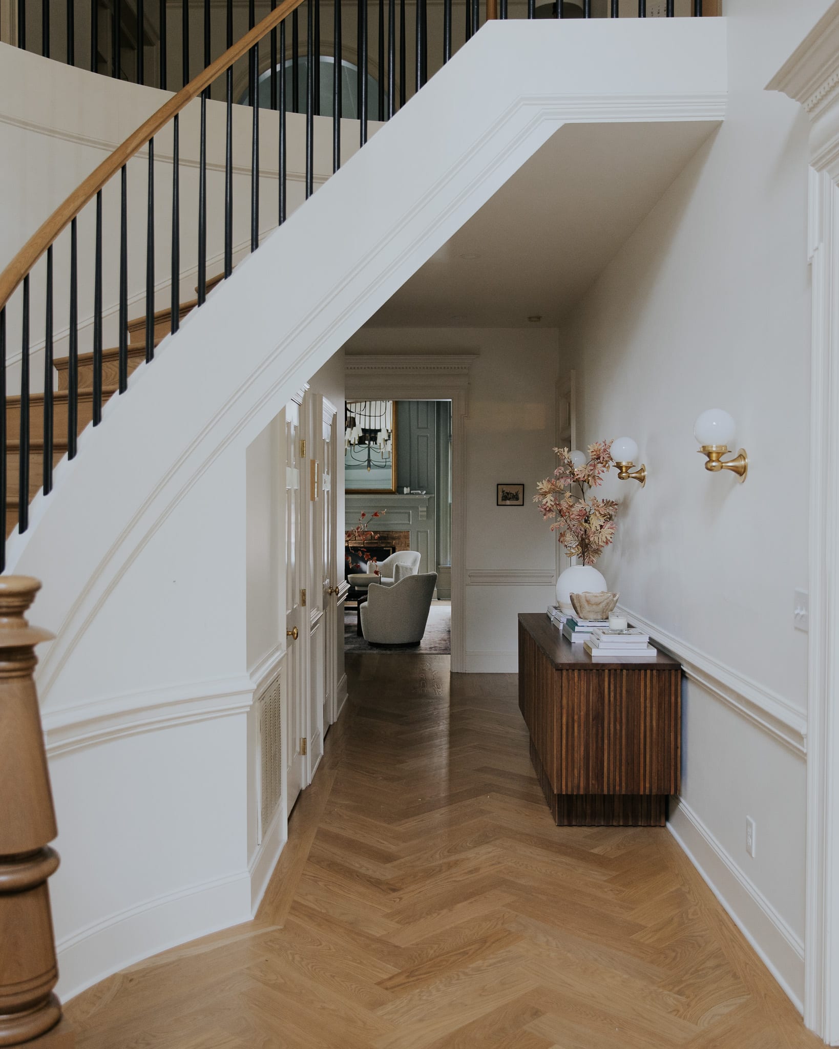
Shop the entry
First things first, it’s good to start with a neutral foundation. The very first thing we did in this house (before even moving in) was lay new flooring and paint everything white. Before hanging wallpaper or painting colorful brushstrokes, we established a solid, neutral foundation.
I’m certainly not suggesting you tear up your flooring and repaint everything back to white, but the neutral tones throughout your home are what allow you to play with colors effectively. We talked a lot about white and neutral undertones in Lesson 3, and if you think you fall victim to too many competing undertones, you might want to make some adjustments.

Shop this kitchen view
Check Your Undertones
As you can see, I typically prefer whites and beiges with undertones on the warm and sometimes green side. My floors are a warm wood, my walls are a creamy white, and the taupe cabinets have a touch of green. I think the reason these don’t compete is because yellow and green are next to each other on the color wheel! There’s no right or wrong way to mix undertones but notice how they interact with each other.

White Vase | Brass Task Lamp | Fluted Bowl
Another great way to integrate undertones is to use contrasting warm vs. cool. We did this in the dining room, and incorporating both adds interest to the space. It also makes the orangey-wood feel more orange and the gray-blue trim feel more blue, which is what I like about this room.

Wallpaper | Rug | Round Dining Table | Dining Chairs (Vintage) | Lantern Pendant | Black Vase
How do neutrals make you feel?

Shop the laundry room
Neutral tones have the power to make you feel calm and grounded and at ease. Lighter neutrals like white, pale gray, and beige tend to make a space feel clean, fresh, and airy, which might be why I love our laundry room so much. The pops of black and warm metals keep it from feeling too vanilla. Beige-on-beige is only interesting if you have some contrast!
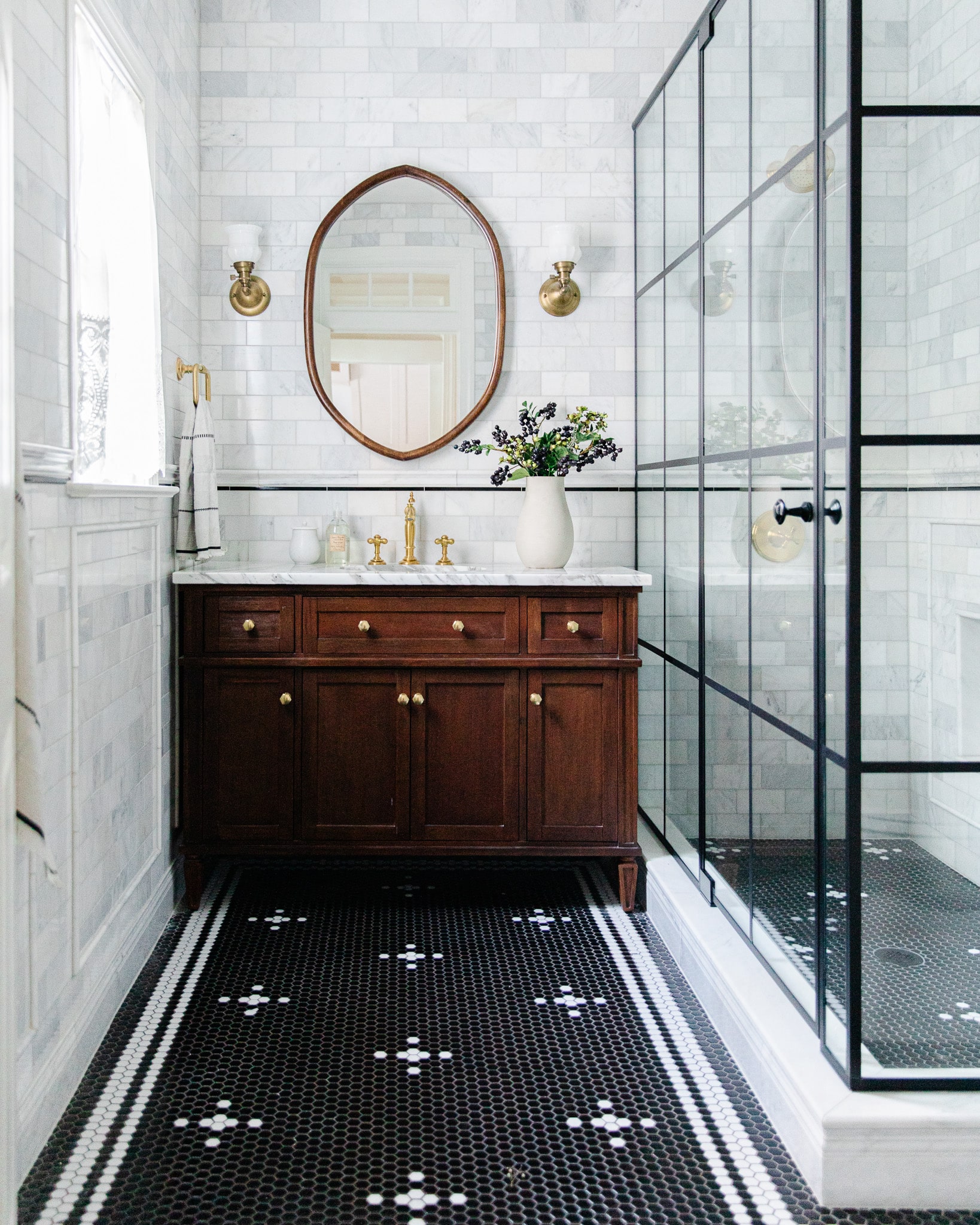
Shop Greta’s bathroom
This is also true in Greta’s bathroom! The space is predominantly black and white, but the warm wood vanity and leather mirror draw you in. Doesn’t this bathroom make you feel pristine and fresh?
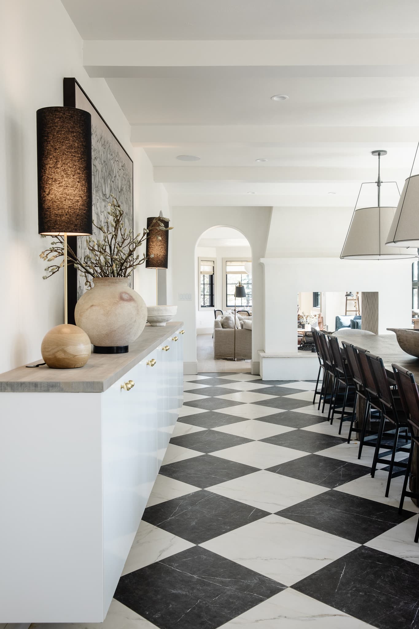
Neutrals are an open floorplan’s best friend

Shop the cottage living room
How do I add color to an open floor plan? – A question I’ve received a hundred times. There are no hard rules, but unless there’s a definitive start and stop to a room, like a cased opening, it’s best to keep your walls and ceiling neutral. Again, start with a good solid neutral and build in color from there. You could paint contrast trim, layer in a rug or two, add some colorful furniture, and tie it all together with colorful accents, which could consist of even more neutrals! I wish there were a clear formula, but sometimes you have to tweak until it just “feels” right to you.
Shop the cottage dining room
As seen in the dining room I miss so much, sometimes a monochromatic color scheme is the perfect statement backdrop for hosting all your family gatherings and dinner parties. Also, if you’re someone who enjoys swapping in and out seasonal decor, neutrals make that easy to do.

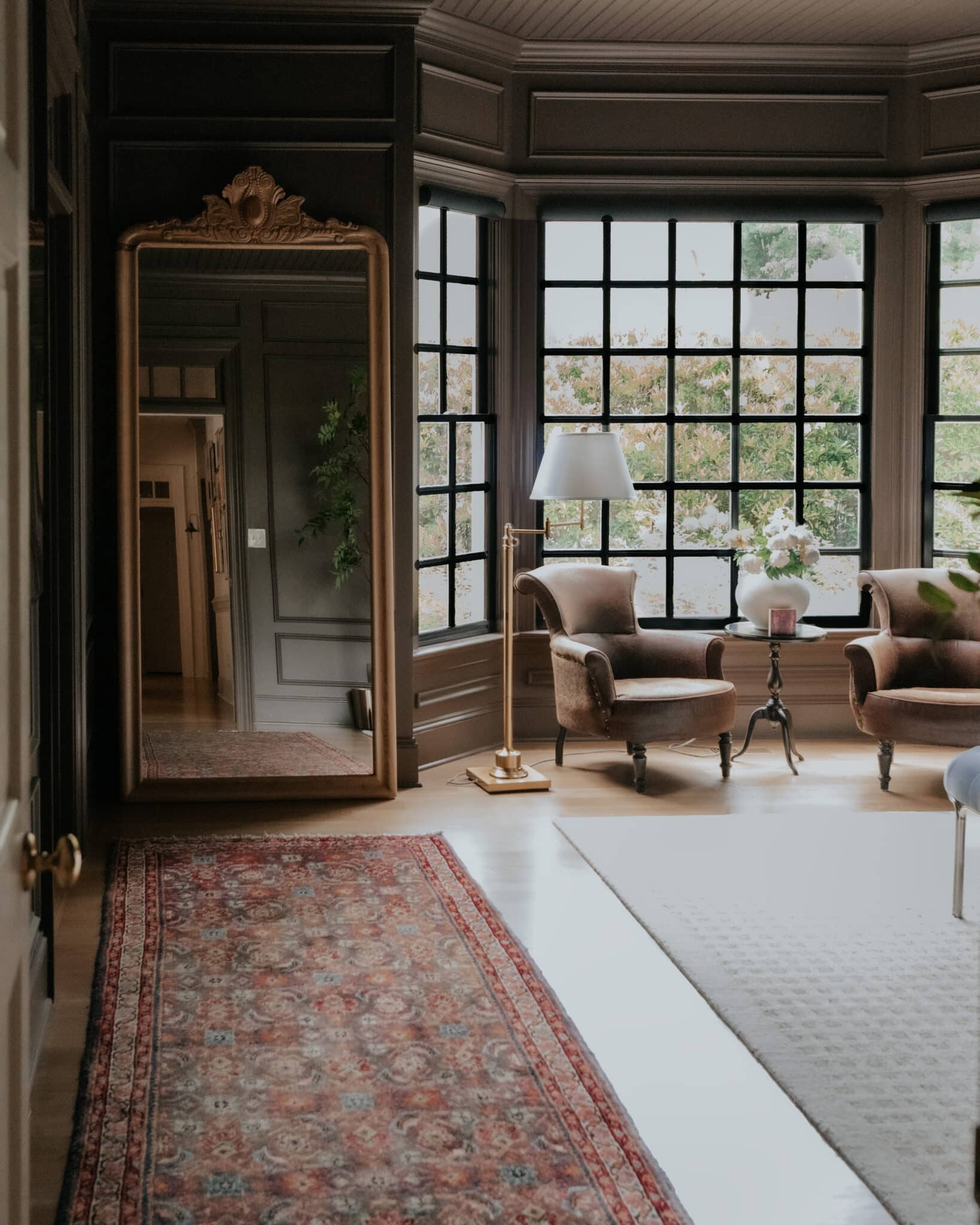
Shop the cottage closet
Are you getting the hang of this yet?
Floor Mirror | Polly Ivory Rug | Armchairs (Vintage) | Floor Lamp | Side Table | White Vase
Brown mixed with other warm neutrals and a pop of red is a recipe sure to swoon.
Shop the cottage bonus room
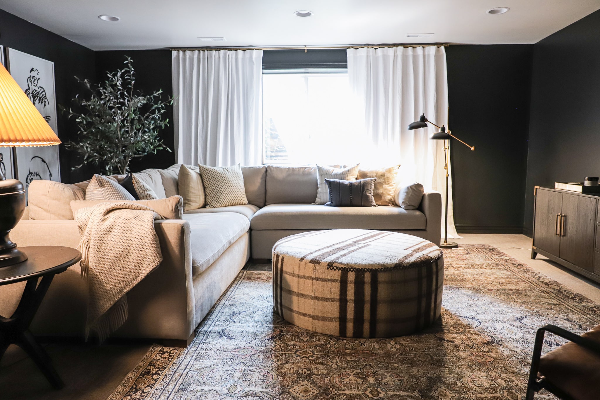
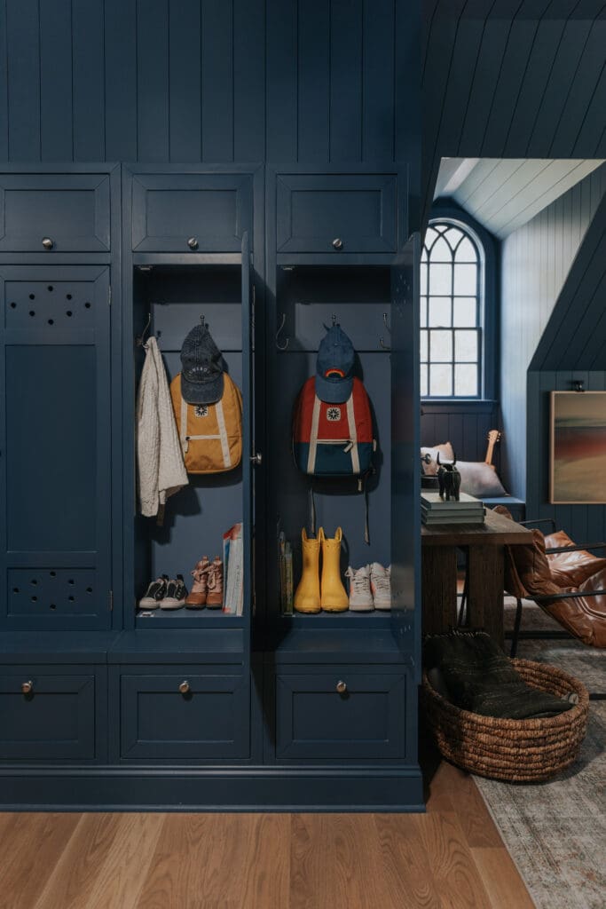
And sometimes, it’s fun just to paint it black for some moodiness.
My guess is you might already have a plethora of neutrals layered into your home, but if you need some supporting actors in your colorful home, here are some of my favorites.
Decorating With Black, White, & Neutrals
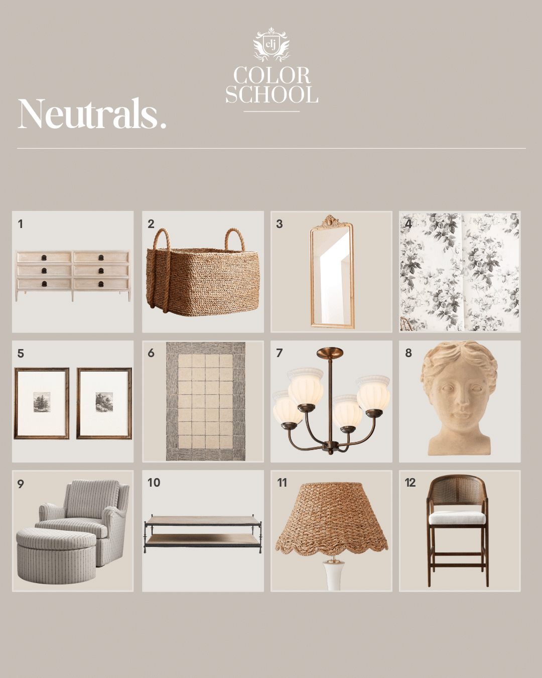
1. Lazlo 6-Drawer Dresser $4,770
2. Square Basket With Rope Handle $119
3. Natural Carved Wood Floor Mirror $1,099
4. House of Hackney London Rose Wallpaper $198 (per roll)
5. Forest Etchings $29
6. CLJ x Loloi Francis Cream/Black $311
7. CLJ x Shades of Light Marlo 4-Light Chandelier $499
8. Hestia Bust $138
9. CLJ x Pottery Barn Kids Glider & Ottoman $1,598
10. Estate Travertine and Metal Rectangular Coffee Table $2,199
11. Scalloped Seagrass Lamp Shade $87
12. Aimee Counter Stool $699
Is there a place to shop for the paint palette in this post? Loving the rich brown color and kitchen cabinet colors!
You can find all of our paint colors and sources on our Shop Our House page!
The tiles in the dining room, are they the same in your laundry room? Did you have to cut them 3 times too or are they already square?
I love all of it!! Do you know what color paint the cabinets are in the kitchen picture?
They are from the Stoffer Home Cabinetry line “Bromley Taupe.”