I’m sad to say that today is our last lesson in this Color School series, but all good things eventually come to an end. Throughout the last three weeks, we’ve covered color theory from the basics and explored how color theory applies to everyday home design. My favorite part was breaking down every color of the rainbow – red, orange, yellow, green, blue, purple, and pink. But none of that would be possible without first establishing a solid neutral foundation. This brings us to today (the final lesson). Because how in the heck do you put this all together and ACTUALLY use color in a way that flows and makes sense? In this lesson, we’ll explore some tips and tricks to help you design a cohesive home color palette because who doesn’t love a game plan?
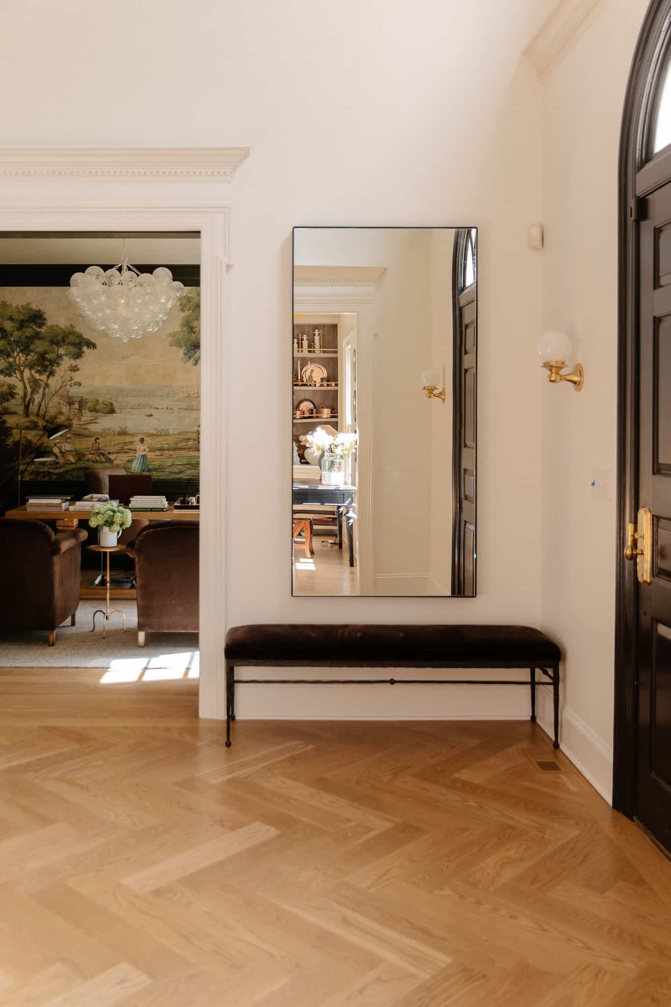
Entry Mirror | Bench | Sconce
This lesson is a part of our Color School series! Be sure to check out our past lessons if you want to feel more confident in your color-making decisions.

Follow along with this Color School series and receive exclusive bonus content and tips directly to your inbox by signing up for our email newsletter. Psst, it’s free; no strings attached!
What is a home color palette?
In the world of brand design, professionals often create a “style guide,” which is a set of do’s and don’ts when it comes to log use, typography, colors, image style, graphic use, and more. A home color palette is kind of like that but for your home! You don’t necessarily need to plan your entire home out before grabbing a paintbrush and just going for it (I certainly don’t), but it’s helpful to get an idea of the overall color palette you want for your home. Here’s an example of what it could look like. 👇

(If you’re signed up for the Color School email series, you’ll receive this template in your email.)
You can tell I like warm woods, clean whites, beiges, greens, blues, and warm accents. But also, you’ll notice none of these colors are super vibrant! I love having a contrast of light and dark tones, but my color selections tend to be muddier. Play around with what feels right to you!
Start with what you have
When we lived in our Rexburg home, we were on a slower renovation timeline than we are now. In other words, we lived with outdated tile, carpet, cabinetry, and finishes and made changes to fit our style and aesthetic over years. You might not be on a mission to renovate your whole home, but if you are, you have my permission to paint your walls and buy furniture that doesn’t “go with” the finishes you don’t even like. Over time, you can transition your home color palette, and in the meantime, throw a rug over that flooring you hate so much.
On the other hand, if you plan to just live with the fixed finishes you already have, then consider them a part of your color palette!
Establish a neutral base

Wood Credenza | White Bowl | Coffee Table Book | White Urn | Sconces
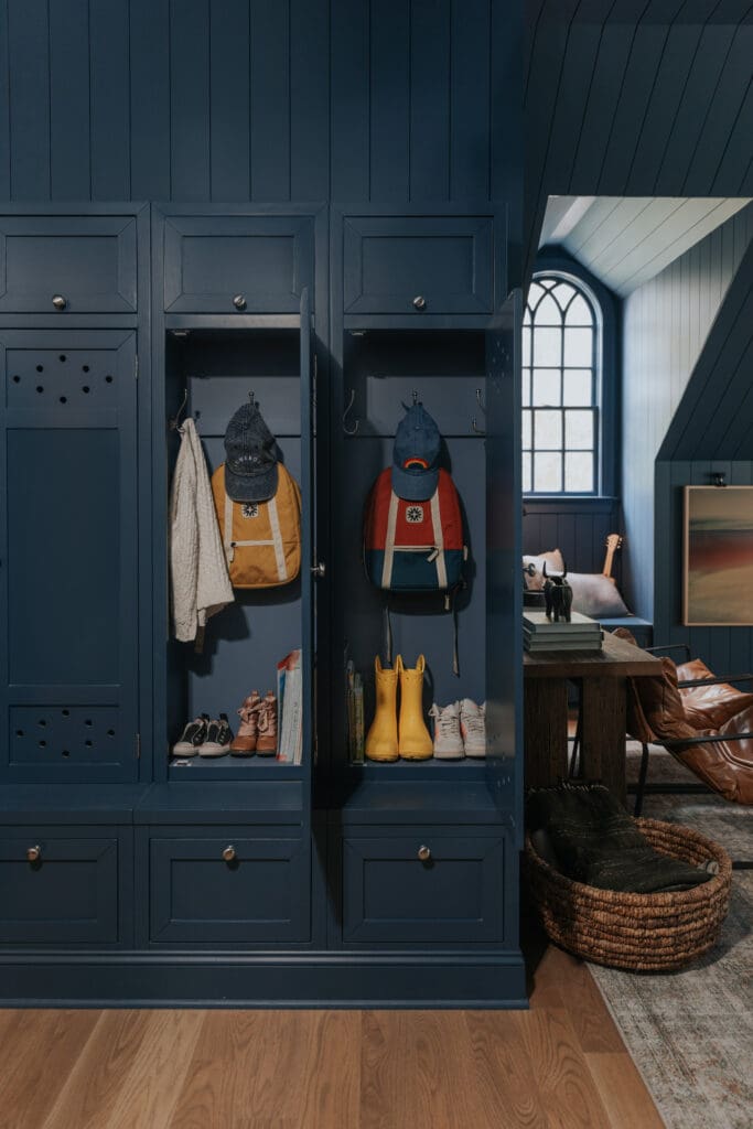
We covered this extensively in the last lesson on neutrals, but before you build in the color, you’ve got to have a solid neutral foundation. Consider the walls, ceiling, trim, and doors in the main connected area of your home. The very first thing we did in this house (before even moving in) was lay new flooring and paint all the walls and ceiling SW White Flour in Eggshell and the trim and doors in a Satin finish. Since moving in, I’ve kept the connected areas white (front foyer and hallways) and have added pockets of color in the rooms that branch off.
In our Modern Cottage home, we had more of an open-concept living area, so this looked a bit different.
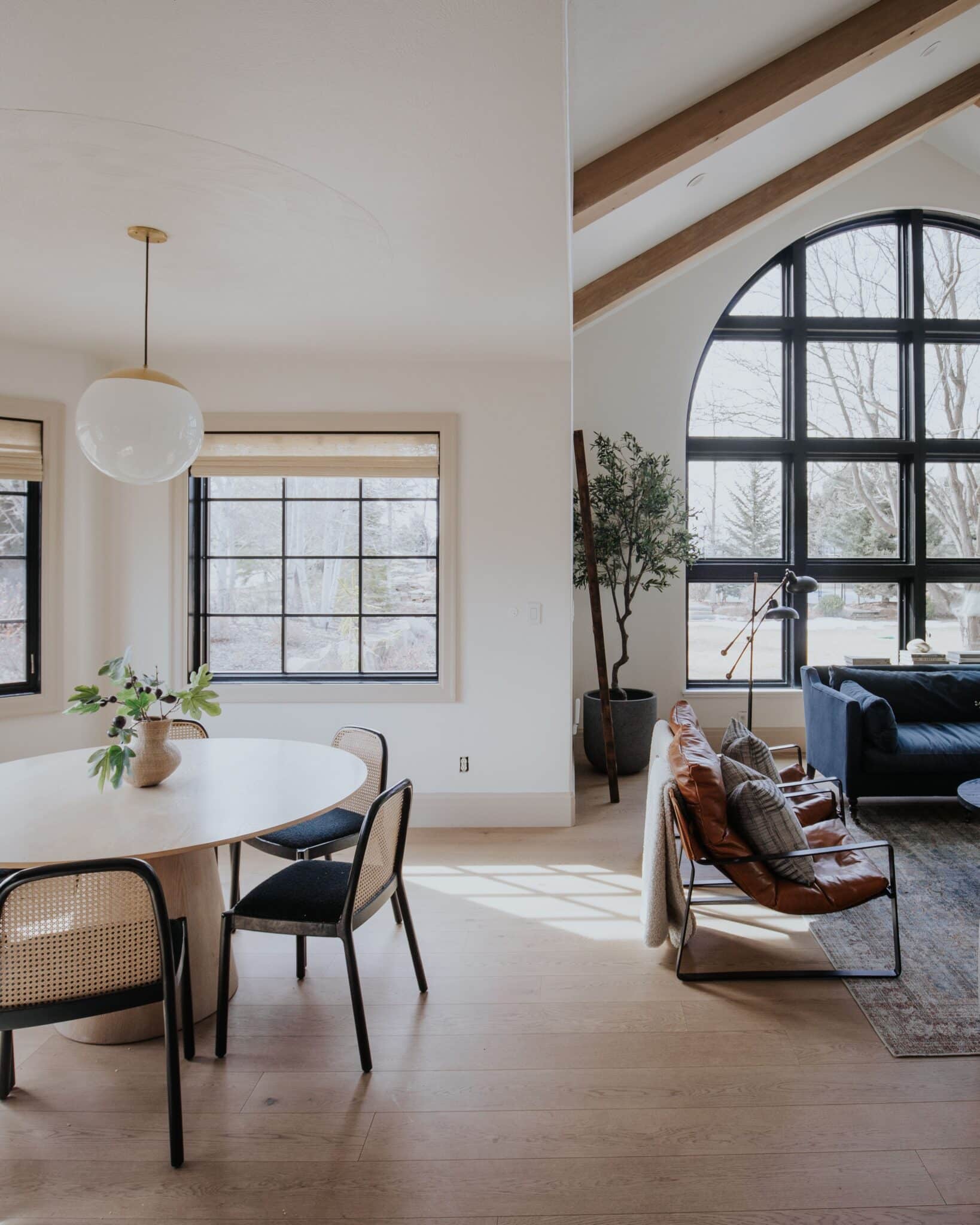
Shop this view

The walls and ceiling in the living room, dining room, kitchen, and connecting hallways, wrapping all the way to the entry, were all painted SW Alabaster. Accordingly, we did contrast trim in SW Accessible Beige, as well as black doors.

Leather Ottoman | Chandelier | Red Chair | Frames | Top Print | Bottom Print | Basket
What about you? Do you have an open-concept living area, or do you have cased openings in your living area?
Make a Color Map
One way to envision this better is to literally map it out!
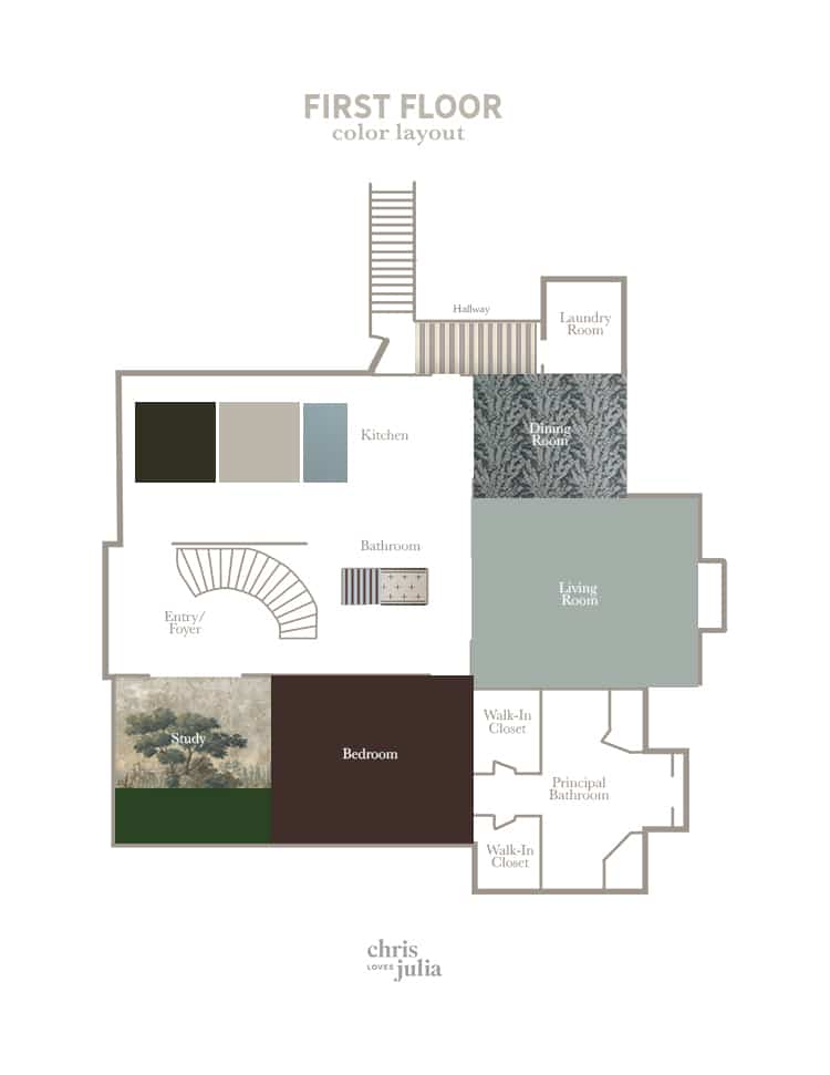
I wish I could give you a simple template for this!
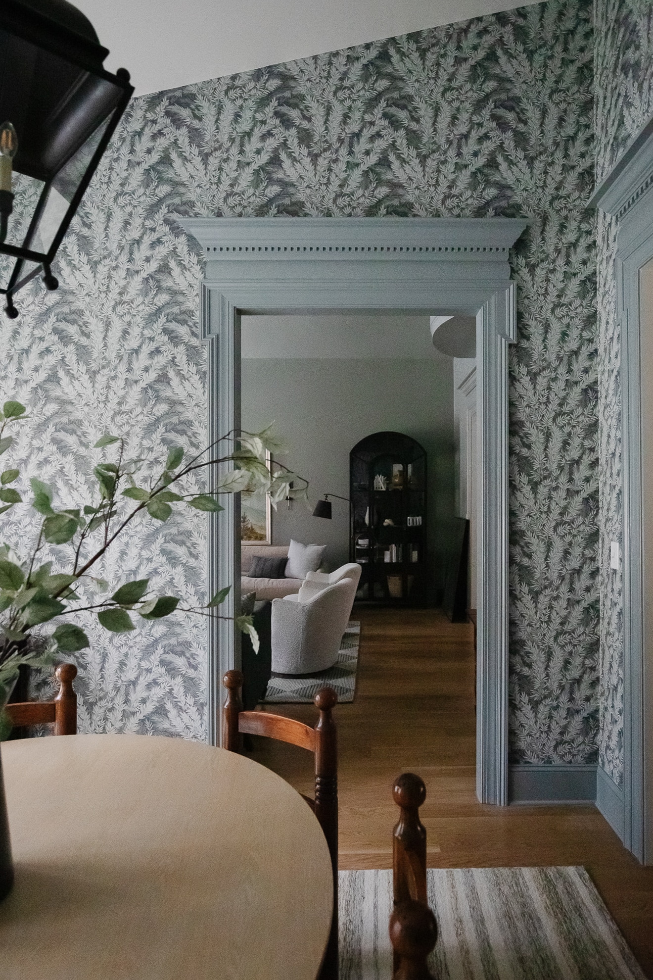
Another reason I like to see it like this is to visualize how my patterns flow together. For example, since I already had striped wallpaper in the back hallway, I chose a more organic wallpaper for the adjacent dining room. And that floral wallpaper complements the scenic mural wallpaper in the study on the other side of the house, which is neighboring the striped powder bath, which ties back the other striped wallpaper. It’s all about contrast, balance, and flow.
Incorporate the Principles of Design
Ever heard of them? This is a heavy-lifter topic for another day, but in short, color is one of the elements of design, and the principles are rules that guide how you use the elements. Some say there are 12, others 7, but in my eyes these are the basic principles of design:
- Balance
- Unity & Harmony
- Repetition
- Scale & Proportion
- Emphasis
- Contrast
When it comes to using paint color, pattern, textiles, metals, woods, and more, keep these in mind as your guide.
How do you transition paint colors from room to room?
This is one of the most common questions I get asked, and the short answer is, there aren’t any hard rules and you can handle each situation case by case. BUT, I’ll show you what I typically do.

Leather Chairs | Floor Lamp | Rug | Black Cabinet
If you have color-painted casing that opens to a more neutral painted space, tape off the inside of the casing and leave it the neutral color. Simple!
As for this cased opening, on one side we have F&B Pigeon trim, and the other is BM Gibraltar Cliffs. I decided to paint the inside of the casing Gibralter, but it was a coin toss!
What about doors?
If you’re painting one side of the door one color, and the other side a different color, paint the inside strip to match side that the doors swing into. For example, these doors swing into the hallway, so we kept the inside strip white.

Wow.
Although this is the “end” of Color School, it’s not really the end because I’ll never quit talking about color. Spending this time with you has been an absolute delight, and I hope you learned a thing or two. If you have any questions, leave a comment below and I’ll try to get to as many as I can!
Also note, if you haven’t followed along through the mini email course and you’ve missed out on bonus content, it’s not too late to sign up and go through the series. Subscribe at any time!

What percentage of SW White flour did you use in your entryway?
100%.
This information has been helpful and I would like to see more decorating content. Thanks!
Thank you – stimulating and enjoyable series of posts.
Thank you this was great!
Absolutely loved colour school, thanks so much for sharing. My style has drastically changed over the years and become more cosy modern traditional and I’m slowly trying to rework my home to fit this. Colour has been a big thing in helping me and this class was so useful. X