It’s no secret I’m a big fan of green based on the number of rooms I use it in. One time I even painted our study an olive green color, only to repaint it a gray-blue and then paint it back to green, but this time a glossy dark green. The hard truth about home renovation is that sometimes it takes a few tries before you get it right. And while I still love the olive green, I’m much happier with the contrast of the dark green and the mural and the rest of the decor. After covering the colors red, orange, and yellow, today’s Color School lesson is all about green. Let’s jump in.

Shop the dark green study


Shop the olive green study
This lesson is a part of our Color School series! Be sure to check out our past lessons if you want to feel more confident in your color-making decisions.


You can also follow along with this Color School series and receive exclusive bonus content and tips directly to your inbox by signing up for our email newsletter. Psst, it’s free; no strings attached!
What to know about the color green

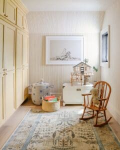
Shop the girls’ office
According to ColorPsychology.com, “Green is regarded as the most restful and relaxing color for the human eye. Green symbolizes harmony, tranquility, and peace. As a soothing, relaxing color, it enhances stability and endurance.” This must be why I’m so drawn to it.

Shop the kitchen
Green is associated with positivity, forward-thinking, growth, renewal… you get the vibes. I think all of these things are things that I crave and need in my busy life, which is probably why I’m so drawn to green.

Shop the living room
Painting our living room from head to toe in Pigeon by Farrow & Ball makes this room feel fresh and healing, which I think is really nice for a gathering space.

Shop Polly’s room
Polly’s green storybook wallpaper makes her room come to life, and although she’s finding herself a bit jealous of Faye’s room we’re currently working on, I think it’s a lovely space for a child to play and rest.
Here are some other examples of green interiors I’m currently crushing on:
Muddy Green

I’ve said it before, and I’ll say it again, if you want to add some complexity and moodiness to a space, go with a more muted color, like this olive brown. Also, one of my favorite uses of color is to pair a neighboring hue of the same color, just like this pairing of olive green and emerald green (one warm and one cool). I find it to be so much more interesting than hues on the same plane.

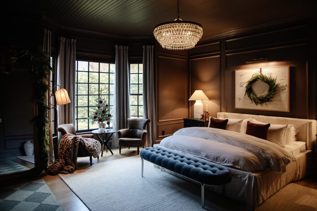
Again, with the dark olive-brown color, this living room is dripping with sophistication, charm, and intrigue. I love how the balance of red tones doesn’t at all look Christmasy, which is tricky to accomplish.

Jean Stoffer is a master at using color, and this Eden Green from her cabinetry line is very similar to the Plymouth Green we have on our kitchen island. Green in a kitchen is just so grounding and fresh.

I’m obsessed with everything about this. This is what we learned is called “color drenching,” and it’s done so well. You can typically find green in bedrooms and bathrooms because of their calming effect, and doesn’t this feel like a relaxing getaway?
If you need a bit more green in your life, check out some of my favorite selections below. 👇🏻
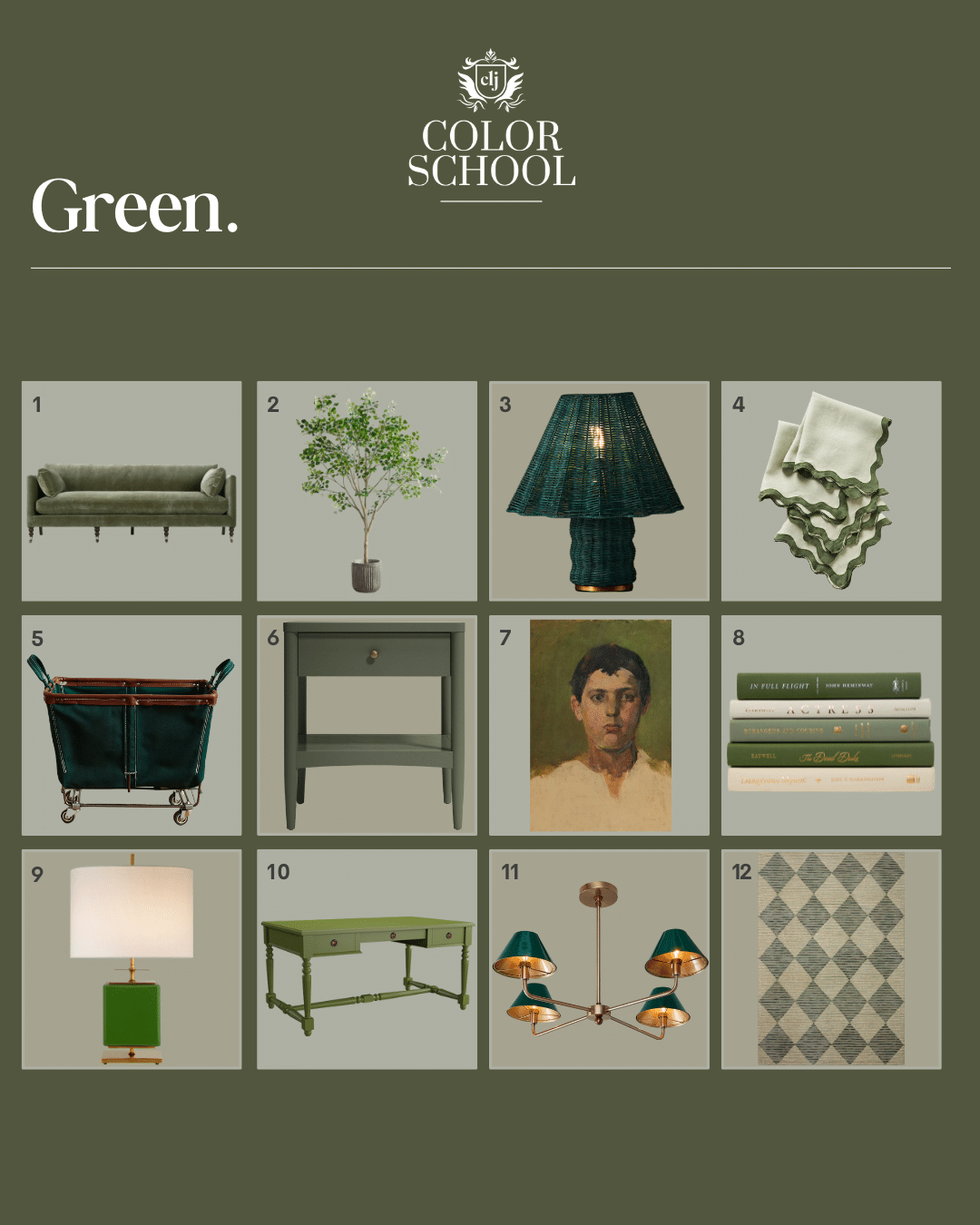
Decorating with Green
1. Fabienne Sofa $3998
2. Faux Shady Lady Olive Tree $549
3. Sutton Rattan Table Lamp $298
4. Bed Threads Scalloped Linen Napkins (Set of 4) $70
5. Medium Mobile Canvas Bin $198
6. Hampshire Olive Green Wood Kids Nightstand with Drawer $349
7. Boy Vintage Print $29
8. Het 5 Piece Decorative Book Set $72
9. Beekman Small Table Lamp $819
10. Casa Florentina Sorano Partners Desk $2099
11. CLJ x Shades of Light Edie 4 Light Chandelier $499
12. CLJ x Loloi Francis Spa/Granite $381


Gorgeous room. Can I ask where you purchased the murals? Love your kids room too.
We got them from The Mural Source. It’s this mural.
I bought the RH French Partner’s Desk after seeing it look so fitting in your study. Unfortunately, buyer’s beware, it is very uncomfortable for a short person (5’2″)! The drawers are very thick so the distance between the bottom and top of the desk takes up more than half of my torso, so I have to raise my arms significantly to use the desk. This can’t be fixed with a higher chair or even cutting the legs because that drawer dimension is fixed. I’m considering having a carpenter cut out the middle drawer, if that’s even possible. It’s so important to check ALL the dimensions before any online purchase
My house has white walls and black trim (not baseboards or crown molding). It’s a Georgian style house. I want to do my kitchen cabinets in a green or blue tone…but feel a little stuck as to what will go good with b&w and hold to the architecture of the home. Any chance you or your followers could provide suggestions? I love all of your designs!!
I tLOVE green but find all the undertones scary – much more intimidating than other colors. Can you talk about how to plan for green in a room that’s open to another with a different color scheme (like blue)?