


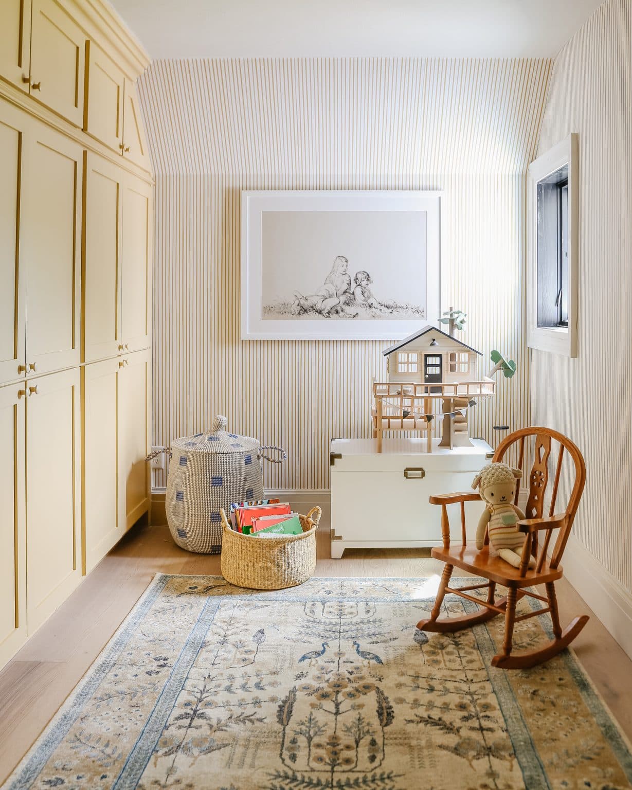
In our last home, I really challenged myself to get out of my comfort zone and use colors I had never used before. I did this in the red music room, Polly’s purple bedroom, and this yellow playroom. I had taken risks with color in past homes, only to grow sick of them in a matter of months. But without making those mistakes and then swinging too far to the beige and neutral pendulum, I wouldn’t have figured out which colors I actually DO like. Soft, muted colors are my jam, and this buttery yellow playroom is proof that you can incorporate a stereotypically bright, aggressive color in a soft, gentle way.
Shop the Cottage Playroom

The color is HGTV HOME by Sherwin-Williams, Restrained Gold.
This lesson is a part of our Color School series! Be sure to check out our past lessons if you want to feel more confident in your color-making decisions.
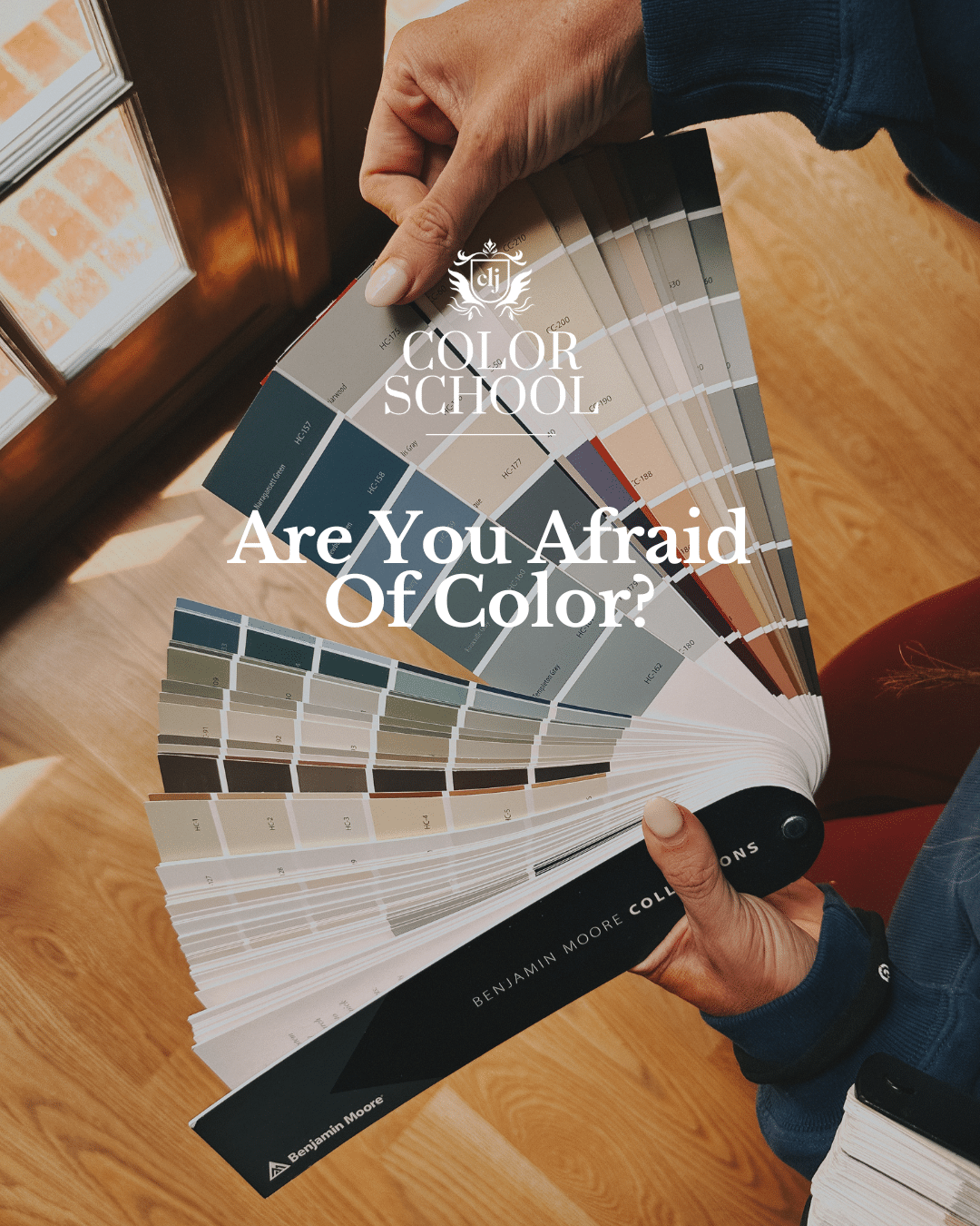


Follow along with this Color School series and receive exclusive bonus content and tips directly to your inbox by signing up for our email newsletter. Psst, it’s free; no strings attached!
What to know about the color yellow

Shop this view
Apparently, yellow is one of the more difficult colors to paint because of the higher LRV (light reflective value). The higher the LRV, the more light bounces around the room, which ends up being yellow light. And then you potentially have yellow light bouncing off of yellow paint, which bounces off to no foreseeable end. In the case of the playroom, we did striped yellow wallpaper around the room and hallway and only painted the cabinet a buttery yellow, which eliminated too much yellow light bouncing.
Yellow is typically a very sunshiny, happy, optimistic color. I get cheery just looking at the playroom images, but I felt even happier being inside that space, which is why it was the perfect color to use for a playroom! According to ColorMeanings.com, a duller, muddier yellow can be seen as a sign of sickness, jealousy, or caution, so beware.
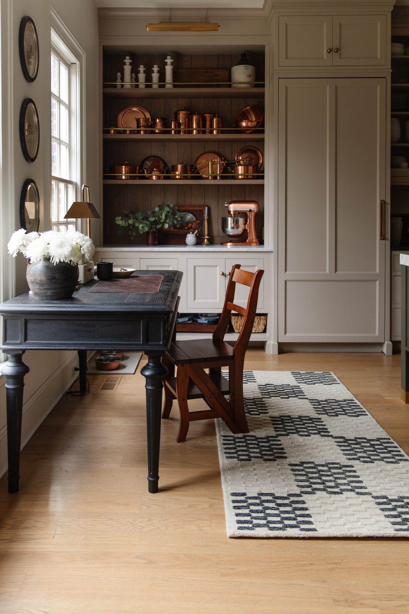
Brass and Gold Have Yellow Undertones

Brass & gold in the kitchen
One of my very favorite ways to incorporate “yellow” into my home is through brass and gold metals. There’s something about using warm hardware that just livens any space, and I think the kitchen is a perfect example of that.

Shop the kitchen
Even the taupe cabinets have a yellow undertone, which is why I think the aged brass knobs and pulls look so good! Even the bowl of pears are adding joy to the space.
Just like any color, yellow can swing to the warm side, the cool side, the lighter side, and the muted side – here are a few examples of each!
Warm, Sunshine Yellow

I’m absolutely in awe over this warm, dandelion-yellow mudroom. Somehow it just works so well with the black, and I’m such a fan of the glossy-painted doors and trim.
Cool, Citron Yellow

If you add just a touch of blue to yellow, you’ve got a cooler, citron yellow. Using cooler color tones tends to lean towards a more modern style, which totally matches the rest of the vibe in this laundry room. (Paint color is Farrow & Ball Citrona Paint.)
Gold & Ochre

This muddier yellow wallpaper puts me into such a trance. I feel like I could sit on that ochre sofa and look around the room for hours on end. Using more muted colors can add some complexity to the emotions you feel, and I think this is a great example of that. This isn’t sunshiny yellow; it’s sulky, sultry yellow.
Soft Yellow

This yellow is nearly neutral, and I think that’s why I love it so much. It’s the perfect amount of color without being too over-the-top or boring.
If you want to brighten up your life, here are some yellow things you could use in your home. Feel free to tiptoe your way in by using warm metals like brass and gold.
Decorating with Yellow

1. Brass Pepper Mill $138
2. Clementine Platform Bed $1,498
3. Provençal Pitcher $69
4. Shelter Daybed $1,299
5. Pastry and Fruit $12
6. Kauai Botanical Wallpaper $198
7. Brass Barstool $79
8. CLJ x Loloi Polly Straw/Ivory Rug $263
9. Gold Outlet Covers (5 pack) $39
10. Antique Gold Deco TV Frame $699
11. Lynwood Square Upholstered Cube $100
12. Faux Autumn Aspen Tree Branch $39
Leave a Reply
What do you think?
Previous Post
Next Post

Semihandmade
Our wood grain Shaker cabinet fronts were designed for busy, high-traffic homes like ours. Clad with durable textured thermofoils, this line is compatible with Sektion, Akurum, Godmorgon, and Besta cabinets from IKEA. It's the perfect, practical way to add the warmth of wood to all the rooms of your home.
Collaborations
learn more

next
Loloi
We have teamed up with Loloi to create a line of rugs that are as affordable as they are beautiful. This collection houses a great mix of traditional and modern rugs, in cottage-y colorways, as well as vintage-inspired beauties that you’ll want to roll out in every room.
Collaborations
learn more

next
STUGA
We partnered with Stuga on a line of hardwood floors — The Ingrid is really livable, and the color is very neutral. It doesn’t lean warm or cool, it’s that just right in-between. We have really loved putting it everywhere in our house. It’s the best jumping-off point for design, no matter your interior style. In addition to being beautiful, Ingrid is really durable — we have three kids, and we always have a home construction project going on. Ingrid stands up to it all.
Collaborations
learn more

next

SHop all
What We're Right Now
What We're Right Now
Looking for our favorite things? A place to shop our home room by room, or just catch up on what Julia's wearing / loving right now? Browse the CLJ shop.
Loving


Portfolio


Design
Befores, afters, mood boards, plans, failures, wins. We’ve done a lot of projects, and they’re all here.
BROWSE BY CATEGORY
let's break this thing up
We have a long-standing relationship with DIY, and love rolling our sleeves up and making it happen.
Projects
Even when you don’t want to rip down a wall, you can make that space in your home better. Right now.
read more
read more
read more
02
01
03
looking for inspiration?
It’s been over a year since we started designing our bathroom. We were working with Unique Kitchens and Baths for the cabinetry, and they came up with two different layouts. We selected one, tweaked it a bit and chose a lot of the finishes…annnnnd honestly we could never quite give the final “go ahead.” This […]


SEARCH THE BLOG
We've been doing this since 2009 and we've posted a whopping 24145+ blog posts and counting. You might need a little help searching, huh?
looking for something?
find stuff like:
")
Can We Send You Our Love Letter?
Another way for us to stay in touch! Joining our weekly newsletter gives you access to exclusive content, never-before-seen photos, your questions answered, and our favorite DIYs. Sign up below!
Follow Along on Instagram
Welcome to our online community where we've posted home, DIY, style, renovations, and family since '09. Renovating our #cljmoderncottage in Idaho and headed for new adventures in Raleigh, NC. #cljfam #cljtransformations
@chrislovesjulia


Links
Get Around
Make yourself right at home
Portfolio
Design
Casual Friday
Projects
Lifestyle
Gift Guides
All Posts
Shop
Love where you live.
Social
RivrLinks
Links
Get Around
Make yourself right at home
Portfolio
Design
Casual Friday
Projects
Lifestyle
Gift Guides
All Posts
Shop
Love where you live.
Social
RivrLinks
I love your work and style. But my favorite has always been this yellow playroom. I could live there.
I tend towards pinky-reds and blues so a basement with ugly golden yellow tile in our new house was a bit depressing. Two small windows means the room always feels dark so I picked a paint strip that looked good with the tile and had the lightest chip mixed at 25% – the paint counter employee was concerned that it would look white.
I’ve only painted one wall but I love the creamy, soft yellow – still not my color, but it’s fine for a mostly utilitarian basement. An almost black purple called Blackberry Bramble (HGSW color at Lowe’s) is my plan for the underside of the stairs so the support structure disappears in the shadows.
I painted my whole family room blackberry bramble and I love it so so much.
Currently, I am planning on painting our shared little girl’s room yellow. Also debating about painting the trim to match since it’s a small room and I think having all one color would be make it feel bigger.
Yellow is definitely having a revival in my mind. I think it’s from all the cottagecore vibes.
I’m loving the Color School series! You’re opening my eyes to the more subtle ways of color.