


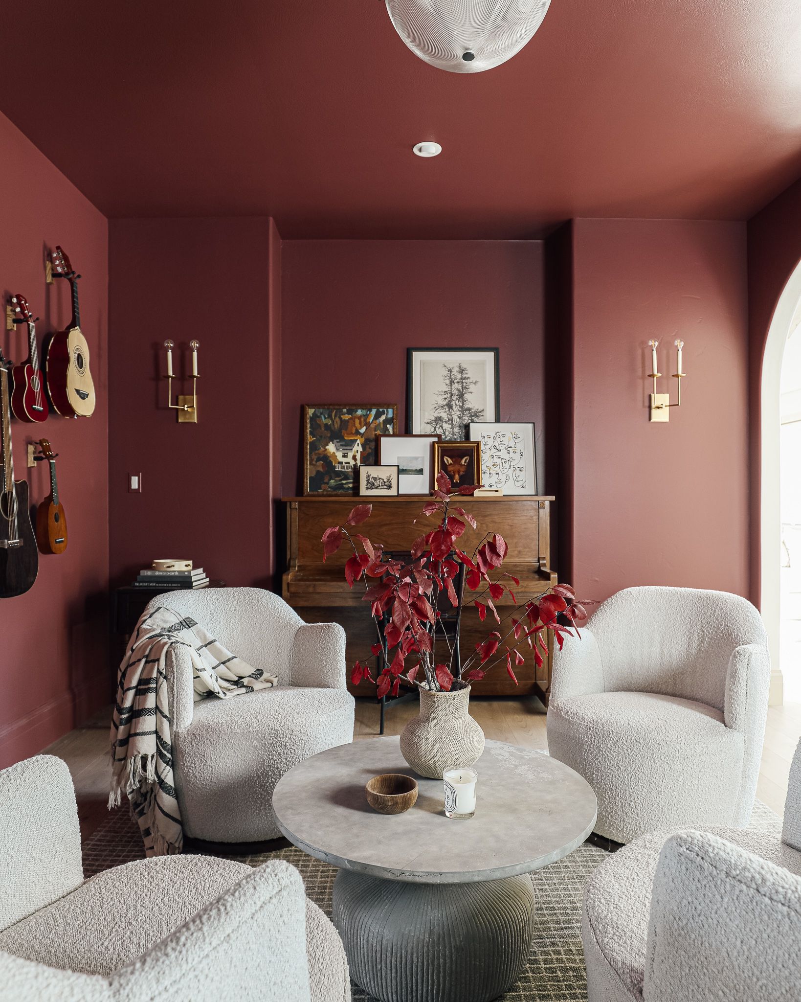
I’ll never forget the day we decided to paint the music room in our last house Fading Twilight by Benjamin Moore. I had never painted anything red, but I had a vision of a jewel-toned room in the heart of the home, and I felt like taking a risk. It’s still one of my favorite rooms we ever did, and it was also one of the first times I tried something called “color drenching.” I just recently learned of this term, where you paint the walls, ceiling, trim, etc., all one color, and it’s one of my favorite ways to make a room feel cozy and intimate. We’ve since done this in our closet, Faye’s room, the living room, our bedroom, and the study (until we repainted it). Color drenching is best reserved for a room with some natural light and cased openings or doorways. If you’ve got an open floor plan, where there’s no obvious start and stop to a room, you’ll be safer sticking to a neutral.
Shop the music room

In today’s Color School lesson, we’re talking all about the primary color red, which kicks off our journey into all the colors of the rainbow. Be sure to check out our past lessons if you want to feel more confident in your color-making decisions.


Follow along with this Color School series and receive exclusive bonus content and tips directly to your inbox by signing up for our email newsletter. Psst, it’s free; no strings attached!
What is color psychology?
Did you know that different colors can affect human emotions, behavior, and mood? You can literally alter your emotions from room to room based on color! So it’s important to select hues that align with the use of the room and how you want to feel inside of it.
What about the color red?
According to ColorPsychology.org, Red is typically associated with passion, warmth, courage, love, and also danger, aggression, and violence. Red has been known to increase heart rate and evoke strong emotions, so proceed with caution! I think what makes red so uncommonly used in interiors is its vibrancy and intensity. There’s just something about red that captures our attention, and it can become overpowering and dominating if you’re not careful.

When deciding on a color for the study, I specifically went with a more muted red. *When I’m talking about “muted tones,” I’m talking about a color that’s mixed with grayish-brown tones, which muddles the “potency” of the color. Fading Twilight leans towards a brown-red, making it more earthy and grounded. To me, the music room was an intimate reprieve from shades of first-floor alabaster. But more than anything, this room felt like a warm, invigorating, calming hug. Ugh, I miss it.
Here are some other inspiring ways you can incorporate red into your home.
Paint it red

Just jump right in and embrace the color red in its true form. These lacquered shelves are painted in Benjamin Moore’s Cottage Red, and they’re jaw-droppingly beautiful. Obviously, this is bold and not for the faint of heart, but if you’re a lover of red and aren’t afraid of taking risks, I say go for it. If you choose to use a lot of red in one room and you want to create a cohesive whole home color palette, be sure to sprinkle in some red throughout the rest of the house so it all ties together.
Muted red tones

I’m so obsessed with how the light dances with this muddy red/brown paint color. It actually reminds me a lot of our music room but slightly more burgundy. A great way to incorporate more color into your home, especially if you’re skeptical, is to use muted tones.
Red in a patterned wallpaper

At first glance, the floral decals in the wallpaper might not even look red. I love good patterned wallpaper, and this is no exception. I love the ways the reds and pink tones dance with the navy. Doesn’t this room feel quaint and romantic?
A pop of red

Nothing captures my attention quite like a pop of red. Red is mesmerizing, and a little touch here and there goes a long way.
Mix different reds together

I love how this bathroom has orange-red hex tile on the floor, burgundy tile on the wall, an orange-wooden dresser, and brass touches. Sounds like a warm, analogous color scheme if you ask me. Also, notice all the color is on the bottom half of the room, which feels really grounding, and balances out the use of color.
Red cabinets

It’s not every day that you see red cabinets, which is probably why I like them so much. Plus, a kitchen is a great space to use red, as it tends to be the heart of the home.
Poll time: Do you have any red in your home, or do you steer clear? In case you feel inspired to make a daring statement in your home, here are some red things I absolutely love.

1. Talasa Tray – Chinese Red $175
2. Martha Stewart 16-Piece Rimmed Fine Ceramic Dinnerware Set $60
3. 1950s Vintage French Style Chairs $2,200
4. The Battenbergs Wall Art $258
5. Floral Lamp Shade $98 I’m so obsessed with this pleated lamp shade. It captures my attention every time I see it.
6. Scalamandre Masai Red Zebras Wallpaper $238 (per roll)
7. Edie Two-Tier 8 Light Chandelier $875 – We just installed this in our dining room, and the pop of red against the cool gray wallpaper and trim is the contrast I’ve been craving for that space.
8. Dalton Brown Suede and Metal Dome Table Lamp $269
9. Bacio Merlot Curved Velvet Sofa $1,749 – I can’t think of anything more bold than a red sofa.
10. Preserved Beech Leaf Bunch $38
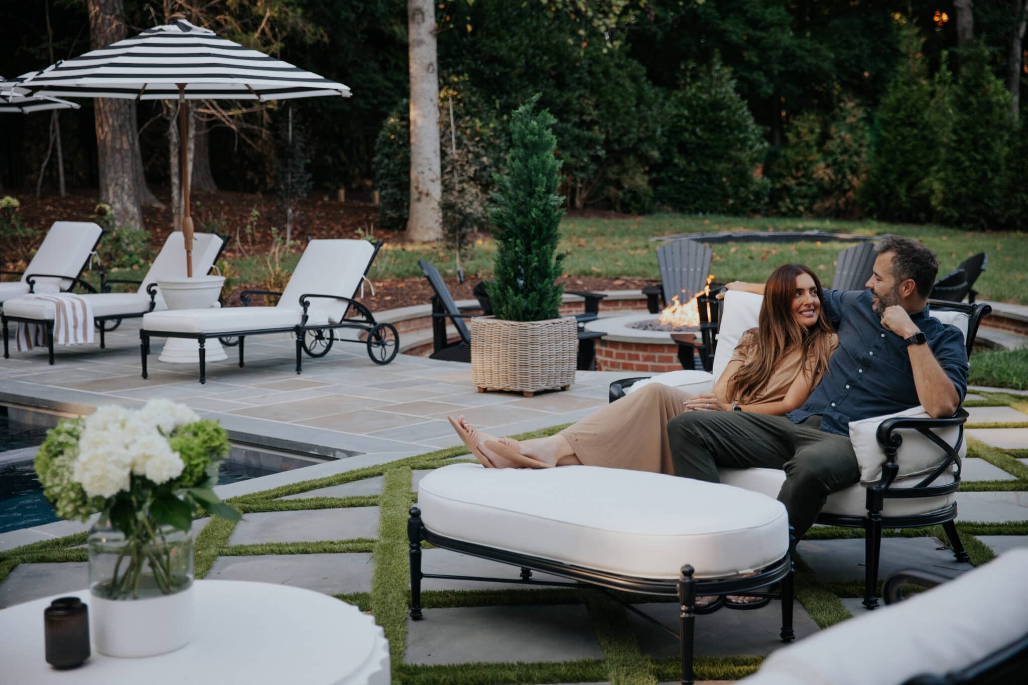
11. 11′ Round Outdoor Market Umbrella $559
12. CLJ x Loloi Jules Merlot/Multi Rug $153 – This rug is one of our most popular, and the rust merlot red goes with everything.
Leave a Reply
What do you think?
Previous Post
Next Post


Semihandmade
Our wood grain Shaker cabinet fronts were designed for busy, high-traffic homes like ours. Clad with durable textured thermofoils, this line is compatible with Sektion, Akurum, Godmorgon, and Besta cabinets from IKEA. It's the perfect, practical way to add the warmth of wood to all the rooms of your home.
Collaborations
learn more

next
Loloi
We have teamed up with Loloi to create a line of rugs that are as affordable as they are beautiful. This collection houses a great mix of traditional and modern rugs, in cottage-y colorways, as well as vintage-inspired beauties that you’ll want to roll out in every room.
Collaborations
learn more

next
STUGA
We partnered with Stuga on a line of hardwood floors — The Ingrid is really livable, and the color is very neutral. It doesn’t lean warm or cool, it’s that just right in-between. We have really loved putting it everywhere in our house. It’s the best jumping-off point for design, no matter your interior style. In addition to being beautiful, Ingrid is really durable — we have three kids, and we always have a home construction project going on. Ingrid stands up to it all.
Collaborations
learn more

next

SHop all
What We're Right Now
What We're Right Now
Looking for our favorite things? A place to shop our home room by room, or just catch up on what Julia's wearing / loving right now? Browse the CLJ shop.
Loving


Portfolio


Design
Befores, afters, mood boards, plans, failures, wins. We’ve done a lot of projects, and they’re all here.
BROWSE BY CATEGORY
let's break this thing up
We have a long-standing relationship with DIY, and love rolling our sleeves up and making it happen.
Projects
Even when you don’t want to rip down a wall, you can make that space in your home better. Right now.
read more
read more
read more
02
01
03
looking for inspiration?
It’s been over a year since we started designing our bathroom. We were working with Unique Kitchens and Baths for the cabinetry, and they came up with two different layouts. We selected one, tweaked it a bit and chose a lot of the finishes…annnnnd honestly we could never quite give the final “go ahead.” This […]


SEARCH THE BLOG
We've been doing this since 2009 and we've posted a whopping 24145+ blog posts and counting. You might need a little help searching, huh?
looking for something?
find stuff like:
")
Can We Send You Our Love Letter?
Another way for us to stay in touch! Joining our weekly newsletter gives you access to exclusive content, never-before-seen photos, your questions answered, and our favorite DIYs. Sign up below!
Follow Along on Instagram
Welcome to our online community where we've posted home, DIY, style, renovations, and family since '09. Renovating our #cljmoderncottage in Idaho and headed for new adventures in Raleigh, NC. #cljfam #cljtransformations
@chrislovesjulia


Links
Get Around
Make yourself right at home
Portfolio
Design
Casual Friday
Projects
Lifestyle
Gift Guides
All Posts
Shop
Love where you live.
Social
RivrLinks
Links
Get Around
Make yourself right at home
Portfolio
Design
Casual Friday
Projects
Lifestyle
Gift Guides
All Posts
Shop
Love where you live.
Social
RivrLinks
I just bought a mountain home that comes with a big red sectional in the family room. What CLJ rug would you recommend???
When color drenching a room with a doorway, would you paint only one side of the door that color? I am struggling with the transition for trim & doors between rooms
We have a “statement” wall in our kitchen painted red. It’s the background for lots of original art and a beautiful sideboard. We love it, but my wife’s mother always asks: “When are you going to get rid of that red wall?” LOL! It’s kind of like cilantro … either you love a red wall or you really don’t!
I have red chairs and curtains in our dining room, subtle accents in the living room right next to it, and our bedroom is red and slate blue. Love it!
In our current tiny condo, I only have pops of red. In our former brick Tudor revival home built in 1930, I painted our central hallway a color I only know as ‘barn red’. It was a small can from the ‘Oops’ pile at Home Depot. Since I painted over wallpaper (I was afraid to strip wallpaper from plaster -not sheetrock- walls) I primed with oil based primer in order to keep the wallpaper in place. Latex paint may have lifted it.
check out the new Fillmore chair in burnt umber velvet, and the Hastings lamp in oxblood at west elm. such great styles to add a pop of warmth.
When my husband and I first got married, 23 years ago, our first piece of bought by us furniture was a red velvet couch. My mom told me I would regret it. I knew that I wouldn’t. We still have the couch today and it’s one of my most favorite pieces of furniture ❤️
I recently painted our kitchen cabinets in Accessible Beige and hadn’t decided whether to also paint the island in the same color. When my husband suggested that it needed to be a color, I settled on Holly Berry (BM). It can be seen from the LR, DR and entry. I don’t think I’ll ever get tired of it!