


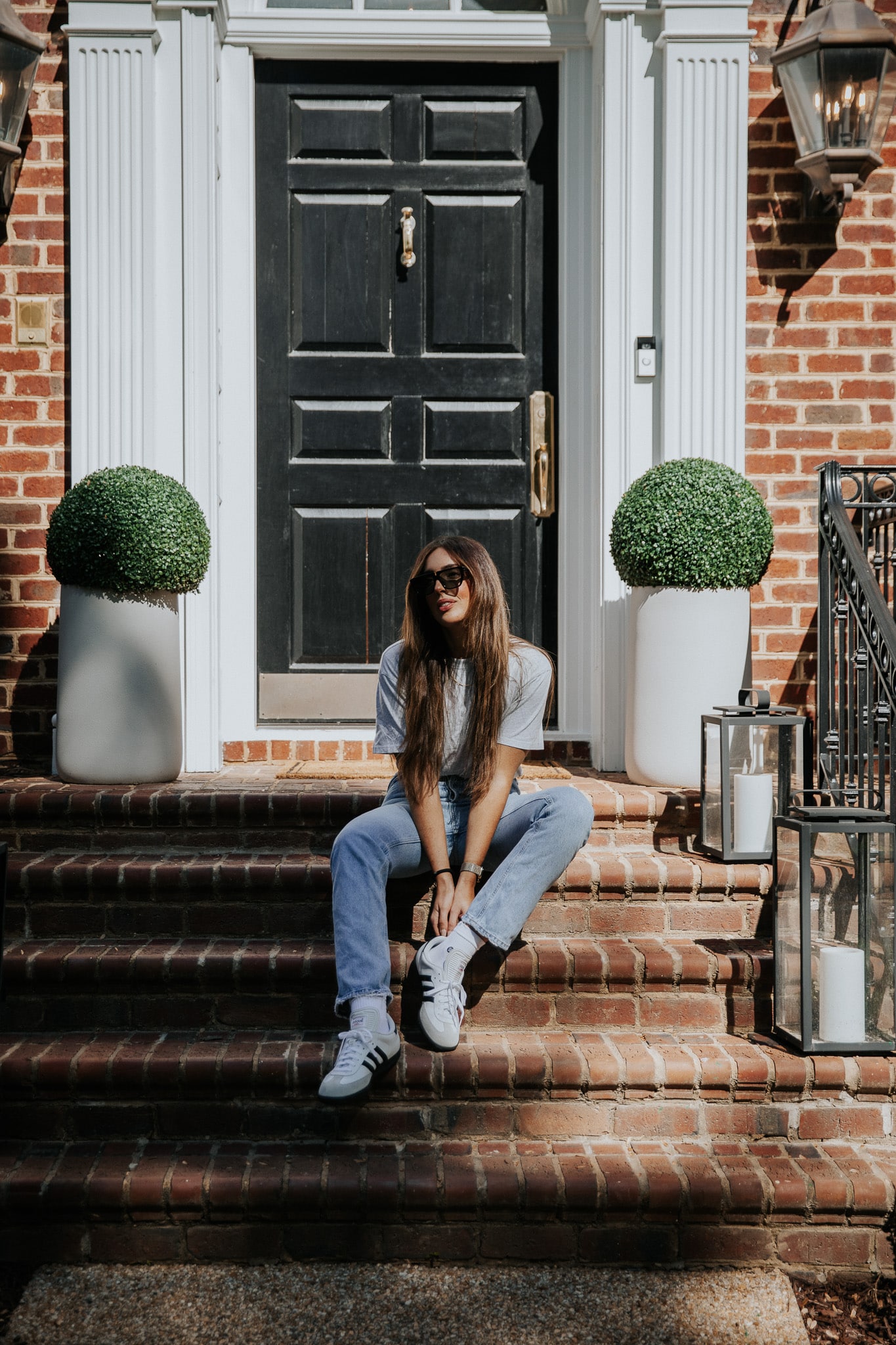
Have you ever been stopped in your Pinterest scroll by a colorful interior and thought, “I absolutely love this,” followed by, “I could never”? Well, you’re in the right place and not alone. Welcome to your first day of Color School, a series of mini-lessons designed to help you embrace color fearlessly into your home. If you want to follow along over the next three weeks and receive exclusive bonus content and tips directly to your inbox, sign up below!
While I’ve never been known to paint my walls in a security blanket of white, I’ve seen this whitewash trend sweep the internet in the last ten years. It’s only a matter of time before the pendulum naturally swings the other way, and within the last few years, more and more people are incorporating color back into their homes through paint, wallpaper, furniture, decor, art… I couldn’t be more thrilled about it! For over 14 years, Chris and I have been using our homes as our renovation playgrounds, and I’ve experimented with every color of the rainbow. I’ve had ups and downs, but through it all, I’ve learned a thing or two about incorporating color into my home more fearlessly.
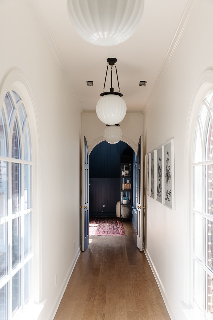
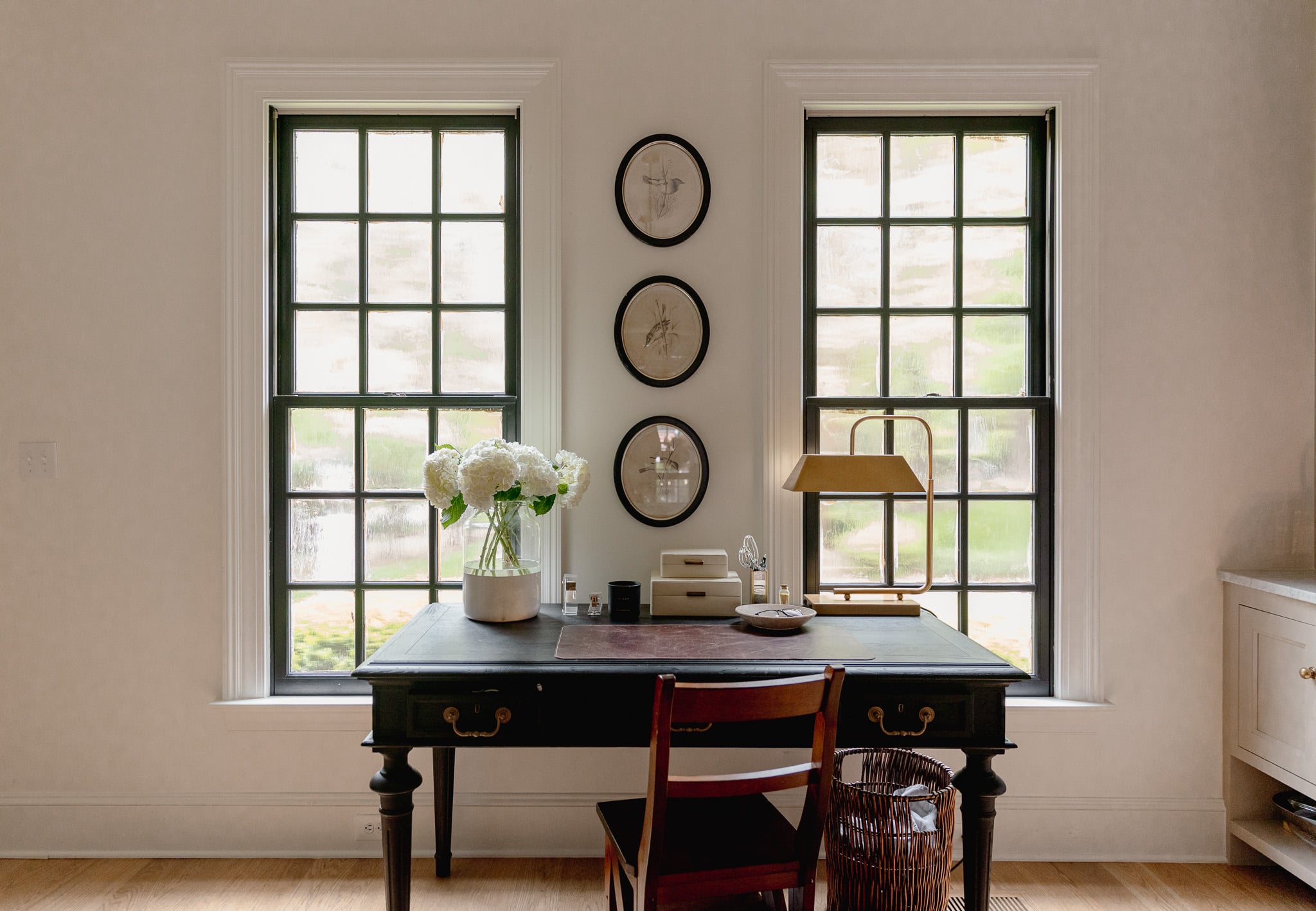
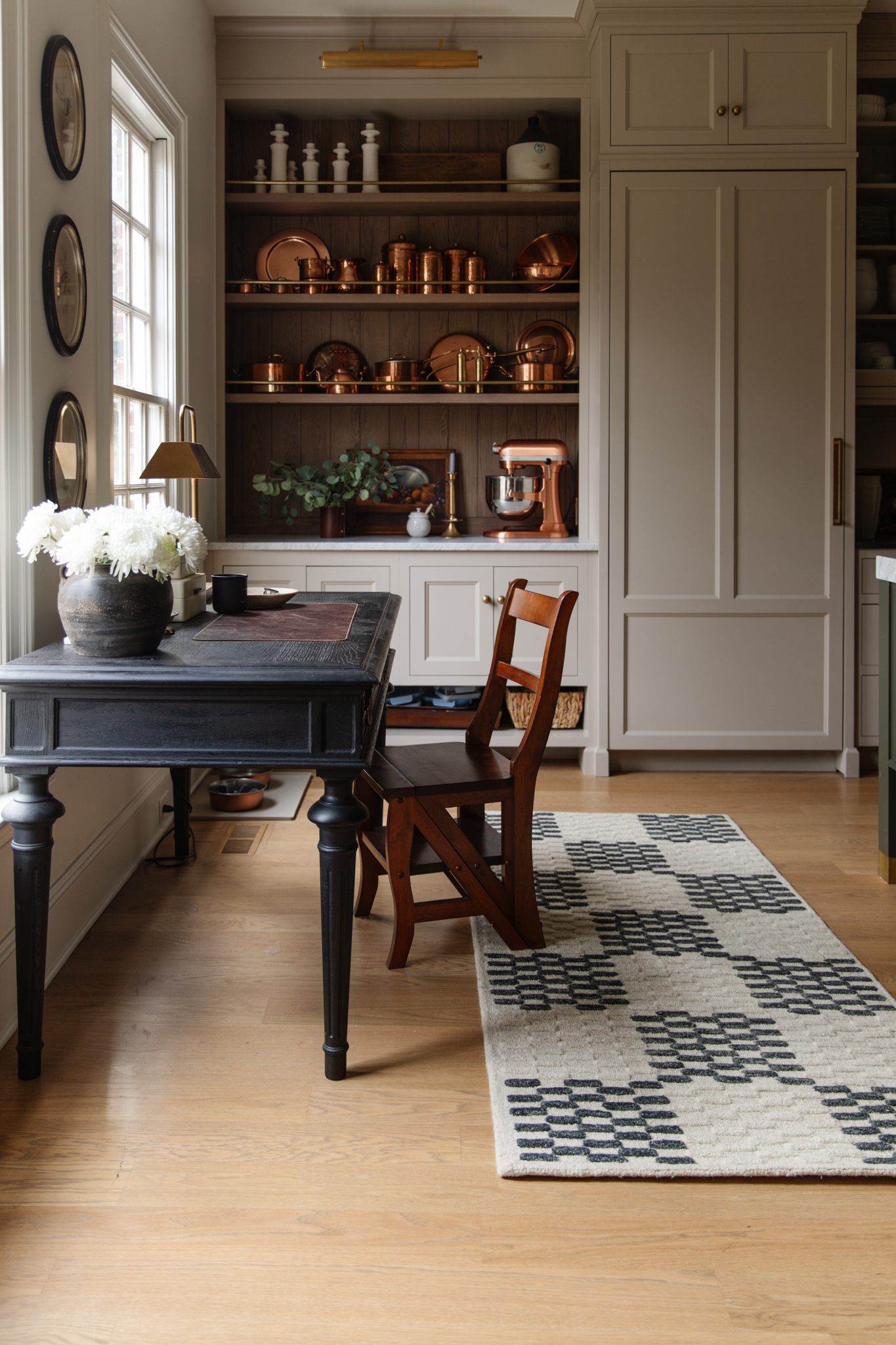
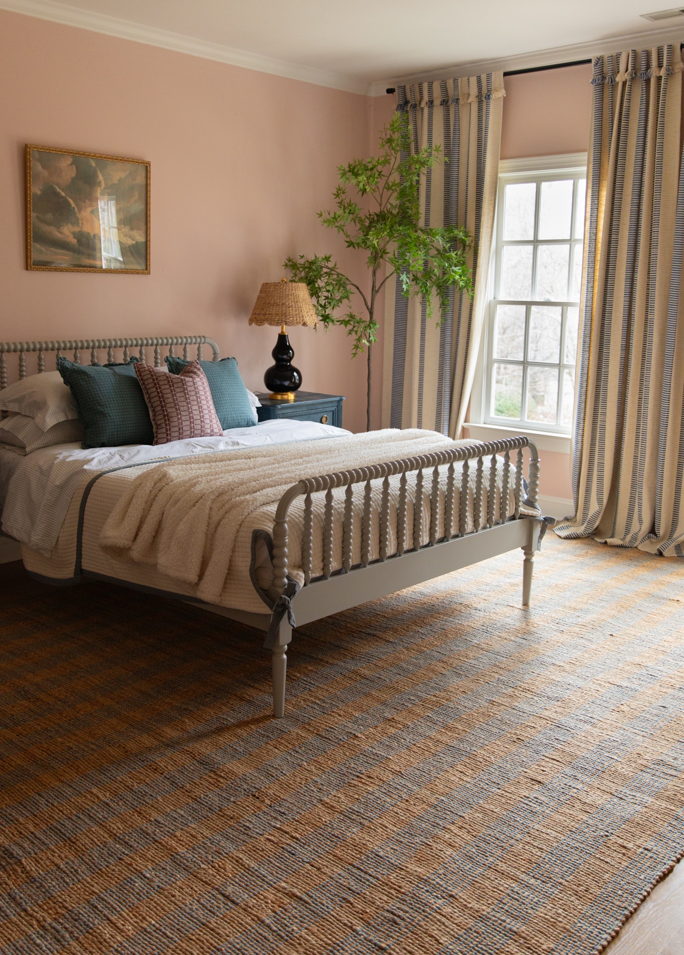
Exhibit A
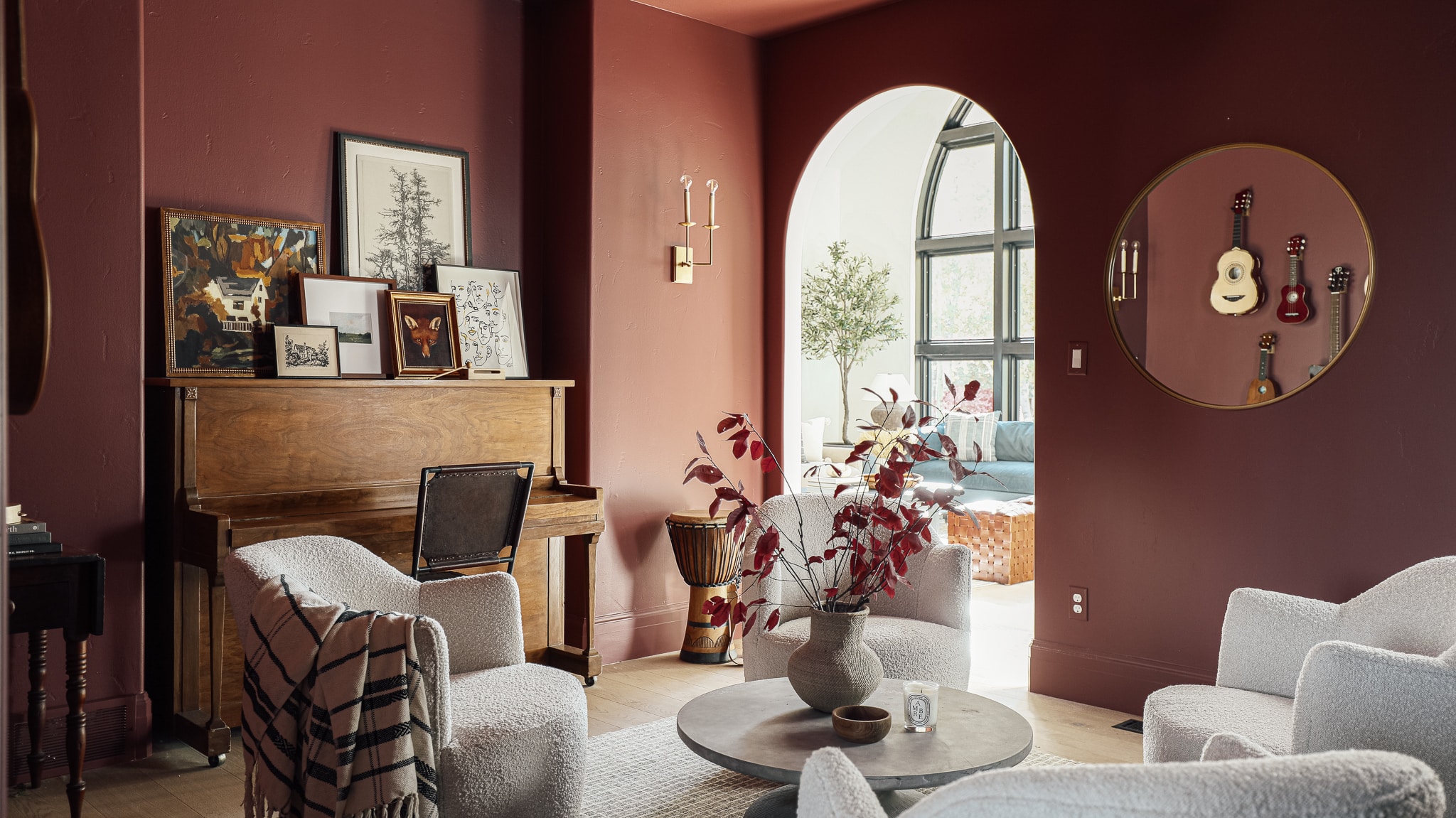
Shop the music room

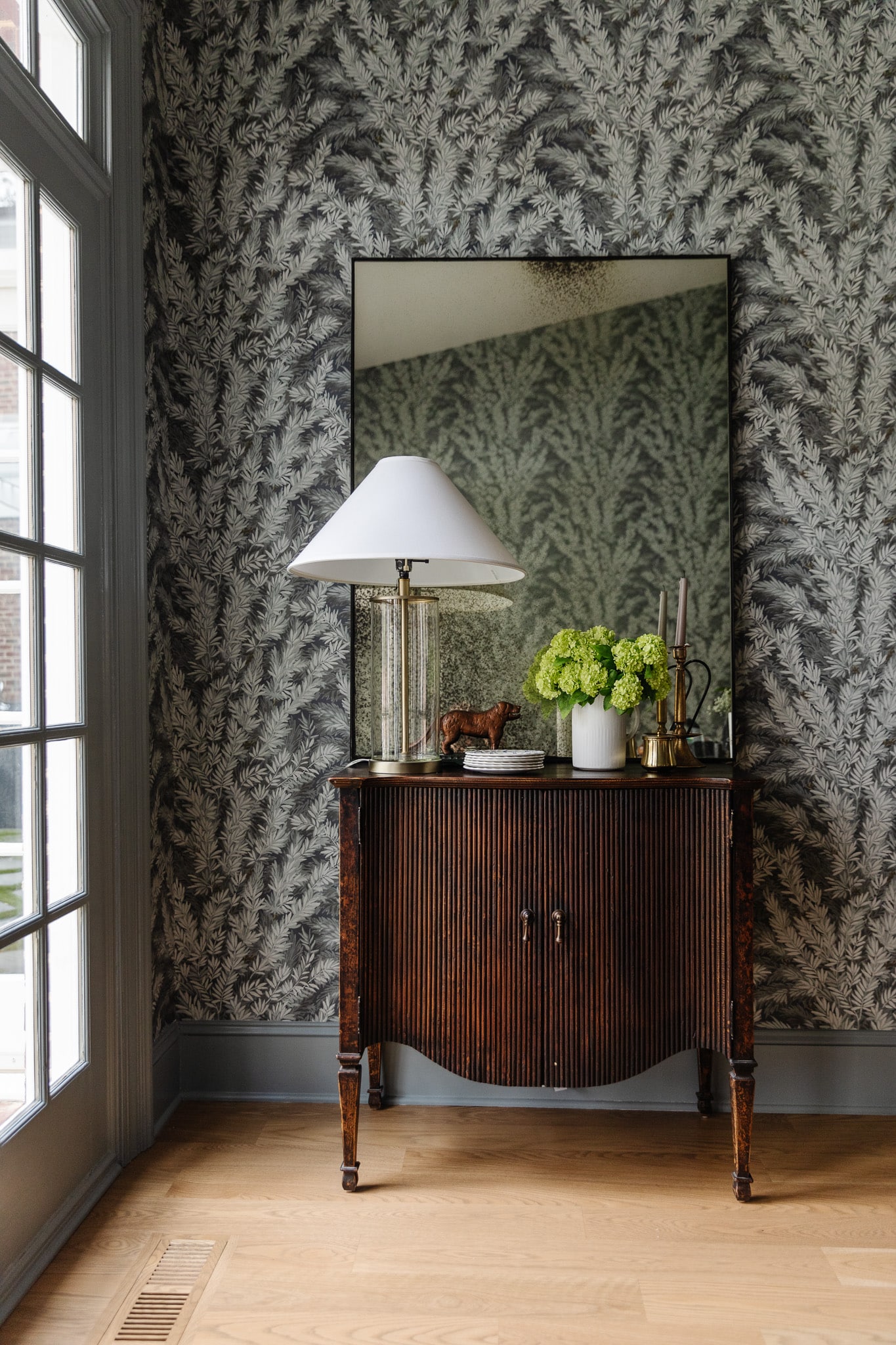
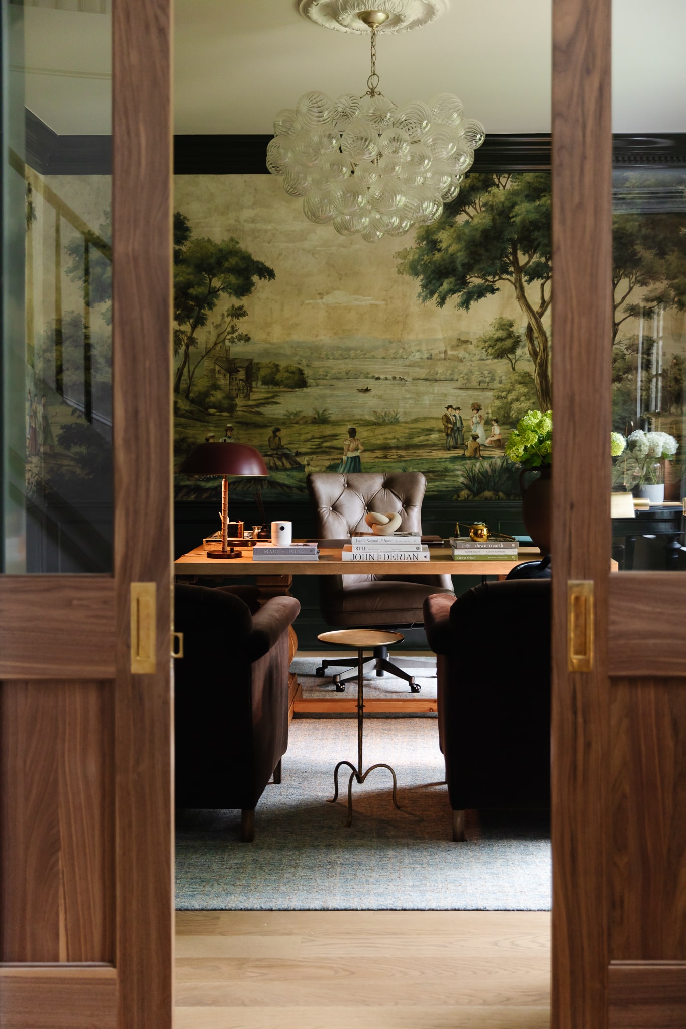
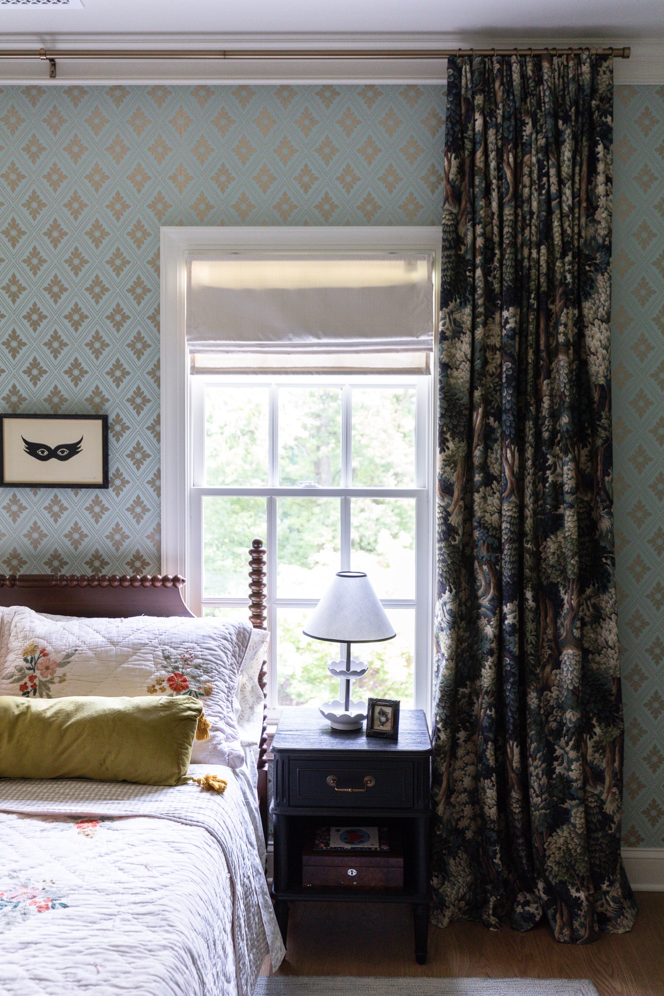
Exhibit B
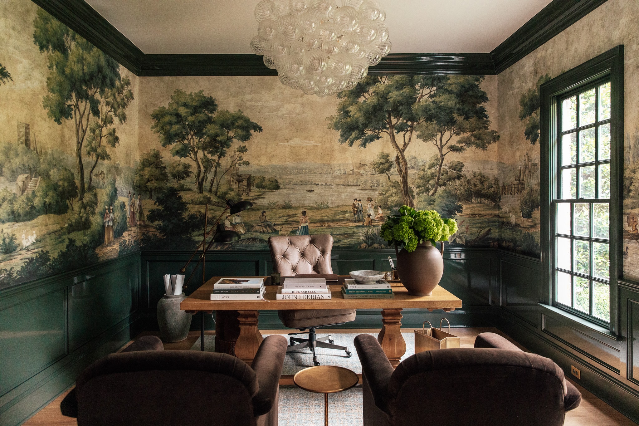
Shop the study
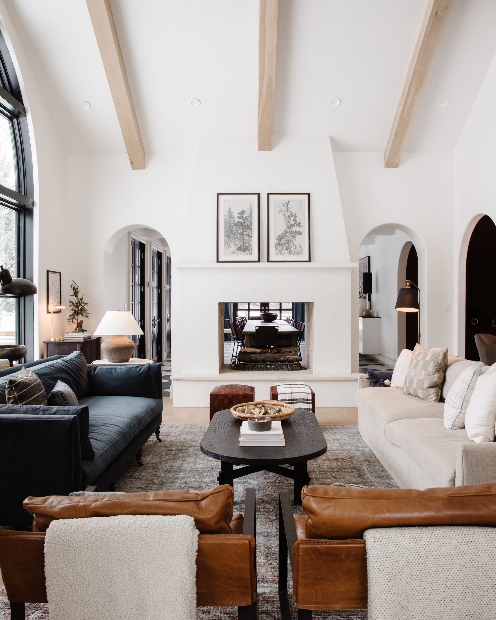
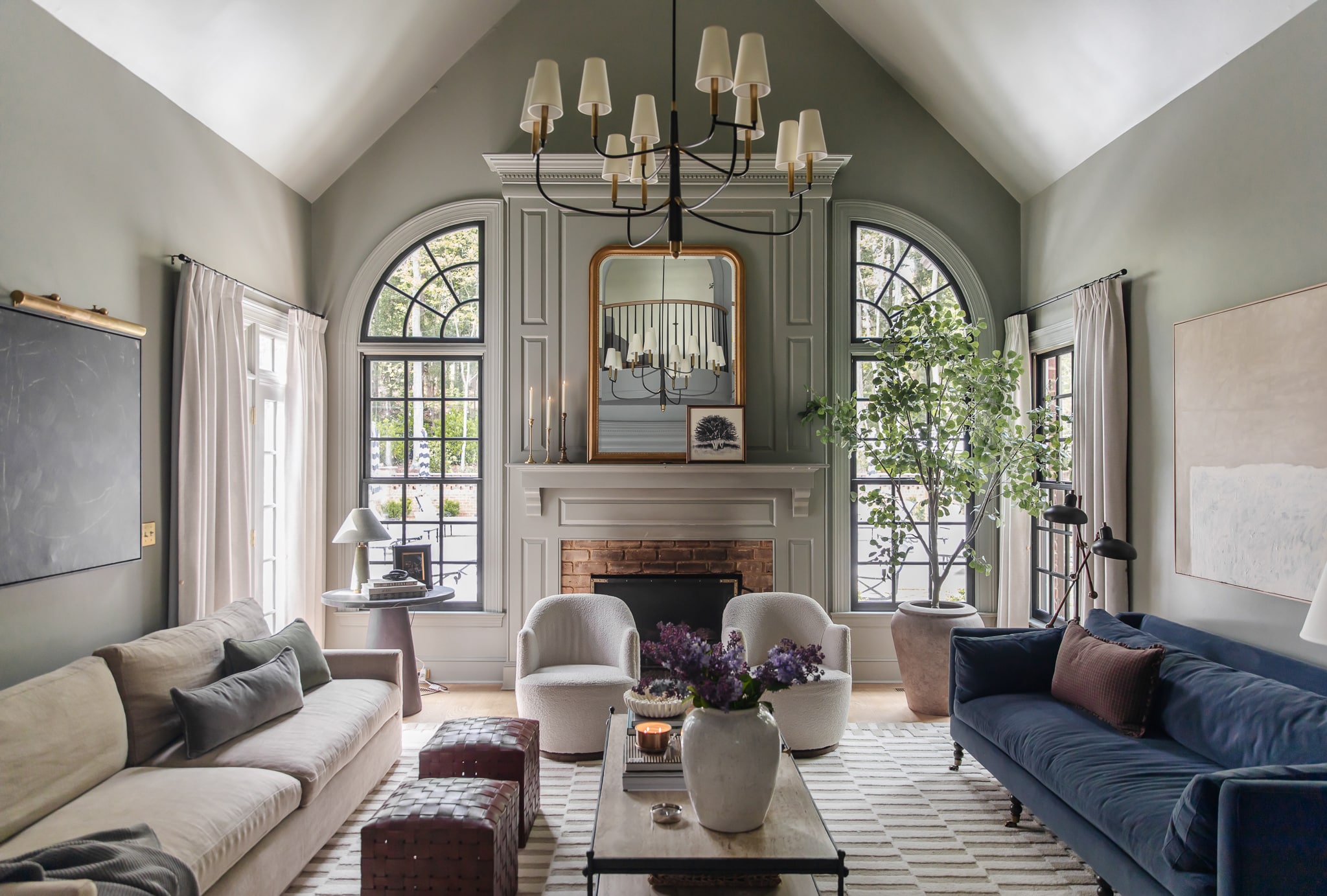
Exhibit C
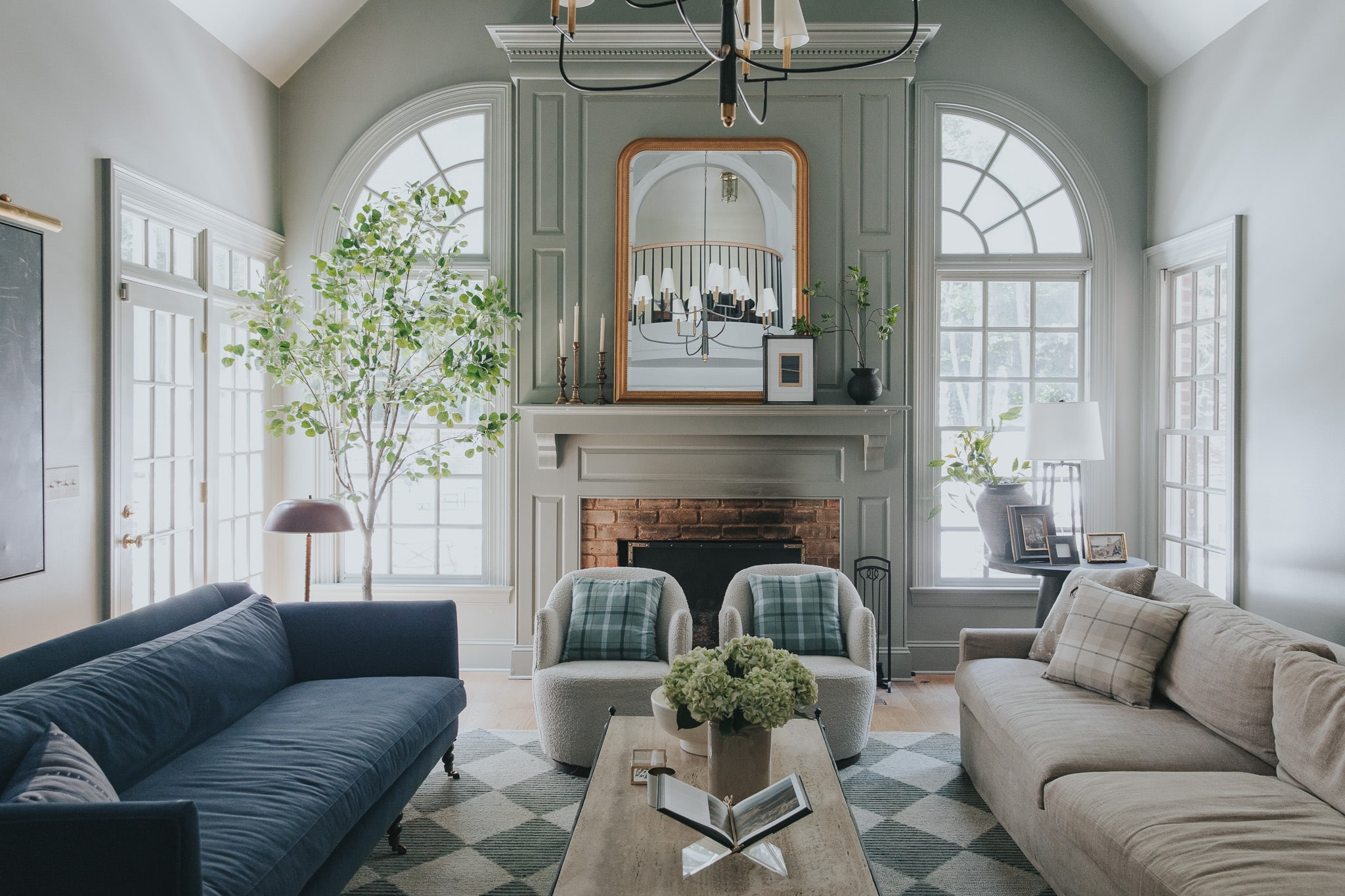
Shop the living room
Are white walls out of style?
I’m certainly not anti-white-walls, nor am I a stranger to them. But did we go overboard with white? This Apartment Therapy article from 2017 suggests that more people were painting their walls white to achieve some sort of Instagram aesthetic. I’ll admit, white walls are pretty photogenic, and in a world of content creation and documenting our lives on social media, that may have contributed to how we wound up in an epidemic of white backdrops walls.
And what happens when you, your neighbors, and seemingly everyone you follow on social media have a houseful of white walls? Well, it eventually gets boring.
Shop the living room
All that being said, I don’t think white walls are leaving us anytime soon, nor do I think they should. White is such a classic, simple, effortless way to make a space feel bright and airy, but when you douse the whole house in white, it’s bound to feel redundant. There’s a time and place for white (which we’ll get into in another lesson), but it’s time to make your home a reflection of you rather than playing it safe.
What if I don’t like color?
I have good news for the color-adverse: You don’t have to like color! We all have our preferences, and it’s totally fine by me if you naturally gravitate toward neutrals. Embracing color in your home isn’t about forcing you to like something you don’t. Rather, it’s a challenge to push the limits of creativity, fun, and self-exploration by inviting more color in. As Natasha Bedingfield would say, “Release your inhibitions!”
Shop the dining room
Even if you’re not a huge fan of color, I would argue that there’s color in everything! This seemingly monochromatic dining room, for example, is a balance of cool blue grays and warm woods, which was completely intentional, by the way. So whether you’re a skeptic, afraid, or simply don’t know where to start, we’re here to help.
Where to start?
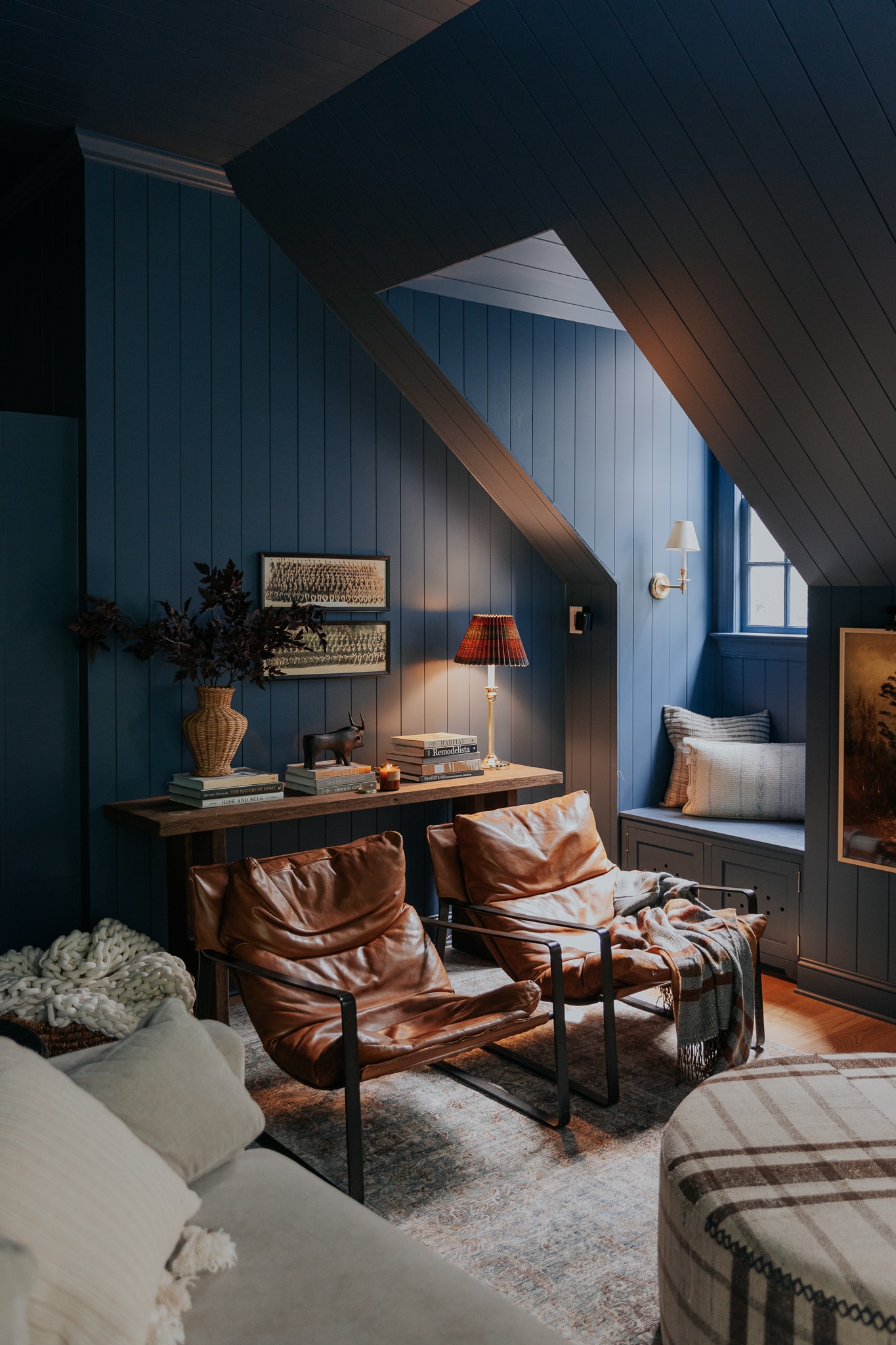
Shop the bonus room
In the upcoming lessons, we’ll be guiding you through the following:
- color theory to help you feel more empowered to make informed decisions
- tips on intentionally using color in your home
- psychology and history of color
- teach you how to design a whole home color palette
- embracing your own authentic home style through color
If you want actionable steps, accountability, and bonus content, follow along with the email course!
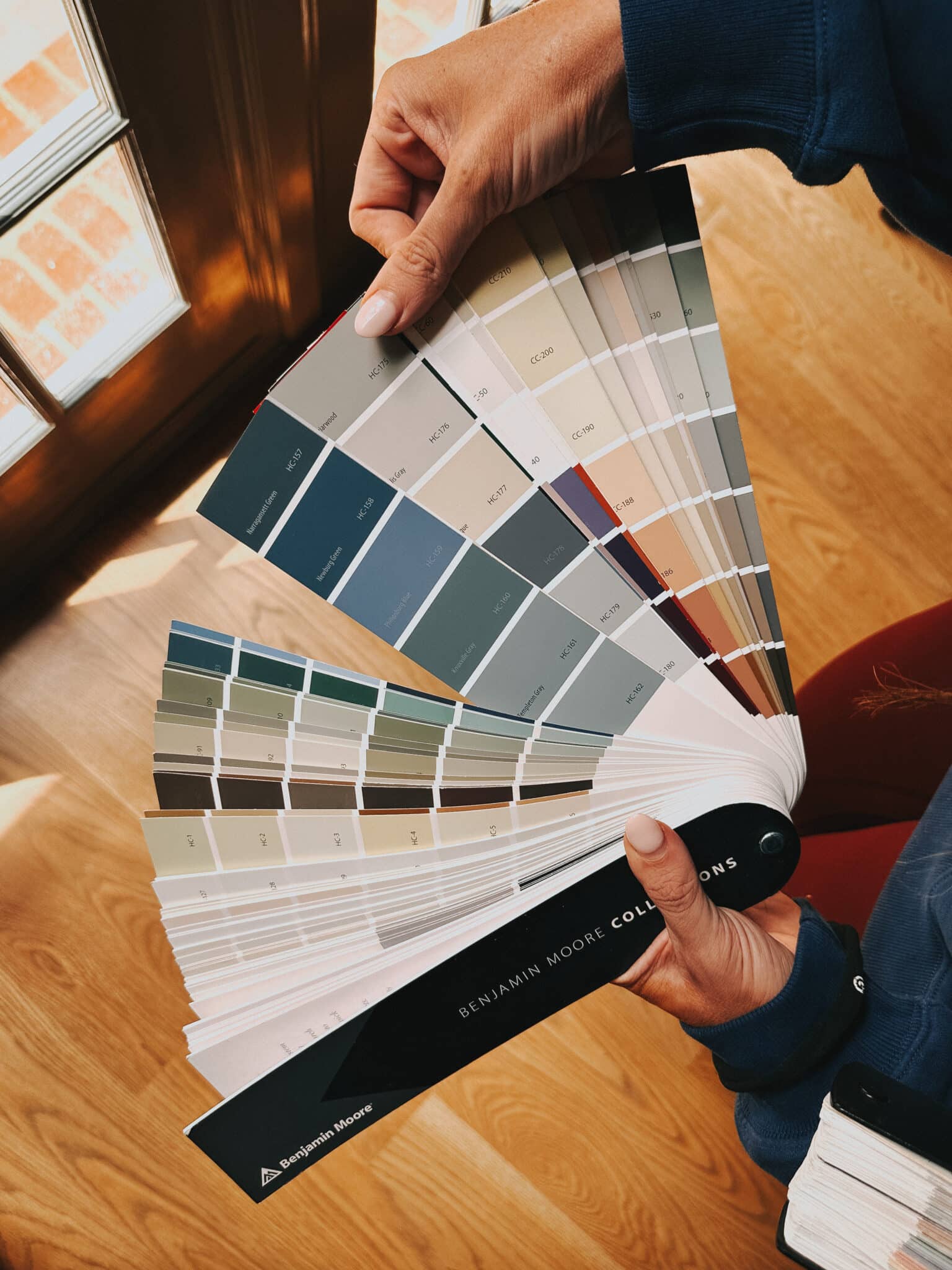
One of the best ways to get over your fears is through a little exposure therapy. While I’m no psychologist, one way to inspire some more color into your life is by flipping through pretty interior photos. I have a growing collection of coffee table books I look to for inspiration and they double as home decor! Here are some of my favorites to get you started.
Coffee Table Books
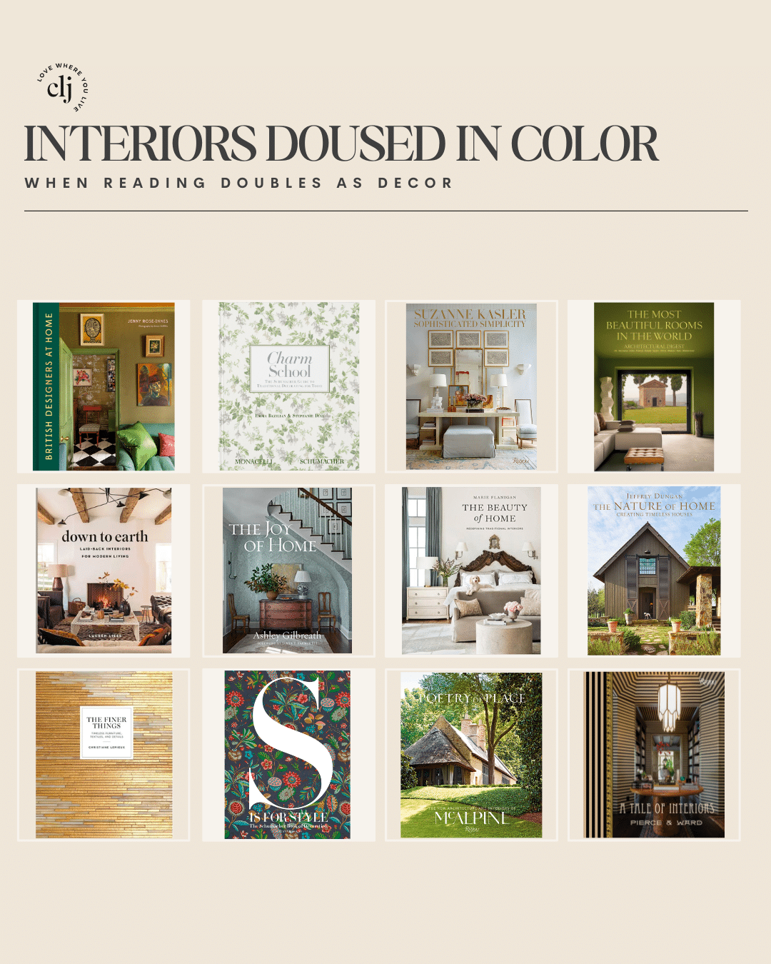
1. British Designers at Home $36
2. Charm School $42
3. Sophisticated Simplicity $60
4. The Most Beautiful Rooms in the World $65
5. Down to Earth $29
6. The Joy of Home $37
7. The Beauty of Home $33
8. The Nature of Home: Creating Timeless Houses $57
9. The Finer Things $37
10. S is for Style $75
11. Poetry of Place $55
12. A Tale of Interiors $45
Leave a Reply
What do you think?
Previous Post
Next Post


Semihandmade
Our wood grain Shaker cabinet fronts were designed for busy, high-traffic homes like ours. Clad with durable textured thermofoils, this line is compatible with Sektion, Akurum, Godmorgon, and Besta cabinets from IKEA. It's the perfect, practical way to add the warmth of wood to all the rooms of your home.
Collaborations
learn more

next
Loloi
We have teamed up with Loloi to create a line of rugs that are as affordable as they are beautiful. This collection houses a great mix of traditional and modern rugs, in cottage-y colorways, as well as vintage-inspired beauties that you’ll want to roll out in every room.
Collaborations
learn more

next
STUGA
We partnered with Stuga on a line of hardwood floors — The Ingrid is really livable, and the color is very neutral. It doesn’t lean warm or cool, it’s that just right in-between. We have really loved putting it everywhere in our house. It’s the best jumping-off point for design, no matter your interior style. In addition to being beautiful, Ingrid is really durable — we have three kids, and we always have a home construction project going on. Ingrid stands up to it all.
Collaborations
learn more

next

SHop all
What We're Right Now
What We're Right Now
Looking for our favorite things? A place to shop our home room by room, or just catch up on what Julia's wearing / loving right now? Browse the CLJ shop.
Loving


Portfolio


Design
Befores, afters, mood boards, plans, failures, wins. We’ve done a lot of projects, and they’re all here.
BROWSE BY CATEGORY
let's break this thing up
We have a long-standing relationship with DIY, and love rolling our sleeves up and making it happen.
Projects
Even when you don’t want to rip down a wall, you can make that space in your home better. Right now.
read more
read more
read more
02
01
03
looking for inspiration?
A reader recently asked me if I’m starting to fully embrace traditional style and whether we still consider our house to be a “modern Colonial” and why. It was a really great question and so timely — I had really just been thinking about my approach to this home and how my style has changed […]


SEARCH THE BLOG
We've been doing this since 2009 and we've posted a whopping 24145+ blog posts and counting. You might need a little help searching, huh?
looking for something?
find stuff like:
")
Can We Send You Our Love Letter?
Another way for us to stay in touch! Joining our weekly newsletter gives you access to exclusive content, never-before-seen photos, your questions answered, and our favorite DIYs. Sign up below!
Follow Along on Instagram
Welcome to our online community where we've posted home, DIY, style, renovations, and family since '09. Renovating our #cljmoderncottage in Idaho and headed for new adventures in Raleigh, NC. #cljfam #cljtransformations
@chrislovesjulia


Links
Get Around
Make yourself right at home
Portfolio
Design
Casual Friday
Projects
Lifestyle
Gift Guides
All Posts
Shop
Love where you live.
Social
RivrLinks
Links
Get Around
Make yourself right at home
Portfolio
Design
Casual Friday
Projects
Lifestyle
Gift Guides
All Posts
Shop
Love where you live.
Social
RivrLinks
Bought an 1969 house and will do quite a bit of remodeling so so after tearing out all the old carpeting decided to paint our subflooring to buy us time before the remodel decisions. But really struggling with paint colors! This is hard!
Love the idea of “school” and would love to see “design school” where readers hone in on their personal design styles!
What iscthe green paint color in the living room
Pigeon by Farrow & Ball
Thank you for this, Julia! I’m honestly SO afraid of color, mostly because I still don’t know what my personal sense of style and committing to color on a wall feels like a monumental choice. But I LOVE your home and every room looks so gorgeous and dreamy, so I know I LIKE color… it’s the implementation into my own home that’s the “scary” part. We bought a house completely covered in “Agreeable Gray”, so I’m longing to change it.
I’m excited for this course. I too love colour, but am in a small space. Plus I get bored quickly. Currently looking to paint my hallway a dark and dramatic colour. 😬😁