In 2012 I wrote a blog post called “I’m not who I used to be,” where I basically confessed that I thought I loved colorful walls, but it turns out I was wrong. Ha! How the turntables (fellow office fans?). Now that I’m more seasoned, I know that I just hadn’t found my color groove quite yet, and I was very much in the experimental phase. Now, I love incorporating color into my home, but I’ve learned that I gravitate towards a more muted palette. In today’s Color School lesson, we’re adding to our color theory foundation and talking about mixing and matching colors together!
This lesson is a part of our Color School series. Be sure to visit the other lessons below if you haven’t already!


If you want to follow along and receive exclusive bonus content and tips directly to your inbox, it’s not too late to sign up!
On day one of our free email course, I asked our readers to share with us what they are hoping to get out of Color School, and the overwhelming response was some iteration of, “I want to use more color in my home, but I don’t know how to coordinate colors together.” We got you. In the last lesson, we covered some of the standard “color schemes,” but in my opinion, those aren’t nearly as important as understanding undertones. Let’s get into it.
But first, I need to say something very important. Neutrals are colors too.
Neutrals and Undertones
Maria Killam, the color expert, made a color wheel for neutrals, and it’s about time! You can purchase it and carry it around your house or tote it around the paint store to help you determine the undertones of nearly any neutral! Genius. Knowing the undertone of your wood, stone, fabric, carpet, and paint will help you immensely in your color journey. Too many neutrals and colors with varying undertones is a recipe for disaster. Maria has the nine most useful neutral undertones listed as pink-beige, orange-beige, yellow-beige, gold-beige, green-beige, green-grey, blue-grey, violet-grey, and taupe.


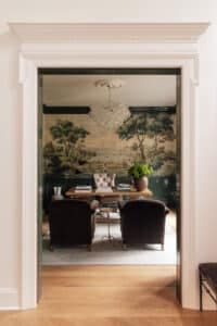
Wallpaper | Antique Mirror | Reeded Chest | Faux Hydrangeas | Candlesticks | Lamp (similar)
In the dining room, I used a blue-grey wallpaper and contrast trim, which complements the orange-beige toned flooring. In this case, the juxtaposition of warm and cool tones feels really balanced and cohesive.
Gradients of White
According to Maria and the flip side of her neutral color wheel, whites can be split into four main gradients: true white, off-white, blue-white, and cream. Whether you’re looking for a white to go with your existing decor or you’re searching for decor to go with your existing white paint, it’s helpful to know the complexities of white.
Now listen up! You’re going to want to save and reference this website, which breaks down the anatomy of hundreds of white paints, which I find to be so helpful.

Let’s compare two white paints I’ve used and loved.

White Flour by Sherwin Williams
I really fell in love with how creamy this white is. It’s on the warmer side of the yellow hue, and has a high reflective value, so it bounces light around which is very helpful in a house with not a lot of window light.
In some rooms, we get a lot of green color cast from the beautiful outside greener reflecting light inside and white flour does a really great job at neutralizing the green.

Alabaster by Sherwin Williams
Alabaster is a classic, classic white paint. It’s less bright and less reflective than white flour, and it leans more towards yellow undertones.
Alabaster felt like a really soft white blanket, especially paired with the Accessible Beige trim.
Okay, okay, I know this is supposed to be about color, but the truth is that you need a strong, supportive white paint to dance with the color in your home! As far as choosing the right white, you need to consider the surrounding neutral undertones, colors, lighting, and overall mood you want for your home.
Color Undertones
As explained in the previous lesson, color temperature refers to how warm or cool a color is. Reds, oranges, and yellows are warm. Greens, blues, and purples are cool. But every color can also have cool or warm undertones. I tend to be more drawn to colors with warmer undertones because they generally feel more inviting and, well, warm!

Common Color Mixing Myth
As we dive deeper into undertones, I feel like I need to put a common myth to bed. Sticking to colors, neutrals, and whites that all have warm undertones is not what I’m recommending. You can and should mix and match undertones, temperature, vibrancy, and more when designing your home! The colors in your home are meant play and interact together, and I could go on, and on, and on, about color theory, but sometimes the only way to really get it is to jump in and see how it feels. And how you want it to feel is going to be different than how other people want it to feel, so you have to get good at trusting your own gut.

Shop the girl’s office

If you want a space to feel dynamic, consider using contrasting colors, undertones, and/or patterns. Too much contrast teeters towards chaos, which is something I DON’T want in my home. It’s a balance!
On the contrary, if you want a room to feel more peaceful and calming, you could use an analagous color scheme, or an all-muted color palette.
60-30-10 Rule
One rule of thumb that I find to be helpful when making any mood board or color palette is the 60-30-10 rule. 60% of the room should be the dominant color. 30% in the secondary color. 10% in accent color. Just another tool to add to your toolbelt in case you get stuck.
A few things that affect color
Lighting plays a significant role in how we perceive color. The two pictures below were taken on different days and times of day, and you can see how the cabinetry color totally changes! Keep in mind your natural light sources, and bulb brightness and temperature when you make color selections in your home. And by the way, I have no problem with the cabinetry changing colors!–It’s completely normal.

Toaster | Faucet | Blender | Tea Kettle | Backsplash

Latches | Pulls | Bottle Organizer | Towel | Tumbler
Contrast refers to the difference in value, saturation, or hue between colors. Seemingly by magic, contrast can completely change how we perceive color, which is a tool that should be used for good, rather than evil. This post illustrates how colors can mutate when they interact.
Using contrast effectively in your home can enhance visual interest, draw attention to specific elements, and create a sense of depth in a composition. Use it wisely.
Putting it into practice
Now what? Now, you take your new wings and learn how to fly. I’ve gathered a few images of other really lovely interiors so we can talk through some examples of cohesive color composition.

Source: Ashley Montgomery Design
I spy a really lovely triad color scheme of muted yellows, reds, and blues. Who knew the primary colors could look so elevated?

Source: Chalk White Arrow
I chose this example specifically for it’s majority use of white. You can still love and use white, while incorporating colors into your home. This space incorporates contrasting black and white, and complementary colors of sage green and a subtle pop of red. To me, this feels playful, yet calm which is easier said than done!

Image Source: Heidi Callier Design
Heidi is the queen of mixing color and patterns, and this dining room space is no exception. The orangey woods complement the blue floral wallpaper perfectly, and I love that there’s this juxtaposing green hutch with jaw-droppingly pretty stone. The longer I stare, the more elements I find that I love.

Image Source: Lucy Williams Home
I had to include a more vibrant use of color, because while it’s not typically what I gravitate towards, I find this living room to be so lovey and charming. Looks like we found another triadic color scheme that works.
Class dismissed!

Hi, we recently started a project where we are getting our main floor painted in White Flour. After getting on two coats, I started googling and found your blog, because we are thinking we need a third coat. We are covering up color, so that could be it as well. Also can you share what color/sheen you used for trim with your White Flour? Since it is pretty white, I am having trouble deciding on a good matching color.
We used White Flour for the trim as well in semi-gloss sheen.
Hi! Loving these posts! How do you view wood built ins? We have a wall of walnut built-ins in our living room. Does that color get included in the triad of colors? Or is that an extra “color”? Thank you!!
We want a subtle contrast trim like at CLJ Cottage, but our “white” walls are actually a full-on tan (they look pure white on the walls because of our light but it’s Duron Hayseed which is absolutely tan). It’s throwing off all the neutral colors because the walls aren’t actually “white.” How do I find something dark enough to stand its ground but still in the neutral color scheme?