


When we first painted the study, it was right after we added the trim and mural to the room. I chose a mid-tone olive that tied in nicely with the mural, but I didn’t love how the mural felt a little lost with the color.
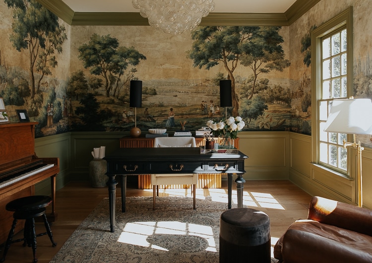
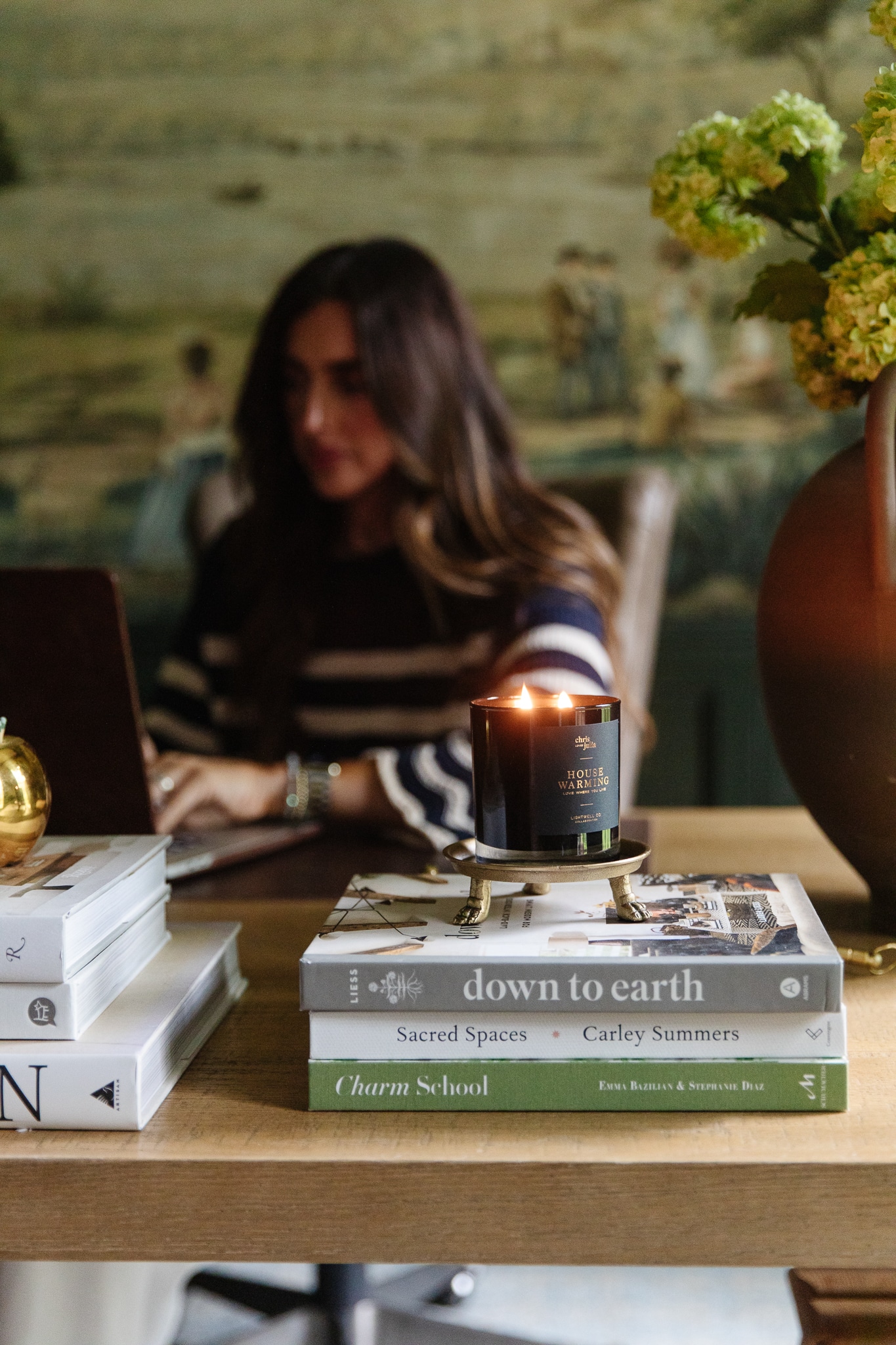
Mural | Chandelier | Desk | Chair | Vase | Peonies | Credenza (similar) | Buffet Lamps | Fluted Bowl | Marble Links | Planter
Paint is the fastest and least expensive way to transform a room, and since I didn’t love it, we eventually decided to repaint it blue.
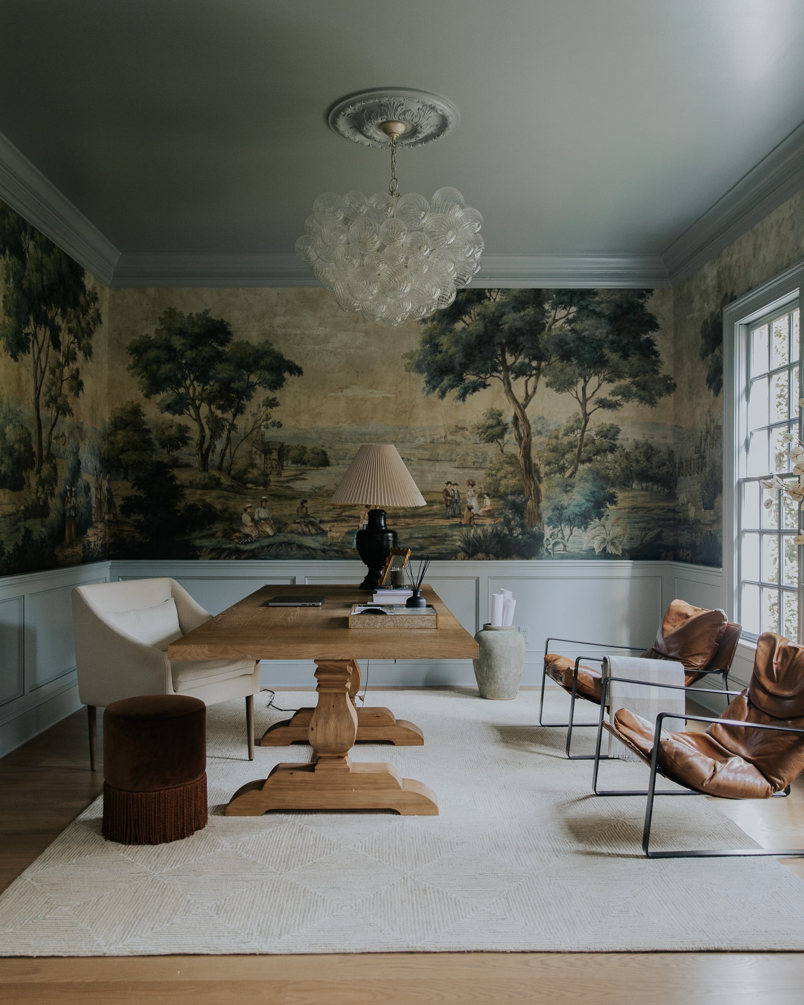
Mural | Rug | Chandelier | Table | Desk Chair | Ottoman | Sling Chairs
The blue is softer on the eyes; and we painted the ceiling this time which lended itself so nicely to the color. I have loved the study like this! And probably would have kept it MUCH longer. It’s serene and refreshing. I think light blue is going to really be trending in the next few years. But as you know, we’re adding some built-ins and pocket doors, and when the contractor asked me what the paint color is so he can match the shelves, it felt like an opportunity to change it yet again.
And when I see an opportunity, I snatch it. I guess it’s a sign that the blue paint hasn’t quite satisfied how I wanted this room to look and feel–or I would have just gave them the paint color. (Boothbay Gray, btw)
I think I’ve wanted a moody paint color all this time, so I went back to the drawing board, painted on some swatches, and now I’m feeling much more confident.
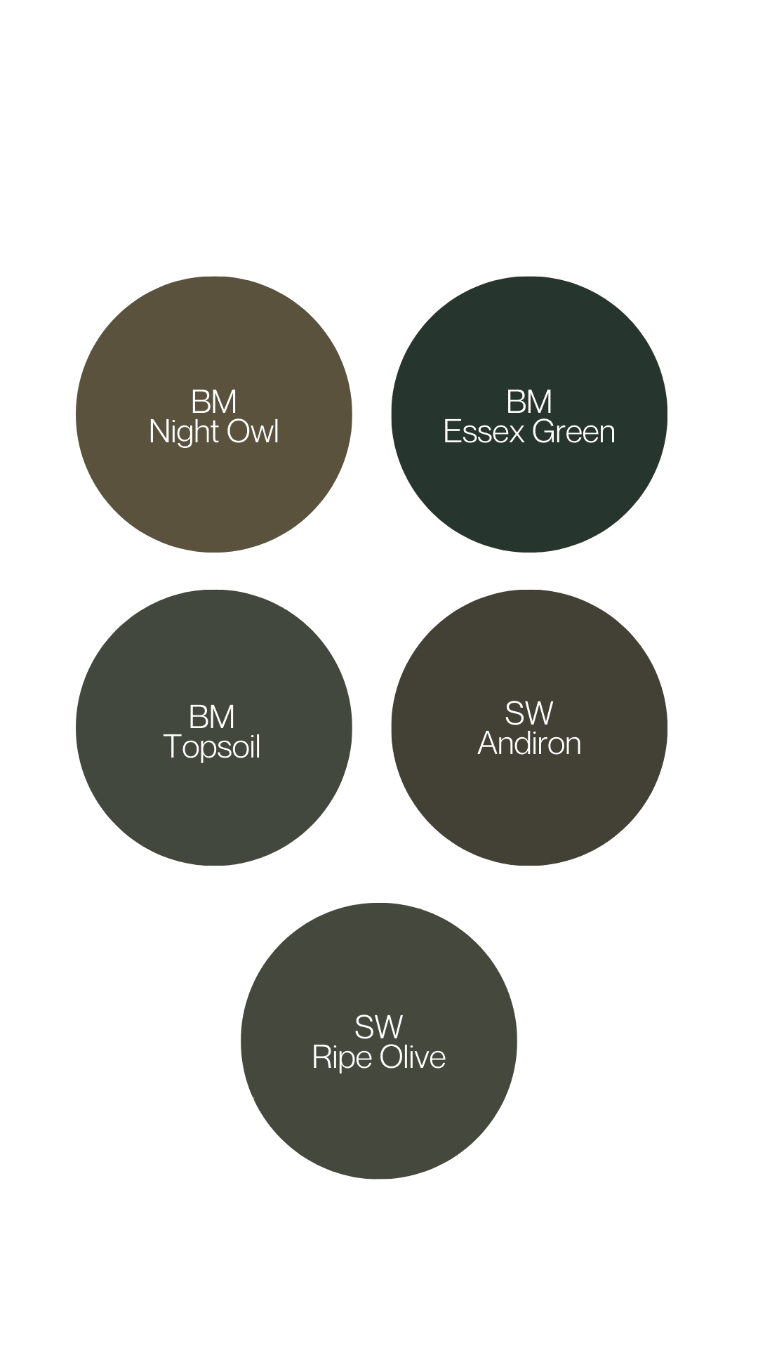
Dark green paint colors from left to right: SW Andiron, BM Essex, SW Ripe Olive, BM Night Owl, BM Topsoil.
After much deliberation and consideration, my heart settled on Topsoil on the far right. It’s the perfect dark, moody green that my heart wanted all along, and I think it will tie in with the kitchen cabinets across the hall. I almost settled on Andiron, but I preferred the depth of Topsoil.
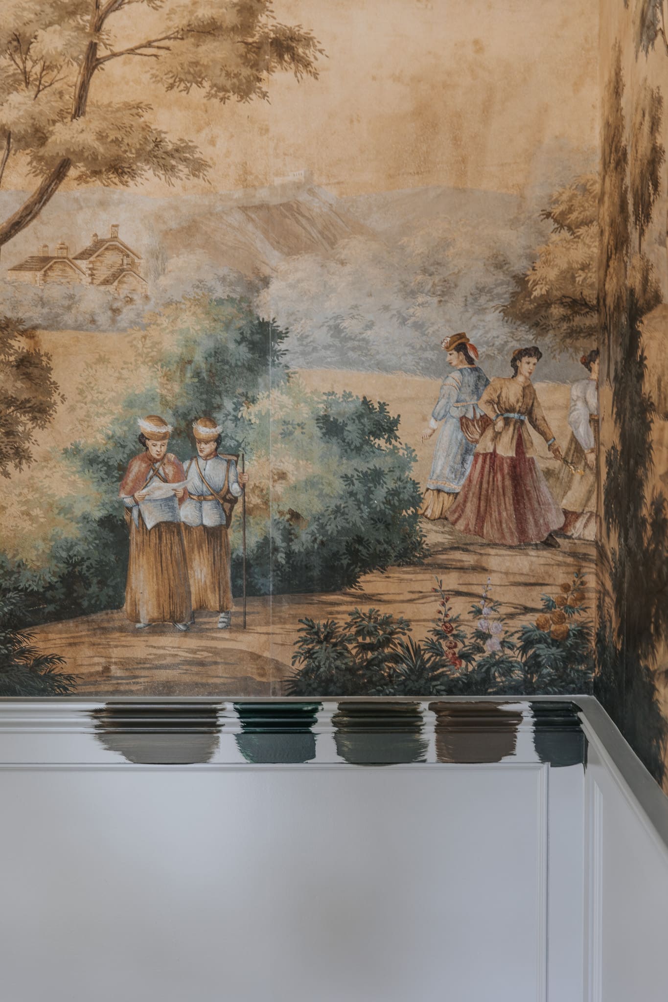
And then, I had to decide if I wanted to paint the ceiling yet again or switch it back to white. When I looked at historical photos of colonial interiors, it had both. Some ceilings were white; sometimes, they matched the walls, and sometimes the color stopped at the crown molding. At the end of the day, I think painting the ceiling in a satin White Flour would tie the room in with the front entry and would add a nice contrast to the dark green paint.
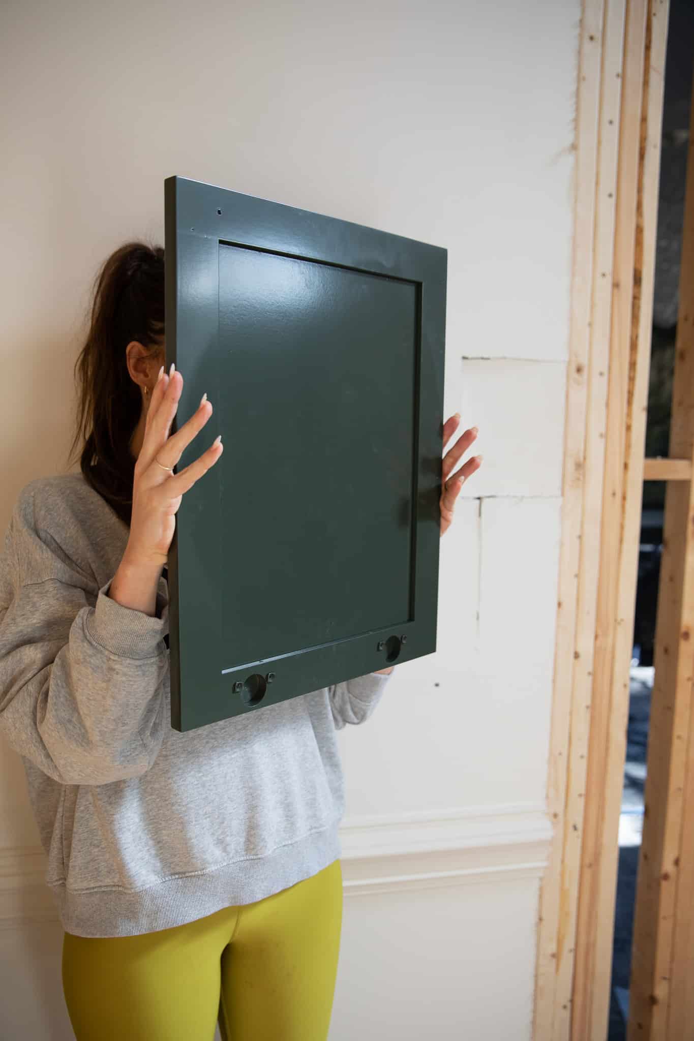
High Gloss vs. Semi-Gloss
The other change I wanted to make (since we had to paint anyway!) was making the paint more glossy for drama. Our contractor brought a cabinet sample piece with one side painted in a cabinet-grade semi-gloss and the other side painted in a cabinet-grade high gloss. Both are super pretty, and it’s fun to compare side-by-side, but I’m going with the high gloss for this space. I think it will be the perfect modern, lacquered touch, and I’m really excited because I can’t remember the last time I painted with a high-gloss paint!
High-gloss
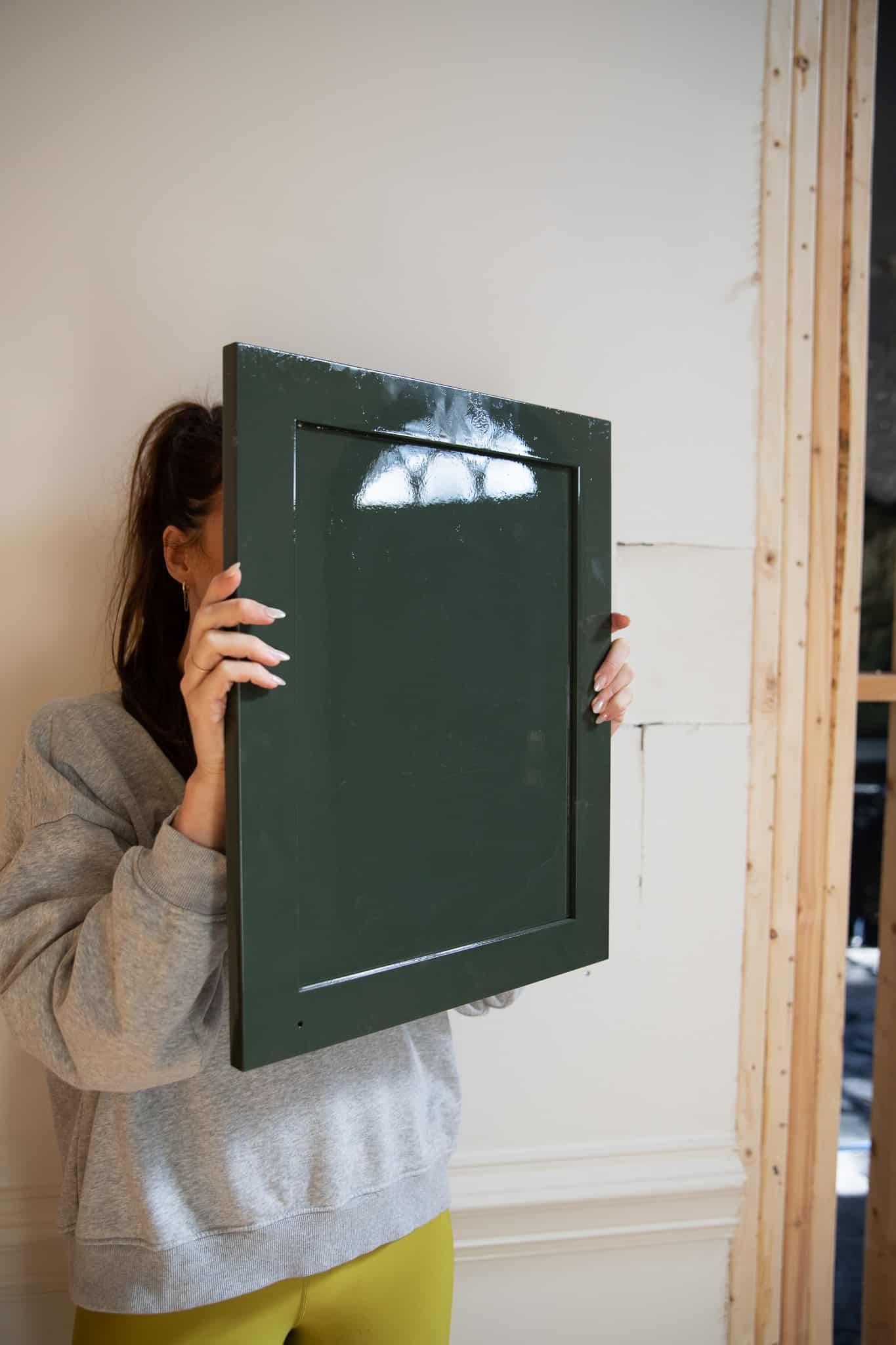
Semi-Gloss
The wainscoting, the crown, the trim, and the built-ins will all be high-gloss, which makes me feel better about my choice to keep the ceiling white. A glossy ceiling would reflect a lot of weird light. I did get a lot of DMs worried about fingerprints showing, but I’m not too worried about it since it’s in a more secluded adult room of the house.
The thing about seeing paint colors online is you can’t always trust what you see! We try our darndest to match the photo to what it looks like in person, but there are too many variables that can make a paint color look different. I actually looked up photos of Topsoil online after choosing it and got a bit spooked, but I trust what I see in-person more. Can’t wait to show it all finished and painted!
Leave a Reply
What do you think?


Semihandmade
Our wood grain Shaker cabinet fronts were designed for busy, high-traffic homes like ours. Clad with durable textured thermofoils, this line is compatible with Sektion, Akurum, Godmorgon, and Besta cabinets from IKEA. It's the perfect, practical way to add the warmth of wood to all the rooms of your home.
Collaborations
learn more

next
Loloi
We have teamed up with Loloi to create a line of rugs that are as affordable as they are beautiful. This collection houses a great mix of traditional and modern rugs, in cottage-y colorways, as well as vintage-inspired beauties that you’ll want to roll out in every room.
Collaborations
learn more

next
STUGA
We partnered with Stuga on a line of hardwood floors — The Ingrid is really livable, and the color is very neutral. It doesn’t lean warm or cool, it’s that just right in-between. We have really loved putting it everywhere in our house. It’s the best jumping-off point for design, no matter your interior style. In addition to being beautiful, Ingrid is really durable — we have three kids, and we always have a home construction project going on. Ingrid stands up to it all.
Collaborations
learn more

next
SHop all
What We're Right Now
What We're Right Now
Looking for our favorite things? A place to shop our home room by room, or just catch up on what Julia's wearing / loving right now? Browse the CLJ shop.
Loving


Portfolio


Design
Befores, afters, mood boards, plans, failures, wins. We’ve done a lot of projects, and they’re all here.
BROWSE BY CATEGORY
let's break this thing up
We have a long-standing relationship with DIY, and love rolling our sleeves up and making it happen.
Projects
Even when you don’t want to rip down a wall, you can make that space in your home better. Right now.
read more
read more
read more
02
01
03
looking for inspiration?
A reader recently asked me if I’m starting to fully embrace traditional style and whether we still consider our house to be a “modern Colonial” and why. It was a really great question and so timely — I had really just been thinking about my approach to this home and how my style has changed […]


SEARCH THE BLOG
We've been doing this since 2009 and we've posted a whopping 24145+ blog posts and counting. You might need a little help searching, huh?
looking for something?
find stuff like:
")
Can We Send You Our Love Letter?
Another way for us to stay in touch! Joining our weekly newsletter gives you access to exclusive content, never-before-seen photos, your questions answered, and our favorite DIYs. Sign up below!
Follow Along on Instagram
Welcome to our online community where we've posted home, DIY, style, renovations, and family since '09. Renovating our #cljmoderncottage in Idaho and headed for new adventures in Raleigh, NC. #cljfam #cljtransformations
@chrislovesjulia


Links
Get Around
Make yourself right at home
Portfolio
Design
Casual Friday
Projects
Lifestyle
Gift Guides
All Posts
Shop
Love where you live.
Social
RivrLinks
Links
Get Around
Make yourself right at home
Portfolio
Design
Casual Friday
Projects
Lifestyle
Gift Guides
All Posts
Shop
Love where you live.
Social
RivrLinks
When you love a color, does your heart pound? Mine does and that’s how I know it’s the right choice. That happens when I see an antique piece of furniture or a brand new appliance or some shoes that are just perfect.
Love all the color choices but I think a dark paint will look gorgeous with the mural. Can’t wait to see it.
I can’t even get part of my interior painted, (although it has been prepped for over a year!) and you’re on color number three for your study! I’m envious! Can’t wait to see the moodier color. We are in the midst of closet planning and looking at yours over and over is so inspiring! Thank you!
I think the Boothbay Gray is incredibly handsome and would have transitioned below chair rail to a high gloss beautifully. It carried onto the ceiling just right. Your mural is fantastic and should have all the attention – my only concern with the dark colors although I have just done ceiling and trim in a very dark eggplant to accompany a Zuber so it all boils down to what makes us happy – right?
I’m having a hard time visualizing the high gloss and look forward to seeing how that turns out! Love the color you chose!
What a journey! Can’t wait to see it done over in Topsoil.
Have you considered fine paints of Europe? they are superior for a glossy finish
Paint and how it works with light and gloss and sheen – it is all so fascinating!! I can’t wait to see how the room evolves!! Thanks for taking us along!
Great choice with the wall color and ceiling. Looking forward to seeing the room finished.
I read Night Owl and thought that doesn’t look like Night Owl, that’s our house color, and then read the BM, not SW. Love all your moody color choices! Can’t wait to see the next iteration of moody in this study. The blue was very restful and soothing.
I agree with others…leave the ceiling blue, at least for now. The room looks beautiful and I can’t wait to see the end result!
There are so many gorgeous colors of paint, I don’t know how anyone decides!! I loved your first two choices, and I’m sure I’ll love the Topsoil! I’m a fan of Benjamin Moore paint!
I admit I never loved the blue. I thought is was kind of weak with the dramatic mural. But I am solidly in camp “keep the ceiling blue.” I’m really looking forward to the big reveal on this one. I think it’s going to be eye popping!
I love high gloss – I used fine paints of Europe high gloss and it’s gorgeous
Gave up IG,FB trying to live more simply less stress. Grateful for reading opportunities instead. Thankful for your Blog “Love letters” Julia
You’re encouraging me to show myself a lot more grace if I don’t nail my decorating on the first pass. Sure, it’s annoying to repaint a room, so is having to live with something I don’t love.
Found and love your blog, I am buying this mural for our master bedroom. The room will also get flat board and baten. I’m a SW Duration Matte finish fan for most things, but I will go with a satin or semi-gloss for the trim in this room. I am pairing this wallpaper with SW Sawdust – it’s a muddy green that looks nothing like the name and is the softest, most velvety looking color on my walls and ceiling. TY for this room, love it!
Found and love your blog, I am buying this mural for our master bedroom. The room will also get flat board and baten. I’m a SW Duration Matte finish fan for most things, but I will go with a satin or semi-gloss for the trim in this room – I could never bring myself to use high gloss, I don’t want my walls to talk to me! I am pairing this wallpaper with SW Sawdust – it’s a muddy green that looks nothing like the name and is the softest, most velvety looking color on my walls and ceiling. TY for this room, love it!
Good morning
The color is great, but I’m worried about the light in the room to work with. I live in the countryside in France, and I have a lot of light in my creative studio, with my computer or at my painting desk. I couldn’t work all day with the lamps on, that would be sad and not ecological!
The white ceiling will help, that’s for sure! Bravo for the decoration of this room and the house in general! You dare and it’s the coolest thing in the end, because you start over if you think it’s a mistake! It’s hard to get started here, out of laziness, I think at the base and also because of the price! Doing it yourself is great but you have to have time and with a job on the side, it’s complicated. Congratulations to you !
I loved the Boothbay Gray but it definitely had a different mood than what I think is going to be amazing in your study!! I love that you are showing the whole process, and that paint colour really is just that – paint!
I used Boothbay gray as inspiration for my dining room and ended up with BM Gibraltar cliffs which is a bit deeper.
I’m excited to see how this room evolves, and know you’re inspiring us along the way to try new things.
Wow! This is going to be incredible!! The choices the last two times were so beautiful too, but I think this time is going to be even more so! I have recently seen high gloss in another home and it seems just next level! Can’t wait to see the finished room with the built-ins and pocket doors!!
Keep the ceiling blue adding a few clouds.
Try one of the high gloss browns just on the millwork surrounding the mural for a “frame effect.”
I love the blue as it is. The beige was fine. This us a splendid room. Chef kiss.
Blue ceilings in the south—good.
Try it and see. It’s like the blue sky with the mural.
Love it!
I remember a deep moody green office!! 😉 Excited to see how it it all comes together.
Keep the ceiling blue. It’s stunning against the green.
I chose topsoil for my dining room (with a similar mural). It’s beautiful. Painted the ceiling as well with no regrets. It’s deep, moody and gives different vibes throughout the day
Hi! I loved the blue w/mural. But I’m super excited to see the dark moody color & agree 100& with changes from satin to high gloss paint. Unsure about ceiling, I like leaving it blue & changing to white. Plz keep me posted as I changed my home office tlfrom one feature wall in Iron Ore by Sherwin Williams to all walls painted in that color & adjoining sunken living room in the same color but the largest wall features photo wall mutual of bright vintage flowers!
I think this is going to look fantastic and I love how just this one room illustrates the power of paint and how simple it is to get a whole new look with a few hundred bucks and a few hours of work!
Beautiful choice! Love the High gloss
I can’t wait to see this. The paneling makes such a demarkation and my eyes stop on it. I was thinking the paneling needs to ‘disappear” with a dark, almost blackish, color (or blend it in with the mural with a creamy golden white). I think Topsoil will be perfect! I do think you may want to try the Boothbay gray ceiling with Topsoil.
I can’t wait to see it! I did love the blue but you really can’t go wrong with how many colors are in the mural.
Maybe this sounds crazy, but I would at least try just leaving the ceiling light blue. The mural is so dramatic, especially with the high gloss paint. You might as well keep going with a blue ceiling. You can always paint it white if you hate it.
I agree!! See if you love the blue!
I also would love to see the ceiling color stay blue. I love how it brings out the blue in the mural and makes the chandelier pop.
I agree with leaving the ceiling blue (at least initially) and even DM’d Julia days ago to suggest this. I think it’d work better than having the high contrast of a white ceiling and would also give a nod to the southern tradition of painting ceilings (usually porch ceilings) blue. Recently Maria Killam painted the ceilings in her home blue but a brighter blue.
Yes came here to say this! Keep the ceiling blue! I think it would look amazing. White will be too stark against the green. And light blue ceilings are so traditionally southern. It’s a beautiful color.
I am so excited to see how this looks! I am really loving anything in a high gloss these days. I’m moving past the flat walls that I have always loved and going with satin on the walls and gloss where appropriate. Thanks for the inspiration!
How do you request high gloss at the paint store once the paint is selected?
Most paint stores carry high gloss!
Using your study as a guide, I just painted my dining room, ceiling and all. I wanted that green blue gray kind of color but deeper. I went with PPG Symmetry and I LOVE it. I painted and accent wall a deeper shade, PPG Night Rendevous! The colors bounce off each other and added so much drama. Hope Topsoil is everything you want. Can’t wait to see. Thank you for always giving inspiration!! !
I’m here for this dark, moody green!!