


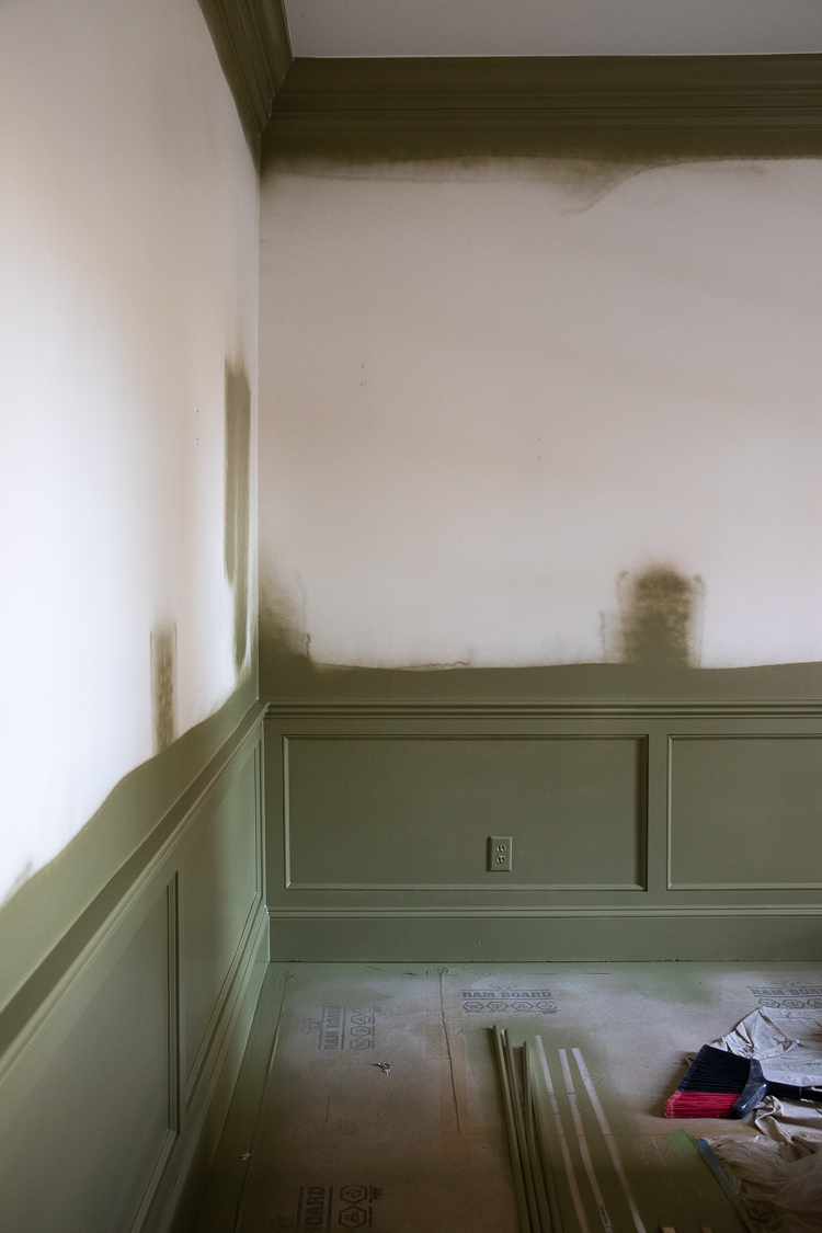
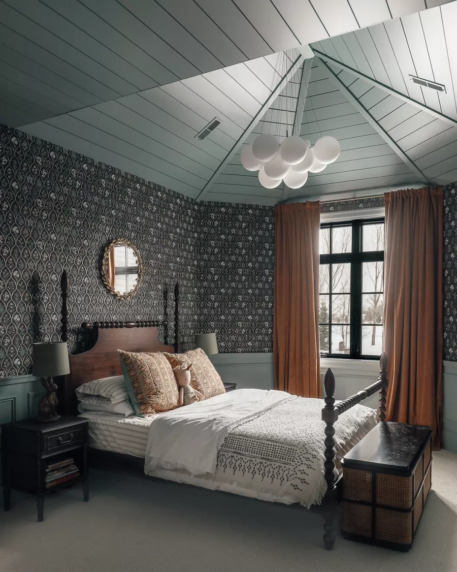
I was all over the map when it came to choosing a color for the wainscoting in the study. When I feel that way, it usually means I haven’t found the perfect color yet — or there are a lot of good options, and I can’t go wrong. In this case, it was both. All of the colors in the paint deck that I kept fanning out would have worked.
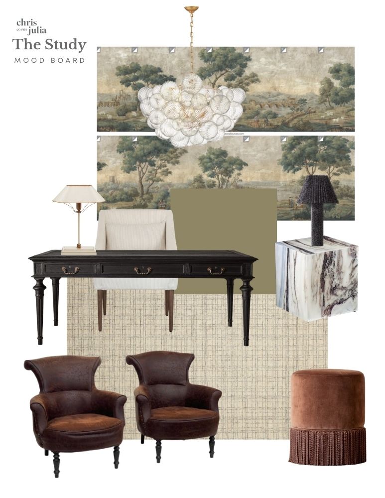
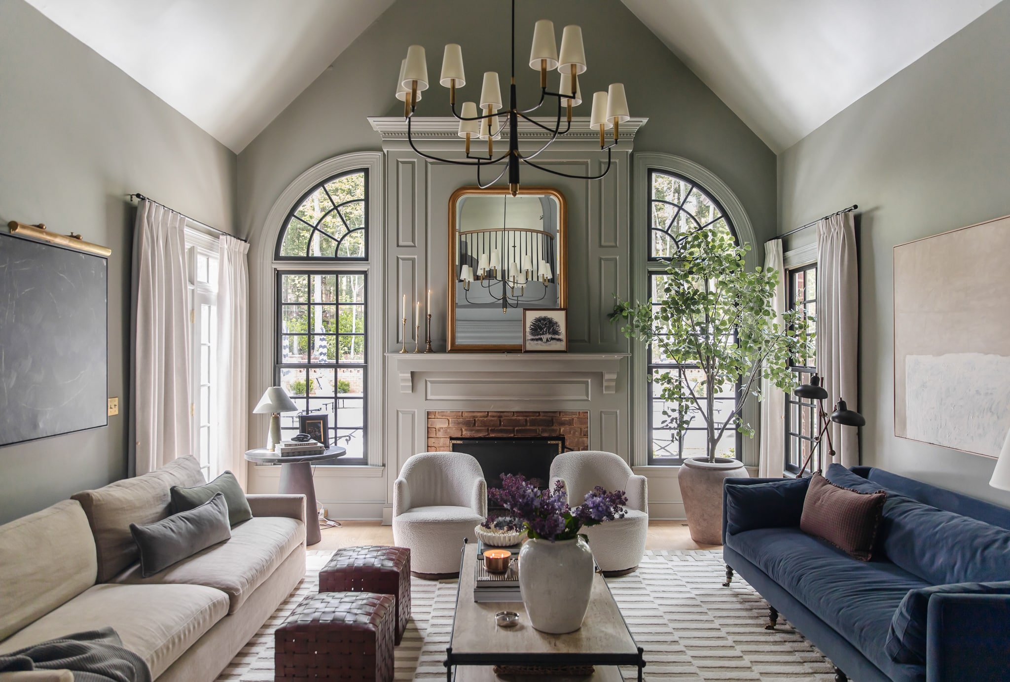
There was a beautiful light blue that was my first instinct — Valspar’s Lark Wing — that felt ethereal and brought out the heavenly skies in the mural. I considered a deep red — Sherwin-Williams’ Rockwood Red — that felt like a loving callback to our old music room. I even thought of doing a really dark black — (Sherwin-Williams’ Tricorn Black) — and contrasting it with a dramatic white desk. Black would essentially “frame” the mural, and that made a lot of artistic sense to me. Though, a lot of the inspiration images that I looked at actually had white wainscoting, and that made me realize that I wanted our wainscoting to be a little softer, with a tone-on-tone design that really allows the mural to be the star.
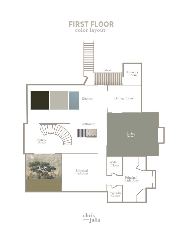
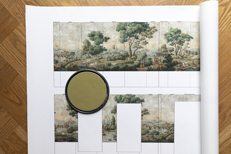
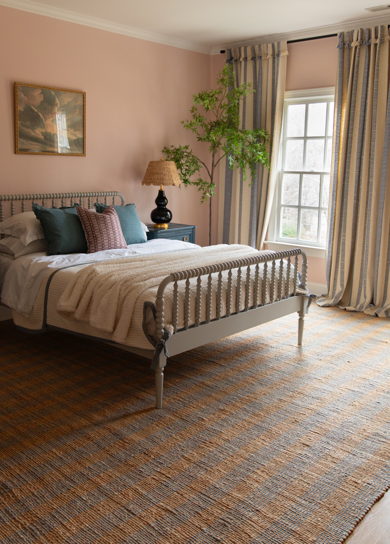
Even though it might be my favorite color, I was shying away from green because we have so many green elements on the main floor, including our living room (Farrow & Ball’s Pigeon — a green-grey with blue undertones) and the kitchen island (Stoffer Cabinetry’s Plymouth Green). I really like to tie in a variety colors throughout our house (in similar tones), but when I pulled this really muddy olive (Sherwin-Williams’ Sheraton Sage) I realized it was different than the other greens. It felt like the marriage of the taupe in our kitchen cabinets (Stoffer Home’s Bromley Taupe) and the green in the island. And suddenly our living room felt like a bridge between the new green that we could use in the study and beautiful blue tones already throughout the house.
(See all the mood board sources here).
We made the first “clue board” when I was trying to decide what to paint the living room, and we just had to update it so I could see! My heart is so happy…
After I unlocked my dream green, I got excited about bringing in some mahogany tones with leather chairs and ottomans, and repeating the merlot tone somewhere else in the house, too. That vision kind of sealed the deal for me.
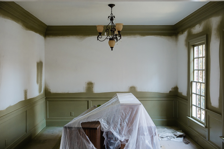
Finally, the new green made the mural stand out more than it even had before — and stand on its own in this room that was starting to really come together in my mind.
I know that choosing a paint color can feel like an overwhelming task at times. But I promise simply DECIDING on a color is the key to getting excited about one.
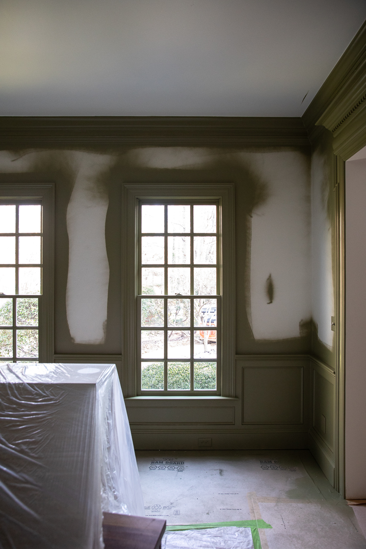
I got a bunch of questions about why we chose to NOT paint the ceiling in here. And honestly, I take it room by room. In this case, I wanted the light fixture, which is very cloud-like, to come from a white surface. Simple as that!
Leave a Reply
What do you think?
Previous Post
Next Post


Semihandmade
Our wood grain Shaker cabinet fronts were designed for busy, high-traffic homes like ours. Clad with durable textured thermofoils, this line is compatible with Sektion, Akurum, Godmorgon, and Besta cabinets from IKEA. It's the perfect, practical way to add the warmth of wood to all the rooms of your home.
Collaborations
learn more

next
Loloi
We have teamed up with Loloi to create a line of rugs that are as affordable as they are beautiful. This collection houses a great mix of traditional and modern rugs, in cottage-y colorways, as well as vintage-inspired beauties that you’ll want to roll out in every room.
Collaborations
learn more

next
STUGA
We partnered with Stuga on a line of hardwood floors — The Ingrid is really livable, and the color is very neutral. It doesn’t lean warm or cool, it’s that just right in-between. We have really loved putting it everywhere in our house. It’s the best jumping-off point for design, no matter your interior style. In addition to being beautiful, Ingrid is really durable — we have three kids, and we always have a home construction project going on. Ingrid stands up to it all.
Collaborations
learn more

next

SHop all
What We're Right Now
What We're Right Now
Looking for our favorite things? A place to shop our home room by room, or just catch up on what Julia's wearing / loving right now? Browse the CLJ shop.
Loving


Portfolio


Design
Befores, afters, mood boards, plans, failures, wins. We’ve done a lot of projects, and they’re all here.
BROWSE BY CATEGORY
let's break this thing up
We have a long-standing relationship with DIY, and love rolling our sleeves up and making it happen.
Projects
Even when you don’t want to rip down a wall, you can make that space in your home better. Right now.
read more
read more
read more
02
01
03
looking for inspiration?
A reader recently asked me if I’m starting to fully embrace traditional style and whether we still consider our house to be a “modern Colonial” and why. It was a really great question and so timely — I had really just been thinking about my approach to this home and how my style has changed […]


SEARCH THE BLOG
We've been doing this since 2009 and we've posted a whopping 24145+ blog posts and counting. You might need a little help searching, huh?
looking for something?
find stuff like:
")
Can We Send You Our Love Letter?
Another way for us to stay in touch! Joining our weekly newsletter gives you access to exclusive content, never-before-seen photos, your questions answered, and our favorite DIYs. Sign up below!
Follow Along on Instagram
Welcome to our online community where we've posted home, DIY, style, renovations, and family since '09. Renovating our #cljmoderncottage in Idaho and headed for new adventures in Raleigh, NC. #cljfam #cljtransformations
@chrislovesjulia


Links
Get Around
Make yourself right at home
Portfolio
Design
Casual Friday
Projects
Lifestyle
Gift Guides
All Posts
Shop
Love where you live.
Social
RivrLinks
Links
Get Around
Make yourself right at home
Portfolio
Design
Casual Friday
Projects
Lifestyle
Gift Guides
All Posts
Shop
Love where you live.
Social
RivrLinks
I love hearing your process! Thank you for sharing! The chandelier is like the sophisticated, French Aunt to the one in Faye’s Princess Room! Oooh La La!! Soooo beautiful!! You really have a gift of listening to your homes and letting them speak without losing yourself.
So where is the final picture?
It’s not here.
You don’t see a photo of the trim painted green??
I’m not seeing any photo of mural and paint either. Maybe bc I’m viewing on my phone?
Mural isn’t posted. Just the paint
You’re basically creating my dream home and following along here and on instagram stories is my favorite part of the day. Thank you for taking us all along on your process a bit more this time around. It is very fun to see the development and your reasonings for decisions. I can’t wait to see the rest of your home come together.
Could you share a BM or SW color that compares to Stoffer Home’s Bromley Taupe?
I’m not able to because it’s a proprietary color to the Stoffer brand
I’m so glad you addressed the ceiling question! I love hearing how design choices are made. Here I was thinking a painted ceiling would highlight that wonderful light fixture, but you were thinking more organically. Both choices are valid, but personal preference wins. I love this room, and looking forward to seeing it come together.
Great choice – and the mural is stunning! I love how the bubble chandelier echoes the shape of the trees but upside down. Wonderful room – maybe your best yet?
Wow! Thank you so much