We’re nearing the end of our Color School series (I know, already??), but I could never forget about the two most feminine colors on the color wheel – purple and pink. Okay, technically, pink is a tint of red, but if you think about it, it’s really the only tint that we identify as its own color! We identify other tints as “light green” or “light orange,” but we never say “light red.” It’s actually kind of odd if you think about it. And if you really want to dive into the trenches of “Is pink even a real color?” you should watch this quick YouTube video. But in the world of interiors, pink is most definitely a real color, which we’re exploring alongside purple.
If you want to learn more about the other colors of the rainbow, check out our other lessons on red, orange, yellow, green, and blue.
Purple

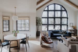
Shop Polly’s Cottage Room

This lesson is a part of our Color School series! Be sure to check out our past lessons if you want to feel more confident in your color-making decisions.


Follow along with this Color School series and receive exclusive bonus content and tips directly to your inbox by signing up for our email newsletter. Psst, it’s free; no strings attached!
What to know about the color purple
If you subscribe to our Love Letter emails, you may have seen my confession that I’m dying to use purple again in this house. Ever since painting Polly’s room in Idaho purple, my heart has been longing for the depth and feminity that purple has to offer. Greta’s pretty excited about doing a phase two in her room someday with the color purple, so until then, I’ll have to live vicariously through these beautiful purple interiors.

As we already know, purple is a mix of blue and red, but it has a personality of its own. In ancient times, purple dyes were rare and expensive, so we naturally associate the color with wealth, power, and royalty. Doesn’t this dark, moody dining room exude regalness? I’m simply obsessed with the use of a dark, dusty purple with the vibrant, magenta dining chairs.
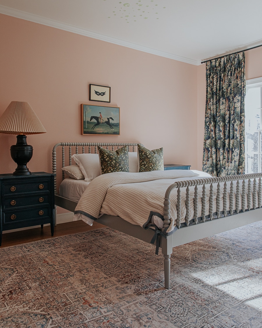
Purple-Pink

This purplish-pinkish mauve sitting room is everything feminine and welcoming.
Purple Furniture

As with any color, a great way to incorporate more purple in your home is through your furniture! Few things are more luxurious looking than a velvet, purple sofa.
Here are some other ways to use purple in your home.
Decorating With Purple
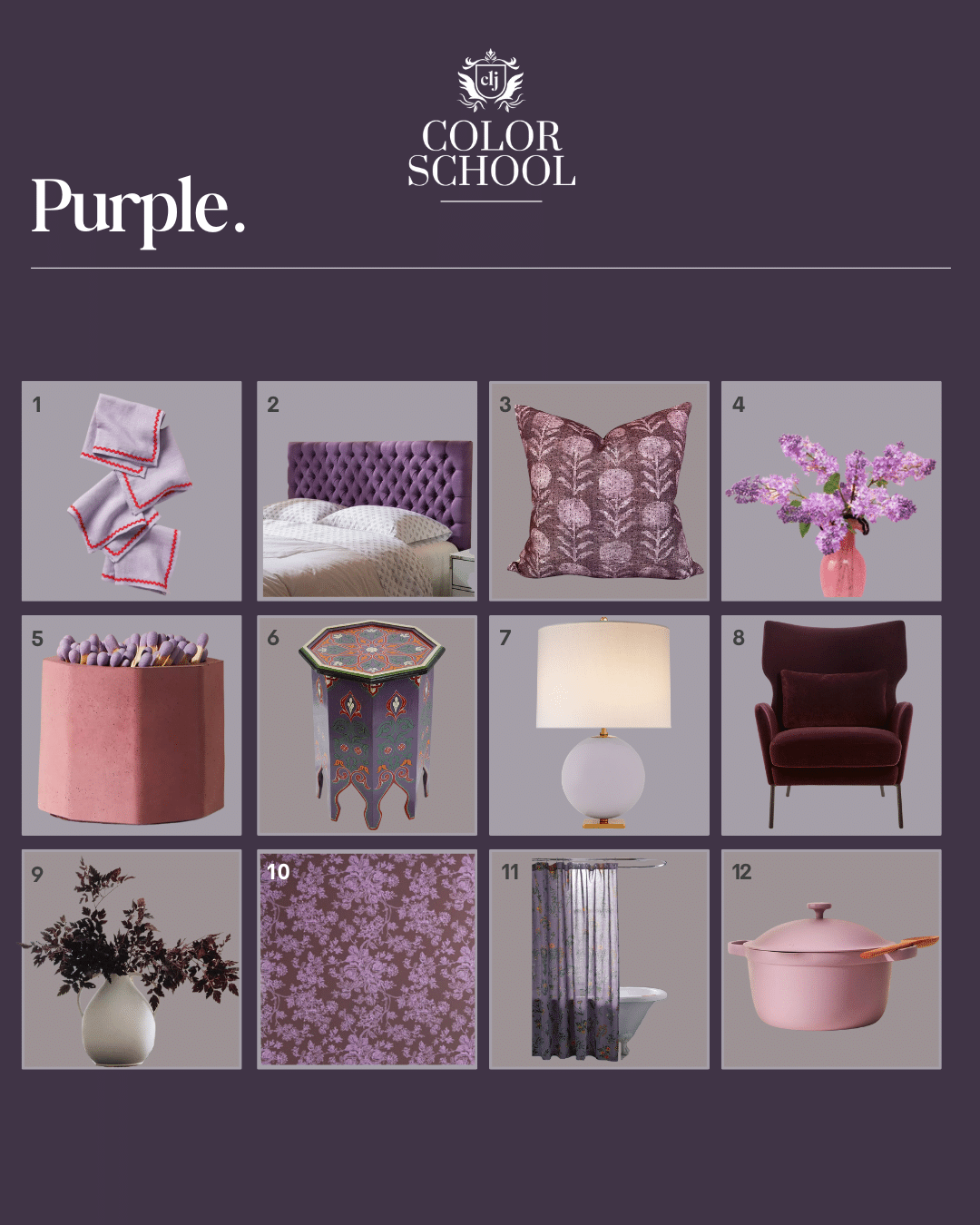
1. Linen Napkins (Set of 4) $65
2. Jezebel Adjustable Tufted Headboard $137
3. Berry Pillow Cover $78
4. Artificial Lilac Flowers (Set of 6) $79
5. Tenn Prairie Striker Match Holder $24
6. Painted Wood Moroccan Side Table $199
7. Elsie Table Lamp $519
8. Velvet Accent Chair $1,399
9. Plum Fake Cimicifuga Ramosa Leaves $28
10. Toile Removable Wallpaper $59 (per panel)
11. Myla Floral Shower Curtain $39
12. Our Place Perfect Pot $165
Now onto pink!
Pink
Shop Greta’s Room
Pink is as feminine as it gets, and I’ll admit, I don’t use a lot of pink (if any) in my everyday decor. Aside from Greta’s room, it’s not a part of our whole-home color palette. I think my fear with using pink throughout the home is that it might seem juvenile or feminine, but never say never! That being said, I think it’s also okay not to be drawn to certain colors. Greta likes pink, which is why we painted her room pink, hung pink curtains in her last room, and painted her bathroom pink a while back, but as she’s growing older, her likes and interests are evolving.
What to know about the color pink

Pink is generally associated with love, romance, and sweetness, and I can’t think of a better way to describe this darling bedroom. This is also a really great example of how you can use pink in a non-aggressive way.

This warm pink dressing room feels tranquil and welcoming and is home to Bryan Graybill, who embraces pink with open arms. Rosy!
A Pop of Pink

Few things are more brave, courageous, playful, and exhilarating than this tickle-me-pink painted staircase! Why not?
Help yourself to some pink things, and please tell me if you too, have a slight aversion to using pink in your home!
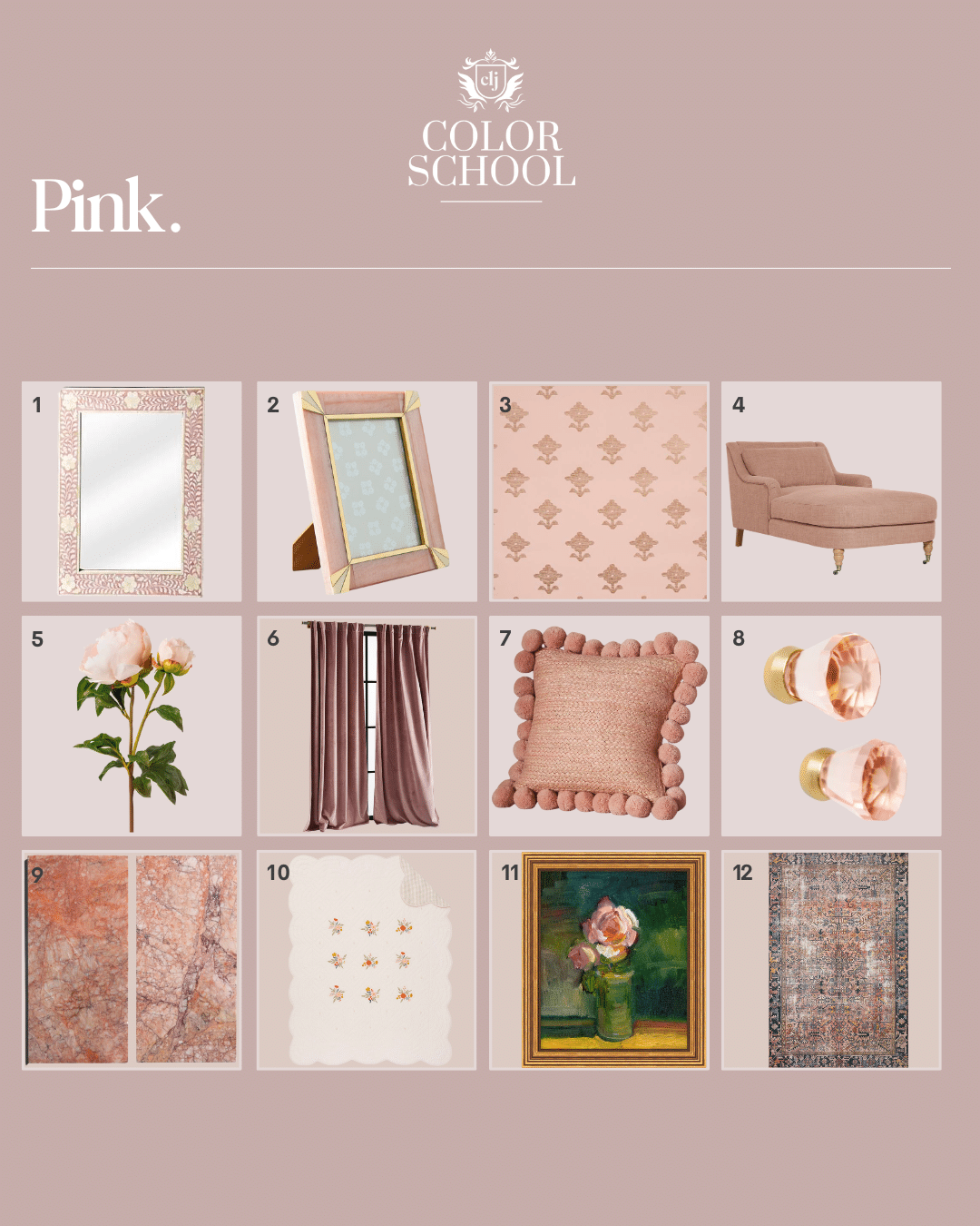
1. Butler Vivienne Pink Bone Wall Mirror $599
2. Zelda Frame $34
3. Schumacher Rubia Blush Wallpaper $35 (per yard)
4. Rivington Chaise $3,898
5. Real Touch Blush Peony $28
6. Velvet Louise Curtain $78
7. Pommed Jute Pillow $78
8. Phoebe Knobs (Set of 2) $20
9. Rojo Breccia Marble Tile $245 (per box)
10. CLJ x Pottery Barn Kids Reversible Floral Embroidered Quilt $269
11. Blush Bloom $300
12. CLJ x Loloi Jules Terracotta/Beige $146
Color school was a hit and has me rethinking every room in my house ! Would love to hear some of your favorite paints in each color scheme. Would help out tremendously ❤️
But what are the paint colors??! Am I just not seeing it?
I love a dusty, muted pink as almost a neutral. Our new kitchen has green cabinets and a western exposure, with mature trees outside, and I feel like the pink walls neutralize the green reflections a bit. When the sun comes in it feels so warm and glowy! We used Tissue Pink by Benjamin Moore.
I’ve seen you post about painting the trim and walls same color in a different sheen, which I’ve read is fairly common to do. However, we did this recently in our primary makeover (professional molding and painting) and I was really disappointed how much lighter the same color on my walls looked in semi gloss. Is it normal to see significant (noticeable) variation in the same color in different sheens? We took pictures back to Benjamin Moore and they said yes, but I really can’t tell from your pictures. Wondering if you have any insight. Thanks so much! Love your posts.
Yes! Lighting reflects more on glossier sheens, so it can make highlights look lighter and shadows look darker.
We had a pink chair in our living room for 25 years. It went wonderfully with our muted teal sofa and the warm woods of our musical instruments. I also use it for our piano bench cushion. Pink makes things feel a little bit fancy and I like that, but I’m one for small doses only.