Design

Our Painted Living Room With Pigeon by Farrow & Ball

September 27, 2021

We believe we should all love where we live.

We’re a couple of homebodies, working to uncover the home our home wants to be. And we’re so happy to have you here. 

Portfolio

Projects

Design

We're Chris + Julia

read more

What we're                   right now

Loving

browse the shop

Befores, afters, mood boards, plans, failures, wins. We’ve done a lot of projects, and they’re all here. 

We have a long-standing relationship with DIY, and love rolling our sleeves up and making it happen. 

Even when you don’t want to rip down a wall, you can make that space in your home better. Right now.

browse all

browse all

browse all

02

01

03

Popular Posts

1.

2.

3.

Top Categories

You saw it in Casual Friday first. We painted the living room–like all of it. I chose a trusted color, one I’ve used before and recommended to many–Pigeon by Farrow & Ball. We first used Pigeon in our home office, 5 years ago and decided it was time for it to make a comeback. I think I’ve been wanting to bring it back for a while now and I can’t think of a better place for it than our entire living room.

Before

After

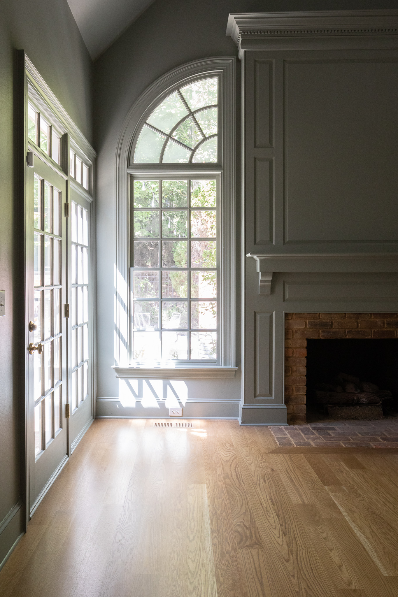
And a little reminder of what this room looked like before we even installed new flooring.

The before before

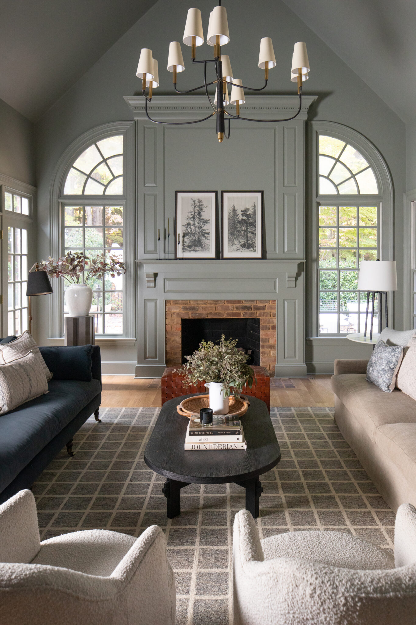
The living room today

This is a mood-ring of a paint color and I couldn’t love it more.

Just recently we shared the living room “today,” and I mentioned that a lot of our furniture wasn’t translating well and that the layout needed some adjusting. Of course when you paint a new room, you’ve got to rearrange the furniture. We didn’t buy a single new thing and it feels so much better. I do PROMISE this room will continue to evolve in furnishings and decor (hi, we gotta fill some blank walls!) and lighting around the room–for a shop your house session, it’s feeling pretty darn good.
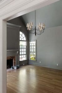
Recently

Today

What do you think–are you team lights off or lights on? The furniture shots were in early evening. We really tried to show how the room truly looks in person, and obviously the different lighting changes what you see.

Making a decision

To be honest, selecting a paint color for the living room has given me some major headaches. I’ve had decision paralysis over it for weeks, and I couldn’t for the life of me muster up confidence in any colors. I channeled my own tips in choosing a paint color and palette that flows from room to room that I shared here and that was a good place to start. I wanted a color that would compliment and support the neighboring rooms like the green island in the kitchen, the blue in the pantry, and the wallpaper in the powder bath.

Spending my day walking in and out of the living room, holding up the paint deck in different light, wasn’t getting me anywhere however. You know what they say about the definition of insanity right? Something about doing the same thing over and over again and expecting different results. I was in a loop and I needed to switch things up. So we decided to “try-on” a few paint colors with the magic of technology.

Magic right? Although these aren’t any actual paint colors, it was SO helpful to see some options of what this room could be.

When it came down to it, I’ve been wanting to use a mid-tone paint color ever since I shared all my thoughts on the newer trend in this post here. To sum it up, we’re seeing less and less of high contrast paint colors (dark tones and light tones) and I couldn’t wait to do it in my own home.

Is it blue? Green? Gray?–It’s pigeon.

The blue-green-gray color stood out to me and actually reminded me of Pigeon. A chameleon color that I’ve loved before, and once I said it, I knew it had to be. At different times of day this room could look completely different and I’m leaning into that. Truly a living, breathing color.


We actually color matched with Sherwin Williams Emerald Designer Edition. Here’s the color match code for reference.

For the walls we used the Emerald Designer Edition in Eggshell, and for the fireplace and all of the trim and baseboards we used Emerald Urethane Trim Enamel in semi-gloss.

I have to say, Pigeon is going to look different in everyone’s house. Our living room is probably one of the darkest rooms in our house, therefore the paint color is going to look darker. I like that this room can feel moody, while still being a mid-tone. My sister compared it to a mood-ring and I think that analogy fits perfectly.

Oh and also, hello new light. See here to read about the bent-up condition this light was in before we hung it.

Sources:

Paint Color: Pigeon by Farrow & Ball

Chandelier, Rug, Sofa, Navy Pillow, Throw Blanket, Leather Chairs, Coffee Table, Wicker Tray, Tapered Candlesticks, Candle Holders, End Table, Tapered Lamp ShadeMidnight Art, Black Shade Floor Lamp, Pleated Floor Lamp, Bench, Wool Blanket, Pedestal Table, Large Vase, Faux StemsBritish Designers Coffee Table Book


Leave a Reply

Your email address will not be published. Required fields are marked *

This site uses Akismet to reduce spam. Learn how your comment data is processed.

What do you think?

  1. Onslow says:

    This reminds me of Disney’s “no see’um green” for utility and other structures they’d rather you not notice. I thinks the SW equivalent is “Relish.”

  2. Jannatul says:

    Nice color

  3. Caroline says:

    I really love the result. What is the app that you used to change the wall colors? It is really helpful.

  4. MaryAnn says:

    Absolutely stunning. This room is so inviting! It’s like a warm hug!
    What color are the floors?

  5. Harriet says:

    Well done! The room feels modern and cozy.

  6. Leslie Walker says:

    I think I would float the sofa and pull the conversation area close together to create a more intimate setting. Then maybe a few larger wood pieces on the perimeter.

  7. Becky says:

    Hey! We just color matched Farrow and Ball’s green smoke– we took the sample chip in to color match at SW (after first having home depot look it up in their system)– totally different colors between what Home Depot said the match was and how Sherwin Williams matched based on the chip. We LOVE LOVE the changing color of green smoke, too.

  8. DD says:

    I love that there’s nothing on the mantel or the fireplace wall behind it. I know it can’t last, but it’s quite a breath of fresh air. Cheers.

  9. Joanne says:

    Absolutely beautiful!! Love the color. Just got finished painting my house, I may have to redo a few rooms. Seriously.

  10. Lauren says:

    Hey I’m curious why you usually use eggshell vs satin on walls?

  11. EK says:

    For anyone else who is considering, I have colored matched Farrow and Ball and unfortunately it’s never quite right/the same as the real deal. But since some color matching fails, I have ordered a ton of F&B paint online and every single time it’s arrived in CA within 48 hours of purchase. Highly recommend!

    • Onslow says:

      The heavy solids of FB is what allows it to “play with the light” the way it does. At over $100/gal it’s not for the faint of wallet. We have a retailer (er, “stockist”) nearby who can have whatever we want sent in without too much wait.

    • Niamh Courtney says:

      Agreed 100% if you want a Farrow & Ball colour buy F&B. If you are going to use SW or BM etc pick one of their colours, they have thousands.

  12. Cary says:

    Really beautiful that everything is painted the same color. Would you please share how your painters applied 2 different paint finishes? I think you showed them spraying the room, I assume the trim wasn’t masked off? Did they then brush the trim after the walls were finished? Thank you

  13. Lynn W says:

    That color is amazing!! What a truly beautiful room 👍

  14. Noelle says:

    I love this so much and love that you painted walls/ceiling/trim to match. I have wanted to try this, but we have vinyl windows that can’t be painted… would it look weird to paint the trim and leave windows and grids white?

  15. Tiffany says:

    Everything looks so beautiful, Julia. The paint color, the styling, the whole space is just *kiss*! I had my eye on that Arhaus couch for awhile, but haven’t pulled the trigger yet. Is this the Belgian linen slipcover version of that couch? It looks so soft and comfy!

  16. Tia says:

    What colour are the ceilings? In some pics, it appears to be the same colour while in others it looks white. Love the change by the way!

  17. Elise says:

    Love this! So new but still traditional. Any reason why you didn’t use the actual Farrow and Ball paint?

  18. Lindsey says:

    Looks so good! What was the name of the olive color you tried on virtually before selecting pigeon?

  19. Angela says:

    I really love how the paint makes the fireplace look amazing now. Before when it was white, the fireplace didn’t really stand out. Now with the new color, I think it makes the brick and the paneling look really amazing.

  20. Lisa Jones says:

    Have you done a post on floor lamps? Seeing the beautiful options in your living room is inspiring to re-start my search for some upgraded options.

  21. JL says:

    It’s like the chandelier was made for THIS space. The shape of the frame and the shades really complement the shape of the ceiling. Would love to see the view from the Juliet balcony…perhaps in your Instagram stories. Also, if you’re willing, would love for you to do your customary Fall/Spring video house tour, once the entry is done. We haven’t had a good look around since before the floors went in. We know the kitchen and bonus room are in progress, there are still boxes to unpack, etc., but it’s nice to see the house as it evolves!

  22. Allison says:

    So cozy! I’m dying to see how the rest of the house comes together with new paint!

  23. Kerry says:

    Beautiful!! And thank you for sharing the paint color code. I got a sample of SW’s Pigeon match (based on what they had in their system for Pigeon) and it just didn’t feel right. Turns out it is different than your formula, so I’ll have to give it another shot!

    • Alex at SW says:

      Hi Kerry! The paint color code is going to be different for each line of paint. For example, in duration vs emerald vs cashmere, all the color codes will be different to correspond to the differences in the base. Sometimes the color codes are even different between a quart and gallon of the same line. Hope that helps!

  24. Mary Lynne Crosby says:

    Do you have a link to rug? I may have missed it. Beautiful

  25. Karen says:

    Any recommendations on what to do with outlets and switch plates when using midtones? When to go dark, when to go light? Would you ever paint them to match?

  26. Keena says:

    For color matching to another brand do you need to bring in a sample card from F&B or does SW have those color match codes on hand? Thanks!

  27. Trudy says:

    Beautiful! I lovc Pigeon and I love it in this room. In my small bathroom in daylight (skylight in there), it reads more blue than these pictures…mood ring is an awesome analogy! At night it’s more gray-green. There’s a F+B supplier in Greensboro that I have used, and I’ve also had it matched by SW and BM…I think the real thing is slightly better. I want to get a Raleigh area F+B thing going! I’m going to ask the Greensboro lady about expanding Eastward with her. Thoroughly enjoying watching your house evolve! Love this new chandelier, too – perfectly modern colonial with the narrow wrought iron arms!

    • Courtney M says:

      Trudy, are you able to share a photo of your bathroom? I’m now thinking of doing my bath (also with a skylight) in this color, but not sure if I should pull the trigger.

  28. Emily says:

    Wow. WOW. Your vision for this room is outstanding. I really didn’t like the Juliet balcony but the color and modern railing just made it so chic. And the color brought out the detail in the fireplace and trim. So smart. Love the color. It’s amazing how it’s soft but traditional, historical but clean. It’s perfect! Y’all did GOOD.

  29. Becca says:

    Hi! I’ve noticed you color match at SW to Farrow and Ball a good bit, but I thought I’ve remembered you also taking a color down to 75 or 50% before. Is that something someone could do when color matching as well? I’m looking at some F&B colors but thinking I’d prefer then a smidge lighter. Would love any advice you have!

  30. Pam Redden says:

    So cozy, I love it!!

  31. B says:

    Looks great. The black painting on the mantle was soooo good. Will it go back?

  32. Donna says:

    Ugh, you make me miss NC sooo much! This color is just perfection with your furniture! What a way to update traditional! Love, love, love it!

  33. Betsy says:

    Perfect! I am a fan of darker paint and I love what you have done. Anxiously following the rest.

  34. Ashton says:

    This is the coziest room. Love the way that paint color makes the brick pop on the fireplace!
    Is it just me or are the railings on the Juliette balcony BEGGING to be a dark charcoal grey to match the light fixture?

  35. Susan says:

    What I’m struggling with when it comes to midtone paint is how it can make rooms look gloomy. Like a wet rainy day. It feels more cohesive to me to see less contrast, but it also affects my mood. We have 9 months of winter so I don’t know how to make this look work.

    • Claire says:

      I know what you mean. I love moody rooms, but I’ve found that I prefer it in certain spaces more than in others. I like light and bright bedrooms and keep moodiness to spaces like mudrooms, bathrooms, we have a “study”-type space that will be more of a mid-tone as well. For other spaces I think it depends, my living room gets a ton of light and I think I’d like to paint it a mid-tone as well to up the coziness factor since I know it will not look dark during the daylight hours. If you look up Alisa Bovino’s blog, A Glass of Bovino, she updated her bedroom a few months ago in a way that might provide some great inspo for you!

    • Kelly says:

      I get that. When I lived in Seattle, I painted a room a mid-toned gray and immediately painted over it with white because there’s already too much gray in Seattle, weather-wise. I didn’t need to bring it inside too. Now that I’m in a sunny climate, I’m drawn to moody interior colors again. I think the local climate has a huge impact on the interior colors that people choose. Look at Scandinavian countries and their propensity for white walls to bring some light to the dark months.

    • Autumn says:

      Midtones are awesome, but they don’t don’t work in every space, for every family. Design is a very personal thing! Some times things don’t work for you and that’s okay! If you want to try out a new design trend like midtone paint, but are afraid it will be too dark in your space, I would go with something on the lighter end. So when you’re looking at paint samples, instead of choosing the paint color toward the middle or bottom of the card, go up one or two colors. If you don’t like any of those however, or if you’re looking at sample cards of that don’t have multiple shades on it, you can have a color you like, lightened at your paint store. The best way to figure out if you will like a color in your space, is to put it in your space! Maybe try painting a few squares on different walls so you can see how the light affects the color. Or if that’s too much commitment, try painting a piece of cardboard you can move around the room. There are also some companies who have peel and stick samples you can order! Hope some of this helps. Good luck!

  36. Kelly says:

    Gorgeous! I love the moodiness it brings to the space – so cozy!

  37. Carrie says:

    This looks great! Thank you so much for including the color matching info, I’m sure I won’t be the only one saving that for later!

  38. Becky says:

    Just beautiful! Have you picked out the wallpaper for the dining room? You had stated you were going to coordinate the two rooms. Your home is gorgeous.

  39. Heather says:

    It looks beautiful! Can you tell me what kind of paint you use for your walls (we’re painting our bedroom walls and I’ve searched everywhere on here to see what you recommend…matte, gloss,semi-gloss)

  40. Bobbi says:

    Ohh it’s looking A-mazing! What about hanging a mirror above the Fire place, it would be the perfect spot for one ♡

all the latest

We believe we should all love where we live.

We’re a couple of homebodies, working to uncover the home our home wants to be. And we’re so happy to have you here. 

HI! We're Chris + Julia

read more

Load More

Reader Faves

SHop all

What We're                     Right Now

What We're                 Right Now

Looking for our favorite things? A place to shop our home room by room, or just catch up on what Julia's wearing / loving right now? Browse the CLJ shop. 

Loving

looking for inspiration? 

A reader recently asked me if I’m starting to fully embrace traditional style and whether we still consider our house to be a “modern Colonial” and why. It was a really great question and so timely — I had really just been thinking about my approach to this home and how my style has changed […]

Can We Send You Our Love Letter?

Another way for us to stay in touch! Joining our weekly newsletter gives you access to exclusive content, never-before-seen photos, your questions answered, and our favorite DIYs. Sign up below!

Follow Along on Instagram

Welcome to our online community where we've posted home, DIY, style, renovations, and family since '09. Renovating our #cljmoderncottage in Idaho and headed for new adventures in Raleigh, NC. #cljfam #cljtransformations

@chrislovesjulia