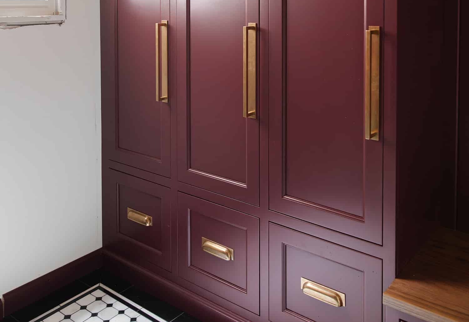
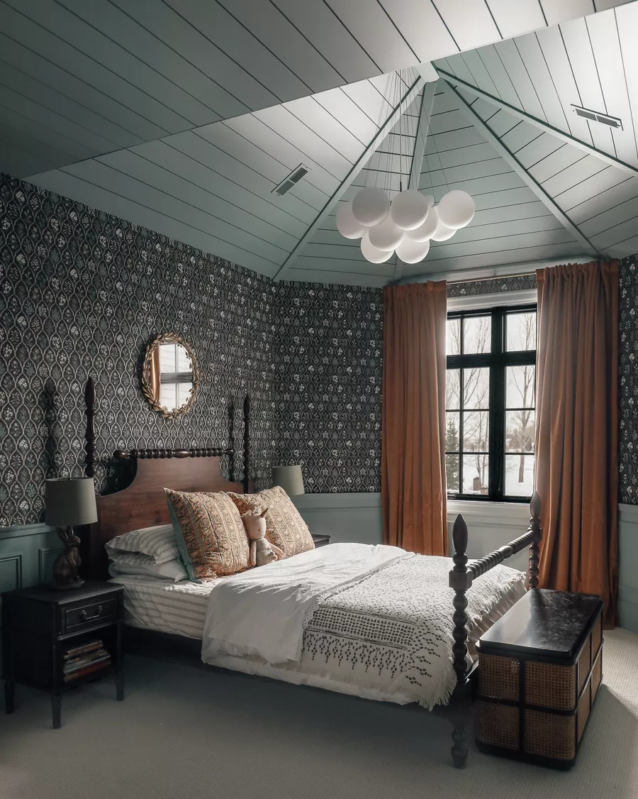
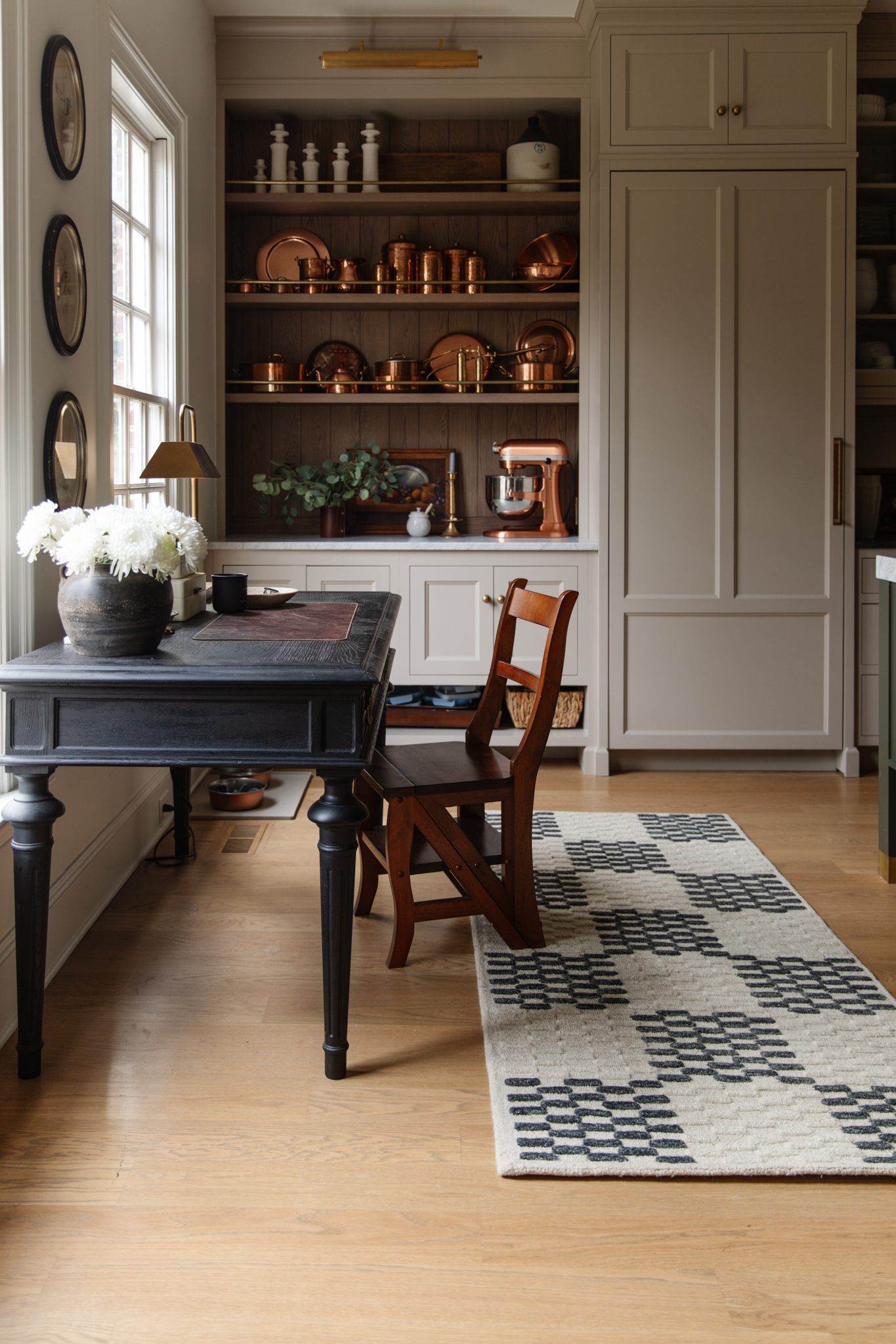
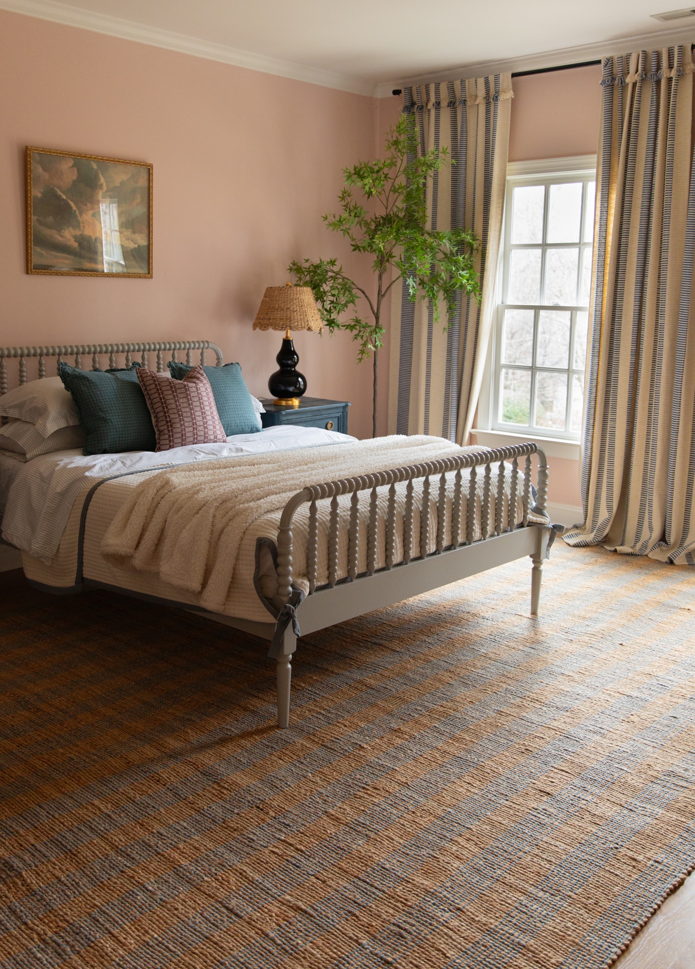
For years now, we’ve been seeing a lot of high contrast tones in homes. Walls have been painted in either light and airy tones, or really dark and moody, and not much in-between. This trend has gone really hard and I’ve definitely happily been a part of that.
In fact, I even remember painting the reading room in our last house a green color and not even a year later, we ended up painting it an even darker green. Darker! Moodier! And elsewhere–white paint ruled main spaces. With “most popular white paint colors” being the top of Google searches for the last several years.
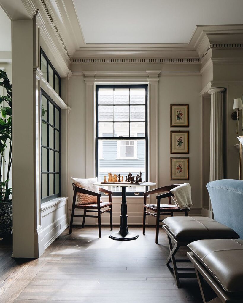
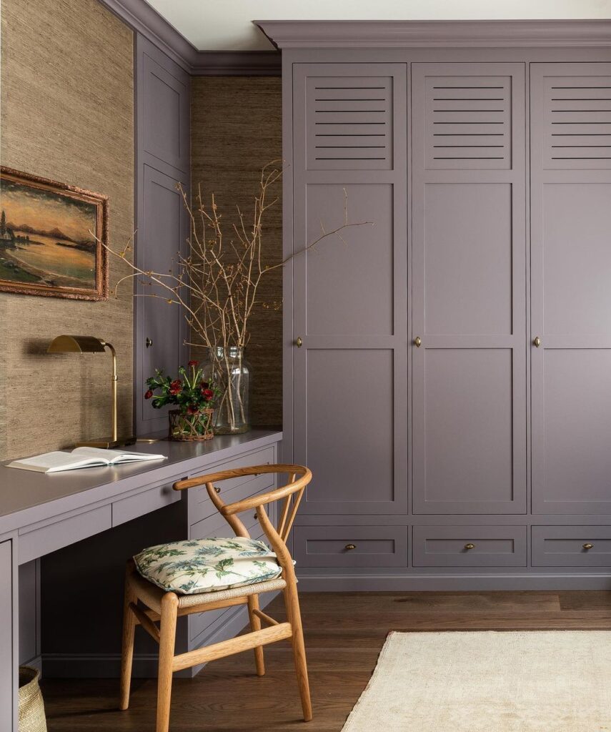
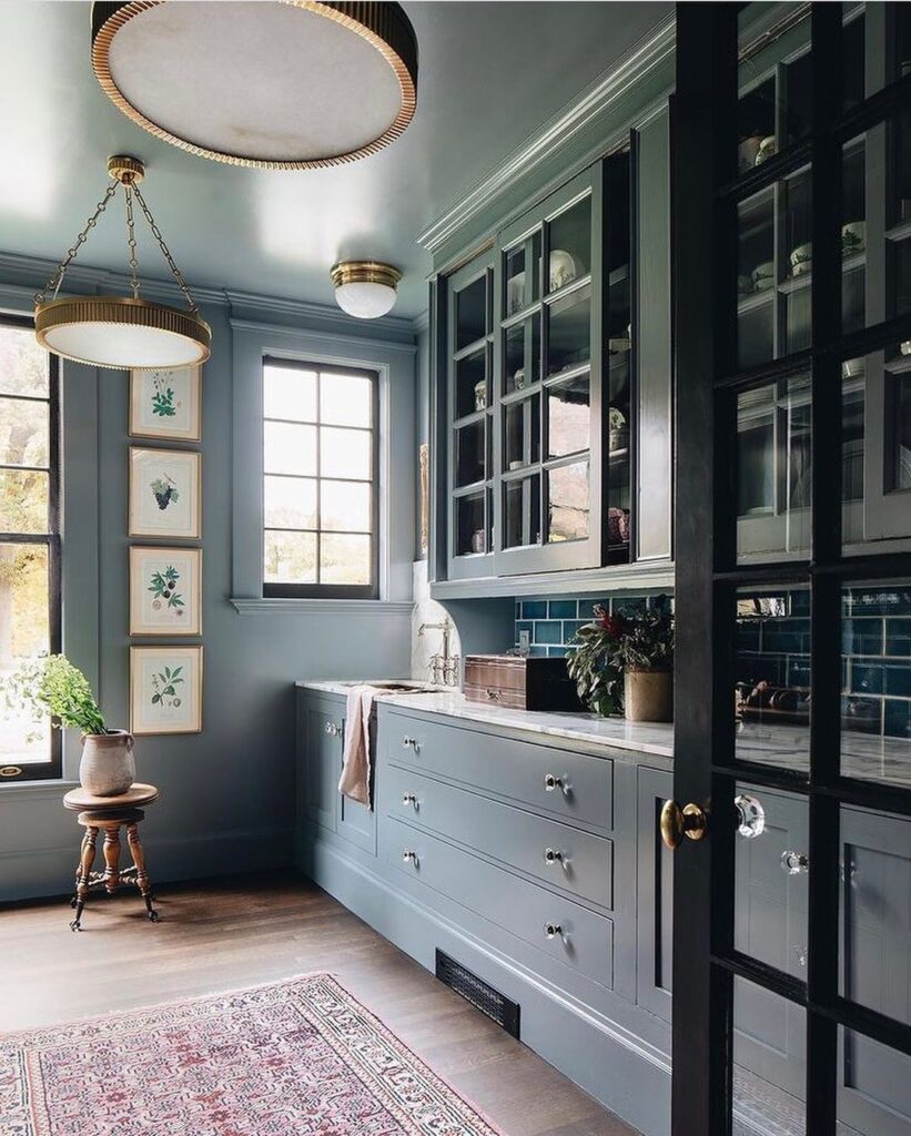
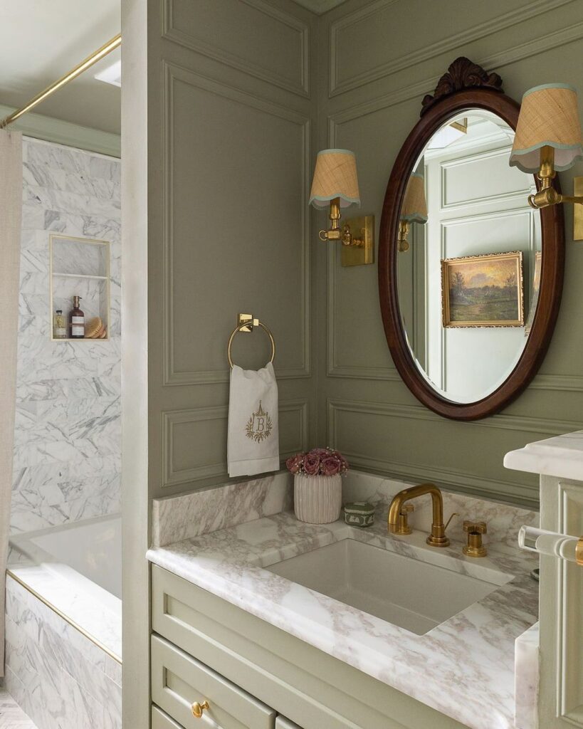
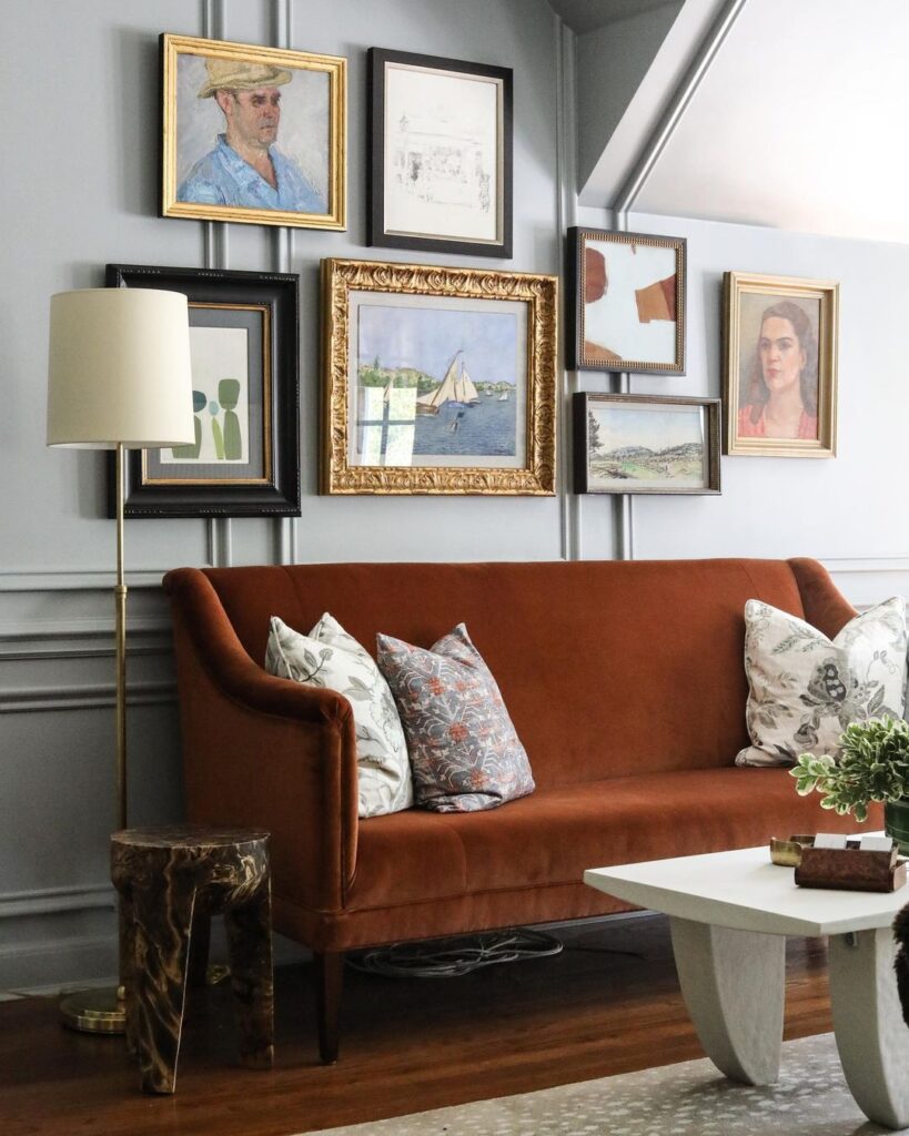
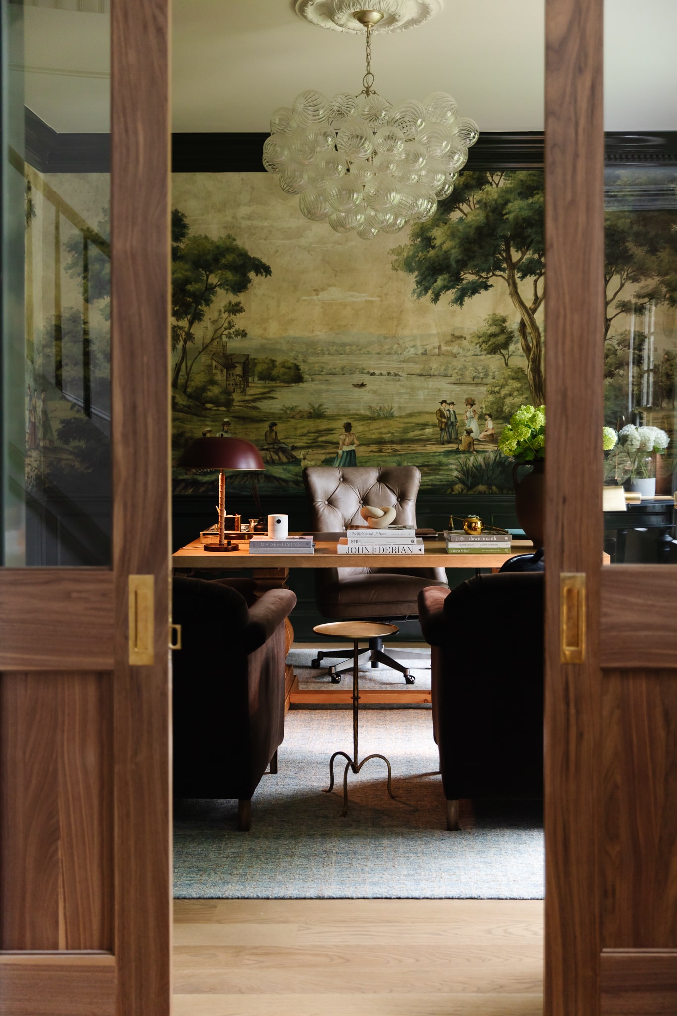
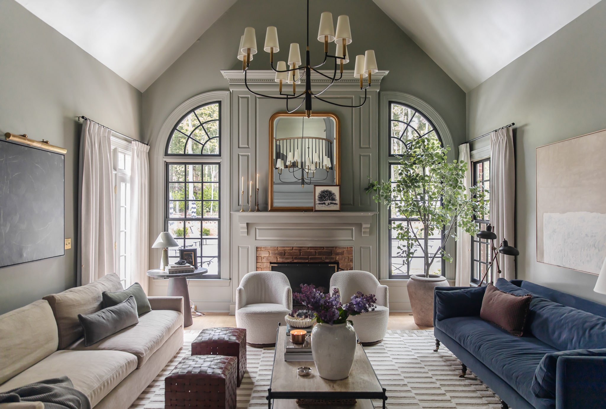
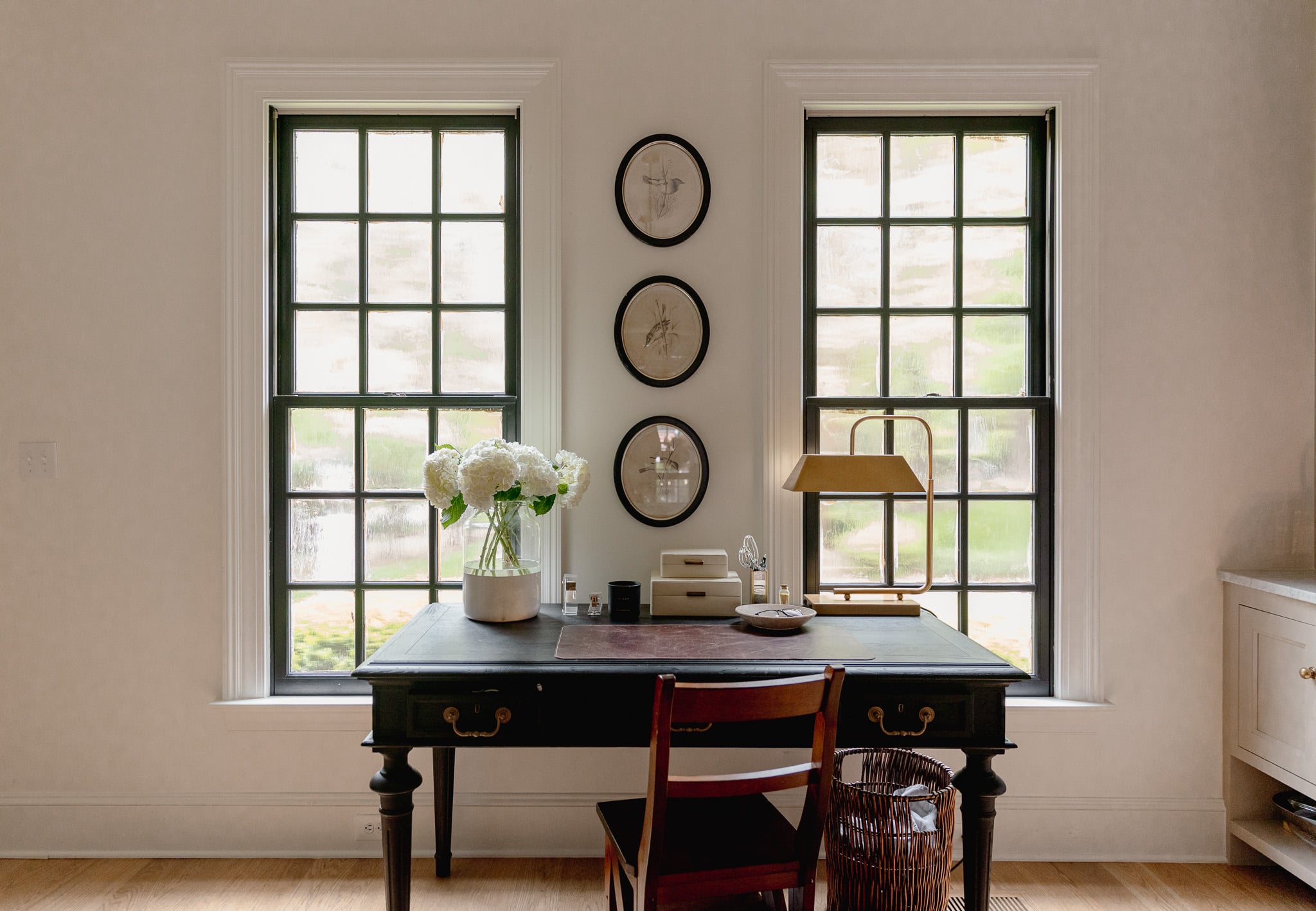
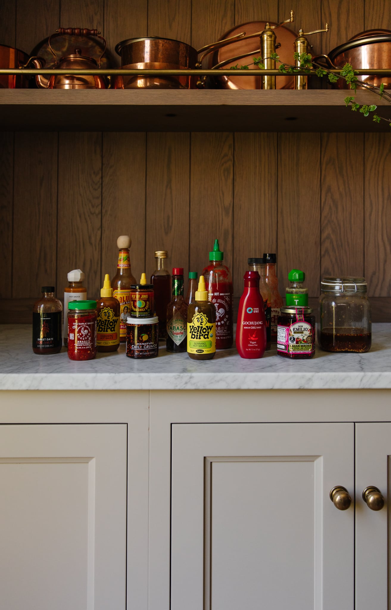
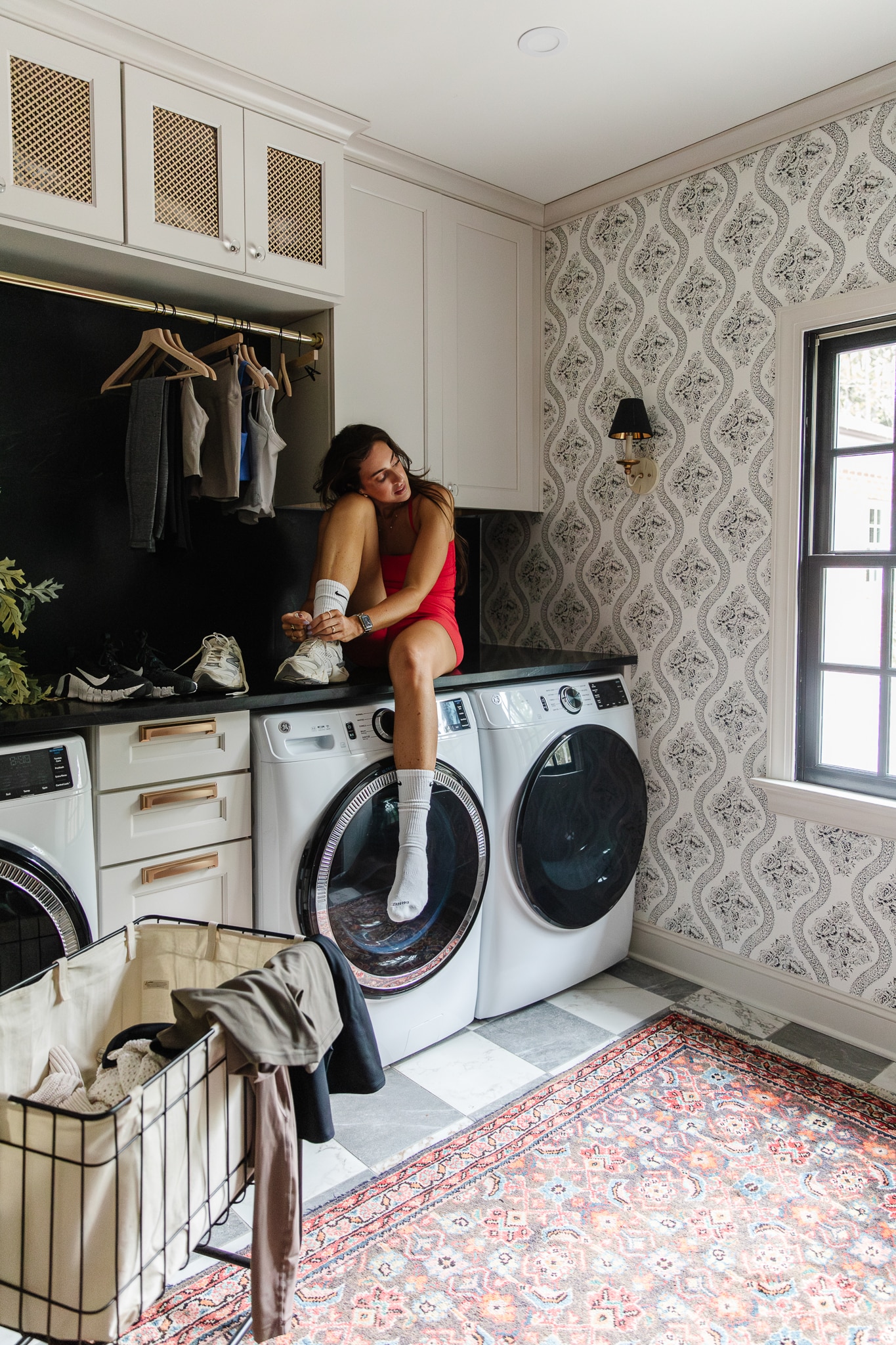
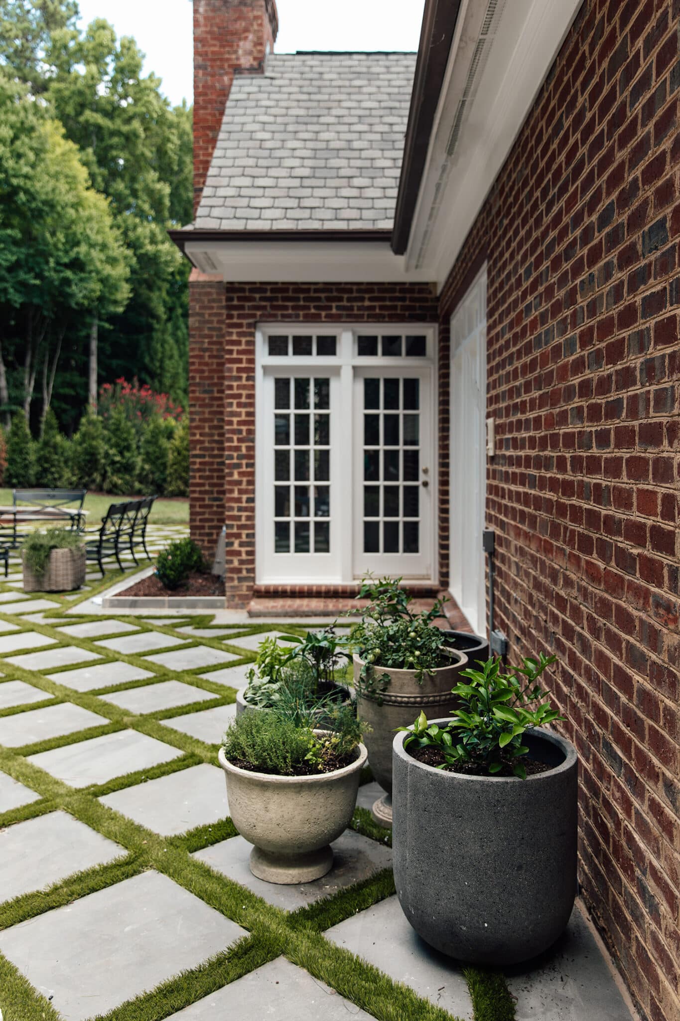
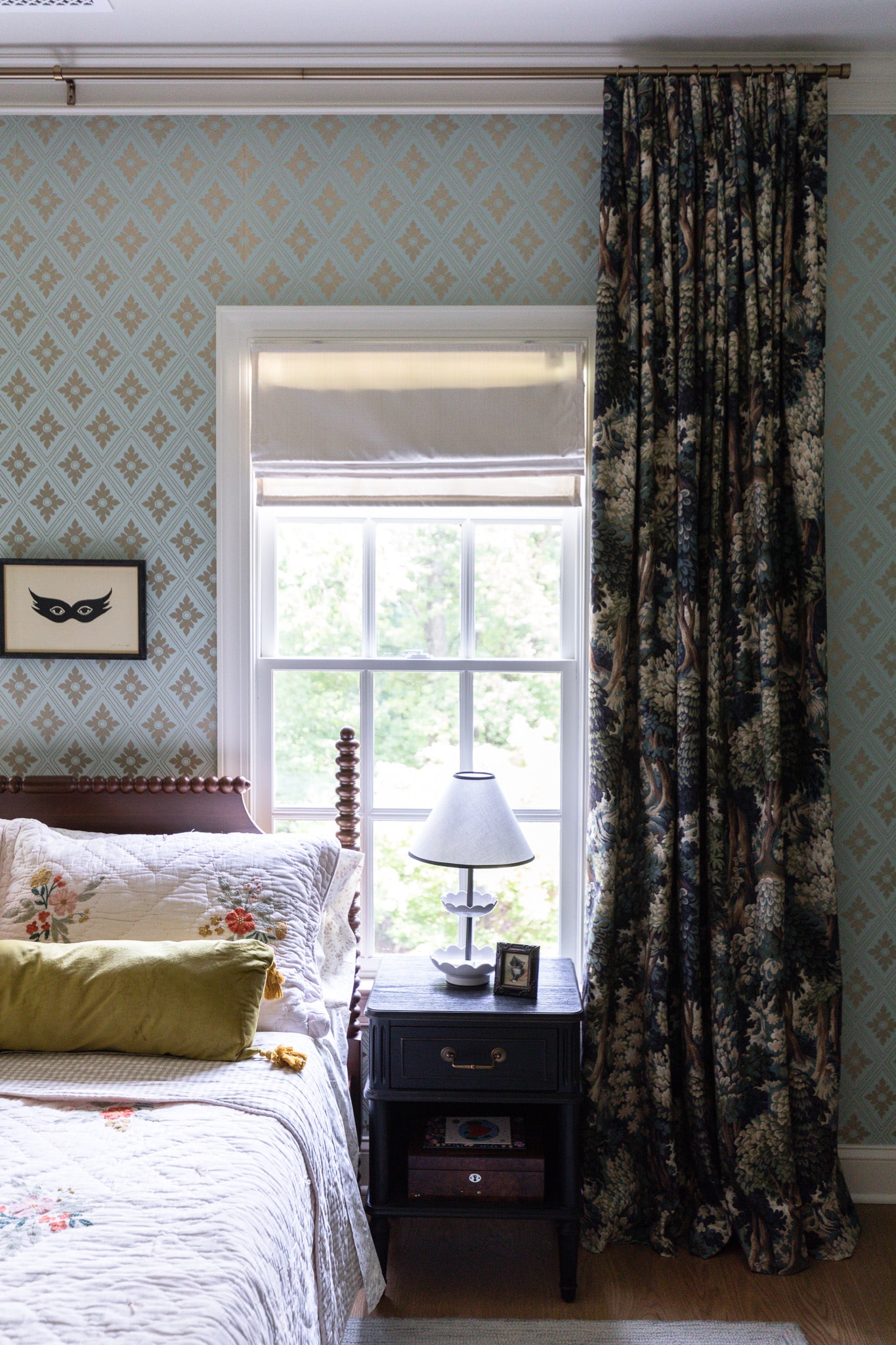
Now, I’m noticing colors landing on more of a middle ground again, and maybe you’ve noticed too? I’m really excited about the in betweens.
I love the way that these mid-tones are a little softer on the eyes–gentle and, in a way, mesmerizing to me. So feast your eyes on these lower contrast rooms, and tell me your thoughts. Are you in favor of this trend, or are you already missing the high contrast tones?
via Jessica Helgerson Interior Design
Leave a Reply
What do you think?
Semihandmade
Our wood grain Shaker cabinet fronts were designed for busy, high-traffic homes like ours. Clad with durable textured thermofoils, this line is compatible with Sektion, Akurum, Godmorgon, and Besta cabinets from IKEA. It's the perfect, practical way to add the warmth of wood to all the rooms of your home.
Collaborations
learn more
next
Loloi
We have teamed up with Loloi to create a line of rugs that are as affordable as they are beautiful. This collection houses a great mix of traditional and modern rugs, in cottage-y colorways, as well as vintage-inspired beauties that you’ll want to roll out in every room.
Collaborations
learn more
next
STUGA
We partnered with Stuga on a line of hardwood floors — The Ingrid is really livable, and the color is very neutral. It doesn’t lean warm or cool, it’s that just right in-between. We have really loved putting it everywhere in our house. It’s the best jumping-off point for design, no matter your interior style. In addition to being beautiful, Ingrid is really durable — we have three kids, and we always have a home construction project going on. Ingrid stands up to it all.
Collaborations
learn more
next
SHop all
What We're Right Now
What We're Right Now
Looking for our favorite things? A place to shop our home room by room, or just catch up on what Julia's wearing / loving right now? Browse the CLJ shop.
Loving
Portfolio
Design
Befores, afters, mood boards, plans, failures, wins. We’ve done a lot of projects, and they’re all here.
BROWSE BY CATEGORY
let's break this thing up
We have a long-standing relationship with DIY, and love rolling our sleeves up and making it happen.
Projects
Even when you don’t want to rip down a wall, you can make that space in your home better. Right now.
read more
read more
read more
02
01
03
looking for inspiration?
A reader recently asked me if I’m starting to fully embrace traditional style and whether we still consider our house to be a “modern Colonial” and why. It was a really great question and so timely — I had really just been thinking about my approach to this home and how my style has changed […]
SEARCH THE BLOG
We've been doing this since 2009 and we've posted a whopping 24145+ blog posts and counting. You might need a little help searching, huh?
looking for something?
find stuff like:
Can We Send You Our Love Letter?
Another way for us to stay in touch! Joining our weekly newsletter gives you access to exclusive content, never-before-seen photos, your questions answered, and our favorite DIYs. Sign up below!
Follow Along on Instagram
Welcome to our online community where we've posted home, DIY, style, renovations, and family since '09. Renovating our #cljmoderncottage in Idaho and headed for new adventures in Raleigh, NC. #cljfam #cljtransformations
@chrislovesjulia
Links
Get Around
Make yourself right at home
Portfolio
Design
Casual Friday
Projects
Lifestyle
Gift Guides
All Posts
Shop
Love where you live.
Social
RivrLinks
Links
Get Around
Make yourself right at home
Portfolio
Design
Casual Friday
Projects
Lifestyle
Gift Guides
All Posts
Shop
Love where you live.
Social
RivrLinks

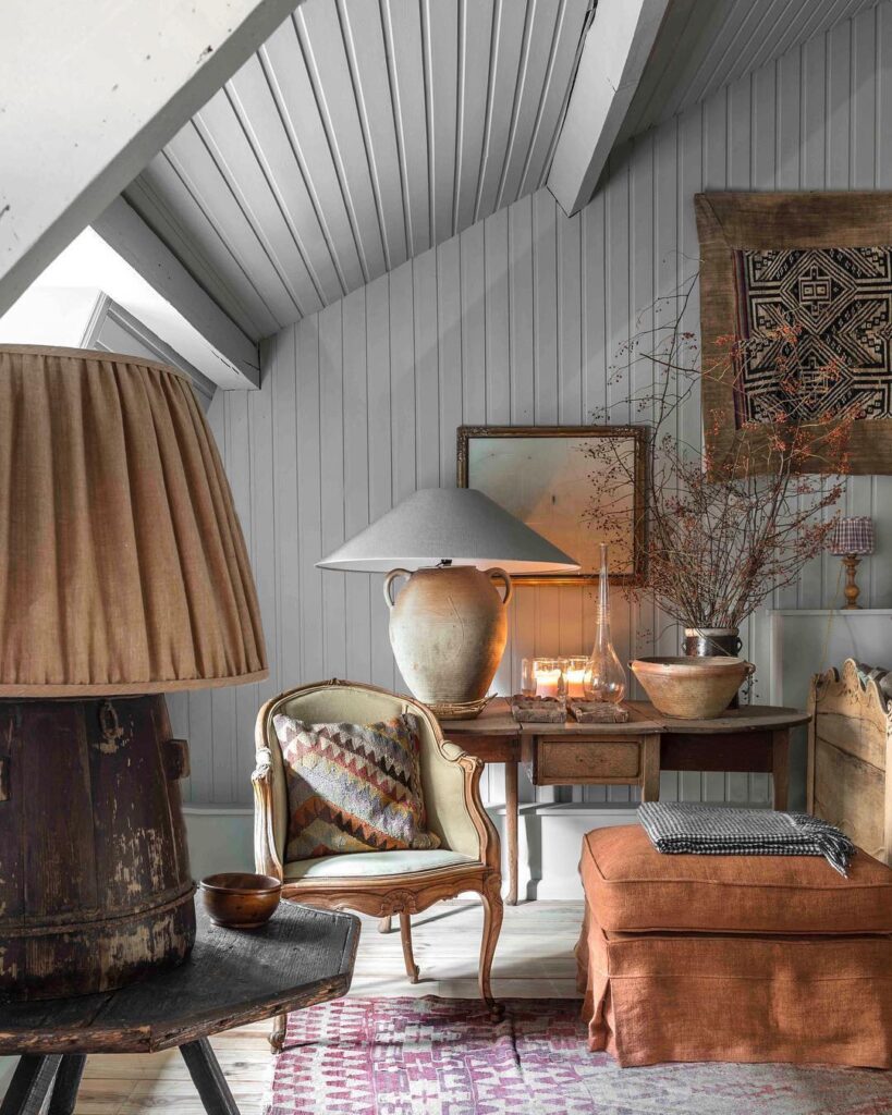
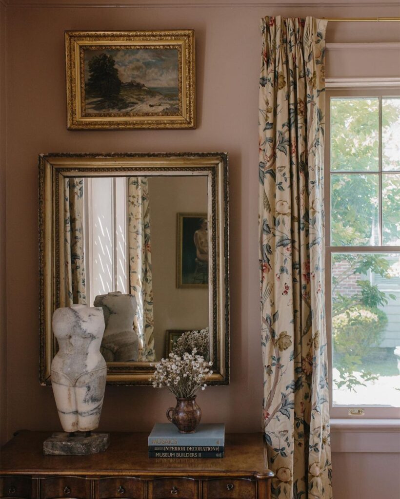
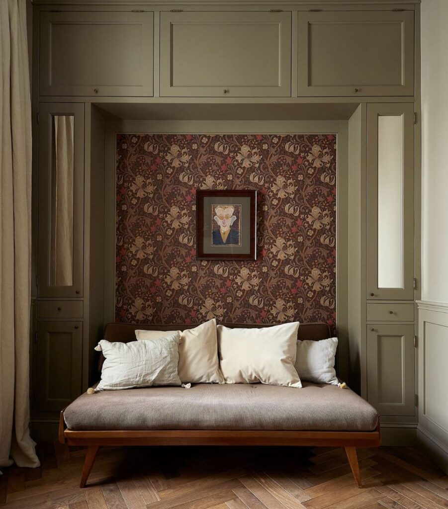
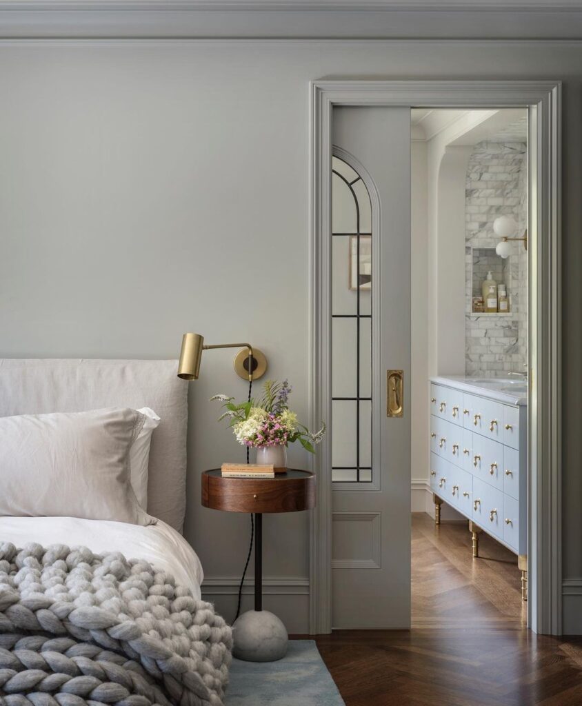
Those are some beautiful images! I love the look, but I don’t think my house can pull it off! I’ve got to choose paint colors for my kitchen cabinets, and I think the tone-on-tone look is just a little more than I can manage in my 90s house. I think I need to accept her for what she is – a suburban 90s home!
I don’t think midtones ever went out of style in average homes. In fact, I’d say its the most prevalent wall color choice among friends, families, and houses on the market in my area. But your inspo photos are all muddier versions of a typical mid-tone color. I’d say that plus the tone on tone wood work is the new trend and I’m here for that!
It ALWAYS takes me awhile to acclimate…I just gravitate to the darker, richer colors…so…sticking w/w/I love!! franki
I also agree that a basic home with no character aka 80’s, 90’s, and even homes in the early 2000’s don’t really have the trim details and the character for these mid tones. Yes in an older colonial or a new custom high end will all sorts of trim work, sure midtone it up. I like using mid tones on furniture pieces. My walls have been all. Dark and moody, midtones, and now creamy not stark white. It’s much cozier in my 70’s ranch in the woods. I’ve mixed it with midtone furniture pieces and midtone rugs. You don’t alway have to paint walls to hit the trends. Sometimes furniture can be painted if an entire wall or room isn’t your thing.
Gorgeous! Love the mid-tones. Hope the move is going well!
I love that pink tone! The mid-tones are beautiful♥️
I never was one for white walls, but you’ll have to pry the moody dark paint cans from my hands. I loooove a dark space. I always have, even before it was a trend. My guest room and main bath are the only mid tone spaces in my home. And I can’t imagine changing things anytime soon. But the pics above are absolutely beautiful.
I love all of those pictures so much but all of those houses have so much character and detail. I feel like the midtones on a builder basic house just would look blah. I think that’s where the high contrast tends to work, in “boring” houses, it gives some character/drama. In houses that have built in character, you don’t really need the dramatic wall colors. Just my two sense ;P
I totally agree! If there are lots of architectural details to add drama then you don’t need to wow with paint as much. It all depends.
Completely agree!
You are so right. Brilliant comment.
I completely agree, Amanda.
I love this look. The white/beige look always feels disappointing, plus I think it looks like whoever decorated the space just didn’t know how to use color, and so played it safe by going white. I really dislike colorful walls with white trim, however. It looks unsophisticated. American suburbia rather than timeless European. Someone commented earlier that mid-tones look especially good with lots of architectural detail but not with plain 70’s ranch walls. I would have thought that, too, except I painted the reading room of my 70’s ranch Denimes by Farrow and Ball, both walls and trim, and it looks amazing. I have a very simple 5 inch traditional-looking baseboard and matching door/window trim, no crown moulding or other architectural details. My friend said it looked very “grown up,” which I’ll take as a compliment.
I’m ahead of a trend! But seriously I think this is the best news for those of us not blessed with lots of natural light. I think light colors tend to look drab in my home, but mid tones make the place seem cozy and homey. It took a while for me to figure it out though.
I can add better lighting to my house but it’s still not the same as natural light. So that needs to be taken into consideration when choosing colors. For my home, it’s mid tones.
I think I’m still team high contrast. To me, these examples -which are beautiful -are relying heavily on the all the trim and character to give them interest. I think if these were plain walls it would look kind of blah. So maybe it works in older homes, but I don’t think it would in my 70’s ranch.
My home is going to be trendy then! haha! I’ve mostly stayed in mid-tones, with the exception of my darker bedroom, and my bold dark ceiling in the living room with mid-tone walls, which I did 13 years ago and can’t imagine changing. Growing up we had any house had white walls, my grandparents had all white walls, then I lived in rentals where I couldn’t paint and they had all white walls, and I swore I would never have a white wall again when I bought my house. I broke my promise to myself and painted my bedroom white. Couldn’t stand it, and went dark blue. I love other people’s white walls, but I’m just a woman who craves color!
I love your comment because it shows that people’s homes should reflect what THEY love, not what is trendy or in. If you love color, put color in our house. If you don’t like color, then don’t put color in your house. Can we please stop thinking everyone’s house need to look the same because it’s boring! Homes should reflect their owners, not just what they see on pinterest/instagram/blogs and think it’s “in”.
I agree wholeheartedly with you Lena! Well said, thank you!
It’s funny that this is a “trend” because it feels so timeless!! ❤️
It seems like the trick to making the mid tones look fresh is to paint the moulding the same color. Otherwise many of these colors were trendy only a decade ago.
Tone on tone forever
Agree I rocked mid tones for a really loooong time. I got tired of it and I’ve moved on to high contrast which I’m still loving. I enjoy following CLJ because it’s a different style from mine.
Love the coziness without the closed in feeling or stark feeling some high contrast colors create. Is one year too soon to repaint?😂😂😂😂
😂 I just painted my kitchen/dinning room/living room all white and I hate it!!! Before it was a beautiful midtown… soooo is a few days too soon to repaint it all back 😂 I wanted all white for so long but it feels like the space is lacking color and coziness now 😭
I would visit but I can’t live there. My last house was tiny and cute and had normal sized windows – really suited a bit of color on the walls and a traditional leaning vibe. But my current home, not huge but bigger, with enorrrrmous windows in most rooms, craves that light, that white paint, and personally I can’t get enough of it! I don’t like high contrast but I do like mediums woods and greens and blues with my light base. I feel like I had seasonal affective disorder all the time in my previous home with the wall colors and less light. I am not part of this trend and it’s rough to see so many bloggers heading over there!
“…my current home, not huge but bigger, with enorrrrmous windows in most rooms, craves that light, that white paint, and personally I can’t get enough of it! I don’t like high contrast but I do like mediums woods and greens and blues with my light base.”
Loving that your home and personal preferences set the tone for your spaces. Personally in sync with your color and wood tones. Beautiful. It’s fun to tweak our spaces if we see a trend that says, “hello there,” and perfectly acceptable to wave them on when they don’t. Variety, yes please!
Love the warmth the mid-tone colors bring to these spaces.
Midtones are where my heart belongs. My absolute most favorite shades of each color, land in the midtones. It’s colorful without being overwhelming and I can live with it longer without making a change because I need something different. It’s bold and calming at the same time.
I knew this was coming and have leaned into it since before it started coming back… I’ve never liked the airy too-much-white trend.
I agree Carly! The plethora of white-on-white-on-white trends often looked unfinished and bland to me, like they got to the priming stage and decided to quit. Here for the mid-tones, in the right space (and 100% agree with the comment that tone-on-tone with baseboards is 100% the key to avoiding my mum’s 2004 taupe living room vibe ;) ) But also Julia, your moody contrasts will always have my heart. I adore your last home’s dark basement with the big artwork and cozy sofa <3
yes, yes YES! I love my all white house (white flour, btw!) but every color I’ve added or wanted to add has been mid-tone. This resurgence harkens my family’s centuries-old houses in the English countryside that immediately feel like home.
I have been waiting for the ‘bright white/pops of color’ trend to die for YEARS. Anything that breaks the seemingly never ending sameness and injects personality and uniqueness into homes is aces in my book.
I absolutely love that this is coming back, especially to balance out the higher contrast spaces within the same home/structure. It gives off the coziest vibe, especially when tone on tone is happening! Dare I say we should have seen this coming when the empire shade started making a comeback as well?