Behind the scenes, we always have way more irons in the fire than we share in any given week. It’s important to keep the projects and the business going, especially in these times where lead times are a lot longer. We have trim being ordered for one room, wallpaper being made for another, furniture on order for another, and some rooms we’re still in the thinking stage on. Well, I should say that every room we’re in the thinking stage on–I can’t help myself.
And really, when you’re designing one room–it’s really good to think ahead. When I think about the spaces in our home, I like to think about the color story from one room to another. While each room is its own design, I am always conscious of how it works with adjacent spaces and within the palette of the entire house. Last week, I casually shared on Instagram that I was thinking our living room wouldn’t be white or light–but a darker color instead, and although “because I want to” is definitely reason enough to paint anything in your house whatever color you want, today I wanted to share how I actually came to that thought.
First, I always look at connected spaces. I don’t like to stop and start a paint color on a corner, so connected spaces will likely all get the same treatment (think our former living room was open to our breakfast nook and kitchen and the hall and up the stairs! All of that was painted SW Alabaster).

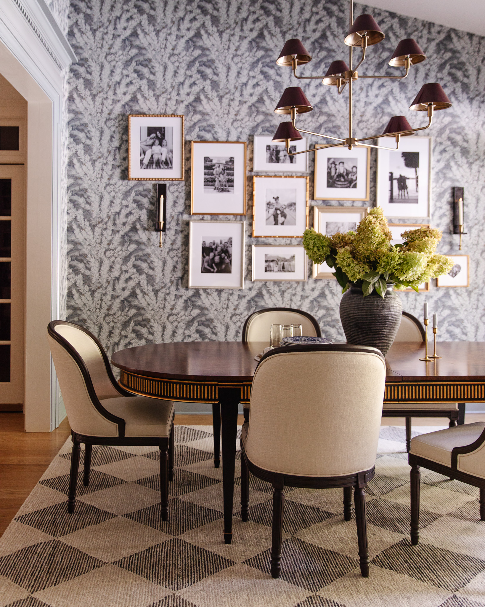
In our home now, there are a lot more cased openings separating room (I love that about it!) with the openly connected spaces being the kitchen into the hall in front of the living room and hall leading to the entry and going up the stairs. Those spaces will all get the same paint treatment on the walls. Do you see (below) how the dining room and living room are separated by a cased opening from each other and the kitchen and hallways?

It might make the most sense, while looking at a map of our first floor.
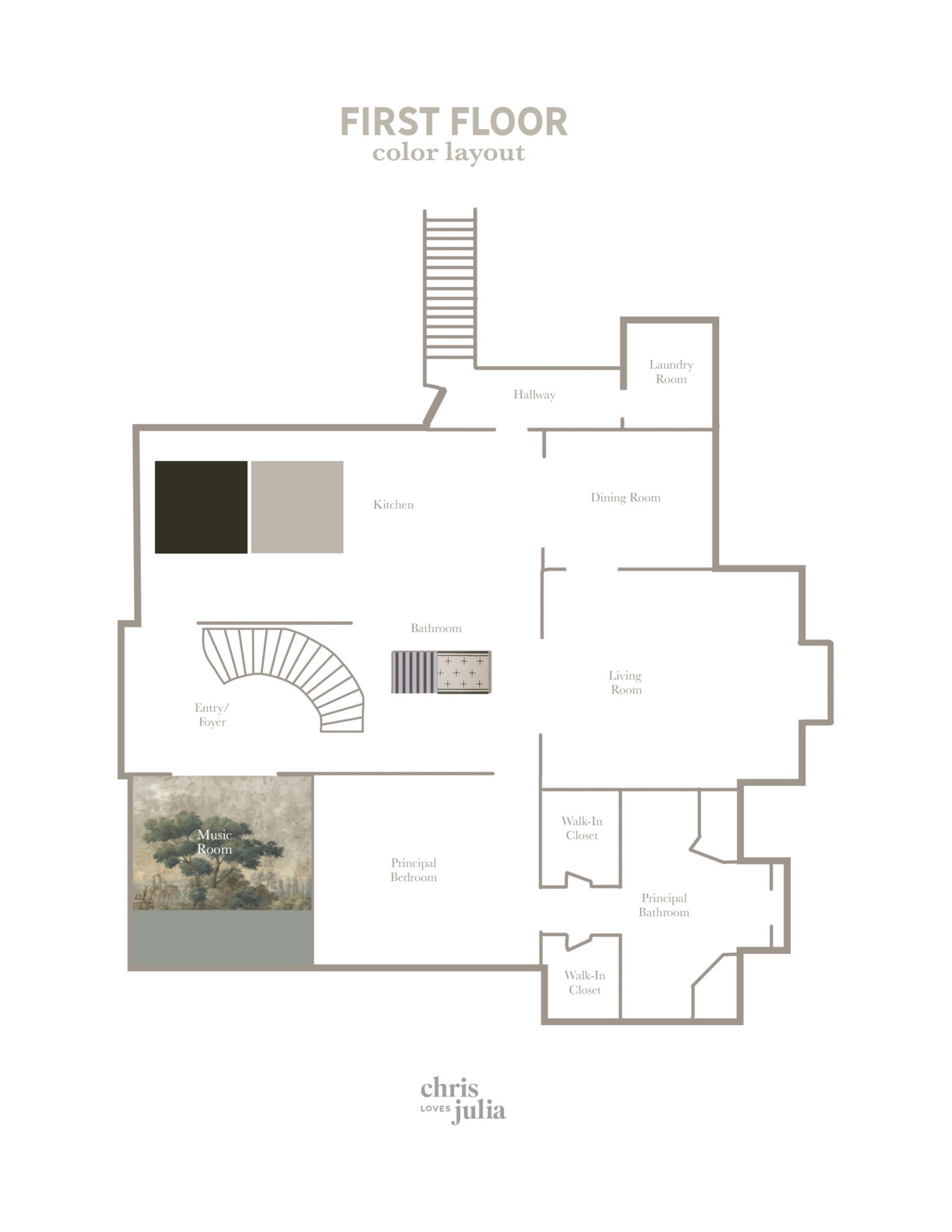
These large connected areas (the circle going from the kitchen to the entry) I will likely paint a light neutral–right now we had our painters paint any patched drywall in SW White Flour. This works even in the kitchen area where the cabinetry will be green and taupe–the walls still need paint! (See the kitchen plans here!)
With the connected spaces all spoken for, I start looking at the pockets that branch off from that–the music room, our bedroom, living room, dining room and even the laundry room way back in the corner. I think about repeating paint tones, and balancing patterns. For instance, if I want to do a mural in the music room–more on THAT in the future–and there’s wallpaper in the powder bathroom, then maybe our room would be a nice place for trimmed out walls and a solid paint color.

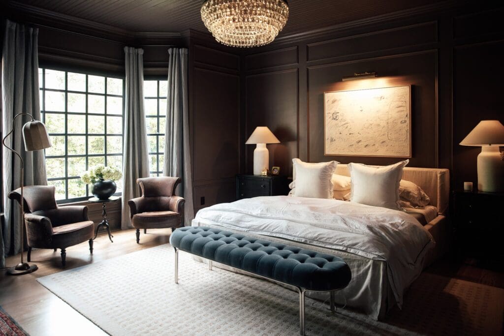
It would be nice to balance the pattern in this layout by bringing wallpaper into the dining room! Which leaves the living room. I’m really thinking our bedroom is going to stay lighter in color (it helps me get up in the mornings, I’ve learned!) so that’s how I came to the conclusion our living room could and should definitely be a little more dramatic. I’m thinking a very dark navy or green. To balance the dark island going in the kitchen. To balance the lighter walls in the connected spaces. To balance the wallpaper that will be next to it in the dining room. It’s the center of it all, but it’s also it’s very open space trimmed out and separated.
When I showed my sister how I plan this all out, she said, “Oh, so you’re designing a Clue board.” Hahaha and maybe I am! Also maybe this is not new to anyone, but I thought it would be helpful to share as we are just getting started here!
But now I’m curious, how do you choose paint colors and palettes for your rooms?

I start with a compass! For instance, SW Accessible Beige looks warm and beige in South facing rooms, and very, very gray in North facing rooms. In East and West facing rooms the appearance of the color changes through the day. North facing rooms need warm colors that do not have green or gray bases. SW Creamy works really well in Northern light, and the “blueness” of the light from that direction takes away yellow tones, leaving a nice clean looking neutral. Northern light makes cooler colors look even colder, so blues and teals and purples have to be chosen carefully and balanced with warmer tones.
I have a compass app on my phone, so I just hold my phone to the window and I can get an exact reading on the light direction/color!
Love leaning your thought process. The visual learner in me would love to see your selections layered on the floor plan to see how you envision them all working together. I’m trying to plan similar selections now abs my fiancé thinks all the rooms need to be one color since there are no doors in the shared spaces. I need to help him along ;) thanks for always inspiring!
Painted our secondary living space (library), BM Wetherburn’s Blue. The walls, doors, trim, and built-ins… everything! It’s such a moody place and I love it.
I do much the same as you, in considering the visibilty and flow of wall surfaces. (And feel good about that now!) I also choose paint color based on the mood I wish to create in a space.
I would say I use a process pretty similar to this; but I have never selected paint colors at time of move or even closely after. Is that wild? It’s easier for me to choose paint colors when I’ve lived and moved around a space for awhile. Our current home is a bit of a conundrum because of the slightly open layout-similar to here-with rooms that open to each other, and some that don’t. This explanation helps a lot, and seeing the overhead view gives my minds eye a picture of my own overhead. I think you just simplified this house for me in one post! Now I want to go paint!
I agree, I like to choose paint colors while living in a home for sure!