Design

Creating a Home Palette from Paint Colors at the MET!

November 18, 2021

We believe we should all love where we live.

We’re a couple of homebodies, working to uncover the home our home wants to be. And we’re so happy to have you here. 

Portfolio

Projects

Design

We're Chris + Julia

read more

What we're                   right now

Loving

browse the shop

Befores, afters, mood boards, plans, failures, wins. We’ve done a lot of projects, and they’re all here. 

We have a long-standing relationship with DIY, and love rolling our sleeves up and making it happen. 

Even when you don’t want to rip down a wall, you can make that space in your home better. Right now.

browse all

browse all

browse all

02

01

03

Popular Posts

1.

2.

3.

Top Categories

I’m not saying I want my house to feel like a museum–I’m just saying I wouldn’t mind having every paint color from The Met in my house. I’m specifically thinking of their European Gallery, which was re-painted a few years ago with Farrow & Ball paint colors. I thought it would be fun to guess which paint colors were used in The Met, using my Farrow & Ball paint deck in hand. Again, these are my best guesses! And I’d definitely swatch anything in your home before committing to a color.

Stiffkey Blue Walls, and Pigeon Trim

image source

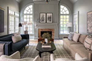
This was the photo (above) that began my deep dive. I came across this image above in Lauren Caron’s stories before we painted our living room and I knew it was the perfect inspiration for our home. The trim looked like Pigeon by Farrow & Ball and that gave me the push to paint our living room in the tone. No regrets, and now I can’t unsee using that blue in the bonus room and definitely bringing a deep red into another room (maybe the dining room?!).  Seeing them together, makes me feel good about the whole-home color scheme I’ve been mindful of.

Here’s a few more colorful spaces in the Met that are sporting the most inspiring paint colors (and my best guess as to what they are!)

Oval Room Blue Walls, Mole’s Breath Trim

image source

Green Ground Walls, Teresa’s Green Trim

image source

Downpipe Walls, De Nimes Trim

image source

Pelt

image source

This is giving me Polly Modern Cottage vibes.

Brassica Walls, String Trim

image source

Picture Gallery Red, Off-White Trim

image source

I’m not over the red we painted in our last music room and I can’t wait to bring it back! And this taupe reminds me of the taupe cabinets in our kitchen. A perfect pair if you ask me.

Studio Green Walls, Downpipe Trim

image source

The paint colors in this image above are actually more than a guess. They’re confirmed by Farrow & Ball! If you can remember, Downpipe is what we painted the guest room in our Modern Cottage.

Isn’t the inspiration just lovely?! I’m feeling very inspired by this deep-dive, so much so that the official bonus room paint color is going to be Stiffkey Blue–a true deep blue that feels traditional but fresh! 

Here’s all the paint colors together for reference. Honestly, if you’re looking for a starting point in choosing a whole-home color scheme, this is a great place to start.


Leave a Reply

Your email address will not be published. Required fields are marked *

This site uses Akismet to reduce spam. Learn how your comment data is processed.

What do you think?

  1. Jaime says:

    Beautiful! I actually sent you a DM on IG in September with a picture my friend took at the Met. It was the room with the herringbone floors. It reminded me of your home. I wish I was brave enough to try more colors.

  2. Melissa says:

    From your photo, I think the first room’s walls look more like Railings.

  3. Jordan Graves says:

    Loved this post! How fun! Stiffkey blue is going to be SO perfect in that room. I remember that being a favorite color on Emily Henderson’s blog too!

  4. Katie Keplin says:

    If you painted a room dark walls and dark trim what would you paint the closet doors? I want to do this in our extra bedroom when I make it into an office!

  5. Elizabeth says:

    Great post! I’m so inspired by these colors!

  6. Jamie Gammon says:

    I feel like I need a field trip! That was so inspiring. Thank you!

  7. EP says:

    When you shared photos on your story yesterday, I wondered if it was all F&B! The colors are so familiar. What you call Green Ground I think could be Mizzle. GG is more of a celery while Mizzle is kind of an earthy minty color? More green than you’d expect from the swatch. French Gray is a contender also. I am dying to paint a room French Gray. Just in case anyone reading wants to try some of these color schemes on for their house, these shades can really be chameleons depending on the space!

  8. Kate says:

    I love this post! The MET has always been a huge source of inspiration for me, too.

  9. Jodi Robin says:

    Hi Julia, what’s your thinking on repeating certain colors throughout the house, like Pigeon on trim elsewhere? I’m always curious how to best plan different yet cohesive color schemes that flow well. Thank you!

  10. Liz says:

    Love the deep colors. I noticed that the color of the frames are coordinated with the wall colors. The golds are in the darker rooms and the lighter rooms have darker frames. Also interesting was that all of the paintings are hung with wires from the top of the wall – probable related to security as well as ease of changing the art. The sculptures in some of the rooms mirror the art. Oh, the benches are all a dark wood tone.

    On the minus side – many of the rooms use “skylights” for lighting. I remember that style in the kitchen of my first home. It works for the museum, but I’m glad that style changed for homes.

  11. Tracy says:

    My front door is Stiffkey Blue and I love it!

  12. Liz says:

    What a fun and beautiful post!! As an art history nerd, this made me so happy! Taking inspiration from your love for F&B colors, I painted my living room (and then soon after my dining room) with De Nimes. Here are some pics on IG, if you’d like to see: https://www.instagram.com/p/CU7Pu1oA9No/. I love it!!

all the latest

We believe we should all love where we live.

We’re a couple of homebodies, working to uncover the home our home wants to be. And we’re so happy to have you here. 

HI! We're Chris + Julia

read more

Load More

Reader Faves

SHop all

What We're                     Right Now

What We're                 Right Now

Looking for our favorite things? A place to shop our home room by room, or just catch up on what Julia's wearing / loving right now? Browse the CLJ shop. 

Loving

looking for inspiration? 

A reader recently asked me if I’m starting to fully embrace traditional style and whether we still consider our house to be a “modern Colonial” and why. It was a really great question and so timely — I had really just been thinking about my approach to this home and how my style has changed […]

Can We Send You Our Love Letter?

Another way for us to stay in touch! Joining our weekly newsletter gives you access to exclusive content, never-before-seen photos, your questions answered, and our favorite DIYs. Sign up below!

Follow Along on Instagram

Welcome to our online community where we've posted home, DIY, style, renovations, and family since '09. Renovating our #cljmoderncottage in Idaho and headed for new adventures in Raleigh, NC. #cljfam #cljtransformations

@chrislovesjulia