Design

Our Whole House Color Palette

April 11, 2018

We believe we should all love where we live.

We’re a couple of homebodies, working to uncover the home our home wants to be. And we’re so happy to have you here. 

Portfolio

Projects

Design

We're Chris + Julia

read more

What we're                   right now

Loving

browse the shop

Befores, afters, mood boards, plans, failures, wins. We’ve done a lot of projects, and they’re all here. 

We have a long-standing relationship with DIY, and love rolling our sleeves up and making it happen. 

Even when you don’t want to rip down a wall, you can make that space in your home better. Right now.

browse all

browse all

browse all

02

01

03

Popular Posts

1.

2.

3.

Top Categories

This post is sponsored by ColorReader by Datacolor. There’s a discount code at the end of the post for our readers!

“Do you mind sharing the color of your walls?” is a question we get all day long! There have been so many times I thought the same thing while scrolling through instagram or flipping through a magazine or even walking through a high-end store. The truth is, paint color on a wall is highly affected by lighting, whether that be which way a window faces or what color light bulbs are used in the space (read our whole post about bulb color here!). But, still, so what’s that color?! (Am I right?)

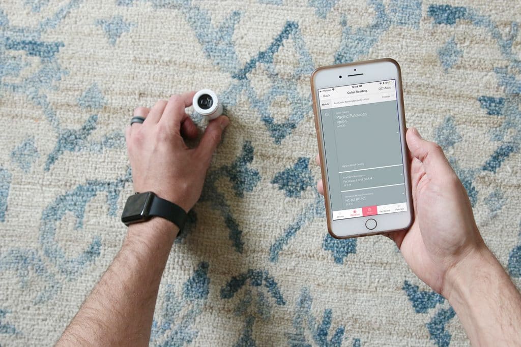
Last month, we were introduced to a cool little portable tool called ColorReader by Datacolor that allows you to scan real life colors from any surface! Think walls, rugs, your favorite shirt, a magazine page, a cabinet door, anything! You then receive actual paint swatch matches on your smartphone instantly from all the leading paint brands – Behr, Benjamin Moore, PPG, Sherwin-Williams, Valspar, Farrow & Ball and so. many. more.

Of course, the first thing we did was scan all of the walls in our house like some kind of test! And then we realized you can create palettes from the colors you are scanning and even share the palettes with others. How handy is it to have your whole home color palette in your pocket with the formula to each paint color, too? So handy. Oh yeah, it has all the formulas, RGB and CMYK!!! 

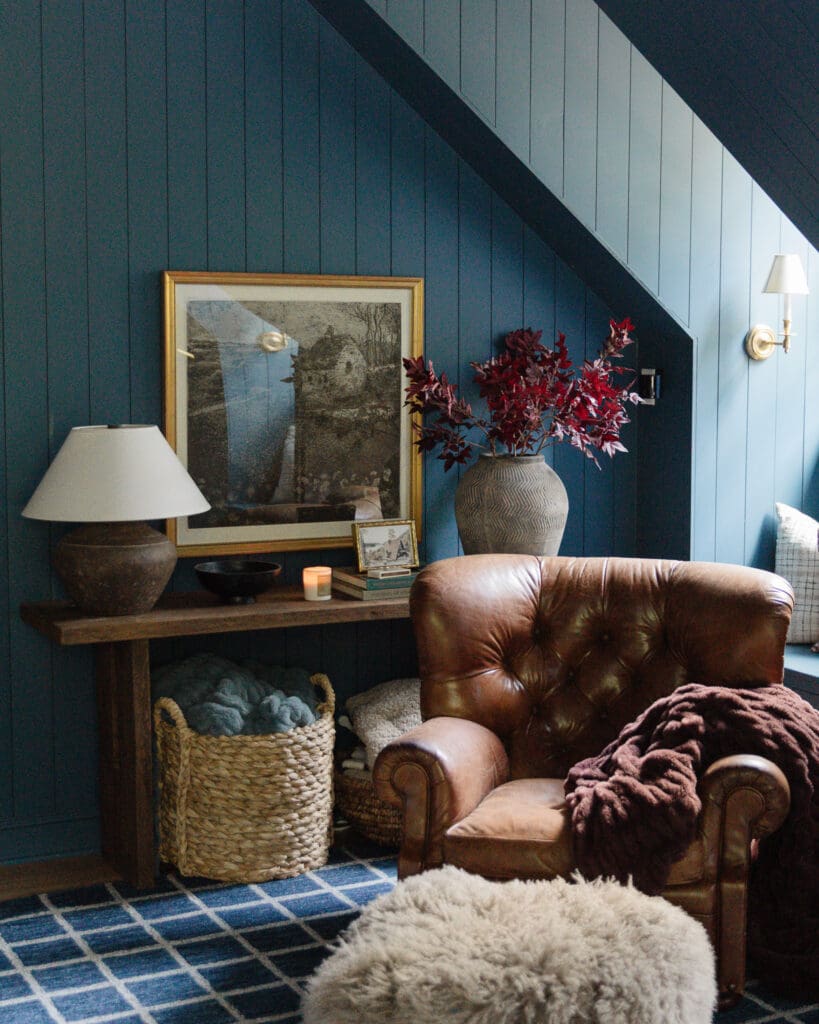
The dark plank accent wall in our living room we were especially curious to assign an official paint name to, because we used a color from a paint brand that has been discontinued completely.

We held the ColorReader up to the wall, opened the app and hit the “read” button.

Within seconds, it pulled up Mount Etna by Sherwin Williams as the highest match quality. It also offers two other close matches. In the case of this wall, Valspar’s State Court and Benjamin Moore Stonecutter. Because they have so many different paint brands, you can select which brands you’d like to see matches with. I opted to choose the 5-6 that we use and have access to.

After you scan, you have the option to add it to a palette (it also saves all your scans automatically so you can always go back and see them and organize them at a later time) so my first palette was our home, which I then shared with Chris. And now with all of you! Behold, all the paint colors in our whole house:

When we were planning our whole house palette, we really wanted to stick to a warm neutral version of any given color, keeping the larger areas lighter; and accent with deep, saturated pockets to keep things interesting and grounded.

The only space that didn’t scan correctly was our family room downstairs, which I always had a sneaky suspicion about. I guess I should say, it scanned it correctly, but the person who mixed our paint years ago didn’t. We painted it Simply White by Benjamin Moore, but we had it color matched at our local hardware store and it has always read SO GREEN and minty to me. I have told Chris a few times, “We have to repaint this whole room and I’m not looking forward to it.” But now I feel validated! The ColorReader brought it up as “Tint of Mint.” So, sadly, spot on. I noted the actual color should be Simply White in the notes…and will be as soon as we catch our breath over here.

I love the idea of being able to pull colors from area rugs, drapes or art! I’ve already put the ColorReader in my purse so I can whip it out at any time.

Such a cool tool, huh! You can learn more about the ColorReader by Datacolor (and get your own) right here!

UPDATE! ColorReader just emailed us with a discount code for all of our US based readers! Use the code CLJ for 15% off a ColorReader! (offer expires 5/31/18)

SaveSave

SaveSave

SaveSave

Leave a Reply

Your email address will not be published. Required fields are marked *

This site uses Akismet to reduce spam. Learn how your comment data is processed.

What do you think?

  1. Hannah Crabtree says:

    Came here to find your exterior house paint color, didn’t see it. Could you please share? Thanks!

  2. Jodi Raymond says:

    I also had simply white mixed by Sherwin Williams and it always looks kind of yellowish green to me!! Weird!!

  3. The app does not give you the paint color formula. Nor can the paint store use the values as displayed on the app to convert to magically make it into a paint color formula. RGB and CMYK values have nothing to do with paint colors. RGB is red, green and blue channels of light. CMYK is cyan, magenta, yellow and black ink. Again, nothing to do with paint.

    Can you use the device to scan a color and search the app’s database of paint colors? Yes.

    It is going to give you the best match it can find within the limits of the database it has to search

    No one is saying that answer or “match” is going to be a good one.

  4. Thalia says:

    So interesting about your basement paint colour! In some pictures the colour definitely was reading “green” to me and I kept thinking it was my computer screen lol

  5. Omg I would have died to have that app before smart phones and Pinterest were a thing! I love that the Color Reader can go right up to something to get an exact match. Kind of dying over here. This is so cool!

  6. Stacy G. says:

    Ok. This little tool is fantastic! It would be especially helpful for those of us for whom design and color choice do not come easily. So many times I have wished that I was an artist, but my brain does not seem to work that way.

    PS: We used Mount Etna on the windows and floor in our breakfast nook. It is a beautiful saturated greenish black. Hale Navy is my favorite (The exterior of our house is painted this Hale Navy.), but Mount Etna is a close second.

  7. varya says:

    I love the color reader tool but it did not exactly identify any of the paints in my house. Did come close in each case though and I think being able to use it on fabrics and on the go is really useful. Keeps me in the ballpark.

  8. Rebecca Lemon says:

    I feel like I’ve read that color matching to other brands just gives you the closest color in that lines’ options so if you really love a color you should buy it in the original line. Did YHL write about this maybe?

  9. Britta says:

    Interesting. I love hazy skies in your living space but when I painted it in my girls room it reads very dark and more green, and I keep thinking they must have mixed the paint wrong. I need to get one of those things so I can check!

  10. Anny says:

    The same thing happened to us too when we had Lowe’s color match simply white. I did a whole bunch of white samples and simply white looked so green we nixed it and ended up with Bistro White, a color Lowe’s actually does lol

    I’ve noticed it being a green tint in other blogger’s houses too. Have you seen simply white in person (bm paint)? It’s made me curious how white it really looks. :)

    • Susie says:

      Simply white does have a bit of yellow-green to it (but not minty or blue-green). It is nearly impossible to match a paint color unless you’re using the correct base. Benjamin Moore has one of the whitest/lightest base, so I’m not surprised that it doesn’t match. My advice is to choose a color from the paint deck of whatever company is mixing your paint.

  11. Carly says:

    I had ‘agreeable gray’ color matched with Behr paint at HD. I didn’t take a swatch to match, they have the formulas there. We did our whole foyer, stairs, hallways with it. I went back to get a small sample of it to do some touch ups, again just telling them the name. I did those touch ups but it is slightly off. Still have yet to take a sample to get color matched to re-touch up the touch ups. Funny enough, I like the sample paint color better but not repainting our stairwells any time soon.

  12. Sam says:

    I broke my door and after fixing it, I was doing multiple trips to paint store bringing chips and trying to match even then I painted it the wrong color and it was way off. Then I used ColorReader and I had three closest match in couple of seconds, I bought the closest match and it came out perfect. Now I am using it for so many other things as well. Love it

  13. Jennette says:

    I have simply white that was color matched in my kitchen and it reads slightly yellow. We got real Ben Moore simply white for a bedroom that we had color matched the ceiling simply white, and the match is definitely more creamy. I think I plan to stop color matching. If I want to spend less money I’ll just choose a color from a less expensive brand. Color matching never seems to work for me. I’ve done gray owl a Ben Moore color and the match I got is so blue that I will probably isn’t it again someday. Even getting Ben Moore paint mixed at Ace instead of a real Ben Moore store have me issues, I ended up with an aqua shade when the sample was much more sage.

  14. Laura Fox says:

    This is so cool! I love that it works to pull color from rugs too. That is so unbelievably handy! Thanks for sharing!

  15. Melanie says:

    This is pretty cool. I would want to use it on everything and would probably get weird and try to color-match the dog or something. I’m shocked by the commenter below who said the previous owners wouldn’t share their colors?! That is nuts. I keep a log of not only our wall colors, but trim, ceiling etc including finishes and whether it was color-matched so if we end up selling the next owner has an easy time of it. Seems so silly not to. People are weird.
    As for color matching. Sigh. I’ve had some issues and some success. I do alot of Ben Moore and Sherwin Williams colors in Behr – I did the ever popular ‘Sea Salt’ SW color but color-matched and it came out nearly electric green. I lived with it for one year. And twice i’ve done Edgecomb gray – and while both turned out beautiful and I love (aka close enough) they’re quite different from each other. Sorry about your minty basement – painting basements is the worst (I recently painted knotty pine in Swiss Coffee and thank God it turned out right because it was a beast to do!_

  16. Courtney says:

    This is so awesome! What a cool tool.

  17. Molly says:

    I’m surprised at the cost, but it is a pretty neat device for what it does! We have some great paint colors in our house but the previous owners refused to tell us what they are! So frustrating since we’re patching some holes and trying to match the current paint color. We’ve tried bringing wall samples to get color matched but I’d like to know the actual color name. It would be awesome to get the color exactly right.

    So- when you held it up to your living room walls it said it accurately guessed that it was Hazy Skies?

    • Julia says:

      It was one of the top three options. It says the highest quality match was Brushed Aluminum. Which does look a lot like it. We also had our Hazy Skies color matched so that could be a part of it.

  18. Mara says:

    I had Simply White mixed at Lowes in a Valspar paint and mine reads slightly green too. I wonder if their color match had the wrong colors listed, assuming you got yours mixed at Lowes too.

    • Chris says:

      We actually had ours mixed somewhere else – that’s interesting that they both read green. Maybe something with how the machines read the swatch.

      • Susie says:

        My guess is that it’s the base white that they use. Nobody’s is the same. Any decent paint store employee will send you over to the swatches to find the closest match within their line of paint because you can never quite match something from a different paint company.

    • Anny says:

      Same thing happened to me Mara. I ended up using one of their white colors after painting it on our walls next to simply white. We had 6 different paint samples lol

    • Mckenzie says:

      My simply white did the same thing, I had it mixed at Lowes as well. Dreading the repainting here also :(

all the latest

We believe we should all love where we live.

We’re a couple of homebodies, working to uncover the home our home wants to be. And we’re so happy to have you here. 

HI! We're Chris + Julia

read more

Load More

Reader Faves

SHop all

What We're                     Right Now

What We're                 Right Now

Looking for our favorite things? A place to shop our home room by room, or just catch up on what Julia's wearing / loving right now? Browse the CLJ shop. 

Loving

looking for inspiration? 

A reader recently asked me if I’m starting to fully embrace traditional style and whether we still consider our house to be a “modern Colonial” and why. It was a really great question and so timely — I had really just been thinking about my approach to this home and how my style has changed […]

Can We Send You Our Love Letter?

Another way for us to stay in touch! Joining our weekly newsletter gives you access to exclusive content, never-before-seen photos, your questions answered, and our favorite DIYs. Sign up below!

Follow Along on Instagram

Welcome to our online community where we've posted home, DIY, style, renovations, and family since '09. Renovating our #cljmoderncottage in Idaho and headed for new adventures in Raleigh, NC. #cljfam #cljtransformations

@chrislovesjulia