


It feels like we’ve been tweaking our entry forever. But I am happy to report, the plan we set out to execute a couple months ago is all in place and we couldn’t be happier with the outcome. This is how our entry looked when we first moved in:
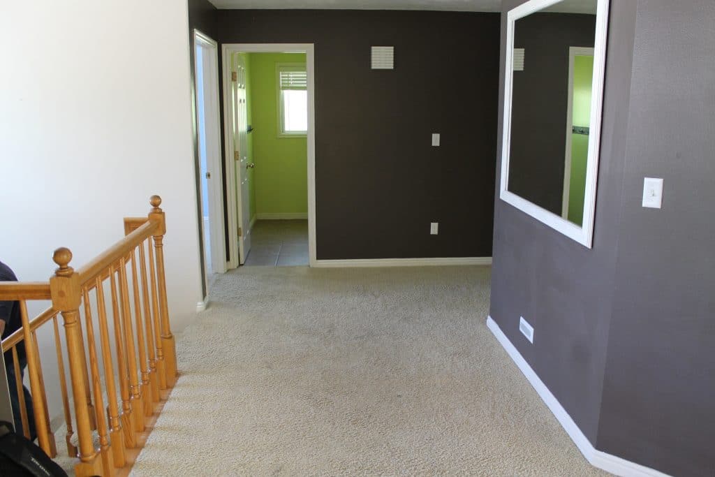
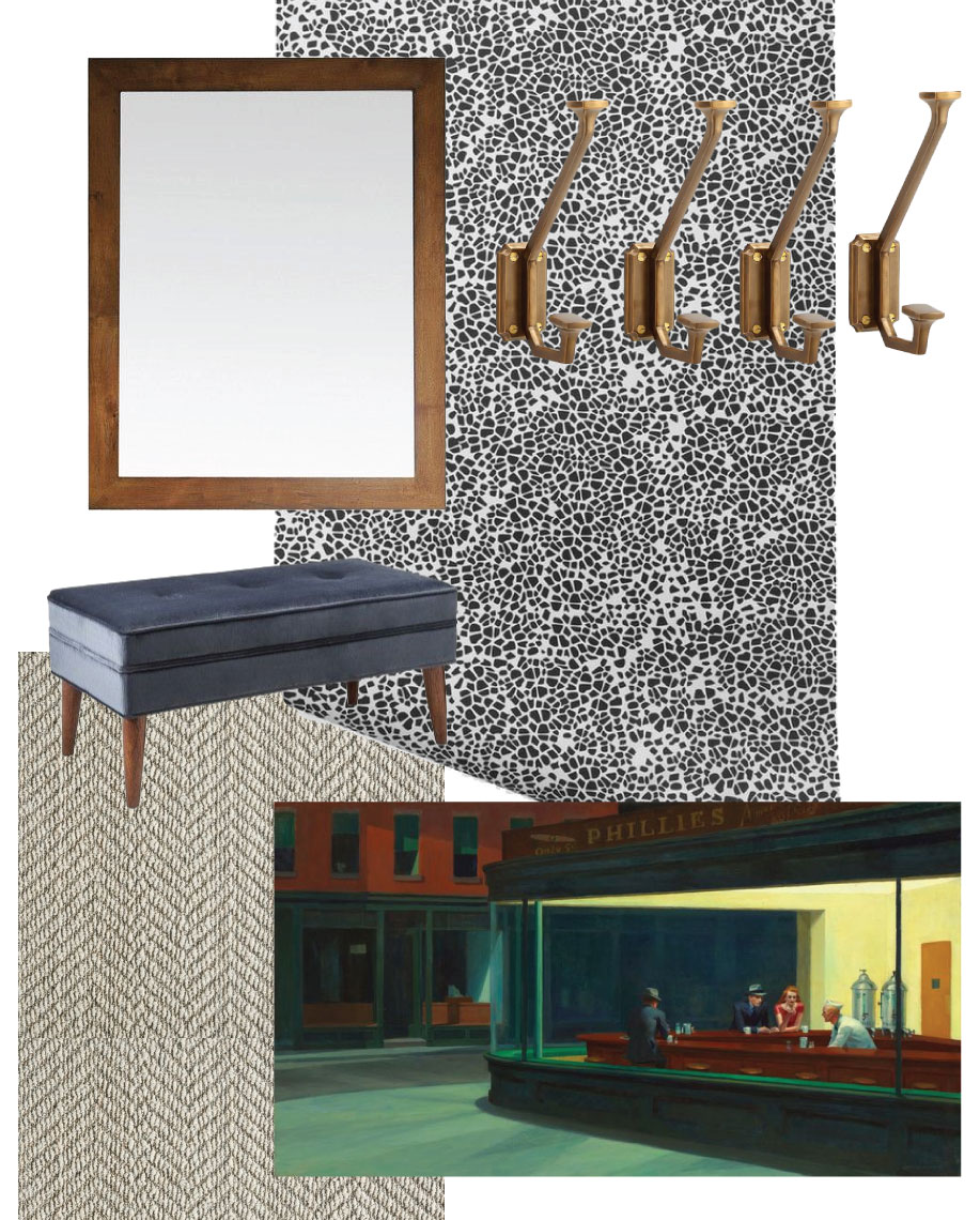
I know it is sometimes hard to understand how everything is laid out from photos. This photo was taken from the reading room. The front door is to the left right outside the room and the living room to the right. Here’s the mood board we came up with after our failed entry:
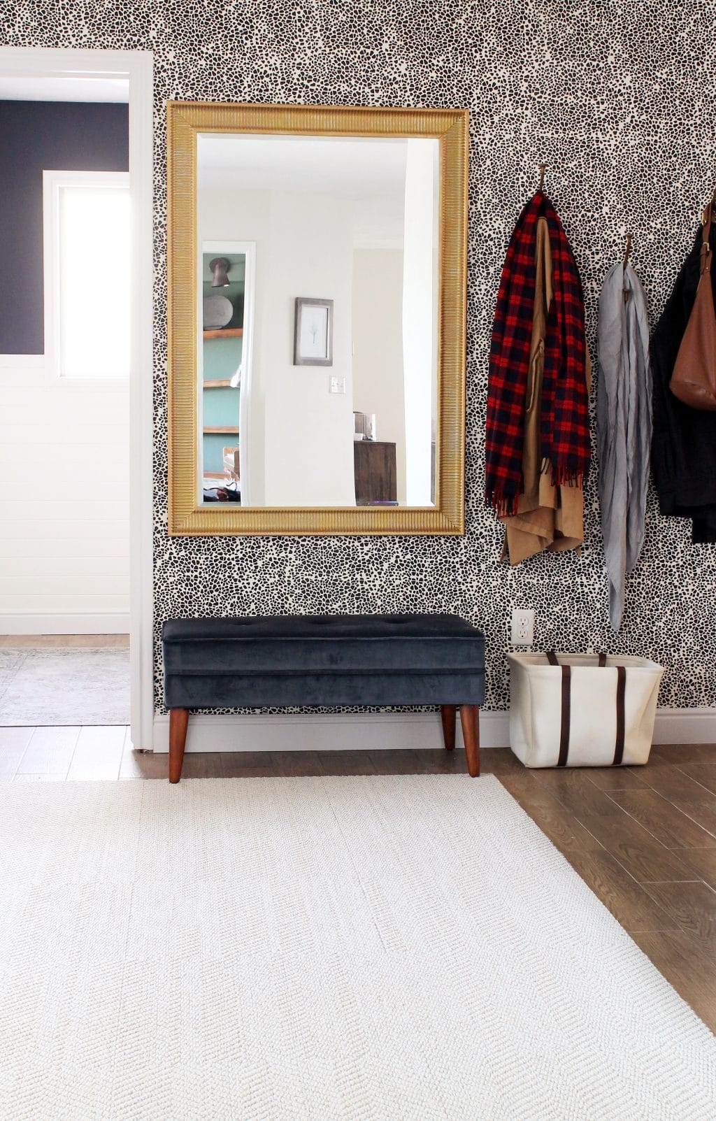
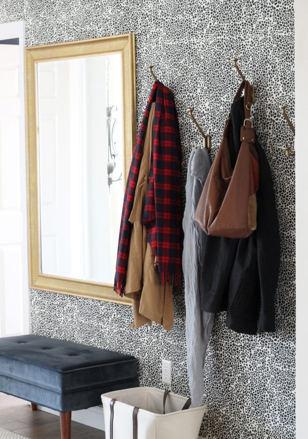
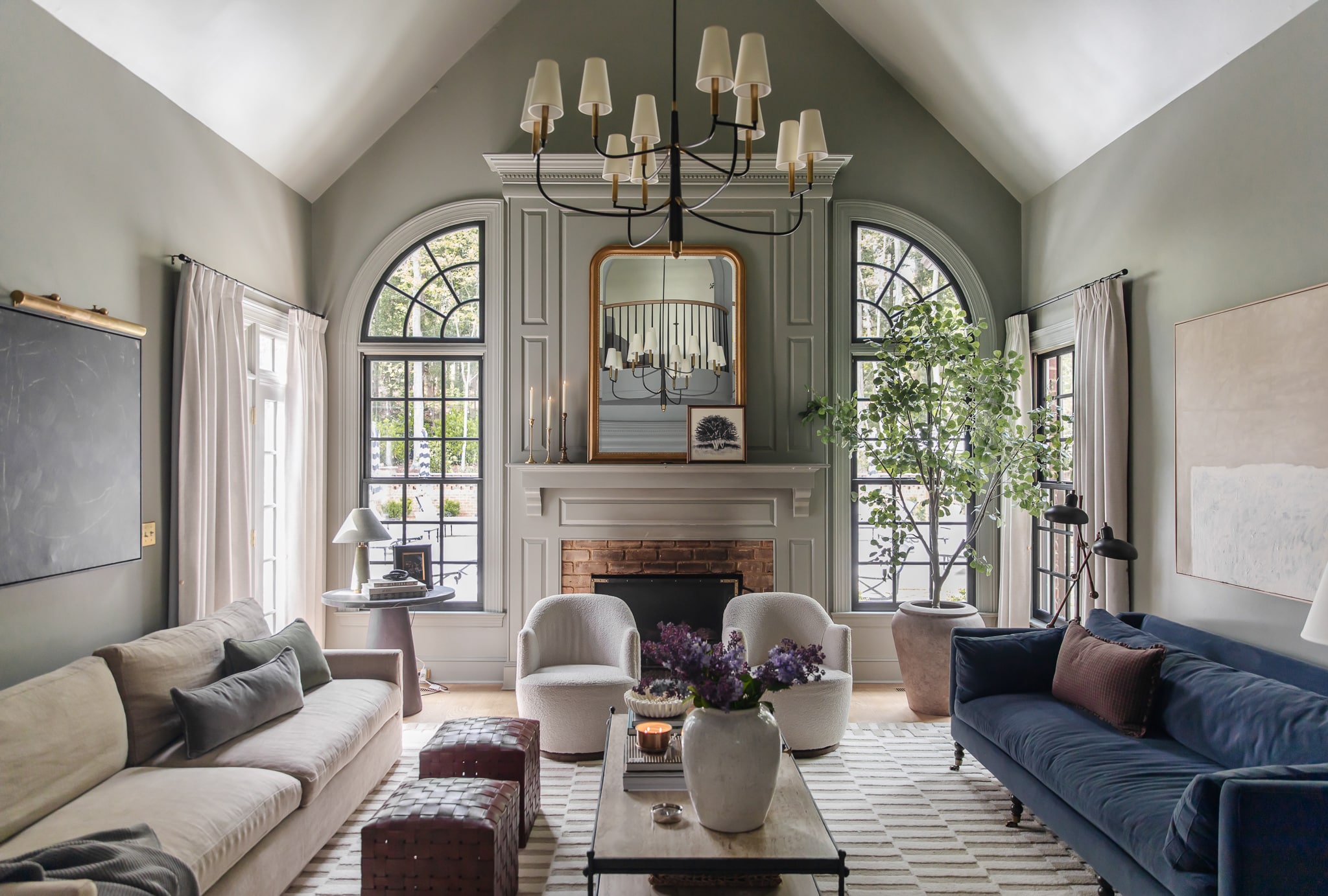
And here’s how it looks all in place!
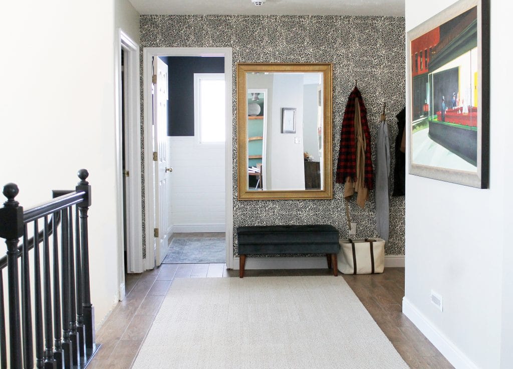
The last thing we were waiting on was our Edward Hopper painting. We got it from Arts Heaven which is a great place to get real oil painting reproductions for a reasonable price. Nighthawks is definitely Hopper’s most famous work and one I studied in depth in college. We really want to expose our girls to all kinds of art. We have lots of Etsy artists represented in our home, my own work hanging, and we hope to mix in some more prints and reproductions of famous works to expose our girls to a variety of art in the home–which is exactly what my parents did.
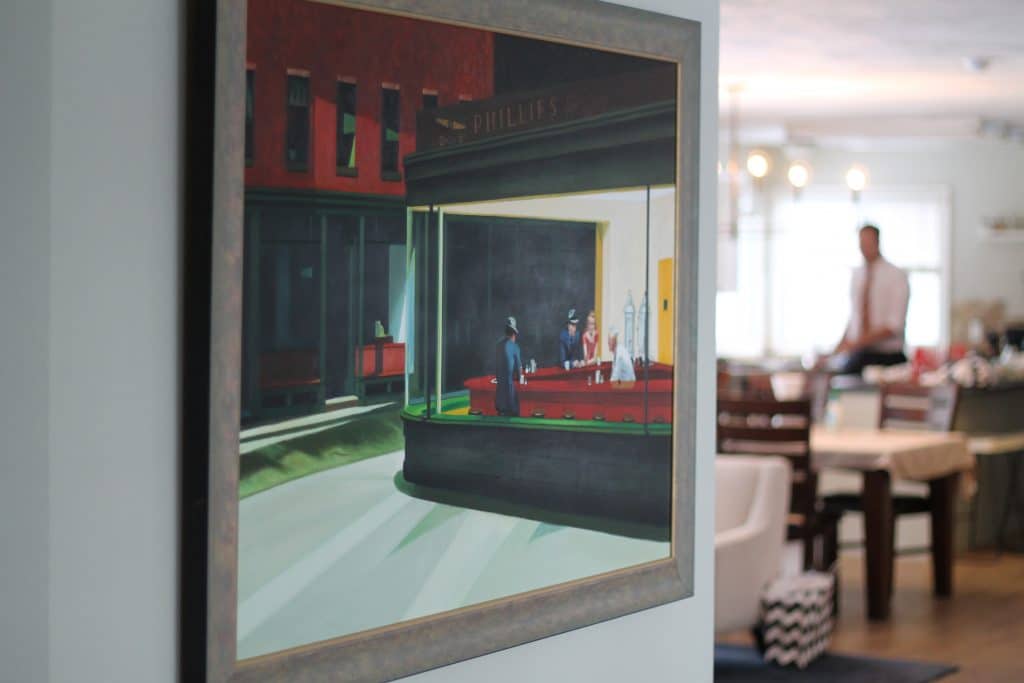
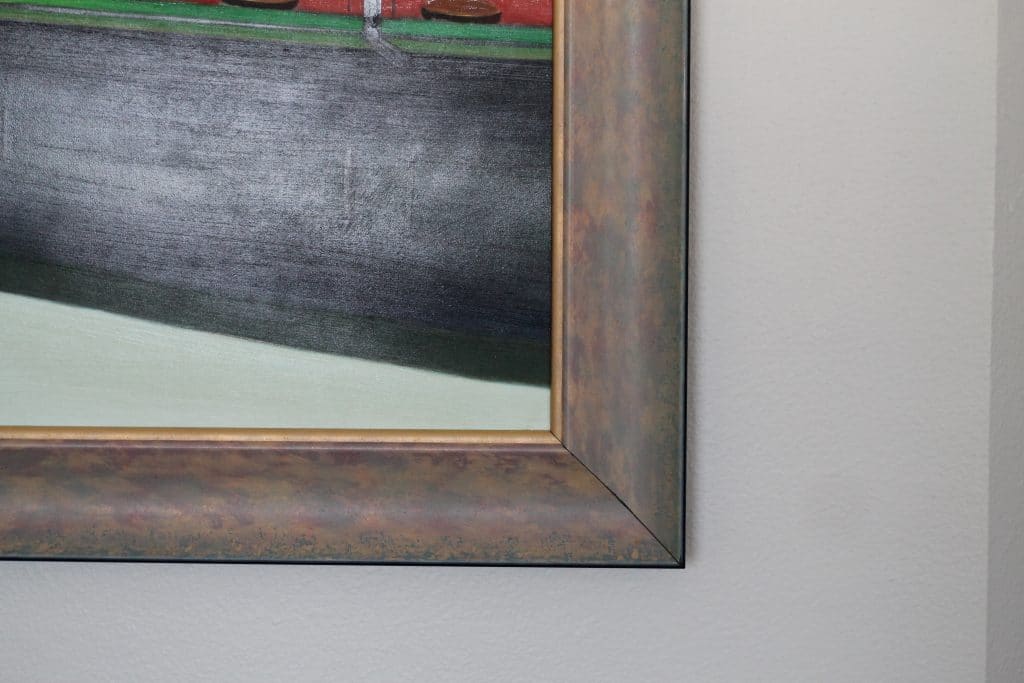
A poster felt a little “young” for us in this home so we went with a reproduction. The quality and colors and texture are so beautiful. We couldn’t be happier. It arrived painted on unstretched canvas and for our 6th anniversary earlier this month, we decided to splurge and have it framed rather than going the DIY route. A local shop was having a 60% custom framing sale and they threw in stretching the piece, too! Even after 60% off, it was over $400 to frame, but for something this size (32×48)–that is a steal. We picked this greeny-gold frame that ties in well with our floors and the adjacent rooms and fixtures and felt appropriate for the painting, too.
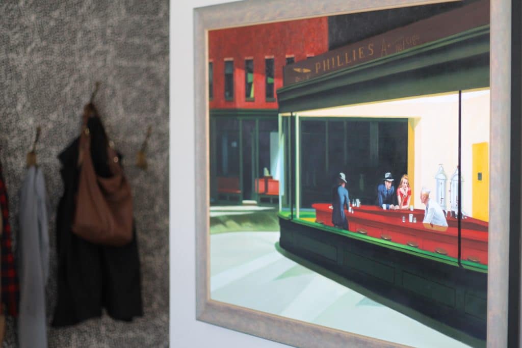
It looks like it is hung high in these photos, but I assure you the top of the painting is lined up with the top of the mirror which puts it at perfect eye height with the bottom falling just below my hips.
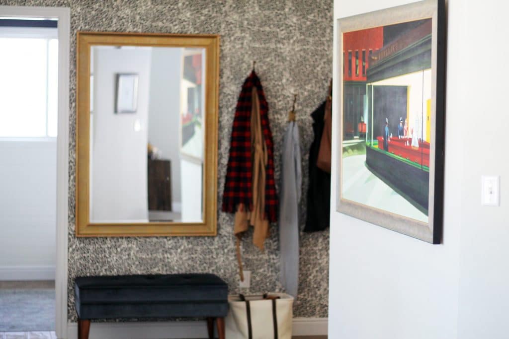
Here’s a shot from the front porch just outside the front door so you can get an idea of how things look as you walk in our home:
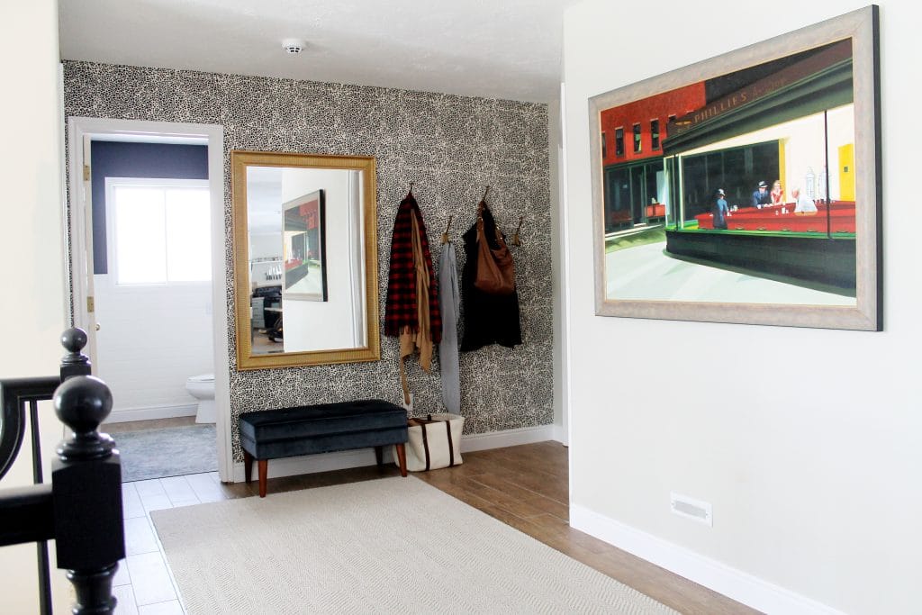
While we initially thought the bench and hooks on the wall that now holds the Hopper would be best, we quickly learned it not only crammed the area, but it wasn’t something we enjoyed opening up the door to see. Now, it’s a welcoming entry and the hooks off to the side are perfect for guests. We’ll eventually have our personal coats in the future mudroom off the garage entrance.
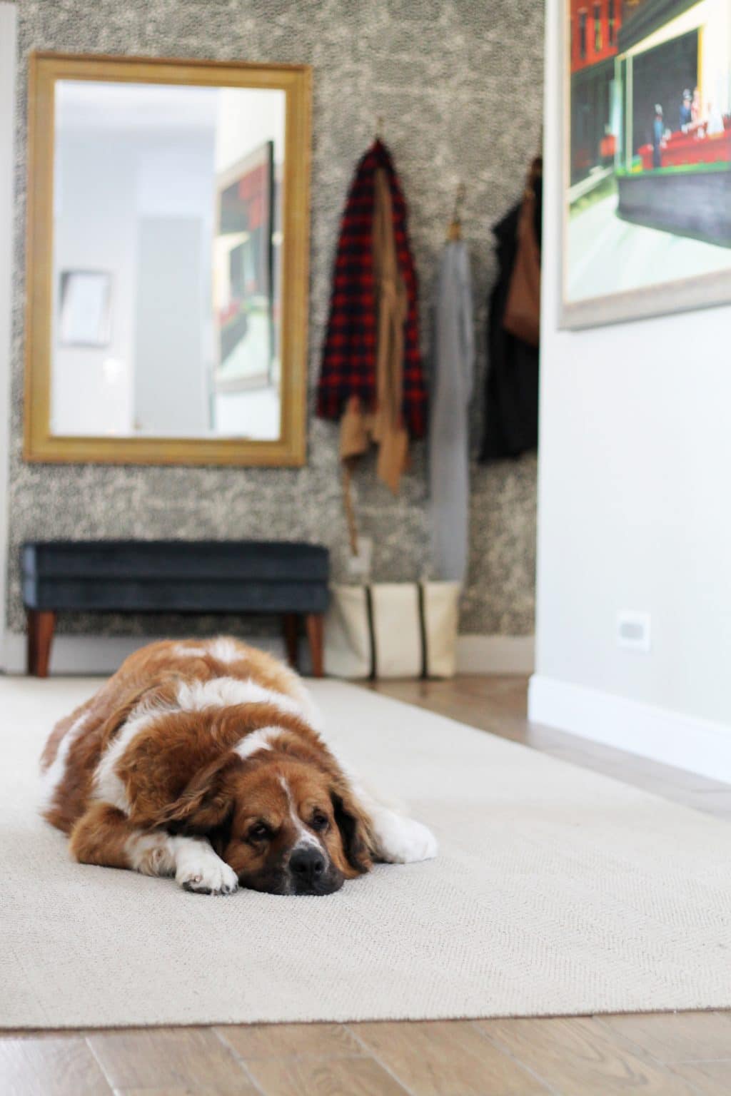
We’ll end on Charly–is this becoming a theme?! She follows me around all day and plopped down right here as I was photographing the space. What a sweatheart. We’ve talked about getting a proper art light for above the frame but we haven’t found the right one yet. We were searching for a battery operated one initially so we wouldn’t have to hard-wire it, but they all seem so small with bad reviews so we might just have to hard wire one after all. Besides that, the entry 2.0 is done just in time for the holidays. Sources and links below!
Sources || Wall color: Benjamin Moore Hazy Skies / Edward Hopper Nighthawks reproduction: Arts Heaven / Stones Throw Away wallpaper: Hygge & West / Boulevard Hooks: Pottery Barn / Mirror: Ikea (painted gold) / Blue tufted bench: Target / Canvas and leather shoe bin: TJ Maxx / Carpet Runner: Suit Yourself in Linen Flor tiles / Banister paint color: Clark+Kensington Tomcat
Leave a Reply
What do you think?

Semihandmade
Our wood grain Shaker cabinet fronts were designed for busy, high-traffic homes like ours. Clad with durable textured thermofoils, this line is compatible with Sektion, Akurum, Godmorgon, and Besta cabinets from IKEA. It's the perfect, practical way to add the warmth of wood to all the rooms of your home.
Collaborations
learn more

next
Loloi
We have teamed up with Loloi to create a line of rugs that are as affordable as they are beautiful. This collection houses a great mix of traditional and modern rugs, in cottage-y colorways, as well as vintage-inspired beauties that you’ll want to roll out in every room.
Collaborations
learn more

next
STUGA
We partnered with Stuga on a line of hardwood floors — The Ingrid is really livable, and the color is very neutral. It doesn’t lean warm or cool, it’s that just right in-between. We have really loved putting it everywhere in our house. It’s the best jumping-off point for design, no matter your interior style. In addition to being beautiful, Ingrid is really durable — we have three kids, and we always have a home construction project going on. Ingrid stands up to it all.
Collaborations
learn more

next
SHop all
What We're Right Now
What We're Right Now
Looking for our favorite things? A place to shop our home room by room, or just catch up on what Julia's wearing / loving right now? Browse the CLJ shop.
Loving


Portfolio


Design
Befores, afters, mood boards, plans, failures, wins. We’ve done a lot of projects, and they’re all here.
BROWSE BY CATEGORY
let's break this thing up
We have a long-standing relationship with DIY, and love rolling our sleeves up and making it happen.
Projects
Even when you don’t want to rip down a wall, you can make that space in your home better. Right now.
read more
read more
read more
02
01
03
looking for inspiration?
A reader recently asked me if I’m starting to fully embrace traditional style and whether we still consider our house to be a “modern Colonial” and why. It was a really great question and so timely — I had really just been thinking about my approach to this home and how my style has changed […]


SEARCH THE BLOG
We've been doing this since 2009 and we've posted a whopping 24145+ blog posts and counting. You might need a little help searching, huh?
looking for something?
find stuff like:
")
Can We Send You Our Love Letter?
Another way for us to stay in touch! Joining our weekly newsletter gives you access to exclusive content, never-before-seen photos, your questions answered, and our favorite DIYs. Sign up below!
Follow Along on Instagram
Welcome to our online community where we've posted home, DIY, style, renovations, and family since '09. Renovating our #cljmoderncottage in Idaho and headed for new adventures in Raleigh, NC. #cljfam #cljtransformations
@chrislovesjulia


Links
Get Around
Make yourself right at home
Portfolio
Design
Casual Friday
Projects
Lifestyle
Gift Guides
All Posts
Shop
Love where you live.
Social
RivrLinks
Links
Get Around
Make yourself right at home
Portfolio
Design
Casual Friday
Projects
Lifestyle
Gift Guides
All Posts
Shop
Love where you live.
Social
RivrLinks
It looks so elegant without being fussy. I love it! I liked your “failed” entry too but this is definitely the entry 2.0 edition. I feel like a lot of our decorating is still “young” even though we’re probably older than you guys :P It’s a good reminder that if you want a grown up look sometimes you hafta fork over the grown up bucks. Great original design, guys!
I agree, it looks fab! I wasn’t sold on the wallpaper but it’s definitively growing on me. :-)
I too think something is needed below the painting, but I’d be tempted to go with a shallow but chunky-ish floating shelf; maybe in weathered wood to echo the painting’s frame? A console would be too much I think. It probably looks completely different in person but to me the painting looks a bit lost alone on that wall.
And talking about the painting, any worries with fading due to the sunlight streaming in? I realise it’s a repro but you went to the expense of getting an actual oil instead of a poster (good call for something so important!) and I’d hate to see it get damaged by sunshine. :-(
Love it! I have to disagree with adding a console table underneath, I say leave as is. Love the direction this has taken after your initial entry (which I admittedly didn’t hate, but this is SO MUCH better!)
Love everything about your entry!!
The first picture with that nasty green bathroom…shutter!
Happy Thanksgiving!!
Oh man, that painting. I love it. Makes me want to get a big oil reproduction of my own favorite painting!
Oh, I love how it all came together! The painting and wall paper play well off each other. Great choices! Looking forward to the video tour too!
Wow! Love it! Much better than what I Imagined!
What is confusing to me is what you see straight forward, the girl´s prints are great, but I´m not sure that is the best place , and next to the photo legde, its just to much with all the pillows and the dark curtains in the dinning room! They would look great in the stairs or media room.
I def need the video tour to see your last projects all together! I´m sure Im gonna get it!
Video tour coming! There will eventually be a window straight ahead. Pictures for now. :)
It looks amazing Julia! You seriously wouldn’t know it was the same room!!
Hey! I just thought I’d let you know that there is a great site you can use (for FREE) that allows you to make a virtual floor plan of your house. Maybe that will help us readers better understand how things are laid out? Check it out at floorplanner.com. It might take a little time, but it might be worth it!
We use it and love it and have even shared one with you guys. You can see a floor plan here: https://www.chrislovesjulia.com/2014/07/the-new-laundrywalk-in-pantry-plans.html
For some reason, people are still mega confused. I get it. We’ll do another video tour soon!
Love it, but u have to say a console under the painting with some styling on it would make that painting and area so much more special! I do love the back wall though!
Maybe!
Love the choices and styling!! Also the blog! Happy Thanksgiving!
I LOVE what you’ve done with the space! I didn’t mind the original spot for the old bench and hooks but the painting is an awesome focal point and that new wallpaper is spot on. :)
The reproduction is BEAUTIFUL! The texture – I love it! It really givesthe entry a special touch and is such a great addition to your art collection.
Have a Happy Thanksgiving!
Looks beautiful and came together very nicely! To keep it real, I love how we can see a peek of your un-styled shelves in the reading room. I’m sure you’re still pulling them together from your awesome halloween decorations, but I think it’s great to see spaces that aren’t so perfectly styled and ready to photograph. Happy Thanksgiving! Enjoy your holiday!
Haha, yes. Keeping it real. I got all the Halloween put away and STILL haven’t got our normal decor back out. My only goal is before Thanksgiving. So…today or tomorrow. Happy Thanksgiving to you and yours!
I’ll be honest, when I saw your mood board, I wasn’t so sure…but it turned out amazing! I love the different texture of the wall paper contrasting with the gorgeous painting. Awesome job!
Thanks, Elizabeth!
Very cool. I like that the painting is the first thing you see when you come in, with the hooks/bench off to the side. It’s a nice feature wall. Happy Thanksgiving!
Happy Thanksgiving, Laura!
The entryway is Gorgeous! And I have no words for how cute Charly is :)
She’s the star!
Its all lovely including the putty! Like the colors of your moody Hopper. Thank you for sharing your home and style Julia and Chris! And your recipes! Happy Thanksgiving : )