Projects

Studio McGee’s Design Plan for our Exterior!

May 26, 2020

We believe we should all love where we live.

We’re a couple of homebodies, working to uncover the home our home wants to be. And we’re so happy to have you here. 

Portfolio

Projects

Design

We're Chris + Julia

read more

What we're                   right now

Loving

browse the shop

Befores, afters, mood boards, plans, failures, wins. We’ve done a lot of projects, and they’re all here. 

We have a long-standing relationship with DIY, and love rolling our sleeves up and making it happen. 

Even when you don’t want to rip down a wall, you can make that space in your home better. Right now.

browse all

browse all

browse all

02

01

03

Popular Posts

1.

2.

3.

Top Categories

The day has come. About a month ago, we announced that we had hired a designer for the first time–specifically STUDIO MCGEE (!!!!) to design our exterior. Below you can see our exterior as it looked when we first purchased our home in June 2019.

During our renovation over the fall/winter, our contractor found that there was some mold under the stucco but in early April, they found it was significantly worse than they thought–covering nearly all of our exterior, rotting the wood underneath. I share more in this post and what we’ve done about the mold so far here .

Ultimately that lead us to hiring a designer (more about that decision here) and 4-6 weeks later, we have our design plans!!! We saw these renderings and design board for the first time on Thursday in our Exterior Presentation (via a Zoom meeting due to current restrictions) with Shea McGee and two of the talented designers on her team. The call was just under an hour long and they went through every detail!

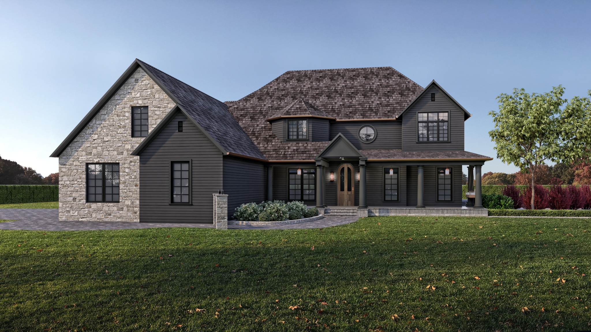
But before we go any further–I have to show you these renderings that nearly made me cry.

Front:

Back/Side:

Incredible right? In the meeting they also shared a 360 degree Sketchup which went into a lot of great detail, but I sadly don’t have that file to share with you. I loved hearing about the process. They went through several variations of our exterior–mentioning they took it very simplified and then decided to bring it back to where we ended up–and we were blown away at the thoughtfulness and detail. It feels like us.

I would love to walk you through some of the highlights from each angle, because even though it’s our house–there were some things that I didn’t even realize were huge changes.

• On the front, the first thing I noticed was that beautiful round window, and more specifically that tiny, odd window was gone–but it took me a few looks to realize the layered gable was gone on the right side!! It is not seen at all on the inside, and it really simplifies the exterior.

• Instead of the layered gable, they straightened out a front portion (connecting Faye’s room and our master bathroom) and added a round window there. That will be centered in our entry inside. I love that charming detail.

• Faye’s arched window was squared off and I couldn’t tell you how happy this makes me. It was something I mentioned to Chris was on my wish list just last week (a little late to bring in to the Studio McGee team) because it’s a challenge to dress inside.

• The window on the top far right (our master bathroom) is expanded. This will definitely impact our plans, but we’re excited about it! We are still doing some measuring to make sure the transom windows will work (our ceiling is not quite tall enough currently, but hopefully our contractor can figure it out because I love the drama.)

• The extra winged trim around the roofline is removed and streamlined.

• The porch’s barrel vault got streamlined!

• A few sentimental touches–the hanging gas lanterns on the porch (I’ll touch on those in a minute) and our front door that was actually on the back of our house when we first moved in and we’ve been hanging onto it ever since! I also am comforted to see the columns still in place and just painted the same color as the rest of the house. I think they keep it feeling a little different and dramatic and moody and still like the house we fell for.

The side of our house has always been my least favorite, mainly because of the garage area–and they completely remedied that! During our presentation I just kept coming back to that garage and saying it was my favorite part, mostly because it’s currently my least favorite part now. Here are a few highlights from this angle (some you can’t see but were shown during the presentation in 360 degree sketch up.)

• The extra overhang + pillars are gone from the garage. This wasn’t even a structural change–just a rip off. And I’m left wondering–why have we left it there this long. It looks so much better!

• They talked a lot about grouping the stone areas so they made more sense and looked more natural. So there are only two areas of stone that follow cut lines on the house. The front, far left that wraps around the garage. And the arch window area to highlight it.

• The arched shape of the garages will remain the same (and help save money!) but we’ll be getting new doors (see the gorgeous ones they selected in the design board below). Above each door is a gooseneck sconce. There will be a flat panel side garage door and our side entrance door (where we and all of our friends and family enter) will be a dutch door with the same copper gooseneck light.

• The siding will be mitered for a seamless, high-end look but they also brought in paneling around the breakfast nook and dining room.

• A simple X railing (that matches the design of our fence!) will surround our balcony and replace the railing on the side entrance. For safety, there will be glass or mesh backing.

• A trellis for greenery on the balcony.

• Expanding the size of the window on the side of the house. This is the girls’ bathroom that we’re not ready to renovate yet, but do think we can still expand the window size without too much trouble inside.

• One of my favorite details you can barely see in the rendering above is the terracotta chimney pots mounted on top of our chimney. They are so unique and will add so much character. Not to be sidelined by the copper gutters–be still my heart.


We also received this design board with a lot more details:

• We’ll be replacing our roof with a cedar shake composite roof from Brava Roof Tile.

• We’ll be reusing and restoring the door that was on the back of our house as our front door (stained in a medium oak color).

• For our anniversary last year, we went to New Orleans where Chris served a mission for our church for two years when he was younger. We loved all the gas lanterns on every house and business and the gas lanterns for the front porch area they chose come from New Orleans! It was kismet.

• We have several colors to try on the siding but we are shooting for one that’s a little lighter than the black windows.

What’s next?

Our contractors are ready to move so all the materials and finishes are being ordered and and we’re hoping they can start on some of the big structural changes immediately, mainly taking out the layered gables and adding that straight part and removing the garage overhang.

We’re over the moon with the work that Studio McGee did. The details are so perfect! They mentioned it is not offensive or out of the ordinary to ask for edits but we really couldn’t think of ONE thing that we would change!!! Can’t wait to take you along for the ride as it comes to fruition.

Leave a Reply

Your email address will not be published. Required fields are marked *

This site uses Akismet to reduce spam. Learn how your comment data is processed.

What do you think?

  1. Julie says:

    Wow…breathtaking. You made me dream !
    May i ask…can we see the floor plan of your home ? I might be so helpful to enjoy the visit :)
    Thank you for all the inspiration !

  2. Barbara Fortunato says:

    Wow!!! Gorgeous!!
    Just wondering about the roofline that had to change under Greta’s (?) window that was flat and moldy? How is that going to look now?

  3. Preston says:

    I approve of these designs. Tell Shey I said it’s a go!

  4. Pamela Mountjoy says:

    OMG I’m so excited for you guys!!! Studio McGee can do no wrong. I love when two of my favorite designers come together. I can’t wait for all the videos!!! Simply stunning.????????????

  5. Rachel says:

    Friggen stunning!!!

  6. Em says:

    Excited to see this come to life. I love the copper gutters! I’ve always wondered, can copper gutters be treated to retain the copper color? Or do you plan to let them patina over time? Either way will look great!

  7. Lisa says:

    I love this and can’t wait to see it at the end! Only question- why did they take out the barrel entry? It ties in so well with the front door and the arches in the house!

  8. Skye says:

    We recently bought a house with rock and stucco as exterior and I’m anxious to update it as well. Would you be willing to share an estimated amount in cost for removing exterior and replacing it? I know it varies a lot depending on size and what we choose for exterior but I’m wondering a price range? Thank you! Love following your process and love your style!!

  9. Tracie says:

    It is amazing! I can not wait for the ride!!

  10. Jeannine520 says:

    Wow!!! It’s perfect! I didn’t think such a dramatic transformation was possible. Really beautiful. I can’t wait to see the plans coming to life.

    • Rosemary Bedosky says:

      If you’ve ever been to an area where they are building new homes, you’ll see that a certain model can be styled on the outside to look so many different ways. It’s amazing. Add gable, add some stone, put a portico on etc. I think that’s why I never wanted to build my own home!

  11. Heather says:

    My house was just painted SW iron ore, and we have our Rejuvenation Carson copper lights ready to hang. I had it planned since 2017!! It is a beautiful combination.

  12. Jess says:

    So excited to see this take shape! It’s going to be beautiful. I actually read through allllll these comments and didn’t see this asked… On your giant arched window, on the dividing pieces – are those going to be little strips of stone? It looks great but I couldn’t quite tell if that was what I was seeing there! With love from that window’s biggest fan! :)

  13. Angela says:

    It looks wonderful! Can’t wait to follow along as the vision is carried out.
    I am wondering… rather, I am curious about the dark exterior colors. I live in Monterrey (MX) and dark paint outside gets washed out and faded pretty quickly, so the upkeep is a nightmare. Won’t this be an issue for you?

  14. Nicole says:

    So exciting! It is the best feeling when something is presented to you and it is love at first site :) There are a few things I would personally change (like squaring off the columns, the round ones feel really out of place), but it is your house and so glad you are happy! Can’t wait to see the rendering come to life :)

  15. Linda says:

    Love it! I am a little sad that the arched window (Greta’s room?) in the front is gone. That arch is so cute and gives a little hint of the arches to come once you step inside. I remember seeing a photo of her (or one of the girls) looking out that window and I thought if it had a railing it would be the perfect Juliet balcony. Can’t wait to go along for the ride.

    • Nerida says:

      I agree. Love absolutely everything else but loosing that little arch – it’s charming (especially in the bedroom looking out). Love the colour scheme, the stone. Squeeee can’t wait to see it come to life!

      • Christian says:

        I think losing the arch on the from window was a great idea, but I think keeping the barrel vaulted front entrance would have been nicer as it plays off all the arches everywhere else! The flat roof over the arched front door looks funny.

      • I completely agree – the barrel vault is dramatic and special and so harmonious with the front door you will be installing.

  16. Lauren says:

    I love it and feel so validated to see my previous comment about only having stone on the garage portion in the front come to life! This is going to be beautiful!!

  17. Abby says:

    It’s no surprise Studio McGee knocked it out of the park! I can’t wait to see the transformation unfold!!!

  18. Valerie says:

    Looks beautiful!! The garage is a huge improvement. Studio McGee always knocks it out of the park. The only thing I’m confused about is the stone columns by the walkway?!? I thought it was a stone mailbox at first, but maybe it’s just that angle? It’s fun to watch the transformation!!

  19. Kathleen says:

    This looks amazing. I really like their suggestions and all of the little details that come through to create a cohesive design. I cannot wait to watch the plan come to fruition!

  20. KC says:

    Soooo good! I love it! Do you expect that the gutters will oxidize to a green? This is what scared us off when we redid our gutters last year.

    • Chris says:

      Idaho’s climate typically causes more dark/black/brown patina. The green oxidation is caused by salty or acidic exposure from coastal weather or heavily-populated areas (pollution causing more acidic rain). But we’ll definitely keep y’all updated on how things go!

  21. Marina says:

    Oh I love this so much! I am seeing a lot of comments about having the stone on both sides for more symmetry, doing tapered columns, changing Faye’s room..and I think if you wanted your house to look like a standard McMansion in a housing development where all the houses look the same, sure. But to me those details are what make your home unique and charming, and are true to the English cottage feel you are going for. I love the little stone columns and front gate – it totally gives me Kate Winslet’s house in The Holiday vibes!! The stone definitely feels more historic this way. It’s all perfect. Can’t wait to see it come together!

  22. JL says:

    Julia, this is SO GOOD! I love the changes to the front exterior roofline and windows. The limestone is a huge improvement over the old stone and offers such a beautiful contrast to the dark siding. I can imagine the dark color in true sunlight or the light reflecting off the snow. All in all, the only suggestion I have would be to widen, raise and straighten the path to your front door. Adding stairs at the end of a wider pathway flanked by the stone columns, topped with large copper gas lanterns would really elevate the walkway. I can’t tell by the rendering, will you add copper sconces between each of the dining room doors across the back as well?

  23. JoJo says:

    Wow ! Studio McGee is my very favorite. They can do no wrong. Great call and how lucky you are to be able to afford the BEST!

  24. Sheena says:

    This transformation will be amazing. Random question – In the rendering produced by Studio McGee, they remove the large tree in your front garden. Do you plan to do that? If so, why?

  25. Julie Rossman says:

    It’s beautiful and makes a statement. A big element you didn’t mention is the removal of the roof returns. It will be a lot of work for the contractor but will make a huge difference in the streamlined look you are going for.

  26. Kristen says:

    It looks so gorgeous! Reminds me of a beautiful winery in Niagara, Canada.

  27. Emma k says:

    First of all, this is gorgeous, I 100% love your moody vision and I think it’s classic and timeless. I know nothing about roofs or interior design but I am an artist so I do know something about colors so I wanted to offer up my opinion. I think that the roof and the house color are not different enough to be striking, or similar enough to be monotone, but kind of blend into one similar but not quite intentional tone. Almost like if it were black and white you couldn’t see any difference. I mocked up a warmer color roof with more contrast in Facetune (lol) and I wanted to attach it just to show you what I meant. I think it should be more contrast by being warmer (as compared to the cool tone house paint) or more contrast by being darker. Here’s both https://imgur.com/a/khmX80N https://imgur.com/a/23CHU5t

    • Julia says:

      Remember, this is just a rendering. In real life, the roof will be warmer. It’s a deep, dark brown-black.

    • Megan says:

      Love your first edit! The colors threw me way off too for a presentation. It almost loses character with everything so dark. The stone not being mirrored anywhere else I can get over but the color really had me going hmmmm. Love everything else though!

  28. Kelsey says:

    Looks gorgeous! Love it all. The only thing is I love the barrel entry with the arched door, so they have the same lines.

    • Kathryn says:

      First off- I want to say this plan for the house is absolutely amazing and I think you guys make the perfect team. I think the colors will look stunning on your gorgeous property.

      I agree with the comment above- I have been so excited to see that door go in and I actually miss the barrel entry way to match. I wish they planned to set just the doorway area on the porch out a foot or so forward so you could stone just that doorway, the beautiful barrel door with barrel ceiling and maybe some stained wood lap under? It actually is an ode to the back of the house where the door looked amazing with stone !

      • Sarah says:

        Same as the two above, only miss the barrel entry! Everything else looks so amazing!! ✨

  29. Coco says:

    Wow wow wow!!!! The renderings are SOOO beautiful! I can’t wait to watch this slowly come to life. What a dream for you and your family. It’s going to be incredible!

  30. Julie says:

    I was curious if you had considered squaring Faye’s gable so it’s easier to place furniture in her room at all? I love it all so much! CLJ x McGee & Co… I’m so here for it!

  31. Emily says:

    I bought a 1932 built house that had stucco. The stucco was cracking all over the place and I wanted to prevent future issues. So I had my siding redone last year, stucco removed, and replaced with fiber cement board and batten. When my contractor removed the stucco we found extensive rot everywhere. It was so bad one section of the house was basically floating on completely rotten framing. So scary. But now I know the house is solid and safe. Also, I painted it SW Iron Ore and it is the most amazing black color. I love it. I have white windows and trim so I can totally understand why you would want a black that is lighter than your black windows.
    It all looks amazing! I love that they removed the “bird boxes” from your eaves. Such a wonderful more streamlined look. Can’t wait to watch the progress.

  32. Denise says:

    Be sure to ask if this roofing material is walkable in case you ever need to go up there (ie, Xmas lights)

  33. Alyson says:

    It looks so good!! And I love how the more you zoom in, and the more details you see in the design board, the better it gets!! The one and only thing I wonder about is why get rid of the barrel vault above the front door? It seems like such a unique design element and would relate to the arched front door and all the other arches in your house.

  34. Stephanie says:

    This was such an interesting post and I learned so much! For example, I never realized the difference between mitered siding corners and not. I am sitting on my back porch “needing” mitered corners when I previously never even noticed that option (ours have trim boards at the corners) : ) . I also love the clay chimney pot detail and I wondered if you had a true masonry fireplace or inserts. I just recently learned you can’t use a clay chimney pot with an insert fireplace and having built a house I was bummed I didn’t know that. There is so much detail to consider and that’s why it pays to hire the experts for sure!! Can’t wait to see this come to life. It’s amazing what “small” exterior changes can mean for a house.

  35. Kristie says:

    It’s as amazing as I expected! I’ve been waiting for this post since the second you announced Studio McGee was designing your exterior project! Love your choice of dark and moody colors as well! So excited for you guys!

  36. Mel says:

    I’ve been looking forward to this reveal but am surprised by the look that you’ve chosen. Having stone only on the garage (except for another area on the back of the house) and also having it such a different color from the siding makes the front exterior feel unbalanced in my opinion. I’d be interested to hear you talk about balance and how you feel like it’s achieved in the design.

    • Julia says:

      It’s a much more historic approach.

      • Mel says:

        Thanks for your response—I hadn’t considered that. Our last home was a Cape Cod from the 1930s, which was almost all stone and then with an addition done in siding. Other homes in our area were a similar combo of stone with siding on the additions, so I can now see that yours is a similar look but reversed.

      • Jenna says:

        I like the look, but I don’t really understand what this means – ‘historic’ meaning true to the 1990s, when the house was built? Or ‘historic’ meaning that traditional tudor pre-war houses had stone on the one side only?

  37. Ashley says:

    So excited for you and can’t wait to follow along! So dreamy

  38. SheLikesToTravel says:

    What I like about the plan is the brick is used more sparingly — and when used it is more cohesive. It makes me think of a home that has some age to it… where parts have been added on over time. I also like the design has simplified some details allowing others to really stand out.

  39. Rachel says:

    Yes, I am blown away! And I can’t wait to follow along this amazing transformation. It’s going to be a fun one to watch! CLJ and Studio Mcgee, what a pair!

  40. Tim A. says:

    Everything looks super awesome. Great job to you and Studio McGee. Have you considered square post columns that are wood stained for the front porch, in lieu of the round columns? The round columns always seemed odd to me and not congruent with your style (and remind me of what used to be in your music room). Adding a wood element to the porch would play well with the wood front door. It would also make it so everything isn’t black in the porch. Just a thought!

    Also, small thing, I love how they de-emphasized Faye’s room, by lowering the height of the window. That was definitely the right thing to do. However, it feel just a little squatty? Adding just 12” to the wall height here before the roof line starts I think would balance this out better and make it look intentional. But maybe it’s just me.

    • Jalene says:

      I also thought that part looked squatty. I mentioned it in another comment. I wondered if this part could be tweaked a bit.

      • Steph says:

        I feel the same way. Would it be possible to make Faye’s room window and gable mimic the right side, which I think is the master bath? Would appear more balanced but would like cost more to do.

      • Jenna says:

        It would look amazing raised to the same height as the other gable, IMO. I have zero idea whether that is cost-prohibitive, though.

  41. Alesha says:

    I think the best part of this blog post is reading the comments of all the people who think they know how to better design your house. Studio McGee did a great job of bringing your vision to life and if y’all love it then that is all that matters! It’s stunning and I can’t wait to see it come to life!

    • Em says:

      I think it’s always best to assume best intentions from people! Every comment has been positive, and there’s nothing wrong with commenters sharing ideas – it’s important for the CLJ blog to have an engaged and participatory readership.

  42. Amanda says:

    It looks sososo good! I love how moody it is. I’m in love with the terra-cotta chimney pots and can’t wait to see the copper accents and more on the gas lanterns! The only thing I don’t love is the columns, I understand not wanting to look farmhouse though

  43. Kristen says:

    Oof, man. LOVE. Is it odd that I extra, extra love that back/side view? I think the paneling around the breakfast nook and dining room is totally inspired. I actually would love to see a touch of that on the front – maybe on Faye’s princess turret? But that’s literally just me grasping for something to suggest hahahaha. Overall really love how they streamlined so much. This feels like how the house should have been built, you know? And contrary to other commenters, I reeeeeaaally like hiding the barrel arch from the front. Cannot wait to see it all come to life!!

    • Kristen says:

      Also also, the color! I know it’s probably not the exact final selection, but I just love the “is it gray, black, green??” color. Feels so complementary to tones inside your home. Yay!

  44. Mel says:

    Gorgeous! We just painted our house Iron Ore and it’s perfect white black windows. Cannot wait to see it all come together!

  45. Jordianne Balan says:

    Wow! This will be an amazing journey to watch. Really excited for you guys and love seeing the transformation. Is the window being removed from the bottom floor (front of house near the girl’s office), part of the garage?

    • Janet says:

      Yes I was very curious about where that window went! I thought it might just be something that was missed but Studio McGee x CLJ is so good with details!

      On another note, the birch trees in the front will be amazing with that colour of siding!!!

      • Jordianne Balan says:

        Yeah!! The landscaping will look so amazing with the new exterior. The renderings show wonderful details when you zoom in, but it will look even better when it’s finished.

  46. monica says:

    Wow – what a wonderful improvement! Removing the arched upper story window and disguising the arch of the barrel ceiling has helped quite a bit in toning down the mcmansion aspect of this home! About the only out of place thing left is the turret – but I gather that you love that part of the house…Also – Love the roofing!

  47. Danielle Merrick says:

    This was so fun to read! We bought a house at the same time as you last year so we’ve had lots of similar things going on. Our home is historic and very English manor/cottage. I kid you not- last week I ordered the exact same gooseneck lights for over our garage along with some solid copper ones for our front entry and we are currently updating all of our gutters to copper (some already are and it was originally all copper so we’re just keeping in tradition with the original design) as well as adding chimney pots to all 3 of our chimneys. We also have stone and siding! However ours is white and will likely stay in that family. But it’s so fun to see how people can interpret that updated cozy English cottage look and make it work for their own home and tastes!

  48. Brittany says:

    It’s going to look INCREDIBLE!!

  49. Jesseca says:

    So exciting! I love all of the material choices and simplifications.

  50. Sue says:

    I’m sad to see the barrel vault gone on the porch. I thought it was a beautiful way to introduce that amazing door and to speak to the lovely arches you have going on inside.

  51. Amy says:

    They did a great job! I’ve always loved a barrel roof/ceiling on a porch though….:).

  52. Kelly says:

    It’s beautiful! I love the combination of dark siding and lighter stone. We are remodeling our house (basically building new) and also doing a dark exterior (James Hardie Iron Grey) with black windows. I had considered doing copper gutters as well, but I think the price point will be out of our budget. Maybe we could just do them along the front of the house visible to the street? I can’t wait to see progress pics and the finished project!

  53. Stephanie says:

    WOW. This looks so amazing! At first glance on my phone I was underwhelmed, so I had to hop on to my computer, but now that I see it in all it’s glory on the big screen, I am blown away! The simple changes make such a difference and I can’t wait to see it all come together!! I know this is just a rendering, but a lot of the large trees are missing around the front entry and back patio. Will they be removed or are you keeping most of the existing landscaping?

  54. Molly says:

    This looks AMAZING! I cannot wait to watch it – they captured everything perfectly!

    • Lisa says:

      I like it! I miss the barrel arch on the front, seems like it would make your front door even more fabulous if you saw the arch from the front to match. I’m sure you had a reason for changing it, just adding my 2 cents! Can’t wait to see the progress!

  55. It’s so good! This is why sometimes hiring a designer is the best move- they can add all the small touches with a good bird’s eye view of the entire project.

  56. Ramsi says:

    Such a beautiful design that really echoes the thoughtful choices y’all have made on the interior! Love it!

  57. Amber says:

    Looks amazing!! I can’t wait to see it come to life. Will the brava composite shakes be more pricey in the end than real wood shakes?

    • Julia says:

      They are a little more expensive but last forever and you don’t need to worry about fire hazards or insurance spiking!

      • Brittany says:

        Looks great! I was wondering how those singles might affect your insurance. We’re in a high fire danger area and shake shingles are a no-go for insurance companies.

    • Lindsay says:

      The plantings are all different? Are they designing the landscape too?

      • Julia says:

        No, they just plugged in what they had. This is just a rendering–they are not designing the landscaping.

  58. Lindsey says:

    Are you guys planning on landscaping similar to what they did in design on the back of the house or do that down the road? Looks great!

  59. Kate says:

    Thanks so much for sharing! How exciting!
    Just wondered: Will the fence that goes through your property remain white?

  60. Shirley says:

    Woooooooow, wow, wow.
    Can’t wait to follow along!! Great job Studio McGee!

  61. So excited for this! It’s going to be so gorgeous! I’d love to get a better sense of what’s going on inside where you’ll be reconfiguring the double gable — will it look any different from the inside?

  62. Ariel says:

    I LOVE it. Many people are afraid of dark houses because frankly they haven’t seen enough of them. It’s a more common look in New England and having seen tons of homes with a moody take like this, I think you’re doing the right thing! This fits perfectly with your inspiration images and will look amazing (and unique) in all 4 seasons.

    • Erin says:

      I guess I am one of those people! I wonder if th this is a trend, and in a decade people will be sorry to have such dark, gloomy houses. Sometimes when things are dated, they still have a certain charm. I guess I just don’t see how dark grey can be charming. I remember when my niece was 4. Her mom painted her toenails black. My niece was dumbfounded. She said, “Of all the pretty colours, you picked black??” Neither my sister or I have painted our nails black since then! The design and windows and stone are beautiful and so classy.

      • Julia says:

        It’s honestly such a personal preference. If you’ve followed us for any amount of time, you know we’re suckers for dark and moody spaces–dating back over a decade. You just might be someone that doesn’t care for it–and that’s fine!

      • S says:

        Dark homes are amazing – on so many levels. Can look great no matter the style or lighting. And trees, plants – landscaping looks amazing

        White or light colored homes in bright light are so awful to my eye. Ok if in filtered light and best if architecturally significant with filtered light

      • Molly H. says:

        It’s actually very historical- Louisa May Alcott’s home in New England is a perfect example of a beautiful moody home. If you’ watch the film Little Women it may help you envision it? Especially in Idaho where the snow is plentiful, I legitimately can not WAIT to see this place lit up with Christmas!!!

  63. Catie says:

    I’m curious about the unseen right side of the house now! More windows for the office? How about the upstairs?
    This vision absolutely makes this house grow up from its ’90s roots. What progress!

    • Julia says:

      That side of the house is mostly unseen so we can add windows as we please. That covers the side of our bathroom and office and we’re not quite ready to renovate our office yet.

  64. April says:

    Exciting! But way too dark- not enough contrast for me and all the house’s different angles get lost in the dark color. But to each their own. The outside doesn’t match the inside style.

  65. Jacqueline says:

    Holy wow. I am over the moon for the copper gutters and dark and moody color scheme. So much so that the gutters are on my wish list for my next home. The stone accented areas and gorgeous backyard area you guys have planned will soften things up beautifully. The addition of the small round window and streamlining the front of the house straight across made such a difference! I also love how you’re honoring the original home by repurposing a door!

    Does Studio McGee offer these kind of design services to any regular ole Jane? Please continue to share progress details with us.

  66. Gabrielle says:

    Stunning. Can’t wait to see it it come to life! I only question streamlining the barrel ceiling over the front door. Looks a little squished in the rendering now and loved the drama of the original. Plus the curved shape mirrored the giant back window in your living room.

    • Jacqueline says:

      Now that I’m looking more closely – yes! This is one revision I’d made. Bring back the barrel vault hidden under that arch piece so that when people walk under, to the front door they are wow’ed by the vault above. Can you imagine if you did a similar copper like the gutters to the barrel vault?! ????

  67. Hollie says:

    Love it so so much! Studio McGee really took the time for the little details that make it chrislovesjulia!

    Do you think you will take out your elevated stone back deck like the rendering shows?

  68. Dana says:

    Beautiful!! I can’t wait to see how it turns out. I LOVE the copper details…especially the gutter! I don’t think I’ve ever seen this before. Will those eventually turn green over time?

  69. Samantha says:

    Ahhh! I mean, what’s not to love. It’s amazing and so well thought out and looks perfect for you. My eye misses the arch above the doorway, but the changes to the roofline… so much better. I hope you guys love it, it’s going to flow so well with your interior.

  70. Kelly says:

    I love this! I know you’re probably not soliciting suggestions, but a few commentators have mentioned bringing the stone to the other side of the front elevation. What about changing the existing colonial/greek porch columns (which seem a little out of place anyway) to a tapered craftsman column with a stone base? Just a suggestion :)

    Anyway, I am SO EXCITED for the changes!!!

    • Julia says:

      We actually tried that and it looked too farmhouse

      • Kelly says:

        Oh. Yeah, I could see that. Makes total sense.

      • Jen says:

        Someone posted this rendering of an alternate view with those tapered columns. I love it too! No matter what, this is a gorgeous improvement. https://i.imgur.com/rG6h1EJ.jpg

      • Julia says:

        I don’t like those tapered columns at all–sorry. Way too craftsman.

      • Kelly says:

        Yeah, I’m the OP and I agree with Julia. Now that I see it rendered, the craftsman columns and stone take it into “McManion farmhouse” territory. I’ve totally come around on this column journey, lol.

      • Traci says:

        I love how they changed the other “castle” window. I know you are going for a cottage look but that change would make it look a lot more modern. More of the style that CLJ is known for. Moody, modern and classic

      • Traci says:

        And this new rendering looks more Studio McGee, is this one of their renderings.

      • Julia says:

        I’m sorry–I think that rendering looks basic. Again, I appreciate the effort–but we are VERY happy with our plans and we also know what we want.

      • Brit says:

        I didn’t love the columns (I think because columns on English cottages are not as common), BUTTTT I completely agree you lose the cottage feel and move towards farmhouse by changing the columns and Faye’s room. I think the updated Studio McGee rendering of her room is so quint essential cottage while so many other elements take it towards modern! The more I look at it, the more I love all the choices!

      • Charisse says:

        OK, but perhaps square columns? The modern clean look you are going for would ask for square columns, and good sized. I would keep the barrel vault to be seen from the front view. Relates to the circle window and your door and the other curves through out the house in and out. I would agree with the i.imgur rendering and loose the left curved bump out and duplicate the gable that is on the right side on the left. All about balance/symmetry and consistency. Love the dark color and all the stone work!

  71. EP says:

    I really love what they’ve done! They gave you the look you wanted within what seems like a reasonable scope for a facade refresh. I know all along you’ve been wanting to give the house an identity. One thing that stuck out to me were the X railings. I like the look but it doesn’t fit a modern English country house style to me. It makes me think of a southern porch in Charleston (very YHL and less CLJ). Maybe it’s just me though, I’m sure this choice was well researched.

  72. Amanda Piacentino says:

    I love it! I thought I would love it because their interior photos are SO good! Please tell me you know the source for the Dutch door?! I’ve been searching for a Dutch door and that one is perfect.

  73. Lori says:

    Shea and her team did a wonderful job! Can’t wait to see the transformation!

  74. Amber says:

    Beautiful design! Check with your insurance about the cedar shake! My friend just got a quote for hers and it is considered a fire hazard and will cost 4K a year to insure because of that.

  75. Carrie says:

    Gorgeous! Can’t wait to see it all finished!

  76. Mel says:

    I absolutely love all of it Julia!! Studio McGee does it again! If I had to choose a favourite complimentary feature it would be the lighting choices! From the gas lamps to the goose-necked sconces. To. Die. For!

  77. Meg says:

    It looks stunningly beautiful! I’m wondering, will you be losing the small window on the side of the garage making the girls’ playroom windowless?

  78. Sofia says:

    Love everything they chose!!! It’s going to be stunning and is seamless with the style and beautiful character of the inside of your house!!!

  79. Lindsey says:

    I love the colors and some of the changes but I really think if they were going to go all out changing a roof that’s not at the end of its life and splurging on that plus copper gutters and other pricey items, I would have redone the top roof line and the one bump out on the front that is almost faceted. I think that despite the color changes I’m the roof life immediately gives it a bit of a dated, non-custom feel. I think the one designer who said re-do the roof line was spot on. Now I know it was totally expensive but so are the other changes you are doing and I feel like you might as well whole hog with giving it that custom look. In the end all that matters is that you love it and if you do I think it’s awesome. I just think with all the money and time in renovating that additional step would take it from a 90’s house that got an exterior face lift to magazine-worthy. I also agree with a lot of posters that the round window doesn’t work visually. I’m very interested to see the cedar composite. I think it will be beautiful without the traditional downfalls of cedar.

    • Julia says:

      Studio McGee worked within our budget which we greatly appreciate. And while it might seem like–just do it all!!–it’s kind of like buying expensive hardware on Ikea cabinets. Expensive hardware might cost $500, while going “whole hog” on custom cabinetry would be $30K +. So keeping some of what we had original saves a ton of money, but spending money making it look its absolute best is money well spent.

  80. Adria says:

    So beautiful! Perfect match Studio McGee and CLJ. I’m sure budget is consideration. But I can’t help but want to see what it would look like with fayes room mirrored what the master looks like from the outside.

    • Jalene says:

      Same. The kid bedroom jut-out looks kind of squat. The roof lines on the house feel kind of proportionally small compared to garage. I think mirroring the master roof line for the kids bedroom or NOT removing the 2nd tier roofline above the master might give the house better proprtions? Just some thoughts. Overall, there’s a lot to love. I really really love the back and side of the house!!!

      • Jalene says:

        Actually, I’m walking back a bit. I think mirroring the master roofline might give it a farm house look which I know they are trying to avoid. However, I think I would still like to know what it would look like to leave the 2nd tier roofline above the master that was removed. Just give it more of a curve as it comes down to meet the porch roof. I think that would actually make it even less farm looking. BUT, I love the round window.

    • Suzanne Stewart says:

      I agree. That weird little turret doesn’t flow with the rest of the design. It looks very squat and makes the roof seem huge. More symmetry would balance it out.
      I do like the other changes although I am definitely not a moody & dark kinda girl myself. And I agree with Julia that the garage side change is fab as is the rear elevation with the balcony over the dining room.

  81. Katy says:

    Slow clap for Studio McGee. It was so the right move to bring in the big guns here. They changed things that I would never have even thought of (that round window! Straightening the awkward gables!) Bravo!

  82. Darby says:

    I honestly think you two lovebirds should break up some of the darker colour on the exterior. Especially the front of the house. Maybe add some light trim to bring out the lovely rock work on the left. In my opinion I find it a little dark for your personalities. Other than that it is BEAUTIFUL!

  83. Debbie Ricks says:

    Wow!!! Thank you for sharing this with us!! Question… what area is the window that you will losing? On the front elevation on the original stone part? It’s not on the rendering and I don’t think you mentioned it. It looks soooo… good overall. I can’t wait to see how the front porch area looks completed. It’s the only area that I am not loving… it’s the columns, and the overhang… BUT it’s not my house!!! I can’t believe ya’ll it’s hasn’t even been a year that ya’ll have been in this house!!! It looks so stunning with all of the changes!!

    • Julia says:

      The little window is in the entry so the ripping window will also be in the entry. I’m so happy to keep the columns! I think it keeps from going too farmhouse

      • Debbie Ricks says:

        Whoops… I meant the window on the part sticking out(not the gable, forgot that was stone…) in the original stone part… near the corner where the birch trees are located. On the side facing the sidewalk… Have I said I can’t wait to see this transformation!?!??!?!??!?! It’s gonna look soooo good!!!

      • Julia says:

        Oh!!! That’s a third window in our garage that we could take or leave. Still deciding!

  84. Tamsen says:

    It’s absolutely gorgeous! The only thing that surprised me is the rounded room on the front upstairs. It doesn’t seem to fit with all the other clean lines. I wonder why that wasn’t also streamlined like the other peaks?

  85. Brittney says:

    Stunning!!! I’m in love with black homes!

  86. Jo says:

    It looks stunning, so many great solutions! I am curious about the round window and the fix to the roofline between bathroom and Faye’s bedroom, how will that affect the inside?

  87. Hannah B. says:

    I love the stone placement! It makes a lot of sense to pair the stone with the two prominent gable roofs of the house. I’m curious – does Studio MeGree provide the architectural and structural drawings for the framing revisions?

  88. Leslie says:

    This looks so, so good! Can’t wait to see it come to life! I love that some of the changes are huge once you pointed them out, but don’t feel huge in the renderings (meant to be). Studio McGee was a great match for CLJ. :)

  89. Heather says:

    Just beautiful!! My favorite detail are the copper gutters paired with the dark exterior color. ????

  90. Sarah says:

    I think it was the right call to have a design team work on the outside and what a team to have. They totally nailed the combo of streamlining but also giving it character. I love the quirkiness of the round window and how it kind of marries the arches you have going on mainly on the inside. And I love the idea of the copper pots. I’ve never heard of that but sounds so beautiful! and finally, I love that some stone was kept. It stays true to the house, to the cottage feel and feels completely in place with its surrounding Environment. Way to go!!!!

  91. Crystal says:

    Beautiful. The post was kinda hard to follow for a non-designer like me. I don’t know what many of the terms were! Ugh. But I’m sure I will learn as the work begins. Excited.

  92. Aimee says:

    What a transformation your home is having. It is amazing! While I love the exterior materials, my first reactiin was that it looks soooo dark. There is very little contrast at certain parts, which I guess might be intentional, but at first glance, it looks like a very dark unit (with the exception of the lighter stone). I can’t “read” the different parts of the house because they are all so dark. I just wonder if that’s really what you guys are after, especially since this dark look is really a trend, and the facade of your home will last long after this trend is gone. There are sone exterior parts (ie. The Entry) which could be better highlighted vs. Looking like a dark cave. I am interested to see how it all turna out. Thank you so much foe sharing this with all of us!

    • Julia says:

      We made a Pinterest board of inspiration for them to go off of and absolutely wanted a dark house. It won’t be black (like our beloved cabin that we loved) but a few shades lighter. I think it will feel very classic.

      • Diane says:

        I also think the nature of renderings is that it can be tough to read dimension in colors like these. I think it will be beautiful. Reminds me a little of the materials Amber Interiors chose for her house. Very different house, but similar contrasting materials.

  93. It is absolutely stunning!!

  94. Missy says:

    Didn’t really feel “WOWED” I think it’s too dark. You’re home is beautiful and you have done such an amazing job, I wish you would have designed the exterior yourselves.

    • Lynn says:

      I agree, I love the structural changes, garage area and hardware. But I think its too dark, I somehow low the look right now, because its lighter. Especially with the dark windows.
      And the gate too the front door is kinda weird, because there is no fence.

      • Kim says:

        This is my impression too. I’m sure it will appear far better IRL and you gotta do what makes you happy. I would love to see a lighter alternative just out of curiosity.

      • Kristen says:

        I agree with Lynn about the gate to the front door. That’s a personal pet peeve of mine, when I see something that is TOTALLY form and not function. Like, you could just walk right around the gate haha. I think that’s a very McMansion addition to a design that’s removing a lot of that. If they did that dark gate somehow in their existing fence, that would be beautiful and make sense.

        BUT I like the dark and think anyone who is surprised by it must not follow CLJ very closely. They’ve been totally transparent about their plans to go dark outside!

    • Missy Doesn't Get It says:

      *YOUR home not “you’re” home. Read more. And dark exterior will look beautiful againts all those greenery btw.

      • Holly says:

        Absolutely love the side of the house and the three garage doors area! All that stone is beautiful! The front is too dark for my taste but I know it’s totally you guys and in real life it will look amazing!

    • Sarah says:

      It sounds like Chris & Julia had a pretty strong vision for the exterior, they just looked to Studio McGee to figure out exactly how to execute it. Designing an exterior is HARD and this one is particularly challenging given how all the different roof lines, layered gables, etc. work together and play into the interior and the structure of the house. It’s one thing to look at images and find things you like, but it’s another to figure out how to apply it all to your own house in a way that can be executed correctly. I think it was really smart to bring on a design team with the technical and material expertise to help bring Chris & Julia’s vision to life!

  95. Christina says:

    I’m not surprised it looks this good! I love it. I don’t know why, but the Dutch door, copper gooseneck lights, and the copper gutters are my favorite!

  96. Bianca says:

    This is incredible – even better than I expected! I am so excited to watch it come to life. And copper gutters whaaaat!?! I want!!

  97. Ashlee says:

    I love all of it! We painted our house remodel dark last week and I am so happy we did. It’s moody and earthy and makes our city-house nestled in the trees look like we are in the mountains for a short moment. Picking the paint color was so hard. I told my husband, “I want to see what SM/CLJ designs and then let’s choose our color.” Ha! We went ahead and did it of course – ended up using BM paint but paint matched Farrow & Ball Off-Black No. 57 and it is so good. I’m excited to see all this unfold for you all and will definitely be take some tips following along the way!

  98. Ashley says:

    So perfect! And very ChrislovesJulia! I can’t wait to follow along; thank you for sharing your journey with us!

  99. Ali says:

    I am so excited for you guys!!! I feel like the mold must have felt like a huge setback but what a wonderful outcome. Great work McGee & Co!

  100. Julia Lockard says:

    This is amazing!!! So so so beautiful!

  101. Traci says:

    I love how dark and moody it is. I tend to like symmetry so I wish there was stone to the right side of the house as well to tie it in. I really like Shea’s house but I have that same complaint. The stone seems like an afterthought and a bit disjointed with it just on one side and the back. I think they nailed the CLJ color for sure. I miss your dark and moody style and am happy to see that it will be incorporated in your house in a big way.

    • Kathryn says:

      This looks amazing and agree with you on the garage area being such a transformation it’s hard to look away and not be obsessed with it!! Can’t wait to see the finished product!

      I am curious though – the rendering carries the cobble stone pavers to the backyard and the steps from the dining room. Will you be doing this or keeping your flagstone patio and fire pit?

  102. Kelly says:

    Wooooow – I am blown away! It’s absolutely thoughtful and stunning – I’m so excited to see it come to life!

  103. Liz says:

    Love it all! Curious why you decided to replace the roof, it looks to be in good condition?

    • Julia says:

      It’s original, so about 30 years old and that’s when asphalt shingle roofs generally start having problems. We just don’t want to risk it and would rather do it now

    • Ashley B. says:

      OBSESSED!! I was waiting all weekend for this post, and it did NOT disappoint! All the details and the moodiness feels like exactly what you’ve been shooting for. And the copper details? The TRELLIS??!! ???????? Thanks for giving us a peek into what a design from a design team might look like.

  104. Alisa says:

    Beautiful (as expected)! Does the front elevation of the garage gain a Gable end? Annoy wait to follow along!

  105. Jen says:

    I’ve never seen that color of roof in that style before. I’m skeptical of the roof because it’s not my favorite BUT I’m sure it’ll look wonderful when it’s all done. One of the things I love about your blog is sometimes I am not 100% on board and then it’s done and I’m all like YES! :)
    Obsessed with everything else in the design. It’s going to look amazing!

    • Christina says:

      OBSESSED! This looks incredible. When I saw a Studio McGee x CLJ collaboration I knew I was in for a treat, but this is next level. The stone on the arched window for accent is simply stunning. Cannot wait to see this all come together! #housegoals

    • Jenna says:

      It might be the rendering – I’ve never seen cedar shake composite, but cedar shake is warmer/lighter/less contrasty than it appears in that rendering. It’s very pretty in real life (IMO

  106. Jamie says:

    Wow! What a huge transformation! I have a few questions that are hard to tell from the pictures. Do they leave the rock on your current raised flower beds/patio as is and just coordinate it with the rock on the rest of the house? Or is it all changing? Are you leaving most of your landscaping as is? It will be amazing! Im excited to follow along.

  107. Caeli says:

    Absolutely stunning. Studio McGee and YOU are my two favorite designers so you can imagine how giddy I am right now. Just curious…is it appropriate to ask how much a consultation like that would cost?

    • Christina says:

      Seconding this question. I would love to hire a designer in the future and would also love to know how much to be budgeting for that.

      • Susan says:

        This feels way too dark for me. It would make me feel depressed. Especially the dark entrance on the front, like someone else mentioned. I know you have hired talented designers but I’m struggling to catch their vision for this

      • Julia says:

        They actually caught our vision—which is the best part of this design.

      • Ginger says:

        me too! We are getting ready in the very near future to remodel our island home which is set in the woods & only about 1200sqft. I’ve learned so much on bloglovin & everyone who contributes their amazing transformations, especially CLJ! Cost is a factor especially this will be our retirement home & I’d of course love for it to be just right but knowing our past experiences with remodels, well, we all know that we ‘learn from our mistakes’ too! My husband & I have really enjoyed our present remodel, the transformation is remarkable! With our ‘future’ home we are gathering all kinds of ideas, colors etc. so thinking of someone helping me design the interior is a serious thought. So far every project we’ve encounered keeps us very busy! Seems no matter where we live there is always room for improvement & to make it our very own!

  108. Kelly says:

    Wow. This is going to be phenomenal!!

  109. Eva says:

    So gorgeous and totally you guys!!
    Curious though— in their renderings, especially of backyard, it looks like some of the tall trees are removed and the landscape is more open. Will you guys be implementing that? Or do they just not include the trees in their drawings?

  110. Liz says:

    It’s SO GOOD! I’m so excited to see the end result! Thank you for sharing! The only thing that gave me pause is the roof over the front door. It looks like that’s the only place they left the pieces that cut in (is that the “winged trim”)? Just curious why that didn’t get simplified with the rest. Maybe it’s too complicated with leaving the existing columns?

    • Janine Willis says:

      Agree with this comment. Would love to see those winged trim removed to match the other rooflines!

  111. Vanessa says:

    Wow, this is stunning!! So many special and thoughtful touches. I can’t wait to follow along!

    • Kirsten says:

      Could you post the garage sode rendering? The wrong picture is showing up for me. Thanks!

      I can’t wait to see it come to life!

  112. Maggie says:

    This is so exciting!!

all the latest

We believe we should all love where we live.

We’re a couple of homebodies, working to uncover the home our home wants to be. And we’re so happy to have you here. 

HI! We're Chris + Julia

read more

Load More

Reader Faves

SHop all

What We're                     Right Now

What We're                 Right Now

Looking for our favorite things? A place to shop our home room by room, or just catch up on what Julia's wearing / loving right now? Browse the CLJ shop. 

Loving

looking for inspiration? 

A reader recently asked me if I’m starting to fully embrace traditional style and whether we still consider our house to be a “modern Colonial” and why. It was a really great question and so timely — I had really just been thinking about my approach to this home and how my style has changed […]

Can We Send You Our Love Letter?

Another way for us to stay in touch! Joining our weekly newsletter gives you access to exclusive content, never-before-seen photos, your questions answered, and our favorite DIYs. Sign up below!

Follow Along on Instagram

Welcome to our online community where we've posted home, DIY, style, renovations, and family since '09. Renovating our #cljmoderncottage in Idaho and headed for new adventures in Raleigh, NC. #cljfam #cljtransformations

@chrislovesjulia