


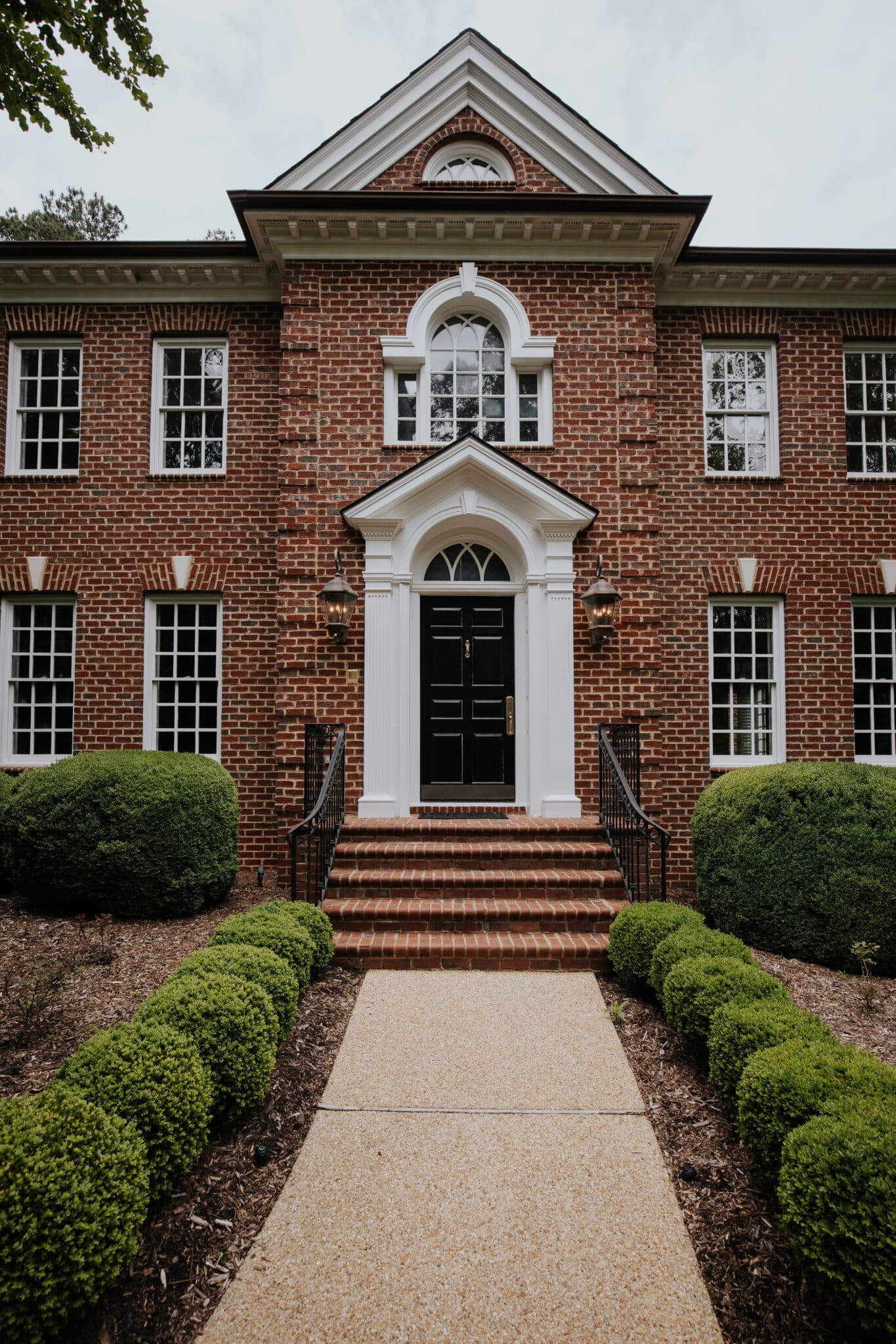
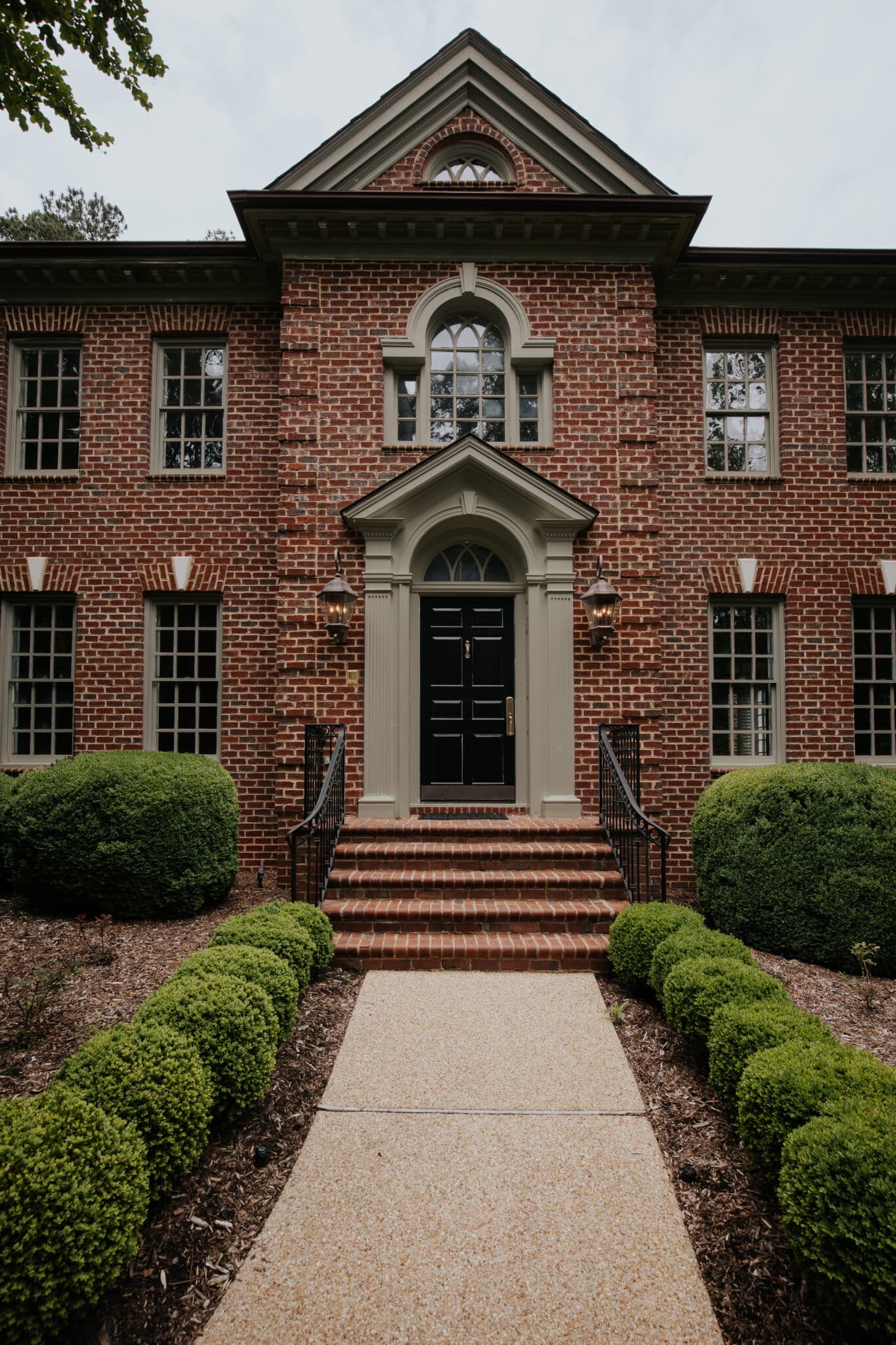
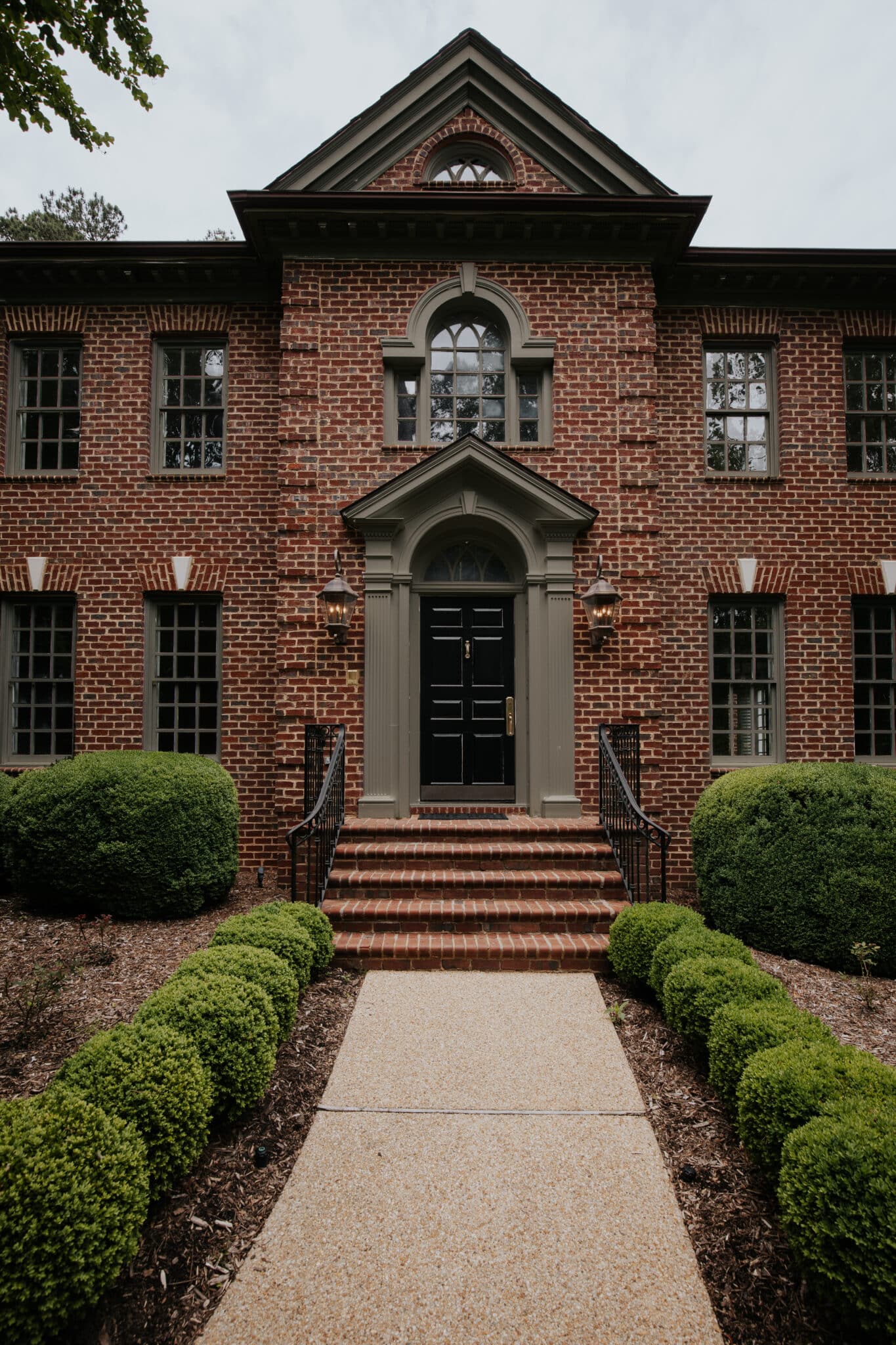
We’ve been making some improvements to the overall curb appeal of our exterior, and so naturally, I’ve been looking more and more at our bright white trim and wondering if we could do better. We’ve made no changes to the exterior of the house, and I find the red brick to be incredibly attractive and timeless. We DO NOT WANT TO PAINT THE BRICK, but it might be fun to update the white trim and window sashes. And SO… I recruited my talented sister Andi to “try on” some exterior paint colors that pair well with red brick!
On our 2023 project list, we talked about possibly replacing all of the windows this year, and I think it’s a go! It’s going to take some time to order the windows and have them made, but we’re starting down that path. The good news is, we had a few pros come and look at the windows and they said we could get away with just replacing the sashes (the window part and grid) instead of the entire window which would save us 10s of thousands of dollars. We went to look at window options and they had an array of colors to choose from, so we thought–let’s go down that road and explore.
One of the most useful things you can do before committing to any paint color is to digitally try it on! There are probably some paint apps that allow you to do this, but Andi usually just opens up Lightroom to tweak the colors. She has a whole tutorial here if you’re interested in learning how to do it. This is more so to get an idea of which color I might want the trim to be, and then I will try to color-match it with a paint deck. First up, we swapped the bright white for a soft ivory.
Soft Ivory
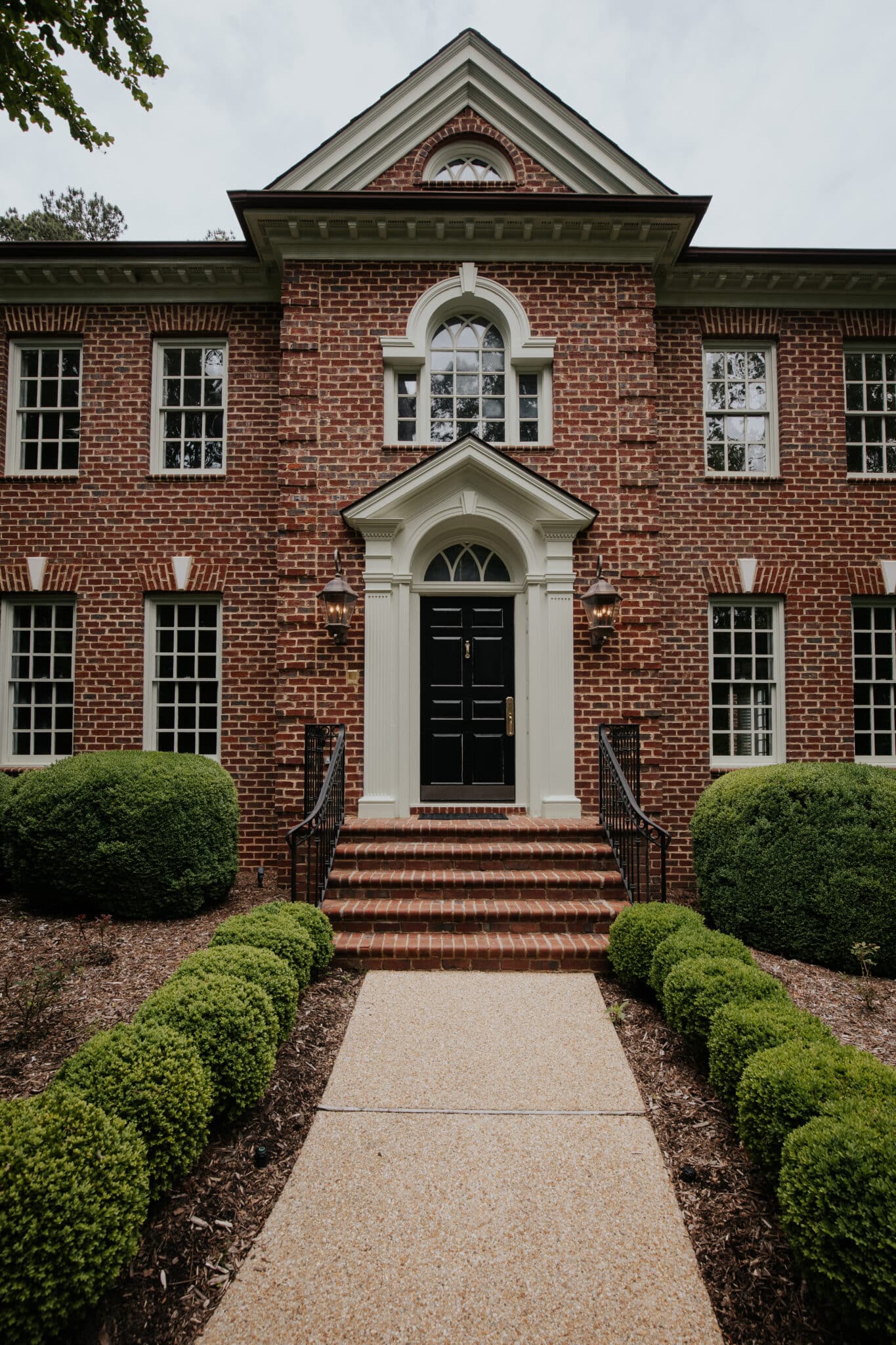
I think that this ivory looks much classic and warm. The white is a little high-contrast when I start comparing it with the other trim options.
Blue-Gray
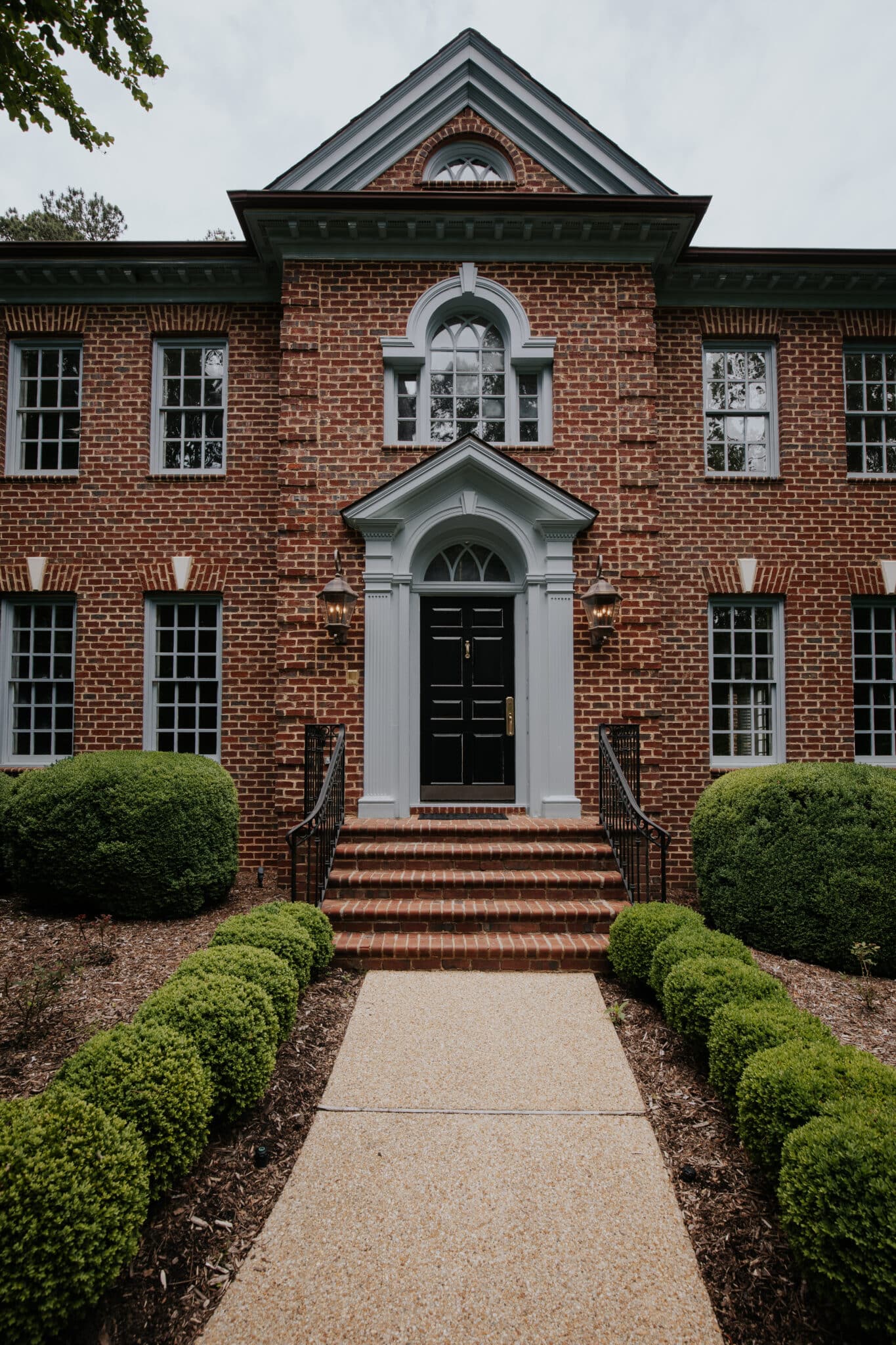
The next option I like is on the cooler side. I’m a big fan of blue-gray paint, and I think it would really complement the red brick beautifully.
Slate Blue
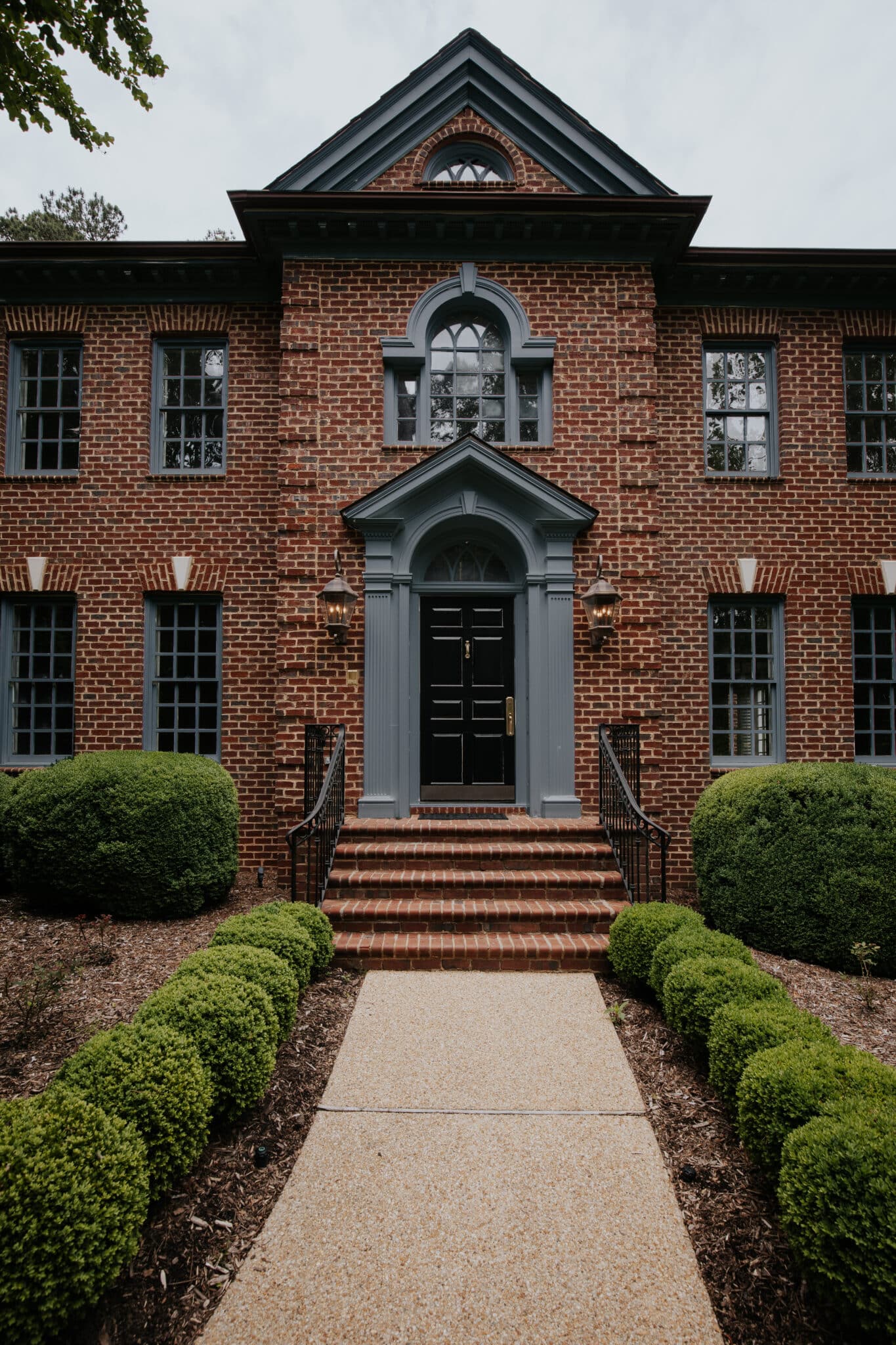
Or we could go with a darker slate blue, which I’m so in love with! There’s just something about that color and tone that excites me so much and feels very on-brand Chris Loves Julia. I guess my fear is that I would be giving away all my secrets before anybody even comes inside ;).
Taupe
Taupe paint colors for a while were considered outdated, but I’m here to tell you they’re back, and for good reason. Obviously, this would coordinate so well with the grout color, and I think it’s proven itself to be rather timeless. My only hesitation is, remember when we first painted the outdoor kitchen a taupe-y color? There were certain times of day that I absolutely hated it, and I’m fearful that this would be the same case.
Mushroom
Taking the taupe color to a darker mushroom might be just the right move. I love how the mushroom color actually goes more to the background and highlights the beautiful red brick! I can totally see myself going with this option!
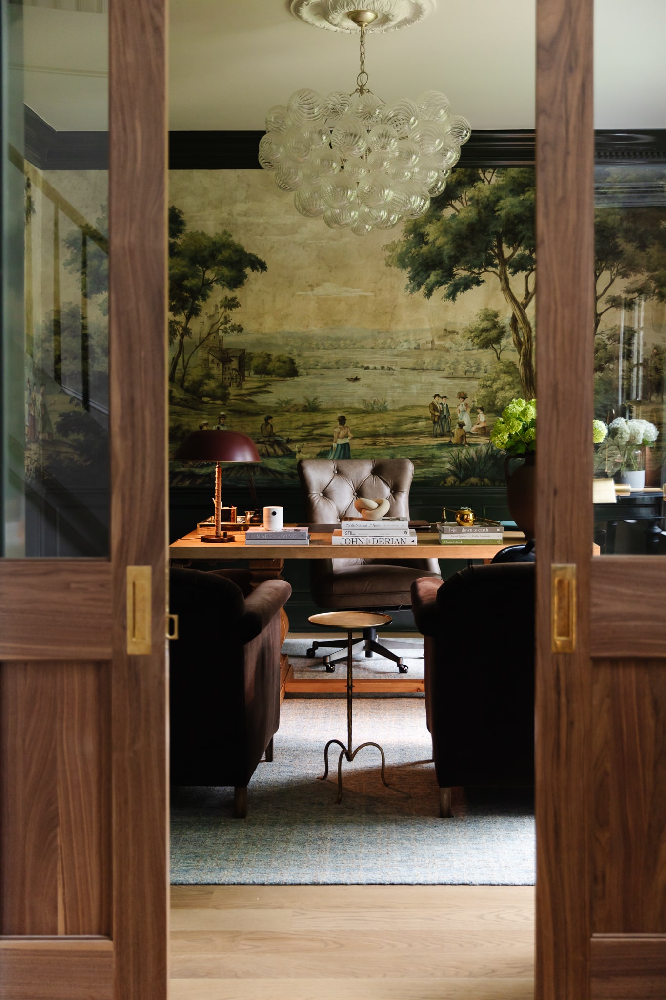
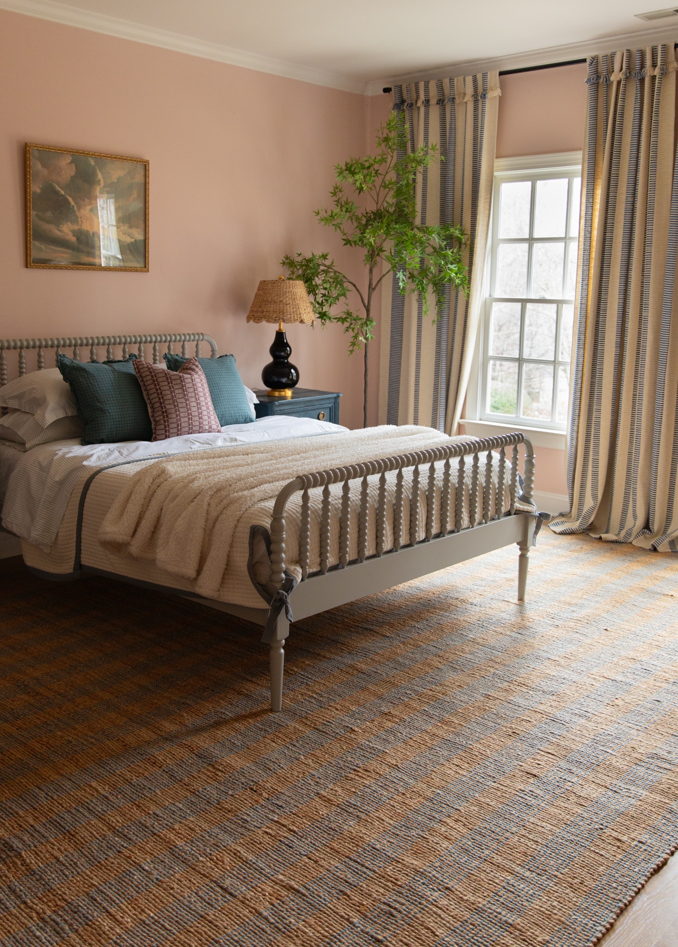
The great news is that only the sashes need replacing, and the trim will be painted to match, which will save us so much money! On the inside of the house, they said that the sashes have to be either white, wood, or black. I’m deciding between wood or black… but leaning more towards black. We’ll see!
Leave a Reply
What do you think?
Semihandmade
Our wood grain Shaker cabinet fronts were designed for busy, high-traffic homes like ours. Clad with durable textured thermofoils, this line is compatible with Sektion, Akurum, Godmorgon, and Besta cabinets from IKEA. It's the perfect, practical way to add the warmth of wood to all the rooms of your home.
Collaborations
learn more

next
Loloi
We have teamed up with Loloi to create a line of rugs that are as affordable as they are beautiful. This collection houses a great mix of traditional and modern rugs, in cottage-y colorways, as well as vintage-inspired beauties that you’ll want to roll out in every room.
Collaborations
learn more

next
STUGA
We partnered with Stuga on a line of hardwood floors — The Ingrid is really livable, and the color is very neutral. It doesn’t lean warm or cool, it’s that just right in-between. We have really loved putting it everywhere in our house. It’s the best jumping-off point for design, no matter your interior style. In addition to being beautiful, Ingrid is really durable — we have three kids, and we always have a home construction project going on. Ingrid stands up to it all.
Collaborations
learn more

next
SHop all
What We're Right Now
What We're Right Now
Looking for our favorite things? A place to shop our home room by room, or just catch up on what Julia's wearing / loving right now? Browse the CLJ shop.
Loving


Portfolio


Design
Befores, afters, mood boards, plans, failures, wins. We’ve done a lot of projects, and they’re all here.
BROWSE BY CATEGORY
let's break this thing up
We have a long-standing relationship with DIY, and love rolling our sleeves up and making it happen.
Projects
Even when you don’t want to rip down a wall, you can make that space in your home better. Right now.
read more
read more
read more
02
01
03
looking for inspiration?
A reader recently asked me if I’m starting to fully embrace traditional style and whether we still consider our house to be a “modern Colonial” and why. It was a really great question and so timely — I had really just been thinking about my approach to this home and how my style has changed […]


SEARCH THE BLOG
We've been doing this since 2009 and we've posted a whopping 24145+ blog posts and counting. You might need a little help searching, huh?
looking for something?
find stuff like:
")
Can We Send You Our Love Letter?
Another way for us to stay in touch! Joining our weekly newsletter gives you access to exclusive content, never-before-seen photos, your questions answered, and our favorite DIYs. Sign up below!
Follow Along on Instagram
Welcome to our online community where we've posted home, DIY, style, renovations, and family since '09. Renovating our #cljmoderncottage in Idaho and headed for new adventures in Raleigh, NC. #cljfam #cljtransformations
@chrislovesjulia


Links
Get Around
Make yourself right at home
Portfolio
Design
Casual Friday
Projects
Lifestyle
Gift Guides
All Posts
Shop
Love where you live.
Social
RivrLinks
Links
Get Around
Make yourself right at home
Portfolio
Design
Casual Friday
Projects
Lifestyle
Gift Guides
All Posts
Shop
Love where you live.
Social
RivrLinks
Could you please tell
Me the paint color name and brand that you called mushroom with the red brick home
This was a mockup using Photoshop so it wasn’t based on an actual paint color. But there should be some similar ones if you go to your local paint store.
Please what is the name of the exact mushroom color? I love it. And what is the name of the Taupe, second runner up.
They’re more of an inspiration with digital paint tools than real paint colors, but you can bring the images to a paint store to try to color match closely?
Thank you!
Hi, I love your home and you are very talented. Thank you for all the wonderful ideas. I’m wondering if you could post the five exterior colors you posted. They are all flattering and I would like to get a few samples to try on my house. I tried to see if you had posted but didn’t see anything. :)
Mushroom. All. The. Way.
I definitely like the ivory. I want to like the blue and mushroom, but I just don’t on a classic house like that. I feel like with black window sashes it will read “modern in a weird way.” I think that sort of risk can work with a house that isn’t so completely traditional, but it just looks forced and awkward on a home that is very classic.
There is a pretty brick house on Oberlin in Raleigh that has a gorgeous dark green as the accent. You should check that one out.
I’ve always been a red color fan! even if it wasn’t fashionable. Maybe it should come to my house, the one with the squirrels.
I can’t decide. They all look great and any of them would look great long term too!
Does anyone else really notice the keystones in the window headers with the blue and dark mushroom colors? They sort of become distracting to me. I really like the mushroom with warm ivory as a runner up — the keystones don’t seem quite as eye catching with the more neutral/light colors.
Dang it! I meant I like the taupe instead of the mushroom.
The dark slate would look great! maybe you could put in a slate walkway to coordinate?!
The Mushroom color looks so seamless, flawless, and stunning with the brick color and style of the house!! Can’t wait to see what you land on!!!
Soft Ivory- Very classic. Very Traditional. Very safe.
Slate Blue-Love it now as it really makes the brick pop! However, my thought is after some time, it may come to feel too whimsical/too much of a contrast that detracts from the beautiful brick.
Mushroom-Gorgeously moody! Traditional enough to not detract from the style of the house, and unique enough to not look like most other homes of this style. <3
Here our HOA has to approve paint schemes. Hope you can get approval for your new paint colors!
Yes, they talked on Instagram about how they need HOA approval but I think all of these colors are already on other houses in their neighborhood too. Julia drove around and gave some great examples. :)
DYING over the blue gray or taupe!
I saw your comment about pollen showing on darker colors. I’m sure you already know this, but Sherwin Williams has some amazing exterior paints that only take a light spray of the hose to clean off debris.
Thanks SO much for this post! We too are looking to update our outside paint color and I am adamantly against painting brick. My tastes are very modern but also our ‘Burby home is what it is and so I’m looking more to update rather than re-invent.
We also have siding on our home. Would you paint the siding and trim the same color?
I love the soft ivory as it ties in nicely with the grout of the red bricks! And it is timeless.
Definitely LOVE the drama of the Slate Blue! It’s like everybody’s grandma’s super traditional (read: boring) brick house grew up into a showstopper! I wouldn’t be surprised if that stopped traffic as well…
Love the soft ivory!
Slate Blue for me every time!
I love the drama of the mushroom, but the soft ivory goes best with the grout and the brick work at the entry of the driveway. I think it draws your eye to the beautiful door much better. It’s timeless and classy. The main staple inside is soft white and black, having the outside repeat that would be good. Either way, excited to see what you choose.
The white is bright and classic – definitely could stay! But the slate blue is warm and inviting and modern. I definitely lean there but know it will look beautiful regardless!
I like the white trim as it is. I think its classy, traditional, and stately. I think just updating the window grids (not as many as there are currently) and maybe painting the front door a different color could be a nice update.
Whatever you decide on will look great!
Although I like the Taupe best, it’s a little more subtle. Ivory is my second choice.
Of all of them I like the cream and mushroom colors.
My daughter has a house like you and has the taupe trim. It is beautiful!
I think it looks great as-is. If I were you, I’d leave it alone and focus on a different project instead!
I think the soft ivory looks best with the keystones. All of the other colors, except for the taupe, make the keystones stand out more.
I’m torn between the ivory and the slate blue … can’t wait to see what you choose !!
You mentioned curb appeal but I think the blue would be beautiful from the backward pool area AND the curb.
Yes definitely do mock-ups from the back/ pool area as well. Also think about….. pollen. The pollen will show more on the darker colors and can obviously be blown/ washed off but it could be more obvious during those times of the year.
Soft ivory 😍 Timeless, classic. Softens the bright white. Works with the keystones above the windows. Looks dreamy and welcoming.
I love the soft ivory and the mushroom!!
Mushroom has been my first choice since you posted on IG, and it continues to be! I do like taupe as well, but mushroom is my first choice. They all look good though, so whatever you choose will be great!
REALLY love the two darker options (slate blue and mushroom). The exterior of your house is so stately and regal and I feel like those two darker ones really do that vibe justice. The lighter colors are pretty, but I think your house needs something more than just “pretty” to do it justice.
Darker Slate Blue🥰
I don’t think you can go wrong with any of these options! Mushroom might be my favorite or slate blue.
Soft Ivory. I love the blues/slate colors, but for some reason it doesn’t make your house look true colonial.
🤩 Slate Blue! It is stunning! I love it so much! I would also love to see the back of the house with the slate blue trim.
I’m loving the blue gray. Something about that one feels right. Ivory would be my second choice.
Agree with Bre 👍
I was once told that you should match trim color, to the grout color. This has worked beautifully for me so far. So, it looks like the soft ivory from your pictures would work best to bring out the beauty of your brick.
This is so fun to see different looks! I am wondering if you would consider a deep teal or anything in the greens? I have seen this mixed with a red brick and it was such an unexpected yet stunning look.
I love all these options. To my eye though the light key stones at the top of the main floor windows pop weirdly with the darker colours, and only look good with the white and ivory. Would you paint the key stones too?
Have you digitally mocked-up the window sashes inside, too? Maria Killam has a few posts about black windows that have made me wary of them; unlike paint it’s a major commitment though I guess you could paint them if black’s not the right choice.
https://mariakillam.com/black-windows/
https://mariakillam.com/how-to-cover-black-windows/
I can’t stop staring at the ivory option! Timeless, classic, and provides great contrast with the brick, while still being warmer and less punch-you-in-the-face contrast than the white. Some of the darker options feel a little less welcoming to me, kind of like a haunted house.
While I can see the appeal of the other colors, ivory is the only one I would do. The others are too fun to have longevity if you know what I mean. Possibly that lighter green-beige that you’re calling taupe would turn out to be classic too, but you kinda hated it in the back yard so I think that’s a no.
The slate blue looks AMAZING
In New Orleans as well as Europe they often paint the door and door casing the same color making more of a block of color instead of a separate door color/ trim color. I really like it and think its fresh.
Would you ever consider it? I love all the colors but for some reason I don’t like a black door with red brick or any of the color options.
I am sure whatever you decide will be incredible like everything else you do!
Have you considered a greige like SW Fawn Brindle? (actually that might be very similar to the mushroom color you have in the running) or maybe even a darker brownish grey like SW Urbane Bronze?
Beautiful choices. Look into Maria Killam’s understanding undertones system. Taupe has a violet undertone. The “taupe” you chose has a green undertone, which means it’s not actually taupe but a green grey or green beige.
My vote when you first referenced this in your stories was Mushroom, but now I can’t stop drooling over the dark slate. It’s a stunner!! And second to that is Ivory. So timeless.
Mushroom is the perfect moodiness which also looks completely timeless and very complimentary to the brick. However, the blue colors are much more on brand. Still, the mushroom really makes the house look very stately.
I think the two colors I would never get sick of are the mushroom or the ivory!
I love the classic warm ivory😍 The depth of the slate blue and Mushroom draw me in and make me want to discord the beauty of what may be inside. 🤩 So many great options!
I love the soft ivory option the best! It looks so classic without the harshness of the bright white.
Admittedly I’m much older than you guys but enjoy following you. When I was looking for an assisted living residence for my parents a brand new beautiful one opened. My parents hated it. They said it reminded them of psychiatric hospitals from their childhood. Some of your moodier taupes and dark blue-grays are giving me that vibe. I see what you’re saying about the bright white. And I realize all our screens show color differently. I know you will land on a good choice.
Soft ivory is the only option here.
Taupe or mushroom. Taupe my favourite gives more contrast than mushroom I feel. Hard to tell in a photo though.
I love the slate blue option. I love contrasting colored trim with brick homes. We have a brick/stone combo home, but the grout they used for the brick is super light, so I have a hard time picture contrasting window colors. I need to try Andi’s digital try on