Demo is coming to a close and it’s almost time to start rebuilding our new entertaining dining room, among other things. I’m cautiously optimistic that putting it all together is going to be faster because 1. we’ll have a larger crew here, and 2. we ran into quite a few surprises in the demo process. Learning and correcting how things were built is a lot harder than building it right the first time (or second time in our case). It’s our job to make sure we have all the finishes chosen and on site so once they are ready, they can go, go, go!
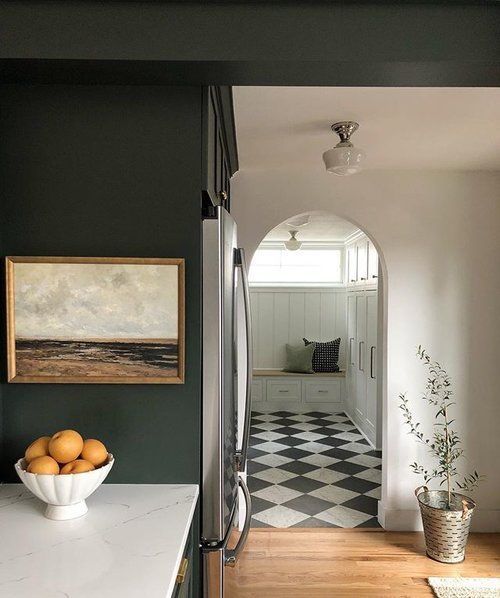
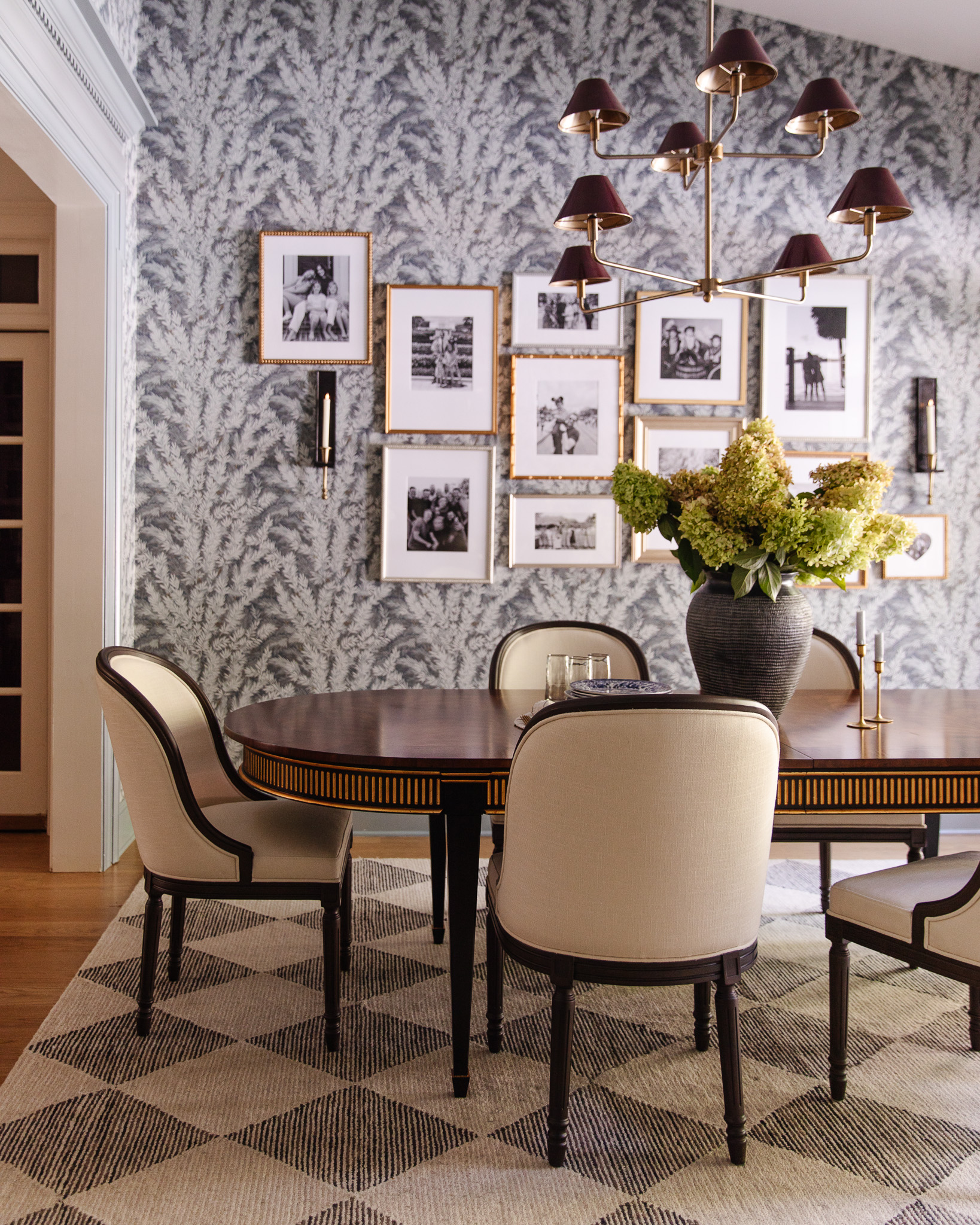
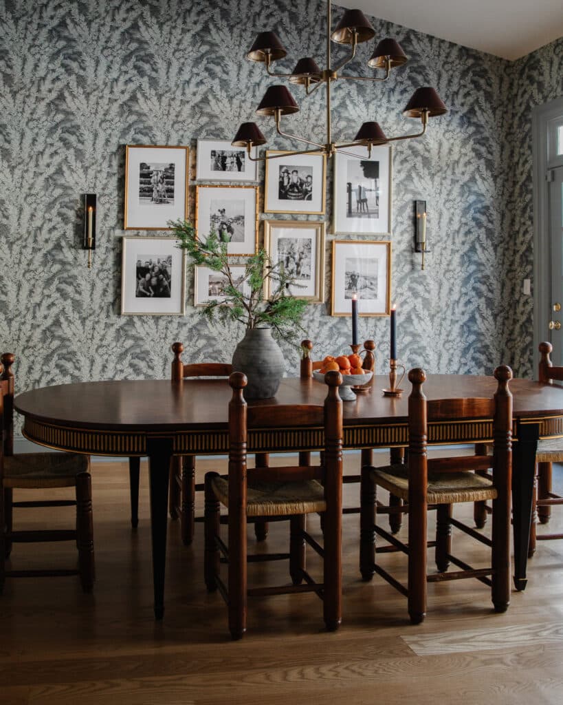
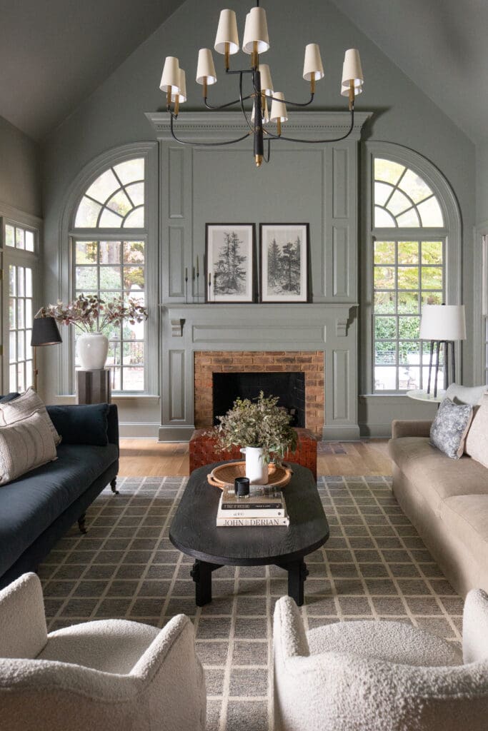
The biggest and hardest decision for me has been the flooring for the new dining room. There will be 2 arched doorways leading to the space from the music room and living room. Part of me thought–let’s just make it wood flooring so it all blended (we’ll be updating all of our wood flooring in the future). But as I was researching and pinning I also recognized this as an opportunity to bring in a bold but classic floor choice. Something that leans historical, but I could modernize. I kept coming back to checkerboard floors. Specifically the ones that were stone and had a lot of variance.
Here are a few that I love:
1. This example from Magnolia is not stark black or white. I especially love the wood tones and contrast trim in the photo (elements that our cottage has) that helps me see that something like this could work in seamlessly.
2. Georgianna Lane worked in some mint and marble in the checkerboard below and although the color palette isn’t right for our home, it really opened my eyes to the possibilities beyond black and white.
3. Like The LifeStyled Company that went a little cool (is that navy?) and I love how it mixed with the mushroom cabinet color.
4. Miguel Flores Vianna did a loose checkerboard pattern with so much variance my mind almost exploded. I love it so much!!
5. Ham Interiors mixed a super soft charcoal with a veiny white marble below. This is when I also started taking note of border vs. no border. And honed vs. shiny. The floors below are honed with no border.
6. While this entry by The Fox Group has a border and is polished.
7. What if we swapped in tan for white marble a la this space by Period Architecture.
8. Light and Dwell was one of my original inspirations for doing the checkerboard floors in the dining room. I love seeing the transition from wood to tile and how the checkerboard almost feels soft and not over-powering at all. The honed soft black mixed with a light grayish marble is perfection.
With all of the information and inspiration gathered, I ordered some tile samples from Bedrosians (all from the Magnifica line, but I may go back for more). I ordered a couple different blacks, marbles, a gray and a tan. They all arrived polished except the Bardiglietto (gray), so I’m trying to imagine what they would look like honed (which I’m pretty sure is my preference).
The first combo I loved was Pietra Gray (which I think would be lighter honed) and the Luxe White (which has a lot of warm veining.
I also loved the mix of the Pietra Gray with Taj Mahal, which is sort of a tan stone.
And lastly the Luxe White mixed with Bardiglietto.
My head is honestly spinning right now trying to decide. I like all three! I’m going to see if I can get a sample of the Pietra Gray Honed to see if it’s not quite as stark. I really want it to be a little softer in tone. But that’s where we’re at right now. What do you think? Have a favorite combination?
204 COMMENTS
Michelle Guel
1 year ago
Beautiful options!! I was just at the tile shop and they have a poster with some of your photos saying your a partner. I prefer the honed look myself. The tile shop has an option that is “tumbled”. You would probably like that!
Julia
1 year ago
AUTHORI didn’t know we were a partner with them! Interesting.
Alex
1 year ago
Hi Julia! I love these floors, and can’t wait to see how you all begin building out your dining room! I’ve been looking at these tiles for our own home, and was curious about the tiles being porcelain. The website lists everything in the collection as being porcelain, but I was wondering if they maybe had a stone top or something? Is there any particular reason you were drawn to this line specifically? I always love hearing your reasoning behind the things that you pick–I feel like you all somehow manage to make everything beautiful and practical all at the same time! Thanks for sharing your home with us!
Molly
1 year ago
For your home I find this an easy decision! Honed, no border, white and tan checkered 👍🏼
DS
1 year ago
Luxe White mixed with Bardiglietto gets my vote. I like the subtle old world with modern vibe. And how it will make black details pop. Keep in mind how the undertones of the grey stone will look with the grey of your kitchen cabinets. Is the flooring going to be in the kitchen too?
Marie
1 year ago
Are you going to install radiant floor heating?. Love this look but would be so cold in the winter.
Bianca
1 year ago
I love the luxe white with Pietra Gray and Taj Mahal all together
I can imagine the a pattern with all three colors 😍
Emily
1 year ago
#1 honed all the way. Love it!
Abigail
1 year ago
I agree with a couple other commenters who mentioned considering the tan + white combo! They are all beautiful but the high contrast combos work best in smaller spaces and read kind of cold and stark in larger spaces, which you dining room seems to be. Just my thoughts! Lookjng forward to watching the room take shape!!
Betsy Kraft
1 year ago
What if you kept it super neutral and did White and Tan Checkerboard!??!
I love all of the samples and the direction you are going in! I cant wait to see the end result! :)
Michaela
1 year ago
Photo #5 and #8 look like they could be one of your spaces…I love the classic B+W but also think the Petra Gray + Taj Mahal, honed, would be amazing in such a large space with so much natural light and fit into that modern cottage vibe!
Silvett
1 year ago
I’m really loving image #4 😍
Julie S
1 year ago
I may not be the first to suggest it but you can spray matte sealer (like a can of Krylon) on the polished stone for a quick sense of what a low sheen finish would look like!
Vicki D Elish
1 year ago
My favorite is the last one…Lux White and the Bardiglietto. I like the softness of those colors together. They are all beautiful so I am sure you will pick the one that is perfect for you and works with all of the other elements you are choosing….cause you are talented like that!
Emily
1 year ago
#4, #5, and #8 are my favs! Can’t wait to see what you do. I typically dislike the “checkerboard” look, but it seems so much classier in these versions you’ve pulled inspiration from. I think what I dislike about it typically must be when it’s stark white and black, with no variance, because these examples are…drooool :)
maria
1 year ago
gray/taj mahal!!
#4 inspo pic!!!
complements the vibes you’re going for in the adjoining rooms. like your accessible beige trim color
Leslie
1 year ago
Oh man, I LOVE when you invite us to weigh in and then I love seeing your final decisions. I vote for the Luxe White mixed with Bardiglietto combo, honed, with border.
Naomi
1 year ago
Hi Julia! I love the last example and can’t wait to see what you ultimately decide. I love that you’re choosing to go bold and classic at the same time. Major thumbs up from me regardless of what you choose and thank you for sharing this!
Julie
1 year ago
Example 4 is just so jaw dropping gorgeous. The contrast, the classic color combo just makes my world. That’s my favorite because it really seems timeless.
Susan
1 year ago
We have black and white checkerboard in our kitchen. The black is granite tile and the white is marble. It has a border. I love a border because to me it makes it feel more formal and finished. I will second that it is not fun to keep clean. Even though I would definitely do it again I wouldn’t recommend black and white combo for a large space that has openings to the outdoors. The black shows everything. The last combo you have I think would hold up the best. Also a thing to note is the placement of where the diagonal tile meets the border. Ours at our entry has the black tile as small diamonds… so the first thing my MIL said was “OH IT LOOKS LIKE FANGS.” She’s a delight.
Susan
1 year ago
Best comment & advice yet!
Nichole
1 year ago
100% for the Bardiglietto combo. Love the muted tones and it seems to come closer to the inspiration pics you are looking at.
Laura
1 year ago
The inspo pics are SO good. My faves are #4,5 and 8. Out of your sample options, thinking the last one? I think I would go back for more samples though just to be sure(and be super confused?) It’s a huge decision! No matter what you choose it’s going to be amazing!
Jaclyn Gutierrez
1 year ago
Love the taj mahal combo!
Ashley
1 year ago
#4 all the way. So classic and both bold and subdued at the same time. Having lived with black and white checkerboard floors…they are beautiful when they are clean, but a beast to keep clean, especially if it’s in a high traffic area. Good luck! Am enjoying watching you transform your new home!
Kerry Spencer
1 year ago
I love number 4 with the varied checkerboard pattern! It’s so subtle and beautiful!
Michelle
1 year ago
Yes to tile!!! So gorgeous and space making. I love your choices and am sure any color pattern will be lovely. I think the checkerboard is classic while the honed look feels both modern and somehow ancient in the way marble is at its best. I was also struck with how classic the tiling was in the entry way of Anne Hathaway’s country home recently featured on Architectural Digest, being mostly dark with the white pop. I’ll share the link in the spirit of just enjoying things, not suggesting you change at all: https://www.architecturaldigest.com/story/anne-hathaway-and-adam-shulman-reveal-their-california-country-house. As you’ve mentioned this room is for entertaining, is tile louder? Echoes are more or less the same, but the sound of chairs moving across tile at my mothers house always seems louder than our wood floors, but this is not a scientific study, lol. I’m sure there is some clever way to manage chair legs for sound dampening, but since you are in early stages it seemed worth mentioning. Thanks for sharing your process with us.
Alexis Mena
1 year ago
I love the tonal look that option #3 would give! And I think it would be gorgeous and timeless honed.
Amy
1 year ago
Number 4 is gorgeous!! It seems like a honed finish would be beautiful, add a casual feel to the pattern, and also nicely transition to your outdoor space.
Jess
1 year ago
The last option is exquisite! Subtle but extremely beautiful! Classic yet modern.
Krista
1 year ago
The classic black and white (marble) is beautiful! Is it weird that I also want to see what the tan and white would look like together? I don’t think that’s the look you’re going for, but I think I’d dig the softer more tone-on-tone look. Can’t wait to see your pretty dining room come back together!
Shanna
1 year ago
I think Taj Mahal and Luxe White would also be dreamy together! Very subtle but gorgeous and nuanced!
Beth
1 year ago
In my first house, I did a gray/beige and soft white tile in checkerboard in our small kitchen. It was a subtle pattern and I loved it. It was a way to add a pattern without the commitment of black and white.
Number 4 is beyond gorgeous.
Maria
1 year ago
Love all three! If you wanted a vote, i think i’d go with Taj Mahal and Pietra Gray. You can’t go wrong, looking so forward to seeing this room unfold!
Maris
1 year ago
Hate to complicate but I love the sophistication of cream on white. Consider a 4th option?
Chloe
1 year ago
Pietra Gray with Taj Mahal!!!
Julie
1 year ago
I love combo #3. You still get the effect but not so much the bold color contrast. I know you’ll make a stunning choice (no pressure! )
Katie Peterson
1 year ago
Oooh…this is going to be good. I’m rooting for Luxe White mixed with Bardiglietto, but I know whatever you pick is going to look 👌🏻
MM
1 year ago
Oh, that wonderfully-varied messy checkerboard — ALL THE HEART EYES for that amazing Miguel Flores Vianna vision! It’s perfect. I think you could mix up several honed whites/greys/blacks for a loose rendition like this, which looks both old world and fresh at the same time. Don’t worry about the marble — it has been aging beautifully for thousands of years underfoot and everywhere, becoming more beautiful with time. Go for the one that you love with all the variation!
EP
1 year ago
I love the classic white and black pattern, but I think in such a large space it would be better to go a little lower contrast. Especially because you’re not planning on having a rug. Maybe the white and tan, or a light gray and a darker gray? I even saw a floor that was limestone and marble checkered and it looked great. I REALLY love the one that has a lot of different tones and variation, but I don’t know how you would accomplish that. Most people probably want a super consistent product.
Trish
1 year ago
The Ham interiors one is my favorite!! The honed for sure I love so much!!! How exciting for you!
Kristin
1 year ago
It’s going to be fabulous for the multitude of feet gathering in your space! Just fabulous!
Bianca
1 year ago
Taj Mahal with luxe white! It’s less bold and I think would blend perfectly in your home
Jeanna
1 year ago
Ooh, my heart did a pitter pat with the Luxe White and the Bardiglietto! Ooh la la!
Emily
1 year ago
What about the tan and the white? That would be my choice! But you do you :) Your house, your choice! I’m sure it’ll look fab whichever combo you choose.
As a fellow fan of hosting huge gatherings, I am loving following along on this journey!
Mary V
1 year ago
Love the idea of incorporating checker board flooring. I’m very fond of classic and bold! I couldn’t vote without considering what the dining table will be. IF a lighter wood tone then the white and medium gray, but i think darker furniture could hold a floor with more contrast like the dark gray and tan. Whichever direction you choose it will make a stunning backdrop to dinner parties.
Casey
1 year ago
I love, love, love the variance in the Miguel Flores Vianna example! I think it would be the best way to go in your big space. That may have something to do with the fact that it’s the example with the biggest floor space, most of the others are in small spaces…
Anne-Catherine Denies
1 year ago
I believe the first and third inspos are just THE best ☺️ Those are the most intemporal ♥️
Meghan
1 year ago
I definitely prefer a more tone on tone look, over the high contrast of black and white. And honed is definitely more cozy in my opinion. I can’t wait to see what you pick!
Hannah
1 year ago
I work at a tile showroom as a sales and design consultant. Knowing that you have kids and a dog I would absolutely avoid polished marble because of the slip factor and it will show scratches much quicker than honed.
Also another thing to think about is marble in general involves more care than porcelain and can stain, scratch and etch. As long as you are ok with that not cleaning with bleach or anything acidic/abrasive than marble is beautiful and can age beautifully. But if those pose an issue, I would definitely look into using porcelain- there are a lot of really beautiful options now days.
Absolutely love the idea of checker floors! No borders and either grey and white or black and white
Becky
1 year ago
Pietra grey and Taj Mahal! Honed!
Lindsay H.
1 year ago
I’m favoring the Luxe White mixed with Bardiglietto, however I also think the black would look great considering the framing and styles on the windows will be black in the future. I don’t think you can go wrong – I love this idea!
Sara
1 year ago
I love inspiration #4 with the mixture of soft/dark/light. It’s timeless, totally classic and never would get tired of it. Could you accomplish that with 3 of the tiles you picked out? I love the idea of honed over polished as well! Can’t wait to see what you choose!
Crystal
1 year ago
I was like why is she still looking when magnolia had the perfect flooring! But the Petri gray and luxe white are stunning together.
Debbie Peppo
1 year ago
Love the Black and Tan!!
Steph
1 year ago
I think the Pietra Gray with Taj Mahal looks really nice.
Krizia Cerda
1 year ago
I actually like the Taj Mahal (the tan stone) and the Luxe White!!! I think it would actually pull your dining table, walls and baseboards together beautifully!!!
Julia
1 year ago
AUTHORthis is going in our LARGE dining/entertaining space that will have a different dining table and wall color, but I agree it would tie in nicely with other spaces.
Michelle
1 year ago
The Miguel Flores Vianna floor is perfection as well as Ham Interiors! Both of those inspiration pics have such interesting ceilings as well as those beautiful floors (Fox Group, too) and really makes them so so stunning and historical looking. Do you know if every tile you receive will be the same tone or will the Luxe White have some that are more grey, some more white that will provide the variation that feels so authentic? I love the honed finish. Such a hard decision!
Julia
1 year ago
AUTHORI believe each tile will be different as it is real stone
Laurielulu
1 year ago
Hi Chris and Julia! If I was doing my own home I would probably go with wood all the way. That being said, you guys have a really big home and I agree Julia SHAKE it up! I have grown with a family Home that has been lived in by my great grandmother and grandmother and now my mother. The house is over 100 years old and still has loads of original “stuff”. As I age, I appreciate timeless decor that still looks great 100 years later. Kind of obsessed with old English country homes, such as in Downton. Long story short 🥵…….I LOVE a checkerboard floor, but not that weird fake solid black and white crap of the 80’s 🤮
On to YOUR choices and my two cents:
1. Swooning over the beigy/greigy
2. Yes, of course honed all the way! timeless!
3. I love when the two colors are a little closer in tone (dare I say more modern?), even tho the black/white marble will always be so classic
Love you guys, such a fun/pressured time picking out all the pretties
Laurielulu
1 year ago
Crud, after all that…..I forgot 100% border!!!! Sooooo expensive and classy
Heather
1 year ago
Love the Miguel high variance floor!!!
Kristin Zimmerman
1 year ago
Love the idea of a more creamy tone instead of stark white and black! Your inspo photo #4 is everythingggg
Emily
1 year ago
Hi, Julia! I’m on board the “tan and white” train, too! Someone mentioned Jenny Komenda’s Evergreen project back porch. I had the same thought! I think the subtlety would be so nice— and also a little less scary to commit to? That being said, you can’t go wrong. And I can’t deny that I love a good dark veiny stone. So excited to see what you choose!
Katy
1 year ago
Drooling. This is going to be so elegant yet modern. I 100% support this direction!
Bridey
1 year ago
Oooohh. Since you asked, I prefer the last color combo, but I’m sure whatever you pick will look great. I’m enjoying seeing the individual choices you are making and look forward to seeing all the parts come together.
Erin
1 year ago
I’m loving the idea of tan and white! For some reason I think the transition between those two and a wooden floor would be such a warm and subtle statement 🖤
Sam
1 year ago
I really love the luxe white and Taj Mahal together!
Kelsey
1 year ago
Love the variance and interest of the Miguel Flores Vianna floor! Sooo good. I would not have thought to do the checkboard, but you’re right, such an opportunity! After seeing these inspo pics I’m 100% sold. I’m loving the honed, no border look. I think my favorite pick is the Taj Mahal and Pietra gray. It’s a classic but modern combo that I think will look amazing, but any of those combos will be gorgeous I’m sure. So excited to see all the progress! Thanks for sharing your journey through all the choices!
Denise
1 year ago
Was totally against anything but wood till you showed #4 Miguel Flores Vianna! So totally love this as a complete compromise between wood and tile. Please choose this soft option!
Grace Anne
1 year ago
Uugghh wow this opens up so many beautiful possibilities that I did not even think of/know about until now!!! Do they make tiles in a soft peach? Hunter green?? Asking for a friend 🙃
I love the samples you got, esp the first and last. They all seem like they would go so well with the direction your home is headed. How will you ever choose?? 😂 Can’t wait to see what happens!!! So excited about the dining room!
Mary Buckelew
1 year ago
I know you’ll pick something perfect! I’d pick marble and tan or number 4.
Christy
1 year ago
I see several people suggesting going the white/Taj Mahal, and while that would be a beautiful combo, I agree with your intentions to go bolder. With wood floors boarding at two larger entries and other wood tones in the room (plus the soft colors on your walls) a contrast on the floor will be stunning and perfect! Go for it! I want to see it! 😃. I’m holding with honed pietra grey and Taj Mahal. I can’t wait to see what you choose.
Erica
1 year ago
I love the look of examples 4!! So I would pick the bardiglietto and the white from what you’ve sampled here. Also a vote for honed, with a border. You know, if I had a house to put this in myself! Lol. Can’t wait to see what you decide on! Can you really go wrong with checkerboard? I think not!
Lisa B Facioni
1 year ago
Luxe White mixed with Bardiglietto!
Jenn
1 year ago
These are all so beautiful! After seeing the inspiration images, I could totally see this in your home! My favorite is option 3. So classic but just a bit softer. I wonder if the softer option may give you more design options in the future if you wanted to do style refreshes in the years to come.
Christy
1 year ago
My favorite is the Pietra Grey and Taj Mahal, but I don’t think you can go wrong with any of those combinations.
Cayla
1 year ago
I loooove the Luxe White mixed with Bardiglietto- natural and easy on the eye, but still beautiful and enough of a contrast. I’m sure whatever you decide I will love, too!
Jenna
1 year ago
I like the Luxe White with Bardiglietto! It feels a little more soft, yet would still make a statement!
KAH
1 year ago
The last one, or the tan with white. Everything else feels too high contrast to me.
Debra Russell.
1 year ago
#4 is so European looking which is in line with your Tudor feel. So different and unexpected for a dining hall. I have a light stone floor in a Versailles pattern thru out my main floor and let me warn you it is a beast to keep clean ! I have to have it professionally scrubbed and sealed every year $$$! With a room that size with ppl walking in and out of the yard you need variance and especially not white!
Erin
1 year ago
I’m such a visual person, I feel like a photoshop mockup would go a long way to visualize the space, especially given the scale of the room. Personally, I like the last option the best. Inspiration pic #4 is so lovely. Anyways, I know whatever you pick will be wonderful. I love seeing each of your houses take on a life of its own, and how you are building character into each.
Derek Cooper
1 year ago
#4 😍
Lindsay Manly
1 year ago
Pietra Gray and luxe white hands down!!!!!
Amanda
1 year ago
Hi Chris & Julia,
I prefer the black and sandy option, but wonder what white a a darker beige would look like – contrast, but not overwhelming!??
Amanda
1 year ago
I prefer the black and sandy option, but wonder what white a a darker beige would look like – contrast, but not overwhelming!??
Lil
1 year ago
I love the Pietra Gray with Taj Mahal and the Luxe White mixed with Bardiglietto.
Seeing these combinations has me thinking about my own kitchen floors which need to be redone. I have hard wood everywhere else.
Thanks, as always, for the inspiration!
Kelsey
1 year ago
I love the last combo, it feels more tone on tone and less stark contrast. I am also on the jones train, polished seems too formal, I always reminds me of a bank. (Lol) I’m excited to see what you choose as I’m sure it will turn out perfectly regardless of which combo you go with!
Theresa Magliozzi
1 year ago
I love allllll the inspiration and the options you’ve laid out! I can see why your head is spinning and I CAN’T wait to see what you pick!!! Eeeeek
Erin
1 year ago
Hi Julia – this is so interesting! We currently have a checkered floor in our kitchen that I have wanted to change for several years (ours is a teal blue / tan a la 1990’s). Seeing your inspiration photos was so helpful and re-framed my perspective – doing a couple other changes to cabinet color and grout could go a long way in making our space feel updated and could be a great phase 1.
Do you have thoughts about doing this style in large vs. small spaces? I feel like it will look great in your space because it’s so large / grand but might not have the same effect in a smaller room. Thanks!
Erin
1 year ago
Also forgot to mention loving #4 the best 🖤
Julia
1 year ago
AUTHORI guess it depends on how small a room we’re talking, but tile comes in all sizes!
Elyse
1 year ago
The Taj Mahal is making my eyes go all wide with excitement, but your inspo is so spot on I know whatever you choose will be awesome. This is such a genius idea, it would never occur to me, but I think it will be so fitting for your home!!
Cassidy
1 year ago
Curious about the white with the tan. Could it work? My fave of the images is that first one from Magnolia. The tones are perfection.
Sarah G
1 year ago
Luxe White mixed with Bardiglietto! I love white white white and think this would be beautiful with wood tones.
Sadie
1 year ago
I’m surprised by how much I love the Pietra Gray with Taj Mahal but I think the Lux White with the Bardiglietto would look amazing and soft under some wood tones. However I’m confident whatever you choose will be amazing.
Brittany
1 year ago
They are all so beautiful! I love how classic and moody the black and white is and I think you have the right house and style for it. I also love taking the hardwood floors and doing a single plank wood boarder around the whole room to frame the tiles! It might look really gorgeous in your expansive room!
Catherine
1 year ago
What about the Luxe White with Taj Mahal??? 😍🙌🏼 Would be warm, have variety/contrast between the two, but still be so light and soft. The Tile Shop sells a small basket weave tile called the Sampson Mosaic Marble tile that we used for our flooring and I’m obsessed with the color combo! This would be so similar but a larger, more historic look. Maybe a dark mantel/dark table to offset? Honestly no matter what you choose it will be so beautiful! Just had to ask if you’d considered that combo for a softer feel.
Ellen
1 year ago
This is what I was thinking too!
Emily
1 year ago
I was going to comment the same! I think it’d be beautiful!
Lindsey F
1 year ago
The 3rd one is my favorite, or a black with more white veins. I think of vinyl knockoffs when I think of checkered floors, but the example pics with lots of veins had me <3 <3 It softens the look and pushes vinyl far from the mind!
Danielle
1 year ago
I think the grey and white or even the tan and white! The black (even if it’s not so dark when honed) is just such a stark contrast that I feel like the floors would take too much attention away from all the other gorgeous elements that are going into the room. Something a little softer I think would look amazing!
Anna
1 year ago
I am so excited you are doing this! Love them all, and I think getting honed samples would really help! I just tired to do this pattern in my MILs kitchen and NONE of the local tile guys she got bid from wanted to do it! We found one willing to do it in a checkerboard, but not diamond lay. The subfloor was too warped and they had to do so much floating nobody wanted to take it on. Super curious if your tiler has any reservations about the pattern or says piece of cake! A new subfloor was not in the budget.
We went with something siliar to the last option you showed, but looked at doing the lightest and tan option. They were both gorgeous and she couldn’t make a bad decision. These are all bomb! Can’t go wrong!
Cf Betcher
1 year ago
I think the last one since the room is so big. It feels older, softer and more residential. The stark black and white feels more restaurant-y…
Yanery
1 year ago
Love it! I really like 3rd option. But all are beautiful! Can’t wait to see this beautiful room unfold!
Emily
1 year ago
I love what you’re doing here in this home all these classic choices but with a modern vibe. It’s so interesting to watch. We just moved (same week as y’all!) into a 70 year old home (our previous home was 10) and I have been trying to be very mindful that this house needs different things visually from the last. Watching the direction your vision for this house is taking you is very inspiring. I think all the color choices you’ve narrowed it down to will be grand and can’t wait to see where you are lead. With the room so large are you going to play with proportion of the tile at all? Ie have larger size tiles to create your pattern? What size are you envisioning?
Julia
1 year ago
AUTHORthese tiles come as 30×30, which is maybe slightly bigger than I was imaging. I think a 20×20 would be great.
Emily
1 year ago
Awesome. It’s going to look sooo good!
Sonya
1 year ago
I am in love with the Miguel Flores-Vianna version!
The subtlety of the pattern is so nice! I can’t wait to see what you chose!
Emily
1 year ago
The light gray and the luxe white. Did you see the patio Jenny Komenda did on her flip project (the Evergreen house)? Something like that, in more luxe material, would look incredible in your space.
Bridget
1 year ago
I love the last one!! Excited to see what you pick!
Gloria
1 year ago
I love pietra gray and taj mahal. So pretty. 😍
Millie
1 year ago
Love them all! Definitely go honed for better slip resistance!
Crystal
1 year ago
I agree your last inspiration picture is perfection. I really like the luxe white and the gray stone. Subtlety making a statement while still remaining neutral.
Janie
1 year ago
I personally love the colors and randomness of #4. Using honed Pietra (if it’s lighter when honed), tan, & luxe white.
It’s all beautiful though and you can’t make a bad choice.
Colleen
1 year ago
I would choose something lighter with less contrast than black and white. A soft beige and creamy white would be nice.
Katie
1 year ago
Honestly you have such lovely taste that any of the options you’ve set for yourself would be gorgeous. I think the Luxe White’s veining would relate wonderfully to your trim color! It’s hard to say, though, which of the black or gray would work best. Gray is subtler and the examples you had of closer tones were so understated and elegant. But then black is such a classic and bold! 🖤🖤🖤
Robin
1 year ago
This is going to look amazing no matter what you choose! Have you thought about doing the Taj Mahal and the luxe white together? This may work better if you pick a white stone with warmer veining. I see this as flowing well with wood floors and giving a tone on tone, more subdued riff on the classic checkerboard.
Michelle J
1 year ago
Absolutely love it all! I think the first option is my favorite and definitely love a honed look. It is casual while still feeling rich and classic. I loved Jenny Komenda’s lighter checkerboard pattern she did on the outside of the house she renovated. I’m trying to figure out how to add it in my home!
Lindi
1 year ago
I’m dying! I can’t believe you’re going for this! It’s going to look absolutely amazing! I love the dark and tan combo as well!
Susan
1 year ago
Pietra Gray and Taj Mahal! 😍
FDM
1 year ago
Hi Julia! (pro-tip greeting!) I like Miguel Flores Vianna’s the very very best because it is so unique and aged looking! Secondly, what would gray and tan look like? Maybe that didn’t look so great since you didn’t show it, I was just wondering. I love the harlequin choice any way you do it!
Lindi
1 year ago
I’m dying! I can’t believe you’re going for this! It’s going to look absolutely amazing!
Barbara
1 year ago
Love the classic dark/ light combo personally but any colour combo would be beautiful!! It will be timeless and elegant! 🖤
Jesseca
1 year ago
Tough choice! I think I am leaning towards the last one.
Z
1 year ago
Love #2 and feel like you single-handedly have made me rethink all things tan colored. 3 is a close second though as it feels softer and less predictable than the dark vs light.
Molly
1 year ago
The last one!! The gray and white is amazing! Whatever you choose I know you will make it fab :)
Carriereen
1 year ago
Hi Chris & Julia,
I like the direction you are going in for your dining room. My preference is the last option of white and bargielleto. I do love the idea of them being honed as well, though that may be hard to find in 24×24 squares. Grout will also be easier to choose if the tile colors aren’t so drastically opposed. I believe that this room will be indoor/outdoor sometimes as well and a lighter color palette and a low sheen flat finish tile will be better for hiding dirt and slipping by Polly’s little sock clad feet. Best of luck and I look forward to following along.
Carrie Winterton
1 year ago
What about the tan with the lightest one?
Julia
1 year ago
AUTHORLots of people are bringing that up! I’ll have to consider it!
Dianne
1 year ago
They are all stunning options but I personally love the last one that little bit more. Whatever you choose will undoubtedly be beautiful. Can’t wait to see how this all unfolds. 🖤
Laurie
1 year ago
I loved the one with lots of variation. Also, the one that was sort of greenish, if you could find a color palette that worked for you. Both of these were striking, but not stark.
Kristen
1 year ago
Pietra Gray with Taj Mahal is siiiiinging to me. But you cannot go wrong with any! I was SO hoping you’d do checkerboard floors – I think I left a comment when you first talked about the dining room saying so! You guys are seriously building my #goals house. Do you know how big/medium/small you’ll go with the tiles?
Birgit
1 year ago
Hi, I love all pictures but would be really scared to see it in such a big room. So either tonig down the contrast or making a mix of wozluld at the outer parts an tile in the middle as in one of the inspiration photos
Birgit
Elyse
1 year ago
Birgit, I think once the big table is in the center of the room with accessories and styled out, it will look so amazing! The inspiration pics are a little more bare, I think in CLJ’s space it will read more cozy than those spaces!
Kirsten
1 year ago
Omg the one with the subtle variance! I don’t love checkerboard but I am ON BOARD with that one
Mary
1 year ago
I can’t wait to see what you choose! I think we can trust your experience and taste here and just follow along to see what amazing design is chosen. That pattern feels very French to me 😊
I love the last color combo. But I know I’ll love whatever you choose.
Melody
1 year ago
First, there’s a repeated typo—it should say “border” instead of “boarder.” Regarding your flooring choices, what’s your plan for a rug? I realize that your table is going to be a huge, but you live in a cold climate. If you have hard flooring with no rug, will you have heated floors? Just some questions that came to mind. Black shows so much dust, dirt, and food crumbs, so I’d personally choose an option without black in the mix. Looking forward to seeing what you choose—it’s sure to be gorgeous!
Julia
1 year ago
AUTHORThe floors will be heated!
Melody
1 year ago
Awesome! That’ll make it so cozy for your feet!
Lora
1 year ago
This comment reminded me of that Jenny Komenda post RE tone.
Shari
1 year ago
^ Yes it does…comments like this jump out so much to me now, and feel so inappropriate, after taking her post to heart. Melody, I’d like to make a gentle suggestion to consider reading this heartfelt post from Jenny Komenda, so that your comments may be appreciated in the future. Here is the link – the first couple of comments are the main points from Jenny. https://www.instagram.com/p/B2cELQBD8y0/?utm_source=ig_web_options_share_sheet
Monique
1 year ago
Luxe white with Taj Mahal tan! Or the pietra grey and tan, if we’re sticking to the pictured options 😉
monica
1 year ago
Given the size of this space I would worry a bit about sound and echoing with a stone floor, which would be less with wood. In addition, wood would might add some a cohesive aspect to your home, since it already has that McMansion mishmash of architectural styles.
Lynn Riddle
1 year ago
I like the gray with the white (last one) or even the white with the tan (which you didn’t photograph, but many people have presented as an option). I think the pattern will look amazing & honed would definitely be my choice & without a border
Chris
1 year ago
I totally envisoned this room with checkerboard flooring when you announced your plans for it, so I am thrilled about this!! I love the black/tan and white/gray options, and I totally want to see a white/tan sample! Also I vote honed, and I’m unsure about a border. :) So excited about this!
Jess
1 year ago
What fun! You can’t go wrong with a classic checkerboard. My thought is that many of the inspiration pics you shared are of smaller areas and/or hallways. And as I remember, your new dining room is quite a big space! A bold pattern often feels REALLY bold in a large space. To that end, maybe a less stark, more tone on tone combo option might be really nice in your larger space. And in the long run, potentially lends itself to more easily layering other colors, patterns, etc. Good luck – it will be beautiful, I’m sure!
Hannah Gokie
1 year ago
I love the dark with the tan the most — that combo feels most “Chris and Julia” to me of the three! but they are honestly all so beautiful. I think you are envisioning a really special, loved room, and doing something outstanding with the floor totally fits that feel.
Skye
1 year ago
I love each and every inspiration photo and combo option :) I can not wait to see which you pick!! Any will look excellent by themselves- so the deciding factor will be which compliments the other design choices for the house– something that is absolutely your strong suit and I am giddy to see which choices you make. :)
lynn
1 year ago
Love, love, love, #4. It looks like it’s been there a while and the subtle variations seem appropriate for a dining room. To me, it’s both formal but calming and classic but modern. I agree, honed is best.
Maya
1 year ago
I’m just thinking about the same thing for the entry for our house (which is a 1600s/ 1907 (renovation) former inn in the Czech Republic, so the entry is pretty grand)!! I love how checker board feels classic but fresh, and can elevate fairly simple stone (or most likely tile, in my case). I can’t wait to see what you do!! Bonus: you can actually play checkers on it… We have a checkerboard pattern in our living room too, and we played checkers on it back when we first moved in 😆
Kelly
1 year ago
Hi Julia! Love them all, but what if you tried the Luxe White with the Tan for a softer patterned look.
Chantal
1 year ago
Hi! Great inspiration photos! I wonder if Kelly has a point, maybe for such a large space, tone on tone would be interesting!
Have you considered Limestone instead of marble? Totally different texture but I think it would warm and beautiful.
Also another cool traditional flooring pattern: cabochons! https://www.pinterest.ca/pin/466404105161687096/
Thanks for sharing with us!
Chantal
1 year ago
Oh and reading the comments about dirt showing on white floors, didn’t even think of it! Perhaps Limestone is lower maintenance..🤔
lilah
1 year ago
I love this idea. It’s so classic. Since it is going to be a big space, I would tend to go with something more subtle like #3 or perhaps Taj Mahal and Bardiglietto. Can’t wait to see what you do.
EmilyH
1 year ago
What about the white and tan together? I could see that being a softer transition from a wood floor. But I also love the white with the gray (the last one pictured).
Megan
1 year ago
Oh interesting! I love the white/gray combo best, because it’s less contrast so it looks a bit less busy. Even though you didn’t present this as an option..I also like the look of the tan/white together in the first photo of all 4 colors. And big YES from me for a border, it just looks so classic to me.
Molly Gray
1 year ago
It’s probably crazy, but my favorite image is the first where you showcase all four colors. Is there any way that you could integrate 4 colors in one floor?
Arli
1 year ago
I like the tan because it sort of picks up on the trim color you have in the kitchen (and living room?), and it isn’t as stark as black and white. But, if you are planning to use that same trim color in the dining room, maybe the tans will clash?
Catherine
1 year ago
ooh It’s beautiful. I think I prefer the honed, no border look. I also like it when the floor is almost a little bit faded! The black and white combo will just always stay classic and true. I do love the tan element, but think you could bring that in very classically on the walls or window treatments. It’s going to be just beautiful whichever way you go. Lovely, enjoy it.
Melissa
1 year ago
So pretty!! Will you do radiant heat floors under the tile?
Lori
1 year ago
I personally like the second example and the last option the most. It’s less visually overpowering in a huge room. Can’t wait to see what you decide!
Katie
1 year ago
I am so excited that you are doing this!!! We are in the midst of renovating our Kitchen and our budget is very very tight. I was originally going to put down a black and white checkered vinyl but we found an really inexpensive flooring on Kijiji that we couldn’t turn down. I am trying to be okay with not having the checkered and you doing it will let me have the experience that I originally wanted. They are all amazing options.
Annie
1 year ago
Such an exciting idea!! Given the size of the room, I’d go with the absolute least amount of contrast you can come up with since it will likely read really busy otherwise and become very bossy. 😄 Even at low contrast though, it’s going to be a showstopper!! Can’t wait.
Rebecca
1 year ago
Absolutely stunning! I really liked the one that had all the different soft colors. Can’t wait to see it put together. It’s going to be so amazing!
Debbie Ricks
1 year ago
OH.MY.GORGEOUSNESS! I am so excited to see what you guys do in the space!!!! My vote would be for a variance pattern, with the tan, white and gray… no black(I know, I couldn’t believe I’m saying no to black) all honed with no border. Thanks for showing us inspiration photos and samples of which way you are leaning!!!
Leslie
1 year ago
Gah! They’re all so pretty. I vote lots of variance like Miguel Flores Vianna, honed, no border. I leave the colors to you since I can’t decide – but I love where you’re going!
Katherine
1 year ago
Agree! I never would have thought of the light/light combo before Jenny komenda did it but I love it.
liz
1 year ago
This is soooo classic in the best of ways. I love that you are doing this! Cant wait to see this room come together. Thanks for sharing Julia!
Krista
1 year ago
Loved the green or blue inspiration floors!
Natasha
1 year ago
I had a black and white checkerboard floor in an old apartment. The contrast was a bit stark and I always felt like the white squares were dirty so I like the muted direction you are taking. I’m sure it will look fabulous. Will you heat it? My heated kitchen floor feels so homey and luxurious when it’s cold out.
Julia
1 year ago
AUTHORYes the floors will be heated
Shannon
1 year ago
Pietra Gray with Taj Mahal! Can’t wait to see how it turns out.
Heather Bird
1 year ago
Have you tried pairing the sand (Taj Mahal) with the white?
Sanae
1 year ago
How about white and tan?
Sanae
1 year ago
Oops, not only did I duplicate a suggestion apparently I did it as a reply to the suggestion. Am doubly blind today!
Chris
1 year ago
I want to see this option too!
Carrie
1 year ago
What a fun idea! I am totally surprising myself and really love option 2. I see it as the option that would transition most seamlessly to any hardwoods you install elsewhere in the future since it is the warmest option. This home seems to have a warmer palette generally, so maybe that’s another reason it feels right? As you said yesterday, your style leans toward more “fall” colors, and that combo just fits right in! Have fun choosing! This is such an exciting part of the process!
Christina F
1 year ago
Wow, oh wow. I loooooove reading your blog, Julia! I would never have even noticed different hues in a checkerboard floor but you’re teaching me to see more beauty in the world, to see the creator behind beautiful creations, to see a room for art instead of just utility. Thank you for sharing your gift!
Heather O.
1 year ago
Oooo I can’t wait to see what you do! Option 3 is my favorite, but you really can’t go wrong with any of them.
Amy T
1 year ago
I LOVE the Luxe White mixed with Bardiglietto!!
A
1 year ago
Love all of these! I’m sure it will look amazing. My fave is the grey and tan (taj mahal). Question, what makes a checkerboard vs. a harlequin pattern? I would have considered these harlequins. Subtle but more elegant than a checkerboard.
Julia
1 year ago
AUTHORWe will be laying it in a diamond like the examples of that’s what you mean. I didn’t realize it had a whole different name!
Christina
1 year ago
I vote no border, but whatever you do will be perfection…as always!
Patricia
1 year ago
My vote is muted and honed. This will be a HUGE room and the floor will have a big impact. But you’ve surprised me before and I always love it afterwards.
Kate
1 year ago
I am such a huge fan of wood floors throughout a home, I’ve never really understood why people make entry ways and kitchens different aka “more durable” (you can refinish wood! it lasts centuries!) But this checkerboard is not only the exception to the rule, it redefines my whole world. I absolutely cannot wait to see this dining room floor, I think it’s going to look magnificent. It’s such a simple change, but I think it’s really going to launch the overall vibe of your home into the modern yet classic cottage look you’re going for.
Piia
1 year ago
Love your ideas! My favorite combo is #3. I like the more muted tones. I `m very confident your making the right choice for you and your family. Love your blog!
Lori P
1 year ago
Many years ago we added black and white to our kitchen and while it was beautiful, it showed ever speck of ANYTHING that wasn’t an exact match. So for that reason, unless you shed shoes and have no pets, go with something with some variety rather than stark black or white. That’s my .02! I can’t wait to see it and know your choice will be gorgeous.
mockginger
1 year ago
I love love love inspiration #4, and my favorite of the samples is Luxe White mixed with Bardiglietto. I like that the black isn’t so stark, and I def. think the honed is the way to go. Can’t wait to see this when it’s complete!
Molly
1 year ago
Ooooo I love this! I definitely prefer honed too. This is going to look GREAT! I personally like the Pietra Grey and Luxe White the best, but it’s your house and I know whatever you choose will look amazing!
Catherine
1 year ago
From the inspiration photos above, I’m most drawn to the choices by Ham Interiors and Light & Dwell for your home. I totally agree with going honed, and would vote no border. It’s such a tough decision, but whatever you chose will undoubtedly be amazing!
Gwen
1 year ago
Did you consider the taj majal with a warm white? It would create a really soft and textured checker pattern.
Megan
1 year ago
I love this idea.
Mary
1 year ago
Ditto
Allison
1 year ago
I have never been a fan of shiny, high-contrast checkerboard floors, but I could definitely appreciate the application with veining, variance, and a honed finish. #4 is my favorite!
evane
1 year ago
LOVE this idea!
michelle
1 year ago
Personally, not a fan of checkerboard patterns at all. That style always invokes either a diner feel or a childish feel, as in an actual checkerboard. It’s also very masonic and associated with the occult and mind control, which is why you see it a lot in cult-ish movies and TV. But if your dead set on the style or pattern I’d vote for the least variance of color, the grey and beigier marble as in the last photo.
Kate
1 year ago
Sign me up for the CLJ cult! The supernatural, mystical, magical world of home design, where our checkerboard dining rooms are used for thrice-daily feasts, initiation rites of new recipes, ceremonies that commemorate a person’s day of birth, and even a prayer ritual offering thanks on the fourth Thursday of the eleventh month. A Gatsby-esque table where few are invited, and yet all who are in earshot when the dinner bell rings will find themselves with a place at the wooden slab that sits atop the checkered marble.
Julia
1 year ago
AUTHORMy heart 🖤🖤🖤🖤
Christina F
1 year ago
Kate, I’m at a loss for words. This eloquent, fairy tale and surreal world you described touches a deep part of my soul. I’m copying it onto a notecard and will use it as a lens through which to view the home I’m creating.
Heather
1 year ago
Can I join? 🙋🏼♀️
Karen
1 year ago
Three houses ago, when we remodeled the kitchen, I went with a white and black checkerboard. It was an “industrial grade” linoleum (so totally different material), which to me meant “durable”. And it was certainly durable. But white/light is white/light and white/light does not mix with dirt! It was such a pain to clean – we’re talking hands/knees/bucket/warm soapy water/scrubber action.
Gwen of The Makerista uses this classic mix in her kitchen (a very high-traffic area):
https://www.themakerista.com/kitchen-renovation/
I would too explore honed (over polished), and for the lighter square, something with veining/movement to help hide dirt.
Maya
1 year ago
Hiding dirt is basically my only priority in choosing flooring 😆 I was thinking of something like this, so thanks for sharing!