


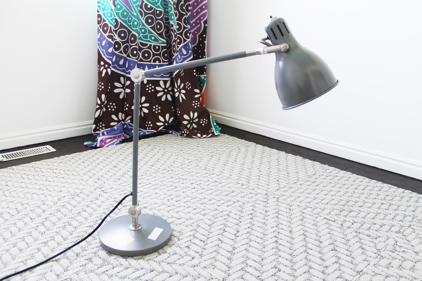
Not to metion, at 50% off just for being the display model, the price was right:

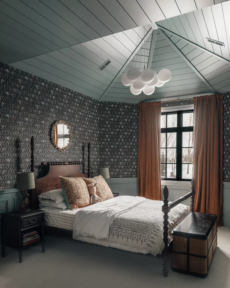
The only thing that may not be right is the color. Which is a little strange, since gray almost always equals perfection in our home. In the studio, maybe. Or maybe this lamp could be one more little pop of color. Either way, it’s up to you whether we paint it and what we paint it.


I don’t have a poll today because I didn’t want you to be locked into just a couple colors. Feel free to sound off any color you would love to see the lamp painted (refer to this post to see a wider shot of the room as it is now) and I’m sure I’ll find the right spray paint to match. Or, if you think gray is gold and it is perfect just the way it is, then let us know that, too! Can’t wait to see where we land.
Leave a Reply
What do you think?


Semihandmade
Our wood grain Shaker cabinet fronts were designed for busy, high-traffic homes like ours. Clad with durable textured thermofoils, this line is compatible with Sektion, Akurum, Godmorgon, and Besta cabinets from IKEA. It's the perfect, practical way to add the warmth of wood to all the rooms of your home.
Collaborations
learn more

next
Loloi
We have teamed up with Loloi to create a line of rugs that are as affordable as they are beautiful. This collection houses a great mix of traditional and modern rugs, in cottage-y colorways, as well as vintage-inspired beauties that you’ll want to roll out in every room.
Collaborations
learn more

next
STUGA
We partnered with Stuga on a line of hardwood floors — The Ingrid is really livable, and the color is very neutral. It doesn’t lean warm or cool, it’s that just right in-between. We have really loved putting it everywhere in our house. It’s the best jumping-off point for design, no matter your interior style. In addition to being beautiful, Ingrid is really durable — we have three kids, and we always have a home construction project going on. Ingrid stands up to it all.
Collaborations
learn more

next
SHop all
What We're Right Now
What We're Right Now
Looking for our favorite things? A place to shop our home room by room, or just catch up on what Julia's wearing / loving right now? Browse the CLJ shop.
Loving


Portfolio


Design
Befores, afters, mood boards, plans, failures, wins. We’ve done a lot of projects, and they’re all here.
BROWSE BY CATEGORY
let's break this thing up
We have a long-standing relationship with DIY, and love rolling our sleeves up and making it happen.
Projects
Even when you don’t want to rip down a wall, you can make that space in your home better. Right now.
read more
read more
read more
02
01
03
looking for inspiration?
A reader recently asked me if I’m starting to fully embrace traditional style and whether we still consider our house to be a “modern Colonial” and why. It was a really great question and so timely — I had really just been thinking about my approach to this home and how my style has changed […]


SEARCH THE BLOG
We've been doing this since 2009 and we've posted a whopping 24145+ blog posts and counting. You might need a little help searching, huh?
looking for something?
find stuff like:
")
Can We Send You Our Love Letter?
Another way for us to stay in touch! Joining our weekly newsletter gives you access to exclusive content, never-before-seen photos, your questions answered, and our favorite DIYs. Sign up below!
Follow Along on Instagram
Welcome to our online community where we've posted home, DIY, style, renovations, and family since '09. Renovating our #cljmoderncottage in Idaho and headed for new adventures in Raleigh, NC. #cljfam #cljtransformations
@chrislovesjulia


Links
Get Around
Make yourself right at home
Portfolio
Design
Casual Friday
Projects
Lifestyle
Gift Guides
All Posts
Shop
Love where you live.
Social
RivrLinks
Links
Get Around
Make yourself right at home
Portfolio
Design
Casual Friday
Projects
Lifestyle
Gift Guides
All Posts
Shop
Love where you live.
Social
RivrLinks
Awww, don’t cry shopgirl…I mean, Keri. I hate to break it to you, but turquoise is kinda out since the entire ceiling is painted that color. Don’t you agree it might be too much?
i 110% think teal (turquoise) in fact..i might cry if you don’t. and you wouldn’t want a crying blog reader.
I vote for a happy bright yellow!
I vote for either the orange(ish) or green(ish) color from the curtains! There’s already a lot of teal and brown, so adding one of those colors would help to bring it all together!
I’d pull some coral or chartreuse. Make this room amazeballs. :)
I’m going with leave it grey and let those tapestries be the focal point for now. With the bold ceiling & curtains, I think another pop of color (albeit a smaller one) might be overload. Plus your art is going to be in there in the future (even if only on the short term) so there will be other ways to interject more color.
I think that bright green in the curtains would look great!
Pickup the ORANGE from the curtains!! :]
I think a bright yellow to match the curtain color . :)
Paint it! A shade of yellow or purple (from the curtains).
Definitely paint it gold!
i think i would pull the orange color from the curtains to compliment all the blue.
Yellow!!
Must paint the lamp! Any of the colors already mentioned, or in the curtains would be great, but I would go with magenta!
Chartreuse!!
I like it gray, but think it would look better in the green or purple color of the curtain!
I love either the lime green in the curtain, or the purple! I lean towards the green, though.
I say PAINT IT and go BOLD!! I would pick out a color from the curtains so it matches the room without being too matchy matchy. Like the orange or the pinky purple color, I like either of those two because they aren’t the main/major colors in the curtains and it will totally POP.
the bright green from the curtains. for sure.
the turquoise from the ceiling paired with the lamp painted a bright green — a serious PERFECT match in my book.
I like the gray with the white walls and the colorful curtains.
Purple or an orangish-yellow kind of color (very specific, I know) ;-)
I think it would be awesome if you could match either the lime green or the turquoise in the curtains.
chartreuse would look amazing!
I vote for bright yellow, like how Sherry at Young House Love painted her Mom’s old high chair!
i think you should do the bright green that you have in the tapestry!
I’m thinking it would be awesome if you pulled the green out of the curtains. I think it would look great with the ceiling, floors, and rug.
I’d go with bright sunshine yellow. Yellow and teal go together and it would bring out another colour in the curtains.
Pop it like it’s hot. Ok that was lame. I say red or a blood orange (persimmons?) would be the ticket. you already have a lot of blue going on in there, so why not bring out some of the other beautiful colors in your tapestry/curtains. Every room benefits for having a little pop of red in it.
Turquoise!!! Just like in the curtains. perfection.
Pear green!
What color is your desk? Are you going to paint that too?
Purple to match the curtains!
I was thinking aubergine or eggplant.
Paint it to match the ceiling! :)
Love the bright chartreuse! I guess it depends on what accent colors you draw from the curtains…..That is an awesome deal on that lamp! Curse you, Ikea!
I like the gray but the lamp could shine in chartreuse.
I think I’d paint it gold or perhaps aubergine/magenta! If aubergine is in fact purpleish. I’ve been known to mistake my color names before…