


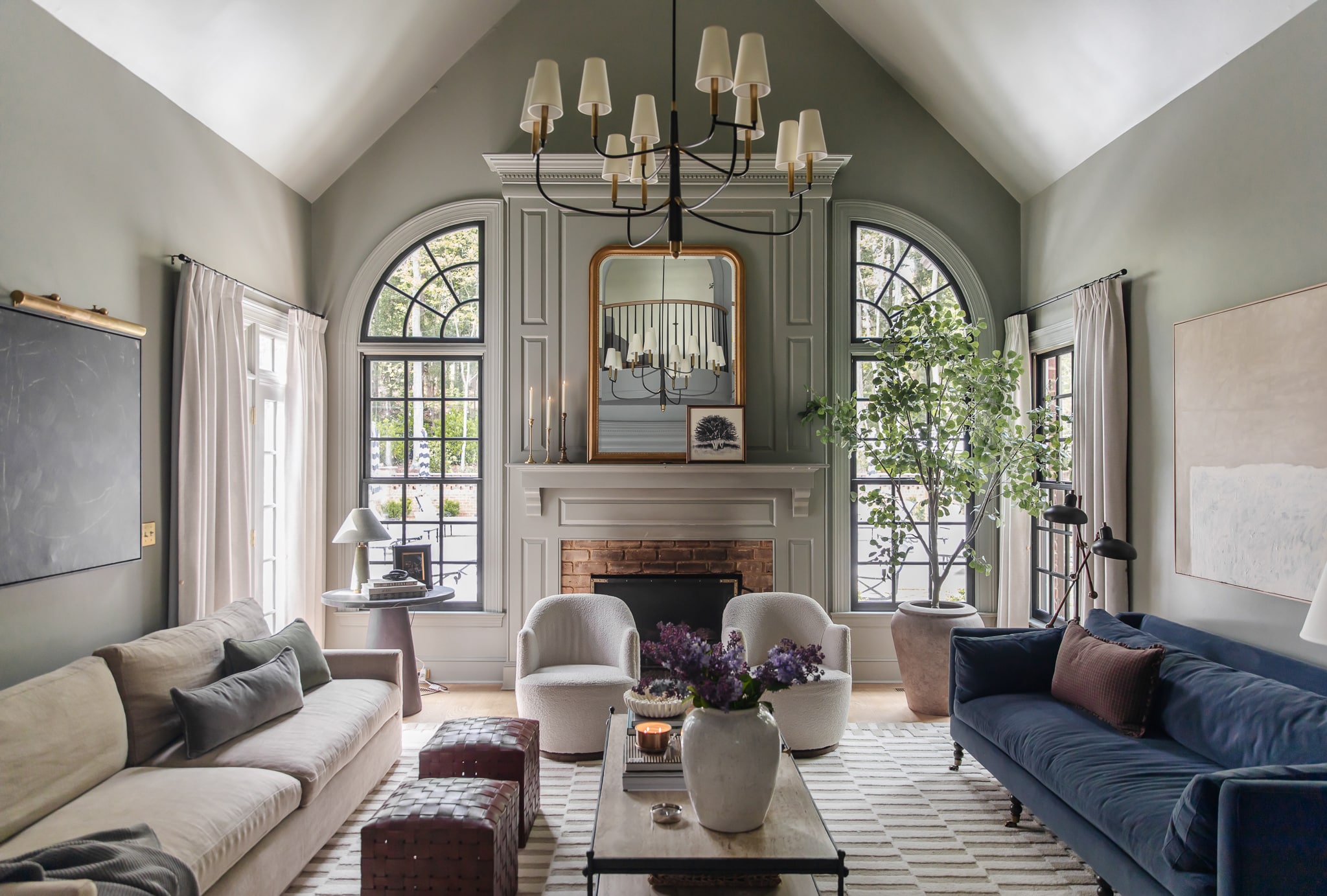
Breathe. Breathe. Breathe. Today is such a big day! We’re so excited to share that we collaborated with A Color Story (the amazing photo editing app by Emma & Elsie from A Beautiful Mess) to bring you a a filter pack perfect for interiors. In fact–we called it INTERIOR. A Color Story is free to download and my absolute favorite photo editing app, you can edit your photos (or even just parts of your photos within their tools. It’s a powerful free app. OUR filter pack, (I’ve been working on since NOVEMBER) with 17 filters designed by me is just $3.99! They are more subtle than a lot of presets you see floating around, but it was done intentionally to just really enhance your spaces and photos instead of making them unrecognizable. Also note: If you want to brighten your photo a little more before (or after) applying the filters you can in the tools!
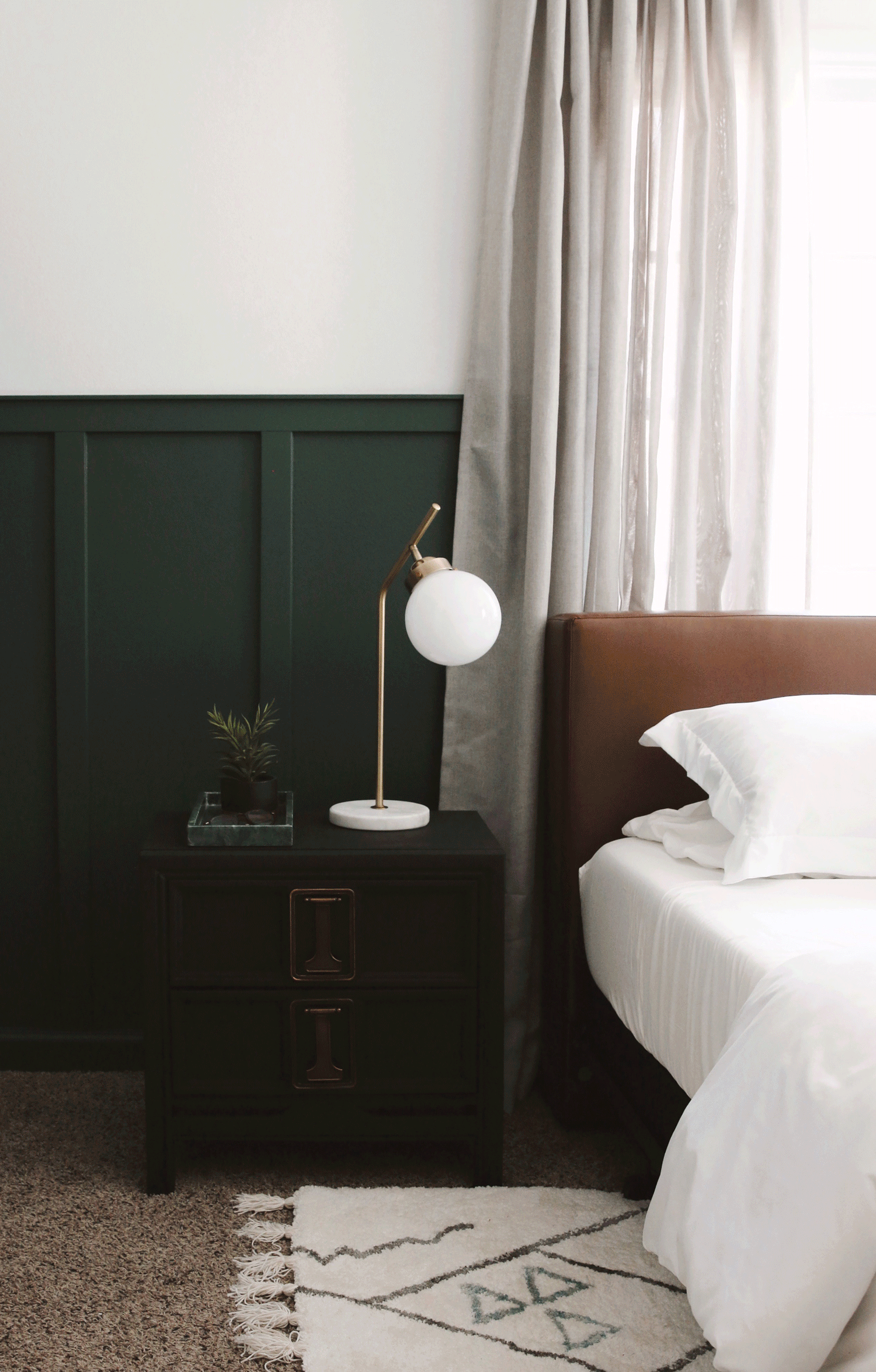
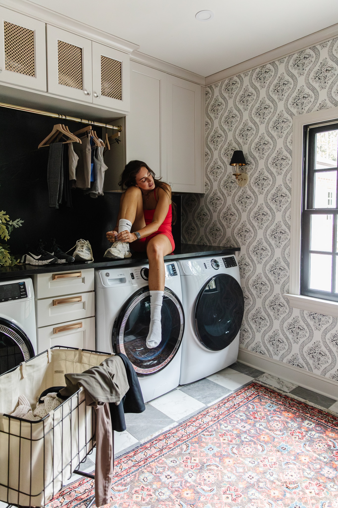
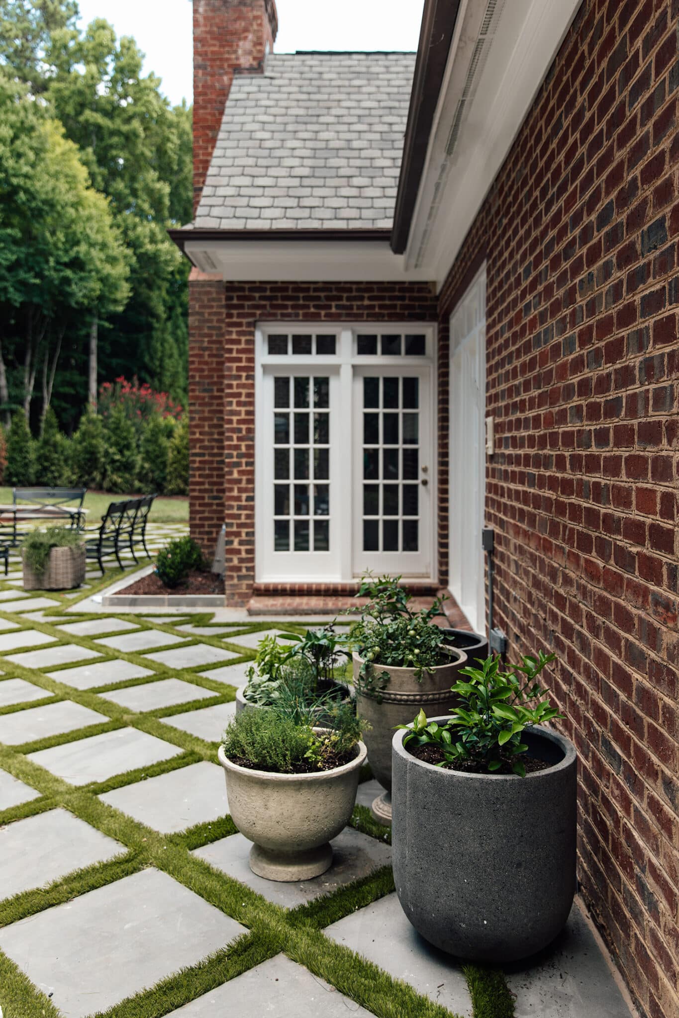
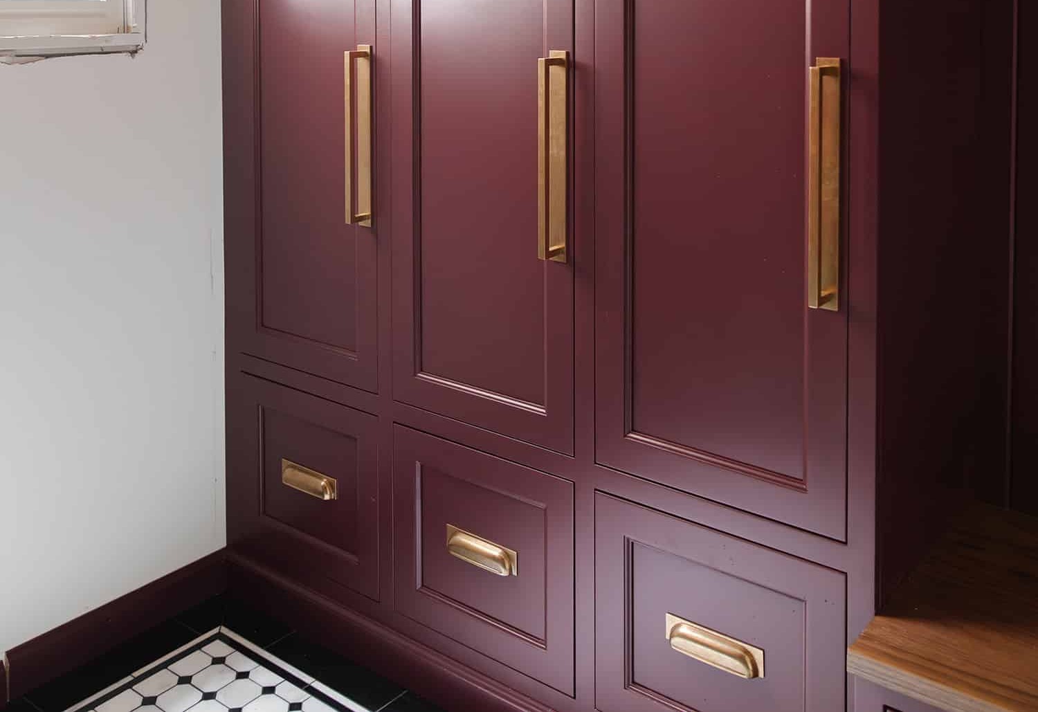
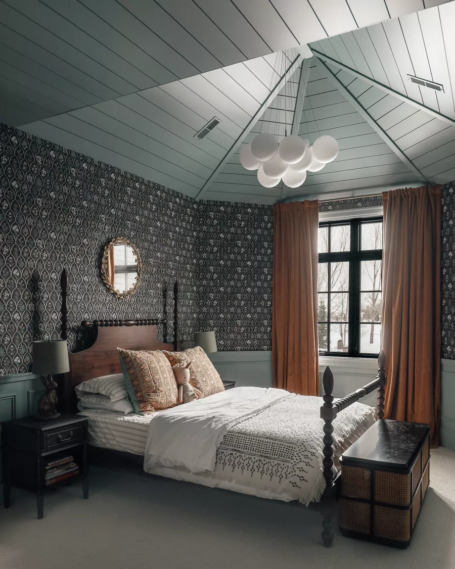
Now I want to introduce you to a handful of the 17 filters that come in the pack! I named each one after an INTERIOR space. These before and afters are just applying the filter and nothing else. I love the enhancement!
This is the STUDIO filter (I don’t want to play favorites, but if I had to):
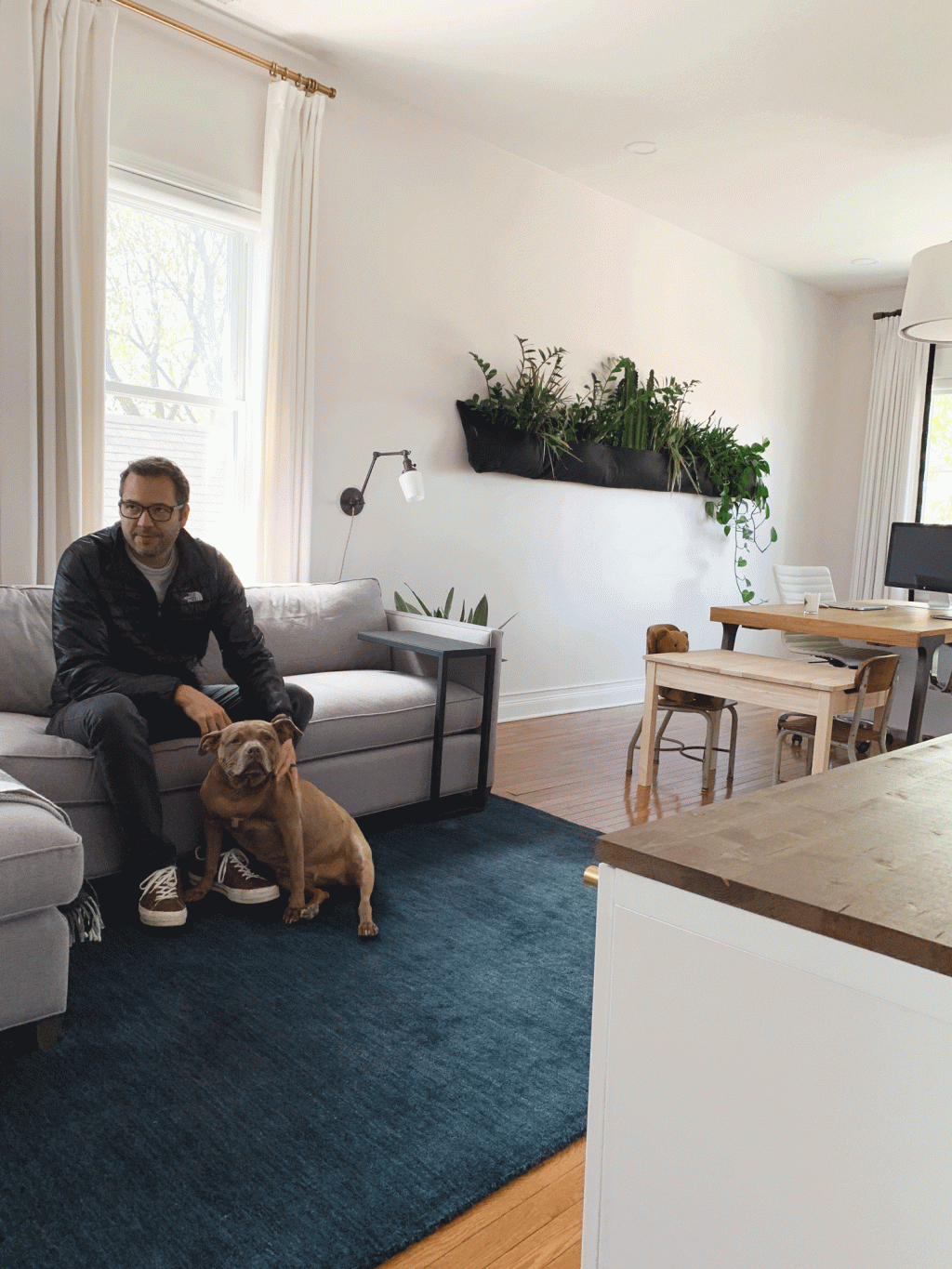
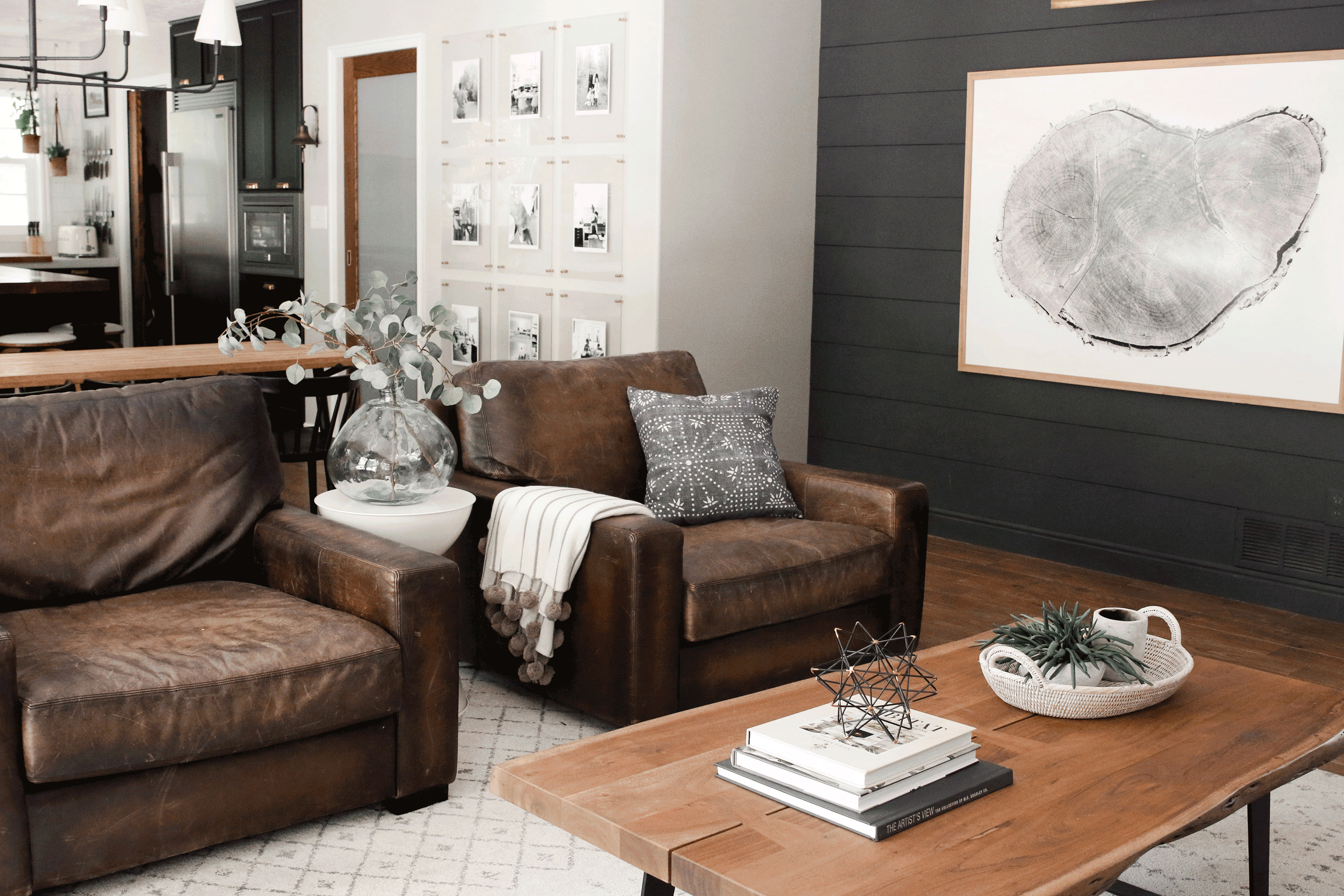
This is the LIVING filter: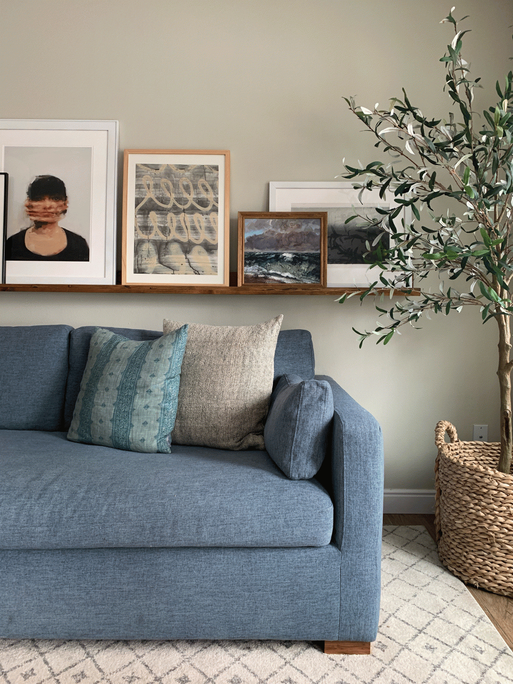
This is the LOFT filter. Moody and warm: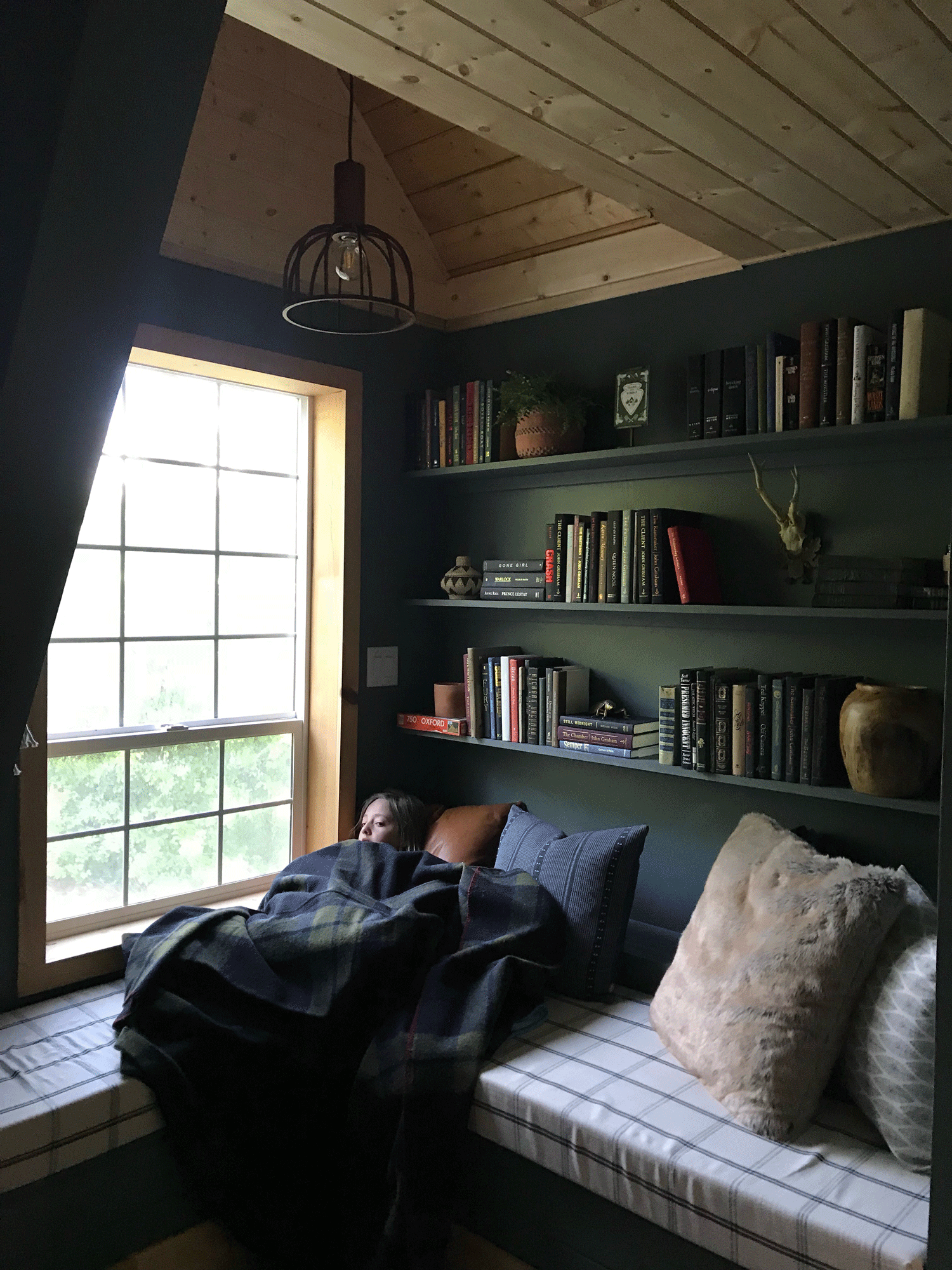
This is the POWDER filter (It brightens and softens beautifully): 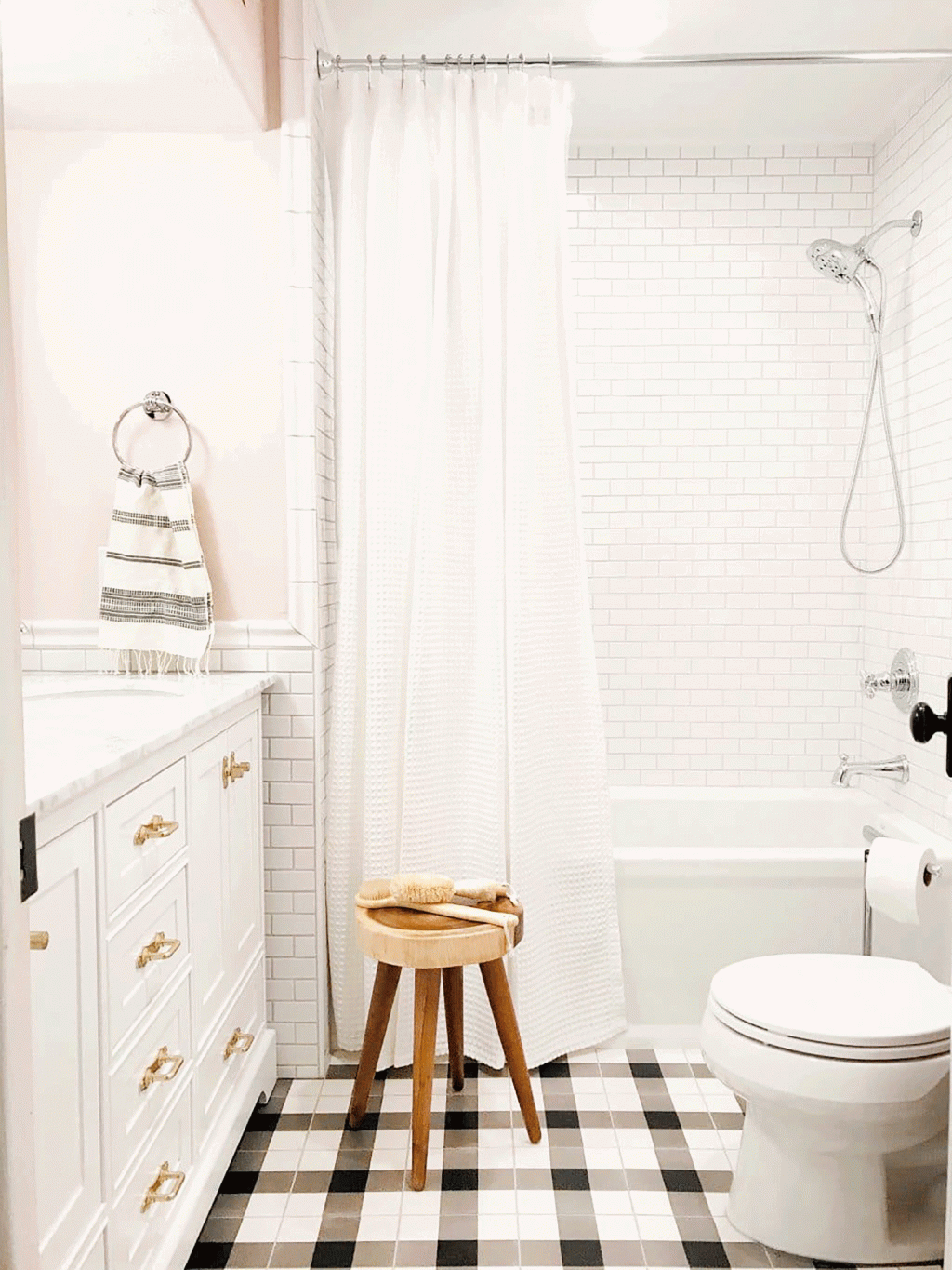
BUNK has a warm pink hue to it and is really fun to double up for even more effect. (Note: You can lessen the opacity of any filter by sliding the bar to the left after selecting and you can strengthen it by clicking the filter and adding it to a photo as many times as you want!):

GREAT makes me want to instantly be in whatever room its applied to instantly. It’s so inviting.

GUEST is actually another top 3 favorite of mine! It softens, warms, desaturates and adds a little bit of mood in one click!
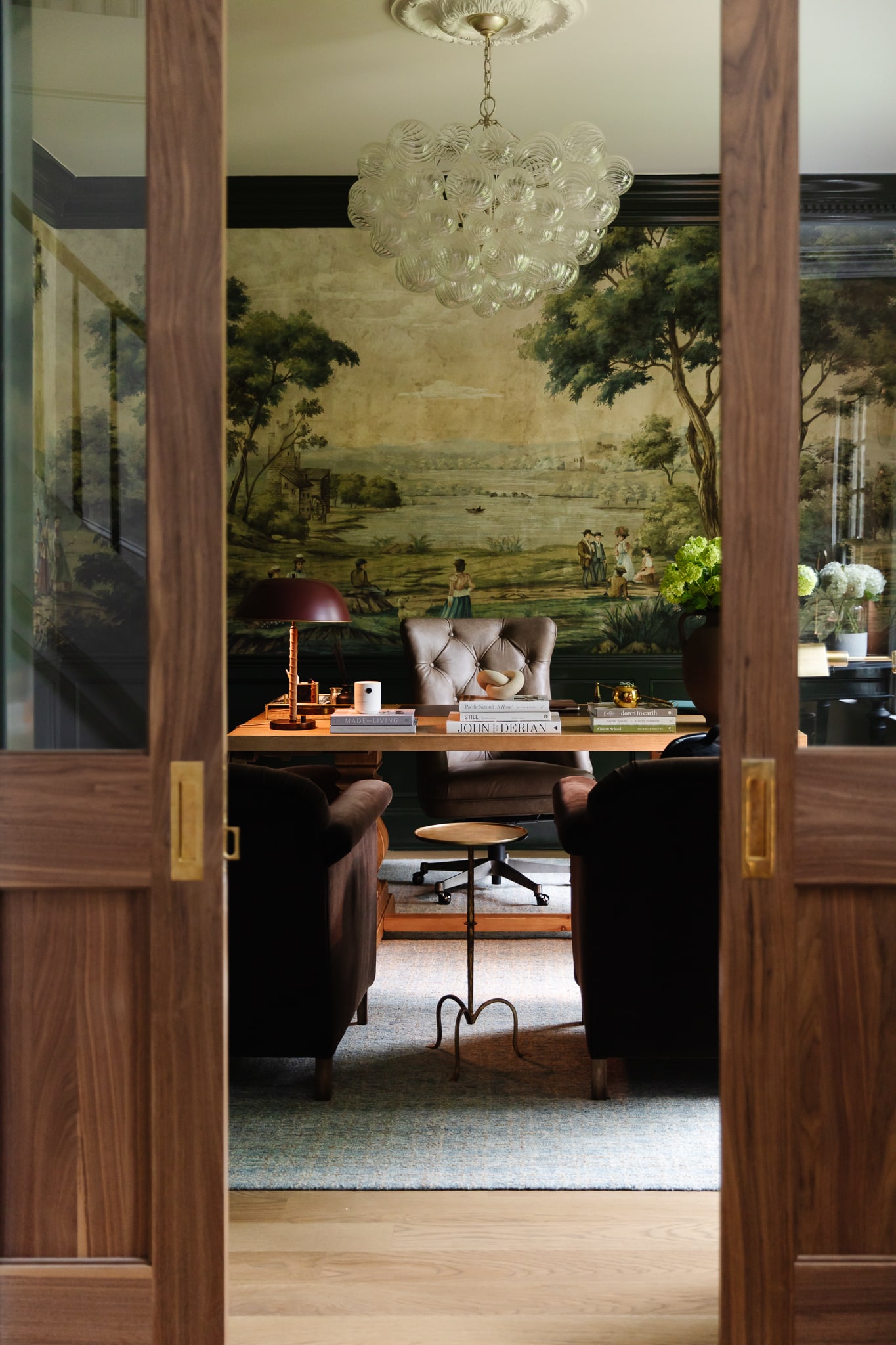
DEN is a mood, am I right??!
FAMILY I have used SO many times already on my own photos. It’s so natural, but when you see the before and after, it makes an impactful difference.
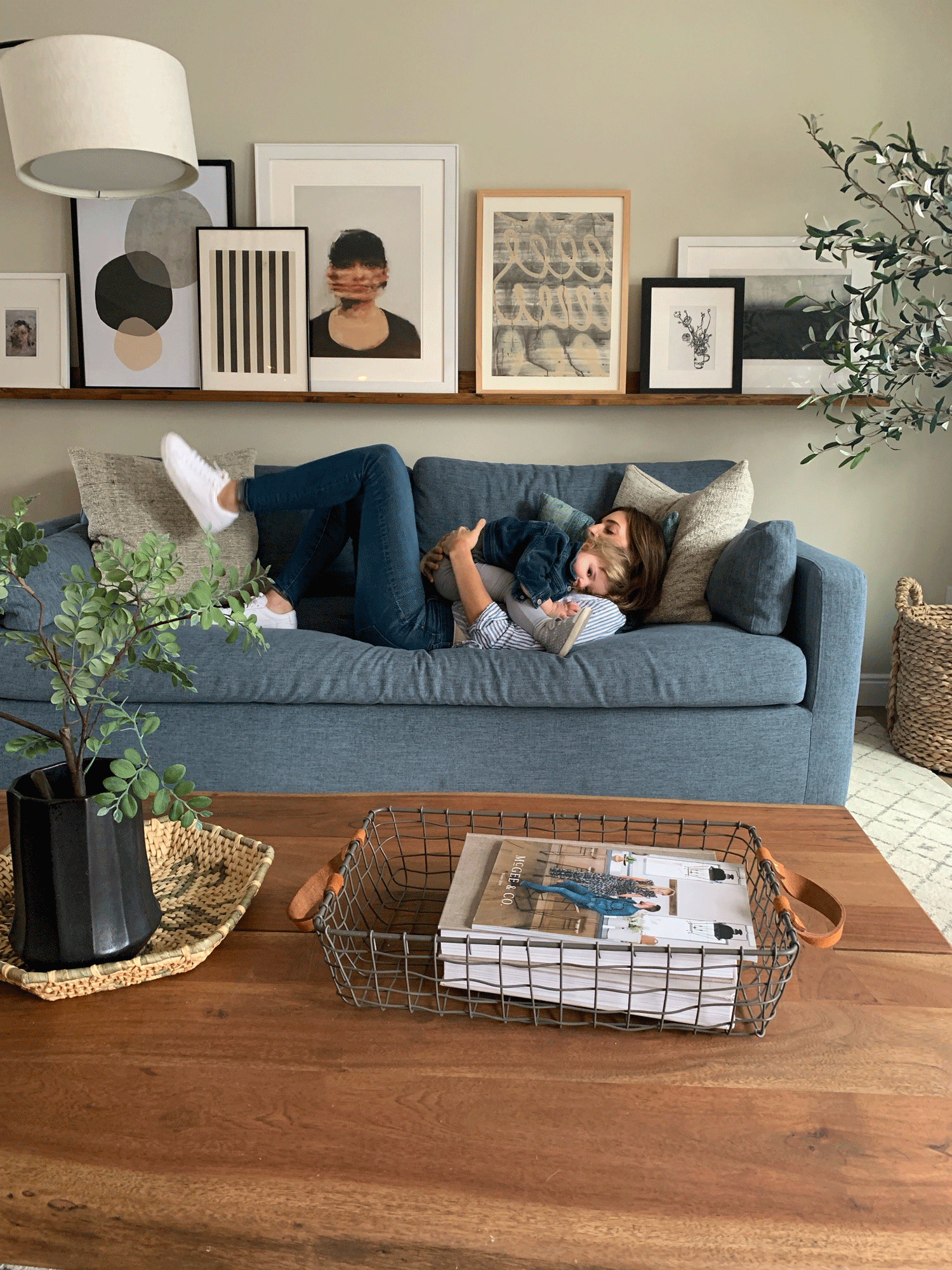
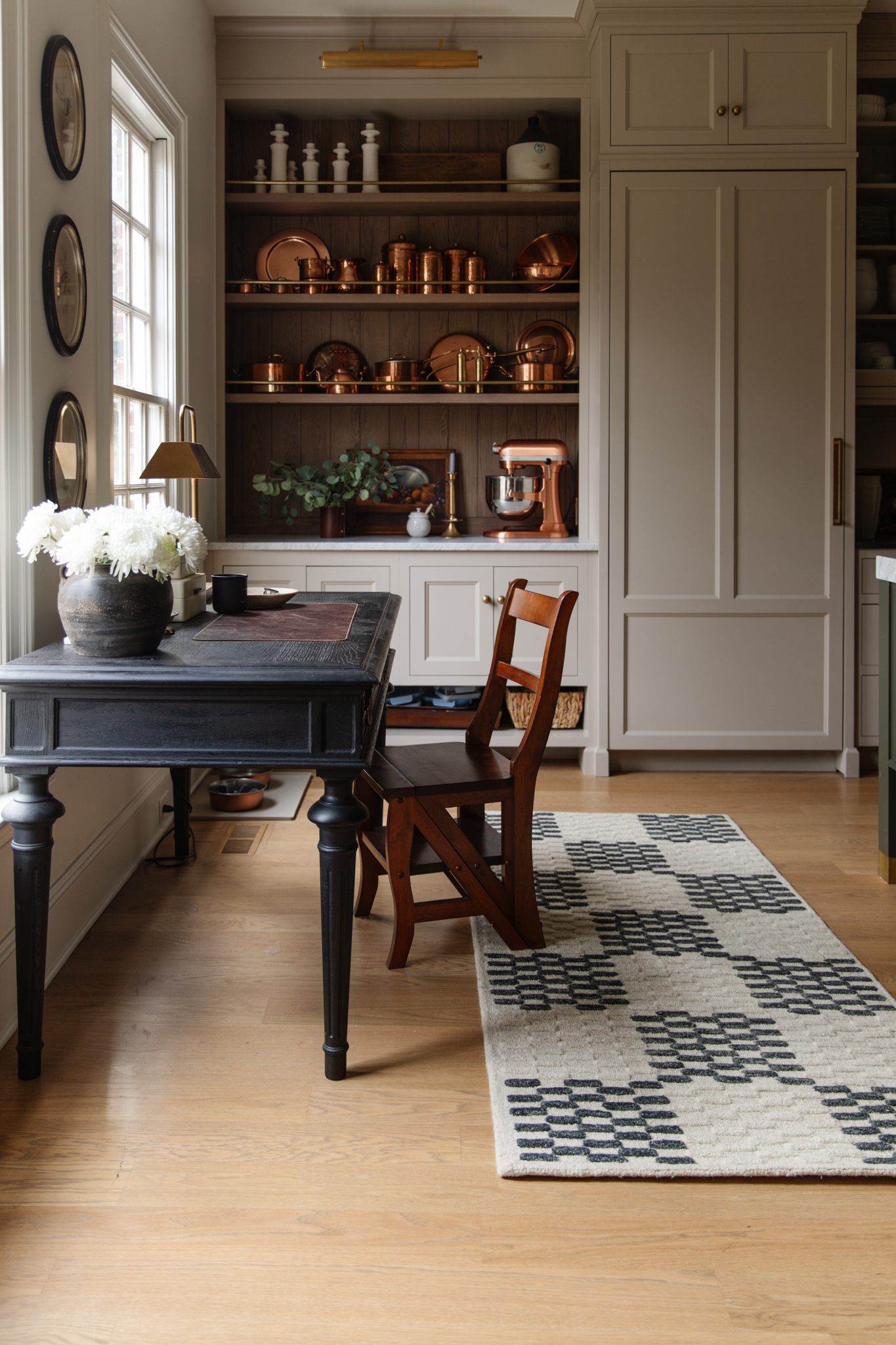
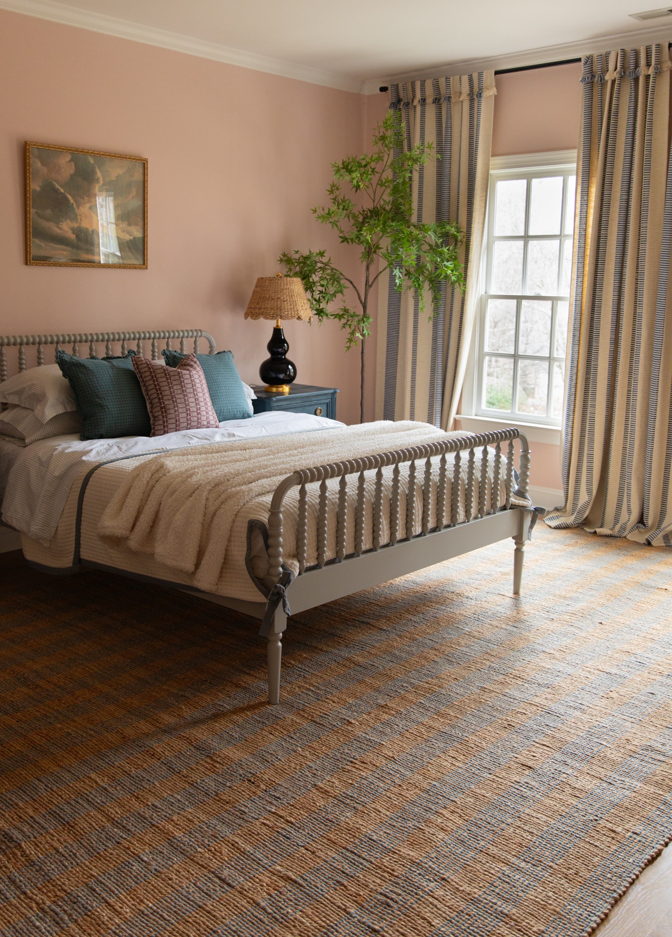
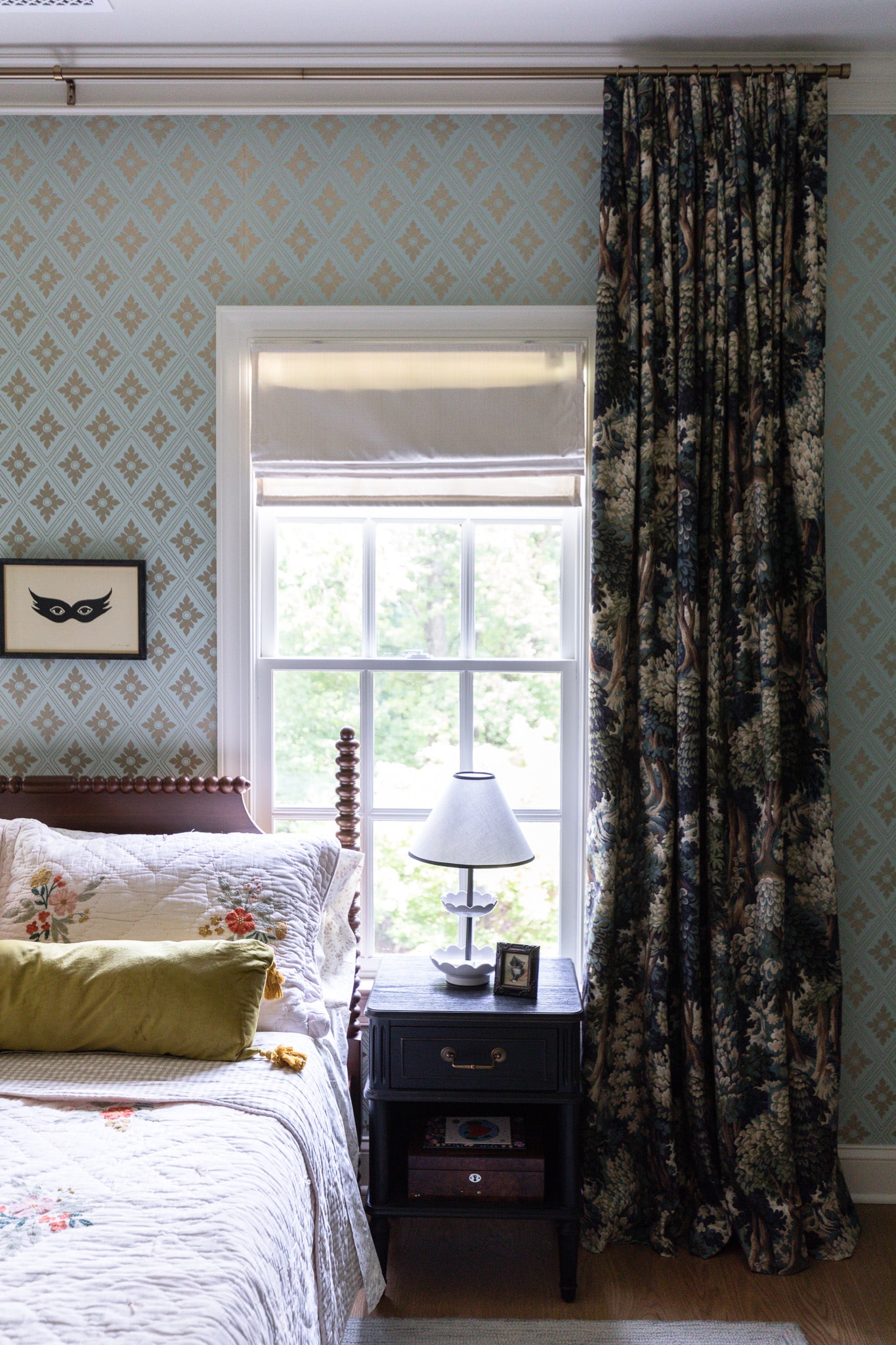
Also, although we named them for INTERIOR spaces, don’t feel locked into using the BEDROOM for your bedroom photos. Or ENTRY for only entry photos. Below I used KITCHEN! :

There’s more filters to try in the pack! If you don’t already have A Color Story app, you can download it for free in the App store! And our INTERIOR pack is just $3.99!! Thank you so much for all of your support (they actually released it late last night and I’m already so overwhelmed with the reach). Can’t wait to see all your photos! Tag me and #acolorstoryINTERIOR (I’m following that hashtag now) and I’d love to repost and feature some favorite edits!
Leave a Reply
What do you think?
Previous Post
Next Post
Semihandmade
Our wood grain Shaker cabinet fronts were designed for busy, high-traffic homes like ours. Clad with durable textured thermofoils, this line is compatible with Sektion, Akurum, Godmorgon, and Besta cabinets from IKEA. It's the perfect, practical way to add the warmth of wood to all the rooms of your home.
Collaborations
learn more

next
Loloi
We have teamed up with Loloi to create a line of rugs that are as affordable as they are beautiful. This collection houses a great mix of traditional and modern rugs, in cottage-y colorways, as well as vintage-inspired beauties that you’ll want to roll out in every room.
Collaborations
learn more

next
STUGA
We partnered with Stuga on a line of hardwood floors — The Ingrid is really livable, and the color is very neutral. It doesn’t lean warm or cool, it’s that just right in-between. We have really loved putting it everywhere in our house. It’s the best jumping-off point for design, no matter your interior style. In addition to being beautiful, Ingrid is really durable — we have three kids, and we always have a home construction project going on. Ingrid stands up to it all.
Collaborations
learn more

next
SHop all
What We're Right Now
What We're Right Now
Looking for our favorite things? A place to shop our home room by room, or just catch up on what Julia's wearing / loving right now? Browse the CLJ shop.
Loving


Portfolio


Design
Befores, afters, mood boards, plans, failures, wins. We’ve done a lot of projects, and they’re all here.
BROWSE BY CATEGORY
let's break this thing up
We have a long-standing relationship with DIY, and love rolling our sleeves up and making it happen.
Projects
Even when you don’t want to rip down a wall, you can make that space in your home better. Right now.
read more
read more
read more
02
01
03
looking for inspiration?
A reader recently asked me if I’m starting to fully embrace traditional style and whether we still consider our house to be a “modern Colonial” and why. It was a really great question and so timely — I had really just been thinking about my approach to this home and how my style has changed […]


SEARCH THE BLOG
We've been doing this since 2009 and we've posted a whopping 24145+ blog posts and counting. You might need a little help searching, huh?
looking for something?
find stuff like:
")
Can We Send You Our Love Letter?
Another way for us to stay in touch! Joining our weekly newsletter gives you access to exclusive content, never-before-seen photos, your questions answered, and our favorite DIYs. Sign up below!
Follow Along on Instagram
Welcome to our online community where we've posted home, DIY, style, renovations, and family since '09. Renovating our #cljmoderncottage in Idaho and headed for new adventures in Raleigh, NC. #cljfam #cljtransformations
@chrislovesjulia


Links
Get Around
Make yourself right at home
Portfolio
Design
Casual Friday
Projects
Lifestyle
Gift Guides
All Posts
Shop
Love where you live.
Social
RivrLinks
Links
Get Around
Make yourself right at home
Portfolio
Design
Casual Friday
Projects
Lifestyle
Gift Guides
All Posts
Shop
Love where you live.
Social
RivrLinks
I wanted to install the app to get the filters, but I’m only shown some painting apps. Is it iPhone only?
I wish you’d di a side by side of the filters before/ after. With it changing back and forth in a GIF, I doubt know which is the filter and which is the original.
This is so cool! We are officially living in the future! Do you think these filters have the potential to mislead readers about the “true” color of the products you recommend? I guess samples are the way to go, if possible?
Our filters are meant to be subtle and more real-to-life. But it’s ALWAYS a good idea to get samples than trust coloring from online.
Maybe a dumb question, but how do I purchase the Interior pack after I downloaded the app?
Great question! If you go to the filters tab, and scroll to the right (past the filters you already have, you’ll see it!)
I’m sort of confused by what is before and what is after… some don’t seem to change at all on my laptop. Could you possibly post side-by-sides instead of (or in addition to) the gifs? Thanks and congratulations!!
Oh no! I wonder if they aren’t working in your browser. I featured a few on Instagram, too!
Same here! Some of them I do see switching back and forth but it’s not always obvious which one is the before and which one is the after…some definitely are, but some aren’t. :/
Same for me. Only a few of them seem to be switching. I’m using Firefox on a desktop computer.
In case it’s helpful, I went back through, and for me, photos 1, 2 and 4 don’t appear to switch.
I can see the change on about half the pics (iPhone safari) but I too can’t tell the difference on which is before and which is after (aside from a few where the blacks are really brought out). Which is truly a compliment, since both pics are equally beautiful in their own right.
Question for ya… I remember you used a filter pack, (maybe from burtsbrisplease?). Do you apply those filters before yours?
Not in these examples, no. These filters are meant to just enhance the photo and not be completely drastic!
omg i can’t wait to get this! they all look amazing! i’ve been wanting filters with moodier, deeper tones for so long and these are perfect!