


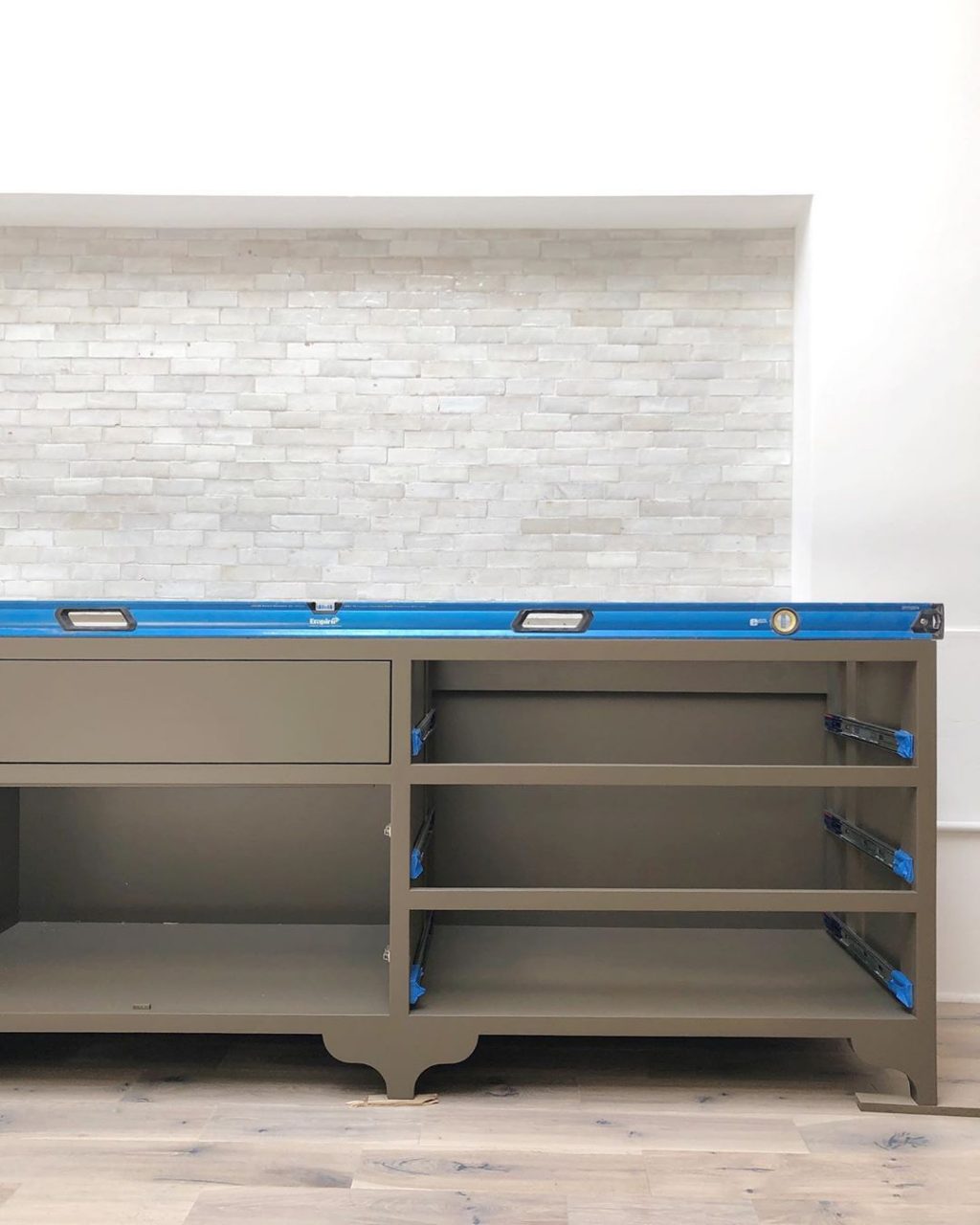
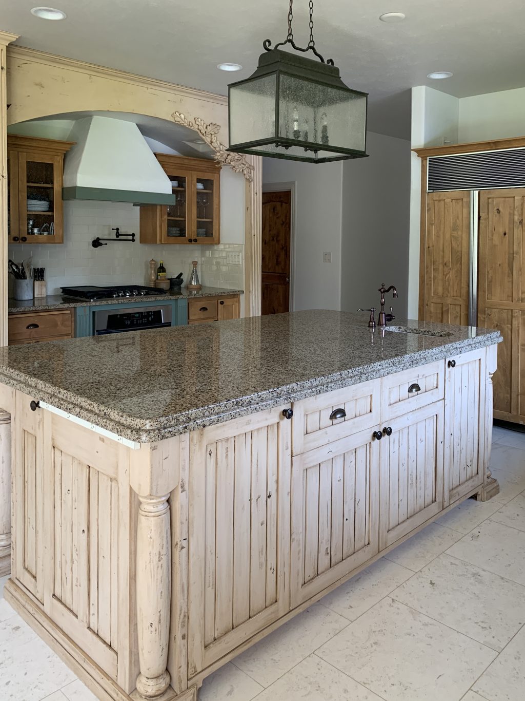
Next year sometime, we’d love to do a full kitchen remodel. We’re taking notes as to what isn’t working for us, but so far the main things are the interior of the cabinetry is too small, the oven behind the island (where the girls sit) feels out of the way and dangerous and we’d like to rearrange most of the appliances and be able to access the pantry from within the kitchen instead of around the corner. The island is big and bulky. It’s all really exciting, but we’re taking a year to save up and plan and continue taking notes to see what is and isn’t working. In the meantime, we’re gonna give our kitchen a quick and inexpensive phase 1 makeover. Here’s how it looks now:
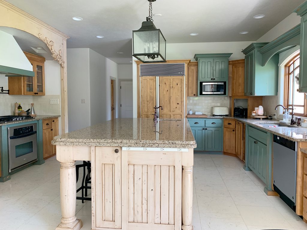
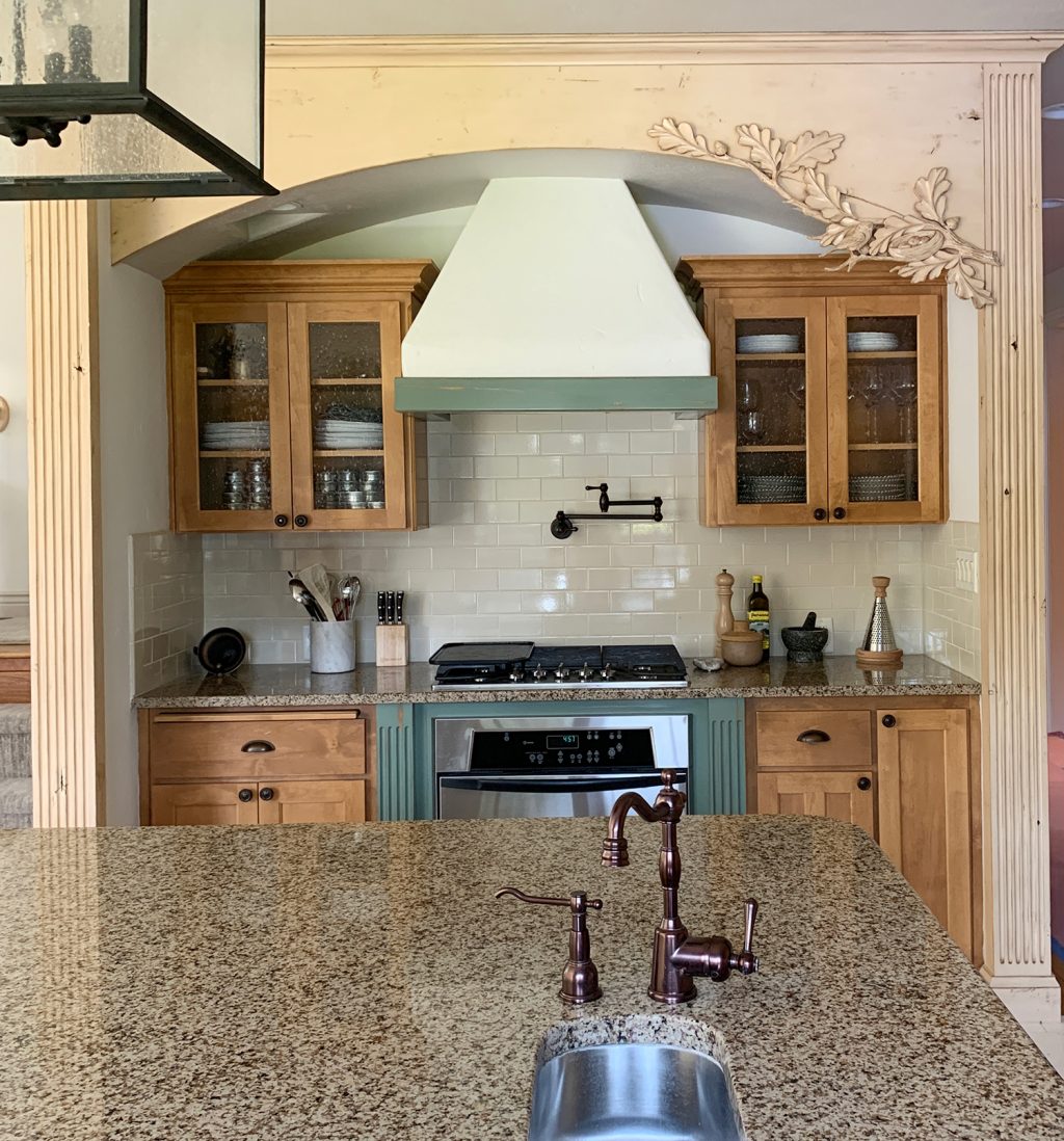
There are a few things that I think are really making our kitchen look dated: the tri-color cabinetry in a high-gloss, distressed finish, with a glaze on the island. Uppers hung at multiple levels (nothing dates a kitchen faster). Partial overlay cabinet doors and full overlay with shaker and beadboard mixed in and all the ornate trim work. We’re going to try to minimize all of these things in our phase one renovation, and address a few other things, too. But first! The color. Our brown granite countertops are staying through phase 1 (womp womp) so that’s the main thing we’re working around. Our white-ish tile floors are also staying until the full renovation probably next year.
We have a big video/photo shoot for THANKSGIVING (how?!) in our home mid-August–in just a few weeks!–so we are under a tight timeline to make this look a little more like us and we’re getting started this week. Paint is a great way to update a space on the cheap and just requires a bit of a time investment. We’re also going to be reconfiguring the upper cabinets and removing some. We’ll definitely share the whole process here when we’re done (and lots of sneak peeks on Instagram stories, too) but for now, I’m just trying to decide on a color.
Here are the colors I’m considering and the inspiration photos I’m drawing from:
1. A Warm Taupe-y Brown
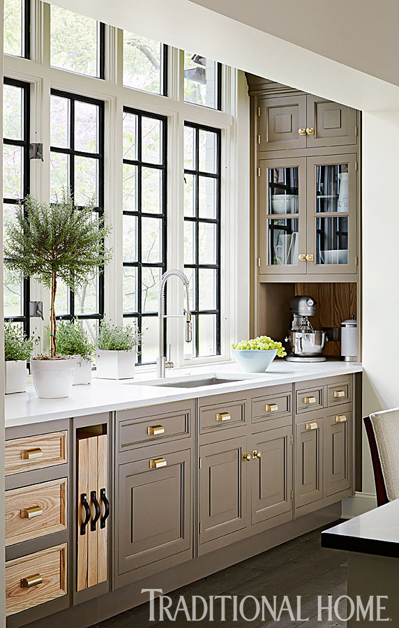
I was first turned onto this color years ago when I was researching for our last home’s kitchen. This kitchen from Traditional Home, designed by Christopher Peacock, below has been saved ever since and now might be a fun time to give the look a go. The color here is Farrow & Ball’s Mouse Back.
Recently, Brittany Chinaglia used a similar tone (Farrow & Ball’s Salon Drab) at her new Vintage Rug Shop store (in progress) and I fell in love all over again.
I think this would work well with the existing countertops but we would definitely need to add a more streamlined, modern element to the kitchen to pull this off with our current cabinets. Maybe fresh hardware would do the trick.
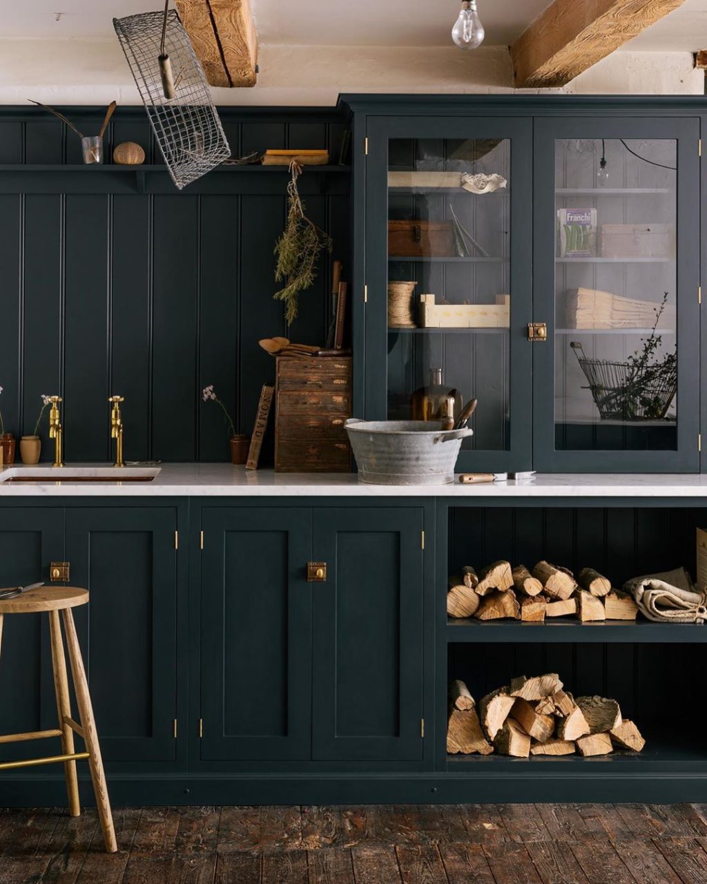
2. A Green-Blue
I really am into this cabinet color for our home and the cottage vibe we’re going for. It being the trial run, and working with a lot of existing things, I must say I’m worried to try this and it not work with the countertops (for instance) and it turns me off of it for the future. But, then again–is that even possible?
Emily Henderson really nailed it with this perfectly grayed-out green (Sherwin Williams Pewter Green) in her Portland kitchen project. Please note that all of the upper cabinets are lined up so nicely. Haha.

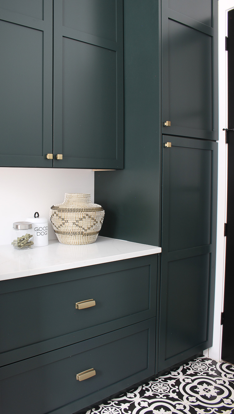
Or something a little deeper/inkier like this beauty from deVOL kitchen. (I believe the color is Farrow & Balls’ Pantry Blue)
The House of Silver Lining used Pratt & Lambert Essex Deep Green in their laundry room and it is easy on the eyes.
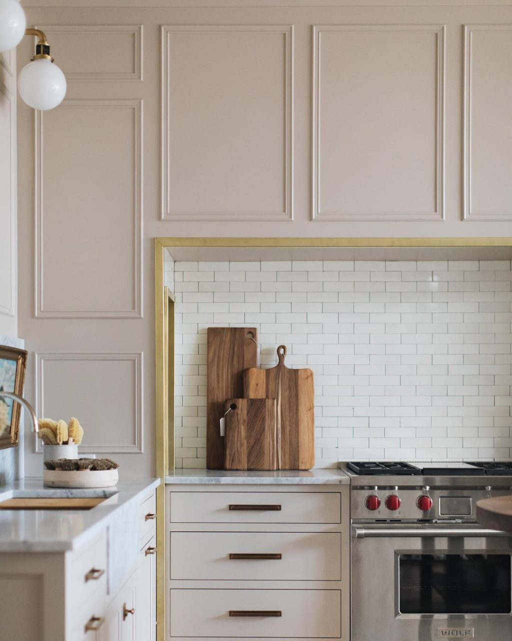
3. Something Light.
We aren’t very accustomed to a light kitchen after having black cabinets for the last few years (that we loved and would absolutely do again in a heartbeat but also want to try something new) but maybe now is the time to try.
These light gray cabinets from Amber Interiors feel fresh but classic thanks to a traditional hardware.

Jean Stoffer used a light beige in her storefront kitchen, Stoffer Home, and I’ve basically pinned every angle. We could even extend our trim color here if we wanted to! (I’m not sure of the exact color here, but our trim is painted Sherwin Williams accessible beige at 75%.)
I can’t do white because of our current tile floors. But I feel good about the options here. Although my mind is racing and part of me just wants to rip out the entire kitchen now (like, a big part of me), I love the challenge of working with what we have. I love the idea of seeing what we can do with $1000 (that’s the budget we’ve set for ourselves for this makeover) and a couple weeks’ time.
Can’t wait to take you along for the ride! Any favorites from above?
Leave a Reply
What do you think?
Previous Post
Next Post
Semihandmade
Our wood grain Shaker cabinet fronts were designed for busy, high-traffic homes like ours. Clad with durable textured thermofoils, this line is compatible with Sektion, Akurum, Godmorgon, and Besta cabinets from IKEA. It's the perfect, practical way to add the warmth of wood to all the rooms of your home.
Collaborations
learn more

next
Loloi
We have teamed up with Loloi to create a line of rugs that are as affordable as they are beautiful. This collection houses a great mix of traditional and modern rugs, in cottage-y colorways, as well as vintage-inspired beauties that you’ll want to roll out in every room.
Collaborations
learn more

next
STUGA
We partnered with Stuga on a line of hardwood floors — The Ingrid is really livable, and the color is very neutral. It doesn’t lean warm or cool, it’s that just right in-between. We have really loved putting it everywhere in our house. It’s the best jumping-off point for design, no matter your interior style. In addition to being beautiful, Ingrid is really durable — we have three kids, and we always have a home construction project going on. Ingrid stands up to it all.
Collaborations
learn more

next
SHop all
What We're Right Now
What We're Right Now
Looking for our favorite things? A place to shop our home room by room, or just catch up on what Julia's wearing / loving right now? Browse the CLJ shop.
Loving


Portfolio


Design
Befores, afters, mood boards, plans, failures, wins. We’ve done a lot of projects, and they’re all here.
BROWSE BY CATEGORY
let's break this thing up
We have a long-standing relationship with DIY, and love rolling our sleeves up and making it happen.
Projects
Even when you don’t want to rip down a wall, you can make that space in your home better. Right now.
read more
read more
read more
02
01
03
looking for inspiration?
A reader recently asked me if I’m starting to fully embrace traditional style and whether we still consider our house to be a “modern Colonial” and why. It was a really great question and so timely — I had really just been thinking about my approach to this home and how my style has changed […]


SEARCH THE BLOG
We've been doing this since 2009 and we've posted a whopping 24145+ blog posts and counting. You might need a little help searching, huh?
looking for something?
find stuff like:
")
Can We Send You Our Love Letter?
Another way for us to stay in touch! Joining our weekly newsletter gives you access to exclusive content, never-before-seen photos, your questions answered, and our favorite DIYs. Sign up below!
Follow Along on Instagram
Welcome to our online community where we've posted home, DIY, style, renovations, and family since '09. Renovating our #cljmoderncottage in Idaho and headed for new adventures in Raleigh, NC. #cljfam #cljtransformations
@chrislovesjulia


Links
Get Around
Make yourself right at home
Portfolio
Design
Casual Friday
Projects
Lifestyle
Gift Guides
All Posts
Shop
Love where you live.
Social
RivrLinks
Links
Get Around
Make yourself right at home
Portfolio
Design
Casual Friday
Projects
Lifestyle
Gift Guides
All Posts
Shop
Love where you live.
Social
RivrLinks
Beautiful color options! The blue green cabinet refinishing is my favorite. Are you going to do it yourself or call in a cabinet refinishing company?
Hi love the process. Would you know the paint color used by Amber? I have the same brown counter top…..
She doesn’t often disclose paint colors so I can’t be sure!
Would you consider camouflaging the floor for the year with sheet vinyl? I fell in love with a Mannington resilient sheet vinyl called Deco in the color wrought iron. Looks like a cement tile. For just over $1 a square foot it could allow some different cabinet color choices at least until the next phase.
Buy those paint samples and see what they look like against the countertops. The island seems like a good place to test all those colors.
I loved the darker color cabinets! Can it work in a smaller open kitchen?
I want to know this answer too!!! I am ready to paint our kitchen cabinets but worried with our small kitchen dark would be bad/make the space look smaller. Is this true?
I vote ( like I have one; it’s your house! ;-)) either the Mouse Back (or whatever version is closest in the paint line that you’d use), or the Accessible Beige that’s your trim color. That granite is so warm in tone (or at least it seems in photos), that I’d want to try and work best with it – which I don’t think is something high contrast in color or lightness/darkness of tone.
All of the green/blue options are gorgeous, but they are depicted with more neutral colored counters, and I think that you’d end up with the blue/brown scheme in some way that you have now. Which is fine, but not what I’m sensing that you’d want to live with for the next little while. That Mouse Back with the black trimmed windows just made my eyes go, Ahhh…
But I know that it will be beautiful no matter what.
Why don’t you do something light now, and when you do the big remodel, do something different, like a green, if you wish? I love that silvery-blue eucalyptus color. I’m going to try and find a paint color that fulfills that when we move in December. I’m thinking it’d be good for a bathroom vanity!
Extending the trim color seems like it would be so chic! Definitely my vote
Just a little feedback from a longtime fan and follower…it’s possible to post your opinions without making your readers feel crappy about their own homes. I’ve noticed this in a few of your posts and I decided to finally say something today when I read what you wrote re: staggered cabinets. You could just say when you do the full remodel that you won’t stagger the cabinets because that’s more timeless, or whatever. Make it sound more positive rather than basically saying “if you have staggered cabinets your house is SO dated!” because that’s how it reads/comes off. I follow a ton of designers and decor blogs and none of them make me feel the way yours occasionally does. Maybe try filtering posts through the lens of your typical reader. It stinks to be excited to read one of your new posts, excited for ideas/inspiration, and to leave feeling bad about my own house (which is nice, so I try to keep perspective, but still!)
You like what you like, but she is 1000% correct. Staggered=dated! This is her blog, she should be honest and say whatever she wants to. Instead of getting defensive and sensitive about it, just realize that it’s not her intention to hurt people’s feelings. Maybe you’re realizing she is right..??
I also have staggered cabinets from a previous owner and I hate them. I wish Julia was offering some kind of DIY solution for that in Phase 1… And yeah I feel crappy when she says it because they are crappy and most of the time I just try to forget and remember there are more important things to spend $$ on right now.
We rearranged our upper cabinets, removing some and lining up others so they weren’t staggered and that didn’t cost us anything! We are all about DIY solutions. We’ll be sharing more in the upcoming week.
We just remodeled our kitchen and went with a color match to Sherwin Williams Cyberspace on the bottom cabinets and I LOVE it. It looks pretty grey on the swatch and in the can but reads navy in the our space.
#1 for sure!
The Sherwin Williams Pewter Green from Emily Henderson is so beautiful but with the color of your countertops, I’m not sure it would work. I love the Mouse Back, would definitely look great with your countertops. I’m sure you will figure out the perfect thing to do!
I think I would take out all the uppers, and *if the floors extend beneath the island* take it out too in favor of something temporary and easily repurposed. It may blow the budget but it may also buy you a little more time to make big, permanent decisions. And that eliminates most of the dated, country vibe so your paint, hardware, fixtures, etc really do their job.
I love the light gray from Amber Interiors!!
i can’t wait!!! we’re gearing up for our phase 1 kitchen remodel and it’s just about all i can think of. i know you’re going to make the best decision for your house and light IRL, but i would love to see one of the beige tones! we’re taking a page from you guys and will probably do the kitchen walls in BM hazy skies, but it just didn’t feel right on the cabinets here. :(
let me live vicariously through you!
Love the Mouse back…
Love the idea of painting the same color as your trim! Cannot wait to see what you do, I know it will be amazing!
You always have the best way of breaking down WHY something looks bad. For the longest time (still now) I’ve always had a hard time describing what it is I do or don’t like about a room, but I could look at a photo and say ‘yes I like that’ or ‘no I don’t like that style’. And why on God’s green earth are those multi level cabinets so pervasive?!?! I see them in all the brand new show homes in my city. You could forgive a designer for their past sins but this is still. happening.
With the countertops, I vote beige/taupe so they blend and look purposeful. I think the countertops will stand out if the cabinets are green or something like that.
Do you plan to paint the cabinets yourselves? We want ours painted and I feel like it’s expensive but I worry about our skill level trying to DIY.
We will be doing it ourselves.
I vote blue-green. It’s tough to get a true sense of the granite from the photos, but in your existing kitchen I much prefer the areas where the cooler-toned teal cabinets meet the beige/brown countertops as opposed to the places where the honey wood meets them. I think that the darker, richer color could help make those countertops feel more modern and I don’t think it’s possible to ruin those beautiful colors!
I scrolled through all of the paint options with the counter photo adjacent to them, and based on that exercise I think Pantry Blue is your best bet! Good luck with the updates. :)
I like Mouse Back! I’ve had that same Christopher Peacock kitchen pinned ???? I feel that the Mouse Back would integrate the whole look and not highlight the countertops that you don’t like. A contrasting color would make the countertops stand out. Like… Great cabinet color. Too bad about the countertops. ???? With Mouse Back you would notice the cabinets first and the countertops would blend in and no longer be a focal point. Mouse back with black and brass accents would be quite stunning. Can’t wait to see what you do! ????
I’d love to see a dark murky green cabinet! I know that’s not an option up there, but i think it would be great with the white and beige walls and trim.
I do worry that with the gray backsplash and brown granite cabinets, plus if you continue the Accessible Beige trim around that curved and routed surround on the stove inset wall…..if you did brown cabinets that’s A LOT of brown. But what if you lightened the trim in this room so that it matched a lighter white wall color, and did the cabinets a deep muddy green like some of your inspirations? I think it would still work with the granite if you did a green color that had some brown undertones in it. I do suggest making the trim + wall color the same in the room. If you have cabinets + trim+wall+backsplash+counters each in different tones…..that’s a lot of competing colors. That’s the major issue with the kitchen as it is now – Just.Too.Many.Different.Finishes!
Your granite is very brown so I’m leaning towards the mouse back or beige. I’d love to see your talented sister mock up the darker colors with your granite.
Looking forward to this.
I just modified my kitchen when I moved in. Painted perimeter dove white. Then added nero mist honed granite. The island was new. I was torn between the sw night owl (dk gray green) and bm hale navy. I ended up going with hale navy, carrara (huge mistake) top, brass fixtures, pendants from rejuvenation. Love it!
I think the dark color with the granite risks putting the kitchen circa 2007 unless you do a lot of their other work being hinted at: shelves, findingna way to get the bead board look out of the equation, etc.
My vote is for the brown or grey.
I would do a deep green. I love the color but I will be afraid to do it in a permanent kitchen. But you will only keeping for a year so it is perfect!!
I am looking forward to seeing what you do!
Do the Essex Deep Green. All the way. Will look amazing, trust.
I love them all! I hope you plan on educating/talking with us through stories on your thoughts on choosing a color. I also have a brownish granite that I would love to work around but I’m stuck with trying to figure out how to tell if it goes with what I have or clashes. I would love any and all advice to get me started.
Alice Waters green, and keep the cabinets by the stove wood. I’m really feeling a more organic earthy vibe right now, moving awar from gray/white/brass and towards warmer creams, browns, black and green.
I totally agree with the comment to remove all uppers and install shelves. Keep uppers by stove alcove though. I think the dark color would work best with light natural wood shelves. The dark color would make the brown look almost black. Can’t wait!
Love the neutral colours, think it will work well with the existing granite. It’s so great to be able to be make small changes with big impact. Sometimes it’s nice when while waiting for the big Reno. So exciting!
I liked the first and second colors to go with the counter tops. The color you love, (which is gorgeous!) you’d hate with your existing counters!! I don’t think the grey would go with the counters either. Surprisingly I think extending the new trim color to the cabinets would be very elegant and diminish the multi tier look as well as the changes you’re already planning. Chris nailed the easiest solution!! Well done.
Thanks fir asking!
How fun!! All of the options you’ve chosen are beautiful. I can’t wait to see what you decide. I am new to reading your posts and watching the magic happen. I am totally inspired by you guys. Here’s to green and growing. Sure beats ripe and rotting.
I know it wasn’t in any of your inspiration pics, but with the brown countertops, I can see a light-ish or very saturated navy working really well!
Love, Love, Love EH’s Pewter Green kitchen. Almost painted our house that color! Went with Retreat instead. Love moody greens with all the light you have in your kitchen!
Pantry Blue feels both sophisticated and vintage.
I would paint the perimeter cabinets same color as the walls so there is little contrast and the unevenness isn’t as noticeable. For interest, go darker green or Accessible Beige on the island. Have fun!
Love the idea of keeping to one or two colors. Since you have that black and taupe granite, how about the taupe cabinets with your black kitchen furniture.? With your white floors it would be so clean and simple looking.
Team green-blue here!
I love all the colors you picked but ALL the inspiration photos have light counter tops. I just can’t see the cabinet colors with brown counter tops. But agree, it needs a refresh! Excited to see what you do.
I was thinking the same thing. I think the cabinet color needs to contrast with the counters, but I’m sure Julia knows this. ????
Quick? Not likely. By the time you prepare all those cabinets and trim, prime, 2-3 coats of paint and at least one top coat you are talking about a lot of time and energy. Inexpensive? Not if you do it right. And all that when you are doing a major renovation in a year. Leave it alone and then do it right next year, rather than piece meal.
For us it’s worth it.
I agree! Plus you shouldn’t need to prime and no top coat necessary with a quality enamel! I have similar granite and went with a mushroomy taupe color that looks good. I love following along on your journey!
What paint do you use for cabinets!? I have been dying to repaint mine but just am not sure which paint to get!
I looove the light gray cabinets from the Amber Interiors pic, and if you choose a warm gray, it could look really lovely with the current countertops. I agree that the green is gorgeous, but may clash with the stone.
Thank you for showing the progress of your home and showing that temporary updates are ok too! So glad you are able to make impactful changes without spending a ton, and without purchasing materials that will just be discarded in a year’s time. Updates don’t have to break the bank or fill the landfill.
Pantry blue!
We’re trying to update our kitchen on a small budget to get ready to sell. We’ve had all white cabinets for 3 years. White cabinets so don’t work for us because they show everything! I’m thinking about a silver green lower cabinets and white uppers.
I’d love to follow along with you guys as you go through the process! Anything you do will look great!
I am so excited to see what you do! I love following along, and gaining inspiration from your makeovers, big or small! ❤️
The deep green or the mouse back.
That dark green is definitely my favorite. Just looks expensive haha
Love to see your thought process!
If you like inky blue, check out SW Inkwell . It is n my dining room and love it after sampling about 10 blues that weren’t dark enough. (Also loved BM Narragansett Green, but it wasn’t the look that I was envisioning. )
While I love putty colored cabinets (dark or light) in general, I also would worry that it might be too much brown as others have suggested. And how does that work with the new trim color? I am curious.
Will the green blue look too country and similar to the green that’s already there?
And my last thought is that I have seen brown granite look gorgeous next to the right cabinet color, so I wouldn’t dismiss the granite just yet.
Love the pantry blue from devol – will work best with your countertops. I think the biggest problem you face in your phase one is making those countertops look good, so I would prioritize choosing a paint color that flatters them. Any of the choices above are great cabinet colors, but which one will best flatter the granite?
Hmm.. so many decisions, but I love that you guys are doing a phase 1 because sometimes kitchens need to be updated but there isn’t the means to do a full kitchen renovation. Helps me to see what’s possible if the ideal isn’t! ???? Loving option 2. Options 1 & 3 make me worried the whole kitchen might just look brown if you’re planning to keep the countertops ???? however if anyone could make that work you guys could! ???? excited to see what you choose!
Something blue/green, all the way!!
Amber Lewis uses IKEA + Semihandmade for kitchen cabinets?! This makes me so happy. For my fellow CLJ and AI fans, here is Amber’s interview with Domino on kitchen renovations: https://www.domino.com/content/amber-lewis-kitchen-renovating-tips/
The devol kitchen in pantry blue looks awesome and will be cool, different, adventurous! (not really feeling the light grey/beige with your existing finishes)
I would go with the Pantry Blue on the cabinets because it looks like it would go with the counters the best.
Silver green with the white floors
Stunning (and so not every other IG kitchen out there..)
The cabinets will sing Hallelujah ????
temporarily anyways
In each inspiration photo, I love all the colors but the finishes have all been updated. I feel like with the floors and countertops you’re keeping, the taupe or any variation of brown will come off very 90’s (in a bad way). I love the Pantry Blue. I feel like it would play beautifully with the new cane chairs you have and look gorgeous with the table in the attached breakfast area.
taupe brown in #1 – ALL THE WAY! It’s such a great neutral that isn’t boring. IT will look good with your counter/floor/etc. IT will photograph well with fall/Thanksgiving colors. But most importantly, it’s calm enough that it will let you eye and mind plan the new kitchen.
I LOVEEEE the Mouse Black and Salon Drab, they are so classic and soft, and either would be a good transition colour which would work with your existing floors and counters
I love all the inspiration photos, but I really need to see color samples in the space. Since you aren’t changing counters, back splash and flooring yet, I think you have to go with what looks best with those. The bold green might quiet the counters, but then again it could totally clash. A more total shade of taupe or beige might end up looking best. Looking forward to voting on your stories once you have sample colors narrowed down. ;-)
I love the Emily Henderson kitchen and have always been a huge fan of Devol’s Pantry Blue (I believe that is Devol’s proprietary color but I have seen a comment by Devol that it is close to Railings by Farrow & Ball). Like you and others, however, I wonder how those colors would play with your existing countertops. It might be interesting to see a paint chip next to the counters just for fun – although I am sure you will pick a color that works well.
Devol replied to me once re the paint and yes it’s a proprietary color:)
They’re all sooo pretty! But I wish you could have found an inspiration pic with brown benchtops (your inspo all had white!). There must be at least one nice kitchen with brown benchtops … right?? ???? xx
Go for the blue/green! So fun to have the luxury of trying the color since you’re doing a phase one! Remove all the upper cabinets and do open shelves? Keep the 2 side cabinets above the stove — I’m sure you’ll remove that alcove look there which will help a lot. Then paint the cabinets the blue/green color. Maybe leave the island the cream color or paint it too? Counter color not ideal but it’ll probably be ok for a year? So fun to be able to do a temporary face lift and test out colors and live with them. I’m a new follower — love watching your renovations!
with your speckled countertops definitely Mouse Back!
I’m in the same boat of probably having to do an in between mini reno and I do love the challenge!
Not sure you could go wrong with any of those! So glad you will be rehanging a few cabinets and giving yourselves a limited budget just to see what can be done! Hardware and painting will go a long way. I vote for warm taupe. I think it will be nice with the existing counters and floors but also give a little contrast with the trim but not too dramatic. The black windows will provide the drama!
Beige would be way too much brown in that space. I love the color Emily chose for the Portland kitchen and think it would be perfect!
I was immediately drawn to the inky-teal and it would look so good with the wall and trim colours you choose. It would also be very interesting to do the trim colour but perhaps at 100% and go neutral. I know whatever you choose will be beautiful. And I totally noted the cabinets all at the same height. ;)
Lots of great options. I think you should choose a color that’s darker than your countertops, at least for the lower cabinets, as the contrast against the granite will make the granite appear lighter and less brown. Can we see a closeup of the granite?
100% agree! Begin by looking at counters like yours and then colours you like with it.
I was immediately drawn to the inky-teal. Possibly with brushed gold hardware. I think its dark enough that it would place nicely with the counters. A temporary kitchen update will give you time to see what you would love in the long run and enough that every time you walk in you will not be wanting to make a change. Excited to see and also learning to enjoy the process.
Julia,
I’m having a similar problem deciding about paint colors for our cabinets. They are for now an oak golden color. Not bad but I don’t like seeing the dark wood grain that much. I worry that I want to paint them now when I’m seeing that wood cabinets are coming back. But anyway I’ll like to paint them to give more light to my kitchen. My kitchen window it’s at the end in the breakfast room so it’s not a very bright kitchen. Our trim is white and my walls are accessible beige. I was so surprised to know that you and I are I to the same colors. I love your taste so I’m happy about that. My counters are staying for now, too many expenses and they are a dark muddy green grayish too. I’m afraid of going dark if the kitchen door already dark but I absolutely love Emily Henderson’s kitchen. I love oyster bay too. I thought about carrying the same wall color into the cabinets or go one more down like balanced beige. I can’t do white since my backsplash is kind of accessible beige and flooring is taupe with brown ????????♀️I’m thinking I’m a few years to change the counters and backsplash. I would love your input in my thoughts since we are talking about the same colors and I love your style. I can’t wait to see yours done!!
Thank you
Although I love the taupe in the first pic, I think it might be too monochromatic with your current counters and tiles. I’m an all-white kitchen girl personally (can’t commit to a colour scheme so just change out my accessories frequently ????), but if I had to choose just one in the short term, the Emily Henderson inspo pic definitely makes me swoon, lol!
I like the inky teal-blue color just because you don’t see if very often; It would be fun to try in a temporary kitchen. I would keep the existing wood stained cabinets and only paint the existing pale green cabinets blue. I’m looking forward to seeing what you guys pick – they all would look great!
a pale beige. would look best with existing countertops and gold knobs.
I am loving following along with your new renovation projects! It is so fun to watch the home transform into a space that feels so much like your family (if that makes sense!).
I absolutely love the green/blue cabinet colors – but worry with your counter tops you might end up disliking it and – just like you mentioned – ruining the color for future renovations! All of your inspiration pictures with cabinetry that color have white or cream colored counters. I also worry the brown might end up being too much brown after it is painted? Although I am imaging all of the current cabinetry being painted – when you are likely going to lessen the amount of brown up top significantly! Personally I love the grey or beige colorways – but I think it might be interesting to see how everyone’s opinion changes once the cabinet layout has also changed!
So looking forward to seeing what you select!
Inky teal blue for sure. So so beautiful. I love the deep green shades
All these inspiration images have lighter counters than the cabinets- so with your current counters still in place i would go the taupe brown in #1 or the dark inky colors…
Trim color for sure! I think the counter tops and all the details of the cabinets will be enough visual interest. I’d change out the hardware for sure too.
I love the dark blues and greens! Those colors seem to bring a lot of modern life, and would help hide the details you don’t like. I would be worried that the light colors would accentuate all the clashing details (ornate trim, bead board, appliques, etc) too much. I love the brown/beige colors you posted as the first option, but I think those colors work in those spaces because of so many other contrasting light colors (the counter and tile) and modern features, which keep it from looking like the beige in your grandmother’s house. I’d be worried that the beige would add to the dated look.
My fave is the inky teal french blue like devol but I just don’t think it would work with you or stone color. I think the best option with your stone color I would be the cream gray beige from Amber interiors. I was actually going to suggest that one! She may have given out the cabinet color on her other site all sorts of.
I think something like the lighter kitchen you showed. I think the taupe would just make everything brown, beige and taupe….
As much as I LOOOOVE the way you style with darker, moodier colors, I think the lighter, grayish tones might be best for your current kitchen. It would help disguise some of the irregular heights and styles of doors, blend well with the tiles and counters, and probably draw a lot more attention out the window, especially if you paint the pane dividers (is there a more professional term for those???) black. I would use Accessible Beige, either at 75% or 100%. All of your inspiration photos are beautiful, and we all know you will make your kitchen look gorgeous, no matter what you choose! Can’t wait to see it!
Mullion :)
Ooohh exciting! Personally, I would totally go with a dark blue/grey/green with that countertop. I can’t wait to see what you go with!
Like this: https://biggerthanthethreeofus.com/kitchen-reveal/
Yes! I was going to suggest Ashley’s kitchen reveal as inspiration too. When I came across pictures of her kitchen on Pinterest I thought the counters were butcher block at first. The beige granite seemed to recede and just compliment the wooden shelves.
This might sound weird but I’m SO excited to see how you make your existing granite work with your style. I can’t wait to see which direction you go for this budget makeover. All of your inspiration pictures are gorgeous.
I really like the idea of carrying the trim colour into the kitchen cabinets! I’m also obsessed with that Amber Interior kitchen and feel like it would work well with the existing countertops!
I’m always drawn to those beautiful blue-green cabinets! I’ve always loved the Lowes Baltimore kitchen makeover you guys did; where you raised the cabinets and put open shelving underneath. That was genius and maybe you can do that here too?
While I LOVE the idea of taupe/light beige I don’t think I would love it with the granite you have to work with so I am team blue-green! I just painted the exterior of my home pewter green (Emily Henderson’s kitchen was a part of my inspiration!) and it is a lovely color that is a chameleon – the color changes quite a bit depending on the lighting but I love the variety. I’m sure whatever color you end up with will be beautiful – so excited to watch this budget makeover!
I think the Amber Interiors example would look great in your kitchen. There’s nothing like some good paint and new hardware to freshen up your kitchen while you wait to do a full renovation! I’m doing the same thing right now. I also have a VERY old fridge that I painted with chalk paint, so that made a big difference for me. Thanks for sharing, good luck!
Love that you’re doing a phase one – lots of us will never get past phase one, lol, so they’re very inspiring.
I’d be interested in seeing what light cabinets do to those countertops. Maybe they’d look darker and more neutral, less “noisy”.
Ohhhh I love the dark cabinets so much, not to mention the greens and blues. I wanted it to work so much with brown counters, but I think it would really darken everything, and since you are painting the windows black I think a nice neutral shade would be perfect. I would say a little bit darker than your trim color. With brass/gold or black hardware. Good luck! I have been watching and reading everyday. I’m obsessed and can’t get enough!!! :)
The leaf detail around the stove area stresses me out. :) You will make any of those options look great…can’t wait to see what you choose!
I like the idea of extending your trim color- or even going full accessible beige for a little barely detectable weight. I like it.
I LOVE the idea of carrying over the trim color!
I’m feeling the warm taupe-y brown. I’ve seen the like mushroom color A LOT and love it, but I think the taupe-y color would be very different from what everyone else is doing. I also think it goes best with the countertops and the rest of the kitchen seems very light – floors, walls – so a medium to dark color in the cabinets would be a good contrast!
I really like the Mouse Back color. I haven’t seen it used much and like the idea of something different.
Your current backsplash looks similar in the photos to the new trim color. I’m voting for the light taupe color because I think a monochromatic look would look more modern to balance the traditional details!
We recently updated our kitchen and fell in love with Sherwin Williams jasper! It’s a very dark green but can look black at certain times in the day. Definitely worth adding to the list for a dark, moody hue! Have you thought about switching out a single, impactful counterspace (island maybe)? It might help settle the fears of disliking a deep color in the long run :)
Can’t you paint countertops too?! I’ve seen that done a lot. I guess you couldn’t do that if you plan on donating them?
Question- I see you said you couldn’t paint them white because of the existing tile. We have similar color floor tiles to you all but have black granite and are looking to repaint our kitchen cabinets. Do you think white cabinets would still not work with the floor tile? Any other color suggestions for cabinetry that would work well with beige floor tiles and black countertops?
Those blue greens … oh la la!!!! But the one from Silver Linings Home is my favorite so far.
I really like the warm taupe but worry with the counters it’d be too much brown. I actually think a lighter color could work really well!
I like the idea of trying the taupe – seems like a good fit to go with your countertops- and it seems like something different than what you’ve done before, just to see if you like it or not. Would it clash with your new trim color?
Warm Taupe!!
I hate my kitchen and was thinking about painting the cabinets so I will be following along. Hope you give step by step.
After reading the other comments, I think I’m in the minority but I vote for a light colored kitchen. I would fully expect y’all to do a bold kitchen based on previous home choices (black kitchen cabinets, the green wall in your living room of the old house, the bathroom tile in your previous master), so I think doing a lighter kitchen would actually be something out of the box for YOU! You have proven you’re good with color and make the bold choices work. So I’d be interested to see y’all work with a lighter kitchen. While it might be the norm for most people, it’s not really the norm for Y’ALL so if there’s anything you want to try temporarily, a light kitchen would be my suggestion for Y’ALL to think out of the box! Especially on a budget. Can’t wait to see what’s decided. :)
It’s true–Light is definitely not in our comfort zone.
I actually love all of these options SO MUCH! I think taupes and beige’s are going to make a big comeback! My only concern is how the counters will read with those lovely taupes and browns. Will it be too much brown? I think the Emily Henderson / deVOL might be the way to go. You might be able to lean into the countertop and make it read more seagrass basket accent/ textural – make it work well together versus make it disappear.
Also, for the unaligned cabinets. Oof thats a doozy. I hadnt noticed it before, but yes, quite the wrench!!! Can you remove the crown molding from the higher cabinets and then for the less high cabinets run a flat crown? Something more modern, flat, no ridges, essentially a flat piece of wood that hits the top of the higher cabinets along them to blend in better? Fool the eye into thinking they are one level? This might be another reason slightly darker paint might be good, would stand out less.
Whatever you do end up doing I know it will be beautiful!
The warm taupey brown is GORG!! Any of these are great options though! I can’t wait to follow along!
TEAM GREY! Since you need to play towards the granite counters, I feel grey is the strongest contender. Tan and grey go so well together. It feels easy and natural. Grey will lighten up the heavy, dark kitchen. It will flow beautifully with the dining nook. It’s low risk to try something new before the real deal reno that you are going to live with for the long term. I’m team grey all the way.
Pewter Green for the win! We are remodeling and doing a white and lighter blue green coastal inspired kitchen but searching backsplashes last week this Emily kitchen made me stop and ask should we change everything bc it’s a stunning color. Coastal rustic vs moody is an internal battle I struggle with. :-) I’m sure it’ll be gorg whatever you choose but I’m def looking forward to the $1,000 budget facelift.
Just a few weeks before you started painting, we finished painting our newly renovated house with white walls and accessible beige trim, too! We did Accessible Beige cabinets in our kitchen too. I really love it…it does make the house flow nicely. If I was doing a phased reno like you I would test one of those other fantastic options. I was a little worried those darker tones would be too much / too harsh of a contrast with otherwise very light and bright finishes in the house. The first Taupe-y brown would be a nice compromise!
Green grey!! Like emily’s. I think it would fit the cottage vibe so well and would be a fun test for phase 1. I’m also biased because i want to paint our cabinets that color but would love to see you do it first :) looking forward to your cabinet painting tutorial!
Some thoughts/content suggestions (or, tbh, requests): Tips on painting fake wood/laminate cabinets as part of a Phase 1 renovation? I don’t like ours but don’t want to make them worse and we don’t want to replace them now since we see a bigger renovation down the line. Along with that, it would be GREAT to see a post with suggested paint colors based on different outdated granite often found in 80s/90s renovations. Same cabinets have granite counter tops that we don’t love but need to tolerate for a while. Thanks!
I love that you are giving yourselves time to learn the flow of the existing kitchen to figure out what you really want in the new space: my husband & I spent 5 years in our house before dreaming up our new kitchen & then another year planning and then another remolding haha. As for color, I agree with the comments about going bold since it’s temporary! I love the green Emily Henderson used.
I would guy the kitchen and start over. The original designer should be ashamed of themselves. It’s hard to tell by the pictures but the recessed lighting looks like it’s to close to the wall. The designer added so much attention to the sink and stove area. That area screams farm sink. All the upper cabinets should go to the ceiling at least 42″ uppers with crown molding if needed. The stove area so closed in short and stumpy looking. Make a bigger statement by taking it up to the ceiling. The cabinets have to much going on with them. I some times wonder if some designers actually think about how hard it would be for the client to clean a spill on a cabinet when the cabinet has so much detail. As a Realtor and designer, I always tell people to live in the space before remodeling so they can think about how it needs to work for them.
I honestly think it’s just a case of times changing. I would never bash a designer, no matter their credentials for something they did 15-20 years ago. Times change and we’re excited to lift this kitchen with us!
I think a tuxedo style would actually look nice. Black bottoms/taupe-y top.
It would be so fun to see the polled results from other blogger friends. What’s Sherry’s opinion? What would Mandi chose?
In the end we all have vastly different styles, you know? But we’ve all done kitchens recently so it’s fun to see what we do differently
I am drawn towards the taupe. I actually did that type of brown granite years ago to replace white formica- when it first came out. I do not like it now of course but it is staying. I have white cabinets and taupey walls and it looks good! But I know you will pull it off- even if it’s just temporary!
#1 is my fave, but since this is a phase one maybe you try the Emily Henderson green color?? I can’t wait to see what all you guys do with rehanging the cabinets! I recently removed a HUGE 36″ tall upper from the corner of my kitchen and it made such a difference! I’m 100% not into the different height cabinets and that’s how my kitchen is. I left one cabinet that way because it’s the one the microwave over the stove is attached to, but that one doesn’t bother me so much now that the beast is gone from the corner. Haha!
I’m drawn towards #2-C or #3-B. They are all beautiful but this caught my eye the most.
I say go bold, if you’re only going to commit to it temporarily and then you’ll know whether you could commit to something like that long term. Whatever you chose will be gorgeous I’m sure!
The gray. Modern, clean, classic. The Audrey Hepburn of cabinets. And Audrey has never gone out of style! Plus, I think the last color example will look very pinkish against your countertops. I think the gray will tone down the brown and bring out the black in your counters. But what do I know…I’m an old lady who lives in the desert Southwest. We’re one big contradiction down here!
I love the darker color options best because of your granite you have to work with. But the light might be something good to try since you haven’t had a light kitchen and you might think it’s awesome. It would be a good experiment for your future kitchen plans. I am so excited to see this transformation almost more than anything because I am toying with the idea of painting my kitchen cabinets. I’ve never seen a tri-color kitchen like this. Yikes! So much eye chaos.
I vote for the gray green. i think the taupes will just make the countertops glare.
My question is – what sheen do you like to use for kitchen cabs? I’m jumping into this soon and dont want them to be shiny, but not sure if a matte paint is okay for a room that gets so dirty and messy, esp with 4 kids. Thoughts?
Satin is my go to!
Thanks so much!
I love the idea of the darker more dramatic colors! It would give you so much change and impact for what is a relatively small amount of time and budget!
i like the green/blue or something light to contrast with the counters. can’t wait to see what you do!
Pratt & Lambert Essex Deep Green. Are you considering F&B Inchyra Blue? There are some inspo photos on their website that show it with shades of tan and brown to get the effect with your countertops and floor tiles. http://inspiration.farrow-ball.com/itemdetails.aspx?id=25428
Nothing is off the table! Really pretty
I LOVE that color! We’re doing an accent wall in our bedroom and inchrya blue is one of the final contenders
So, so excited to see what you do with this space on a budget!!! I know it will be amazing.
Oooohhhh I’m so excited for this phase one makeover! It will be great to see how you transform the space on a small budget. I hope you will include tips, tricks and lessons learned on painting your cabinets.
Given that your current cabinets are a bit busier than your typical style I think it might streamline things to use the color you’re using for your trim. I agree I love the green/blue color but maybe save that for phase 2? Can’t wait to see what you do!!
Gah we just bought a home with the exact same granite color. I have been considering almost the exact same paint colors and really cannot decide. I really like the taupe and stone colored ones, but feel that it may be too much brown with the counters. Those colors look amazing next to white counters. I love the blue/ green Emily Henderson cabinet color. Maybe it would make the ugly counters look better?? Excited to see what you choose!!
I think you could paint all these cabinets hot pink and it would look good. The three colors leaves the eye nowhere to rest. Can’t wait to see what you choose – it’s going to look awesome!!
I don’t hate the taupe as much as I thought but I think with your countertops it would go way too brown. Even with the light gray I fear it would just highlight the countertops. Love all the greens, especially the darker ones – make the color the star instead of the countertops! Would also love to see the potential colors juxtaposed against a swatch of the counters – maybe another post once you’ve narrowed it down?
Love all these choices. I wonder if the beige/lighter colors may be too close to the current wood tones and backsplash tile you already have. It makes me wonder if more contrast would be better. Perhaps the green tones might offer that. I was in love with your old kitchen black cabinets so dark cabinets will always have my heart. For what it’s worth I have an all white kitchen (our phase 1) and i won’t do it again. Between kids and dog, they’re always dirty looking. So I’ll be going dark for our phase 2. I loven to see phases like this, it makes me realize that the process is normal and can even be great.
I agree to push the limits! I’m a fan of the ones in the blue-green category. With the walls, trim, floor, and counter tops all safely in the neutral color zone, I vote to go dark! Plus think how dreamy it will look decorated for the holidays!
I’m super excited to see you try a tan!! That feels like a color that I haven’t seen much but that soon I’ll be seeing everywhere
My first vote goes for the taupe-brown. Second choice is the dark color since that would pop nicely against the wood tones.
I love the Pantry Blue color.
Gosh I am SO SO excited for this!! I’m crossing my fingers for the putty or light grey color(s). Can’t wait to see what you guys do!
I love them all! If it was me, I’d extend the trim color. BUT, I almost feel like this is the safe decision and it feels like you should go really bold since it’s such a short-term fix. It really is your big chance to take a huge risk knowing it is only temporary. Can’t wait to see what you decide, they are all amazing!!!!
Can’t wait! Our kitchen has different height and depth uppers which drives me nuts!
I love them all but I think the beige-y (use the trim color) would look best for phase 1!
I always trust your design sense but I do hesitate personally that the beige/browns would maybe be too much brown with the countertops. All of what you pinned has white countertops, which obviously are the ideal at the moment so I’m finding myself more drawn to your blue/green options.
Love love the DARK colors! It would tone everything down until Phase 2. What a dream to do two phases – so this one you can push the limits and see if you’d consider it for your final kitchen phase.
As a reader, I live for phase 1 renovations because I don’t foresee myself being able to afford your type of phase 2 renovations for a very long time! I love the colors you shared although I’m surprised you don’t have an inky blue on your list like roomfortuesday’s new kitchen. Is it because of the brown granite? I have been a little stuck lately because I feel like white painted cabinets are on their way out and fresh-toned wood cabinets are in, but I have a dark wood toned veneer that is very early 2000’s builder grade and can’t be re stained. Colored cabinets seem like they could go wrong so easily so I’m happy to see how you pull yours off and follow suite :)
Would it look weird if you added a flat front piece to raise the crown molding on the upper cabinets for a consistent crown molding height?
I LOVE her new kitchen, so much. I do feel like we have to lean a little warmer for our cabinets now because of the countertops.
Any of these sound fab! I agree with other commenters; since this is a short-term phase 1, now’s the time to go wild! I vote the dark and bold. If you’re sick of it in a year, then you know :)
That kitchen has great bones! Whenever I see an interior space with that much pizazz, I think how at some point, that kitchen was the homeowner’s dream-come-true kitchen.
And I love this dual-phase kitchen reno plan! I think for Phase I, you should push a bit out of your comfort zone. After all, if you don’t like it, you will KNOW what not to do when you jump into Phase 2. Maybe go for (all) dark and moody, if you’ve never done a kitchen as such? It’s a big commitment, and since you have the flexibility to commit for a bit, try it out!
I love the first beige color! I think it would go so nicely right now with the wall color, trim, floor, and countertops. I with the black windows and brass accents? BIG YES! Of course…all those other colors are easy on the eyes too lol.
Go for the blue-green! I love the taupe-browns but I feel like everything would be too brown since you can’t change the countertops. I’m in love with blue-greens right now and I have convinced my husband to let me do a blue-green on our laundry room cabinets! So excited!!
We’re in the same boat. We moved into our new home in November and are slowly “debrowning” everything. We’re dealing with brown granite too, gold oak cabinets, trim, etc. I was planning on a make do for now approach as well. The first quote for painting our cabinets was over 5k! Does your 1k budget include the cost of the cabinet painting? Are you painting them yourself?
We are painting it ourselves and the budget includes everything!