
Welcome back to a little segment I like to call, “Then and Now” where we take a look back at different rooms in our house (you guessed it) then, and now. We’ve looked at our living rooms and our primary bathrooms, and today we’re taking a peak at the girls’ rooms in our last house and in the modern cottage house, including a talking video tour of the current girls’ rooms and breaking down some of the why’s in the design.
Then
Greta & Faye’s Room
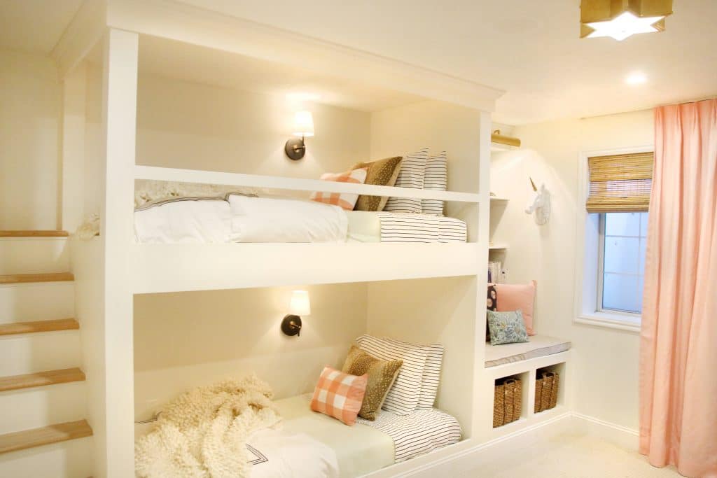


The bunk room was such a fun room to put together. We did it in participation of the One Room Challenge in 2016 and I remember many late nights with Chris, planning, building, caulking, and painting. The room is a basement bedroom and I wanted it to feel bright (as bright as it could) so we took out the one singular light source and added in 9 light sources. Made all the difference. This is also the few times we used wallpaper in that house (peak the wardrobe and the reading nook). I think I was still warming up to it because I used it in pretty small batches but I do think this could be where my wallpaper journey really started. Overall I think it felt modern and playful. I went big on the pattern play but I think if I were to do this room today, the curtains would have been a bolder color maybe.
Polly’s Nursery


Another One Room Challenge over a year later and we have Polly’s nursery. We installed a box trim wall treatment, and embraced even more wallpaper. To me the room feels very traditional and peaceful, and I love the organic shapes in the rug, the cloud wallpaper, and the mobile. I remember a lot of people accusing me of making this room too sophisticated for a baby, but when I look back on it, it actually feels TOO baby-ish! Haha. It was a peaceful room, but I think I just love bringing in some bolder tones in every room now and this room is missing that for me looking back all these years later. Of course, tastes change. And I was very happy with it in the moment.
If I were to redo it now, I’d go with the charcoal color way of that wallpaper, or maybe a darker trim color besides white!
Now
Faye’s Room


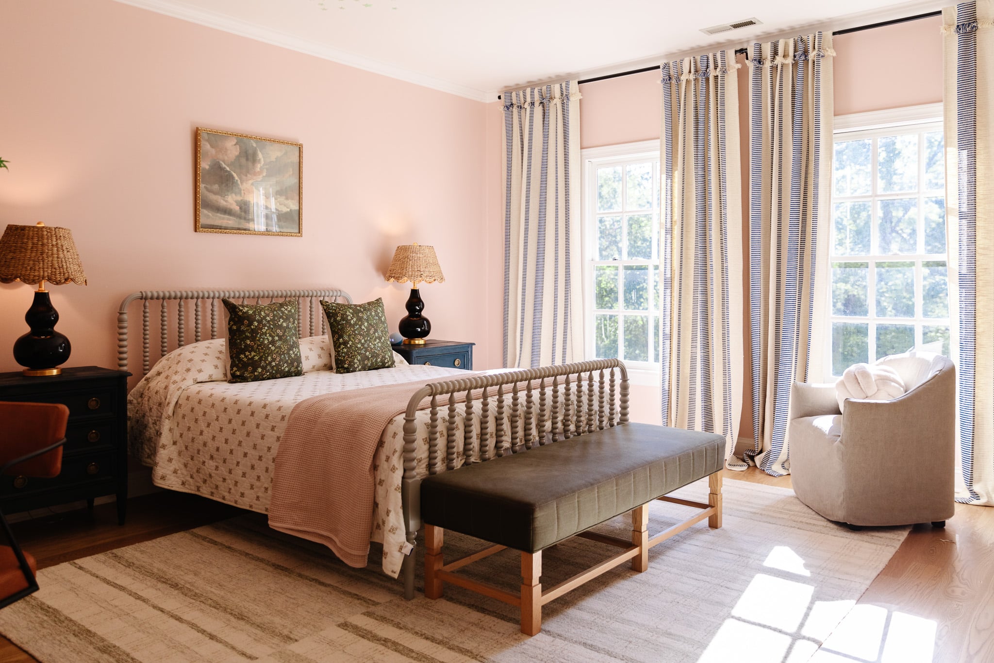
See more of Faye’s room reveal here. I think the biggest difference I see between then and now is how bold I’ve gone with the “modern cottage” style. I’ve played with pattern and color a lot more than I used to, but I do see some elements in Faye’s room comparable to the nursery. We incorporated a similar box trim wall treatment, and used wallpaper throughout. Plus we loved the carpet we used in the basement and bunk room of our last house so much that we used a similar one in all the girls’ rooms.
Rich tones feel more like home to our family and we weren’t shy with it in this house and I expect that to carry over into our next one.
Polly’s Room


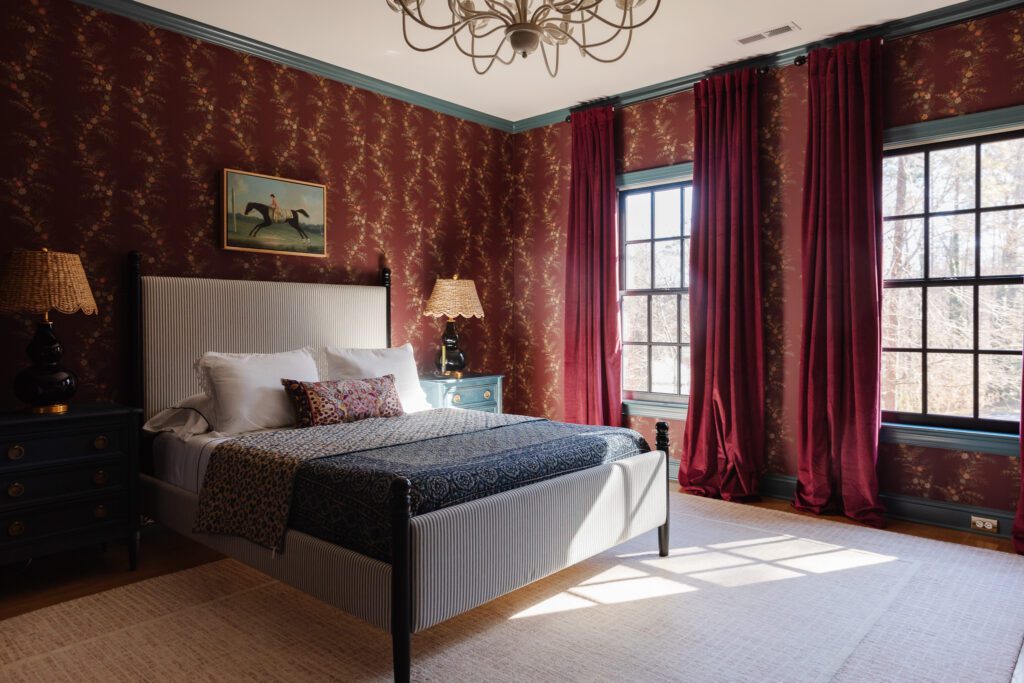
You can find Polly’s big girl room reveal here. I spy the same rocker we used in Polly’s nursery when she was just a wee babe. Actually you can also spot it in Faye’s nursery (before it was Polly’s) 7 years ago. The textured throw blanket is also the same one from the girls’ bunk room. Beyond that, I would say the curtains actually have a very similar organic pattern to the wallpaper in the bunk room which I am just now picking up on. Not to mention the touch of wallpaper on the ceiling. I think Polly’s room feels as peaceful and serene as her nursery did with just more personality. We still cozy up in the rocker before bed and read books, but there’s a rich drama that more reflects Polly’s current personality and I love that about this space.
Greta’s Room

Greta’s room has been through several phases since moving in. At one point we had two full-sized beds in here (perfect for sister and cousin sleepovers) but we got rid of one to make room for some bookshelves we planned on building in. That didn’t actually end up happening because of the decision to move. The room still has some unfinished potential, but I love how the botanical wallpaper is a pattern repeat throughout the girls’ rooms (Polly’s curtains, Faye’s wallpaper) and ties them all together.
If we were going to stay longer, the plan was to do built ins around her windows with a window seat in the middle. And we were planning on adding the same tongue and groove paneling that we used in the other girls rooms to her ceiling. I also thing this room was the perfect candidate for a fun contrast trim (she had requested a light blue) to add some color to her black and white scheme, but we’ll have to remember all of that for the next house.
And since everything is better in video (okay, actually everything is better in real life!!! But video will do for now), I wanted to walk you through each of the girls rooms and briefly explain a few of the design decisions we made and how we made each of the rooms different and individualistic, but still cohesive. I hope you enjoy!!


I love that every space you do has so much personality! I’ve been truly inspired to make bolder design choices instead of just the safe and neutral that is a bit overdone in my opinion.
As a designer myself, Thank you guys for going against the “all white and light” aesthetic you see everyone else doing. These rooms are truly designed well and show you don’t need them to look like everyone else’s. Bravo
They’re so lucky you’re their mom! What beautiful rooms — filled with creativity and inspiration!
Thinking about you Julia and wishing you good health.
Faye’s current room will go down as one of the best, the most beautiful, the most surprising room designs I have ever seen. All these rooms are beautiful, but that one just blows it out of the park for me every time I see it.