Projects

A Dark Beadboard Accent Wall in the office!

February 12, 2020

We believe we should all love where we live.

We’re a couple of homebodies, working to uncover the home our home wants to be. And we’re so happy to have you here. 

Portfolio

Projects

Design

We're Chris + Julia

read more

What we're                   right now

Loving

browse the shop

Befores, afters, mood boards, plans, failures, wins. We’ve done a lot of projects, and they’re all here. 

We have a long-standing relationship with DIY, and love rolling our sleeves up and making it happen. 

Even when you don’t want to rip down a wall, you can make that space in your home better. Right now.

browse all

browse all

browse all

02

01

03

Popular Posts

1.

2.

3.

Top Categories

Last weekend, we knocked out the feature wall in our office and I’m so excited to share how it turned out! We actually dreamed up this idea all the way back in November (see the original mockup right here) , but like all good ideas, it has shifted and tweaked and changed into something we connect with even more.

We wanted it to feel signature CLJ and boom, it really does. We wanted a nod to the modern cottage vibe we’re carrying throughout this house, so bringing in beadboard (that we have multiple other places in the house) felt right on the money. You know what didn’t? This:

Hahahahaha. We got these boards already stained an hour before we had to do a project for a day in the life thing that a company came and filmed a couple weeks ago. They wanted us to do a few hands-on projects QUICKLY, so we did this and yeah…it was a mistake and came right down afterward. But it was just the push we needed to actually tackle this wall.

Vertical planking is really trending right now, but like I said above, I wanted to tie in a more traditional look, so we went with classic beadboard. Specifically these beadboard tongue and groove planks that fit together.


We were looking for the large sheets, but no one in town had them in stock and it actually worked out because these felt sturdy and fit together really well. Although I panicked when I stood back and saw the joints where each board connected with the next. The lines were right where the bead line was so a thin line of caulk made the separate planks look like one uniform wall once it was painted.

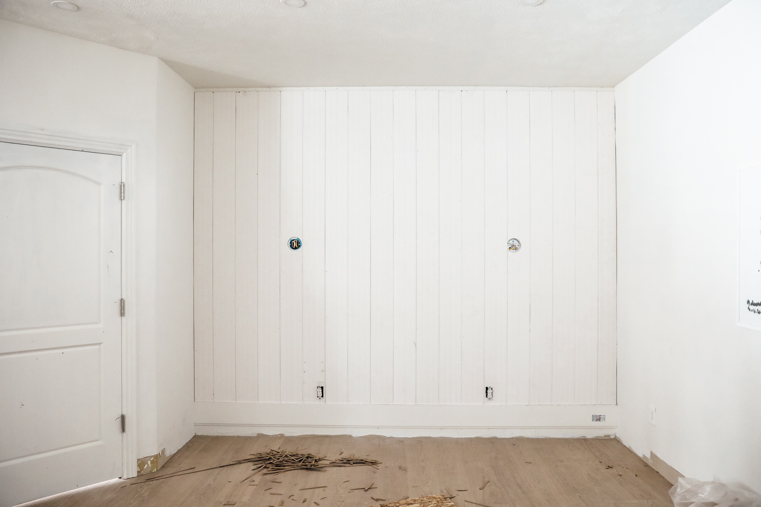
But before we could do that, we had to be strategic about how to make these 8′ planks fill our 9′ tall wall. We added crown on top and, in the picture above, you can see that we added an mdf board on the bottom. We actually used a piece of shiplap so we could use the lip of the board to cover the bottom end of the paneling, and then layered our baseboard in front of that.

Once all the trim was up, we caulked and painted. Again, I wanted to go for a very Chris Loves Julia color, so I chose a navy/gray/green–Downpipe by Farrow and Ball. I had it color matched at Sherwin Williams and the color is perfect! Here’s the formula they mixed, if you’re interested:


Sometimes it looks like a grayed out navy…

And sometimes it looks like it has a little more green in it!…

It actually reminds me a lot of our old living room’s wall! We added these beautiful sconces from Rejuvenation (my favorite–also used them in the Fullmer kitchen with clear glass and facing down!) And the finishing touch was adding our logo. We ordered it from Dropcap Studio. They are an incredible company (and friends of ours!) who specialize in house numbers (any size, color, font you can think of!) but they can actually do any words, letters, phrases or numbers!

It comes with an easy template you just tape on the wall. It has lines to make sure it’s centered and level and shows you exactly where to drill–it’s fool proof! Here’s a short video of hanging our logo:

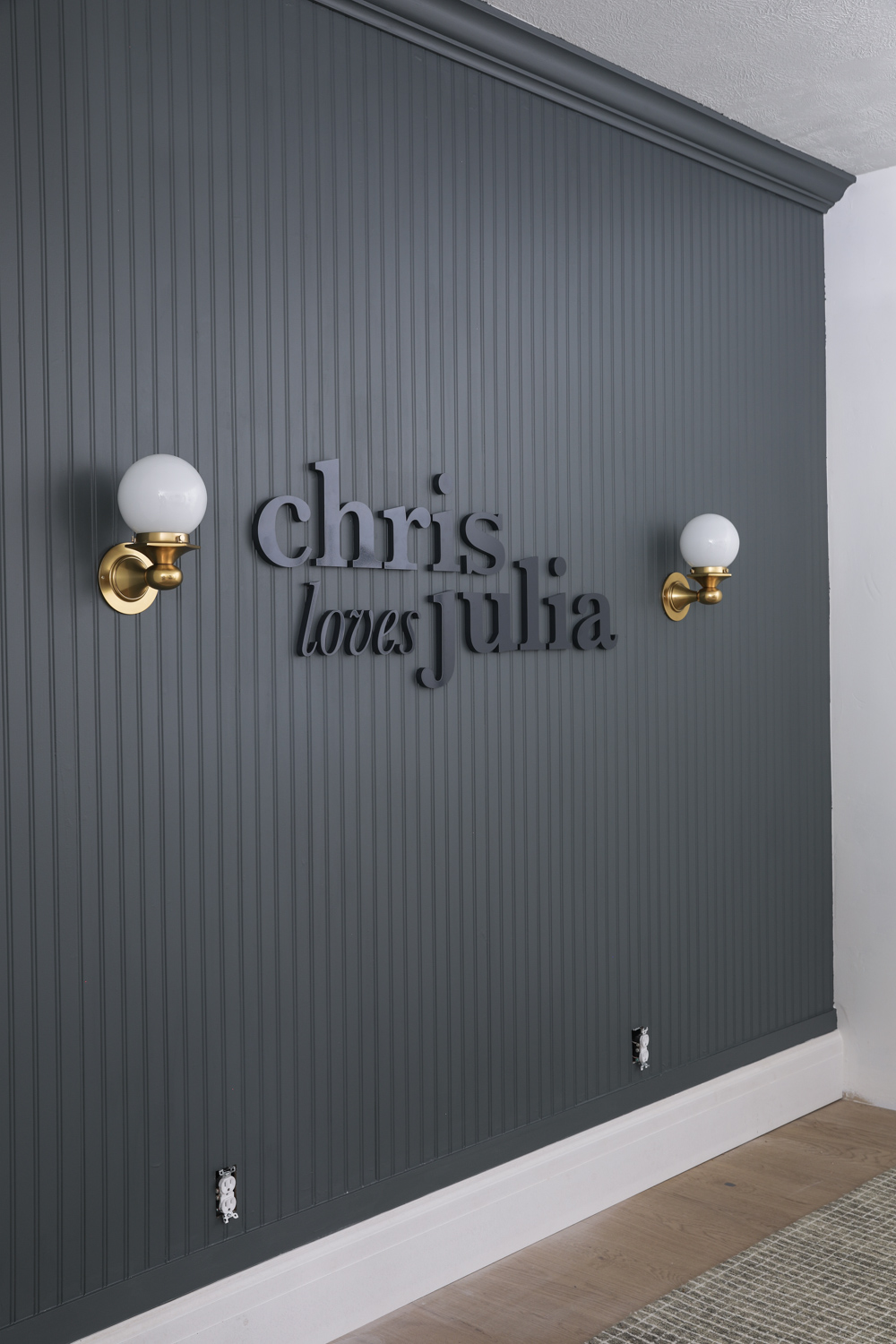
We still need cover plates for the outlets and I have some paint touchups to do, because the painters tape bled a little bit. And I was not sure if I wanted to paint the baseboard or not, but a sectional is going to be in front of it anyway, so I think I’ll just leave it for now.

I know not everyone is putting their brand name on a wall in their house, but I hope this can still inspire a future accent wall in your home. I can see art in the middle of the sconces so easily!

Leave a Reply

Your email address will not be published. Required fields are marked *

This site uses Akismet to reduce spam. Learn how your comment data is processed.

What do you think?

  1. Alisha N says:

    Hi, we love this and are using it for inspo in our son’s room this weekend. Did you nail the beadboard or use an adhesive like liquid nails? Thank you!

  2. Kala M. says:

    Amazing! I think this what I need to do in my master bedroom. Perfect for the wall behind my headboard.

  3. Ciska says:

    Absolutely love it!!

  4. Beth says:

    Love this! What brand of tongue and groove did you use? Was it from HD or Lowes? I’d love to do this in my son’s bedroom.

  5. Shelby says:

    Wow – this looks fantastic! Great job.

  6. Linda Grubbs says:

    Perfect! I love it! That color is so you guys.

  7. Jackie says:

    so good! love it!

  8. Joy says:

    This wall is so fabulous… were you able to stop looking at it. I wouldn’t be able to. ???? you two are amazing. Thank you for sharing.

  9. Elizabeth says:

    Well I had just been eyeing this color “downpipe” for a feature wall in my boys room, so maybe this is a sign! I love how the color kind of morphs depending on the lighting. Thanks for the inspiration as always! ????????

  10. Kait B says:

    Looks fantastic! Kinda reminds me of the 3D quote wall you guys did a looong time ago.

  11. Erin says:

    Can’t wait to see with the couch in front! I admit, I would love to see your logo stand out more. Dark on dark is hard to see. I understand you decided to go a more subtle look. Can’t wait to see it all tied together!

  12. Betsy says:

    LOVE the color! Those sconces are the bomb. Please paint the baseboard. I was looking for the finished picture with the painted baseboard. Then read the second to last paragraph. It looks undone to me painted white, especially with the crown painted the same color as the wall. It shouldn’t take that long to paint, in the grand scheme of things.

    My house needs painting once the weather warms up. I may have to get a tester of that color, to see if it would work on my exterior. Currently a dark gray, but it didn’t turn out quite as dark as i wanted. I’ve been Jonesing over my aunt’s neighbor’s house color. It is navy, then grayish, then greenish. Sounds like the color you used on the wall. So my question, I do not have a Farrow & Ball store where I live. I know that the F& B colors seem to be a lot more saturated, than getting it color matched. I’ve used the Charlotte’s Lock before. Had it matched at Benjamin Moore. But it was always just a little not right if you know what I mean. Maybe Sherwin WIlliams does a better job? Thanks for input.

    • Julia says:

      I don’t think you’ll ever get the depth of Farrow & Ball without getting it straight from the source, but I have the color card and color wise–it’s spot on!

  13. Caroline H. says:

    Can we just pause for a moment to appreciate the “Brave Little Tinter” memo on the paint can label?!?

    In all seriousness, ya’ll nailed this wall. Gorgeous!

  14. Debbie Larson says:

    Wow! This looks amazing! I love following and appreciate all that you share. Can you tell me where the rug is from in this room?

  15. Jill says:

    Guys this is gorgeous! Really quite stunning! Congratulations!

    I don’t understand how you went from wide planks to narrow planks from the pictures or the video. I must have missed something along the way. I’ll keep studying it. ;)

    • Julia says:

      The wider planks have beadboard on them. So they are tongue and groove and fit together and once you caulk and paint, you’re just left with the beadboard!

  16. Erin says:

    LOVE the dark on dark!! So subtle, yet so striking!

  17. Amanda says:

    Oooh I really like that! I’ve been thinking of doing something with our logo in our office and I really like how this turned out.

  18. Patricia says:

    Like it. But don’t know how easy the logo was to install. Looks like Chris got a good work out setting up the layout. And love those sconces; up or down!

all the latest

We believe we should all love where we live.

We’re a couple of homebodies, working to uncover the home our home wants to be. And we’re so happy to have you here. 

HI! We're Chris + Julia

read more

Load More

Reader Faves

SHop all

What We're                     Right Now

What We're                 Right Now

Looking for our favorite things? A place to shop our home room by room, or just catch up on what Julia's wearing / loving right now? Browse the CLJ shop. 

Loving

looking for inspiration? 

A reader recently asked me if I’m starting to fully embrace traditional style and whether we still consider our house to be a “modern Colonial” and why. It was a really great question and so timely — I had really just been thinking about my approach to this home and how my style has changed […]

Can We Send You Our Love Letter?

Another way for us to stay in touch! Joining our weekly newsletter gives you access to exclusive content, never-before-seen photos, your questions answered, and our favorite DIYs. Sign up below!

Follow Along on Instagram

Welcome to our online community where we've posted home, DIY, style, renovations, and family since '09. Renovating our #cljmoderncottage in Idaho and headed for new adventures in Raleigh, NC. #cljfam #cljtransformations

@chrislovesjulia