


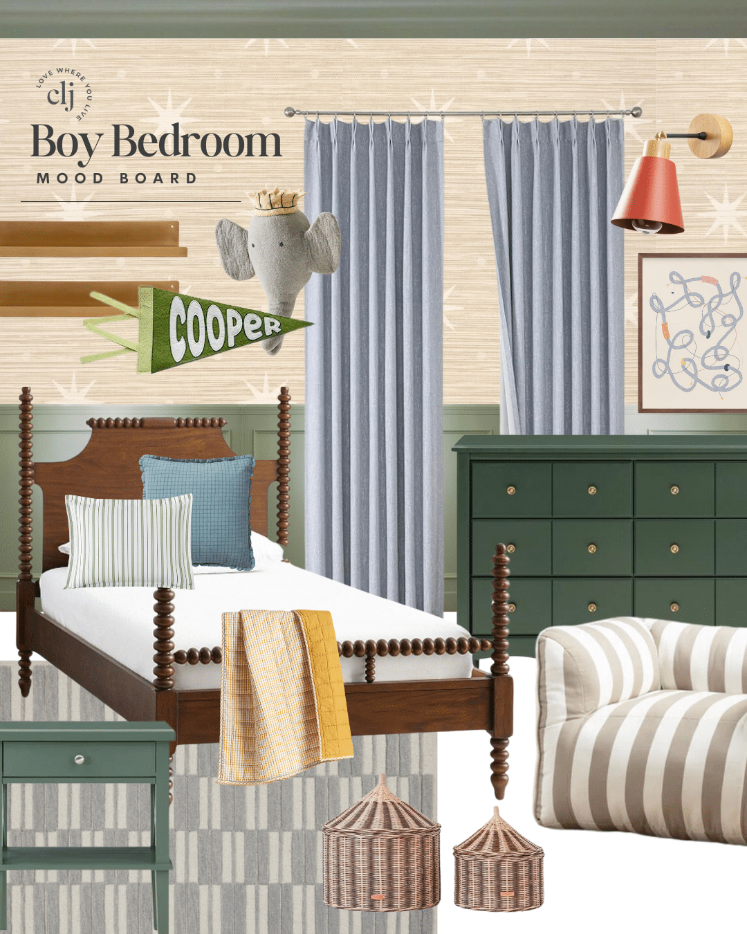
Excited to be back from a long weekend with family (and then a days of server issues! blergh!). We jumped right into a playroom makeover and I’m so excited about this direction. “Playroom” is a generous term, it’s more of a toy room. Or play space. One of the very first spaces I organized when we moved in was this wide hallway leading into Greta’s room. There’s an off-shoot where the cabinetry is that’s a 7×12 (plus an extra 13″ of cabinets) space that the girls gather in nearly every day and play with the tiniest toys known to man. Shopkins, hatchimals, pet shops–why is everything so tiny!? Hahaha.
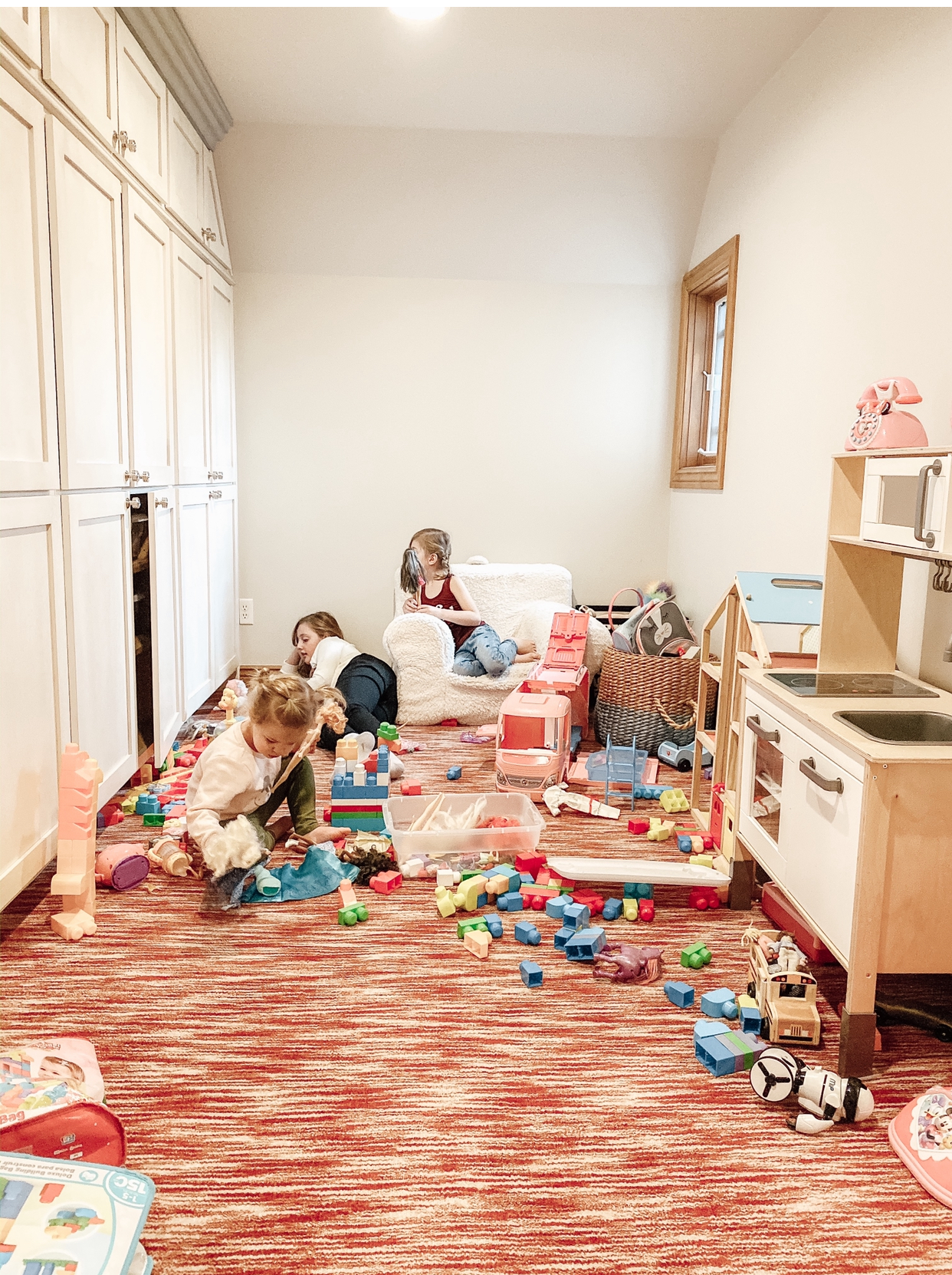
After we tore out the carpet and laid new wood flooring before Christmas, the playing continued enthusiastically but I do think something softer under foot (and knees) would serve this area well. And then I started thinking about how wonderful the storage is, but everything is one color–the walls, cabinetry, ceiling. A playroom makeover was born.

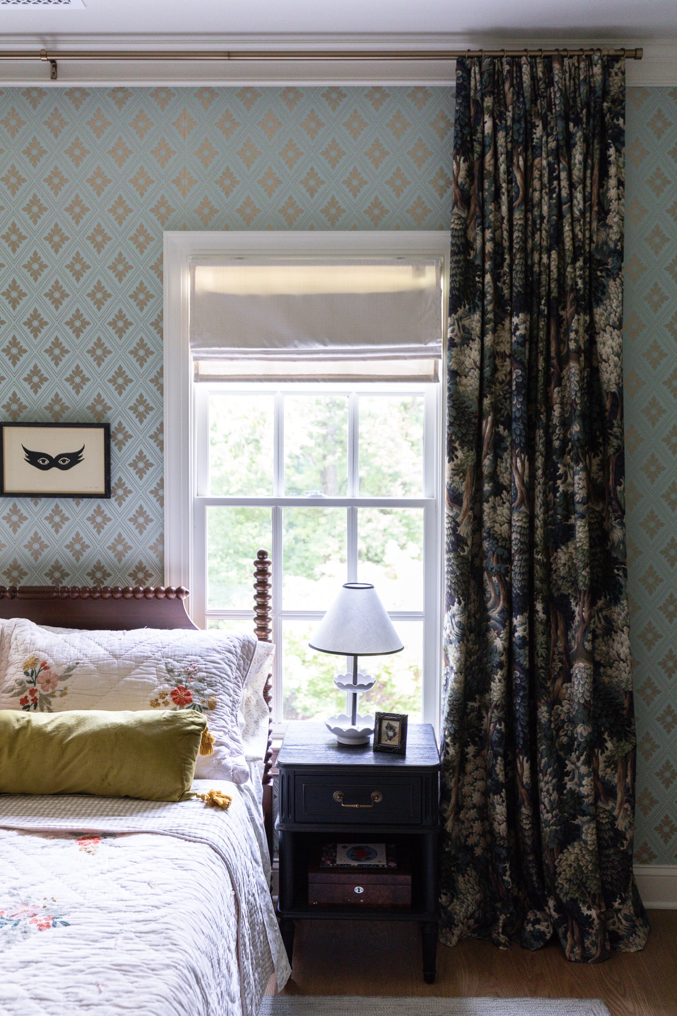
The main areas of our home are all white (Alabaster) but I have been loving adding pockets of color. A gray-blue in the closet, rusty red in the music room, green in the kitchen, a deep charcoal/navy in the guest room, deep green-blue in Greta’s bathroom and now….YELLOW IN THE PLAYROOM.
I’ve been so inspired lately by yellow trim and cabinetry. And once I got the idea, I noticed it started popping up everywhere!
I love that it’s a playful, warm, sunny color but used in a toned way that fits so seamlessly into adult spaces, too. I think that’s the epitome of family-friendly design–a space that appeals to both adults and children.
This week, we started painting the cabinets a sunny, but subdued yellow (HGTV Home by Sherwin Williams Restrained Gold). We’re following the exact tutorial we shared for our kitchen cabinets we painted a year ago right here.
As for the rest of the playroom, they’ll be wallpaper and painted wood knobs, and a large piece of art that always reminded me of our girls…like this.
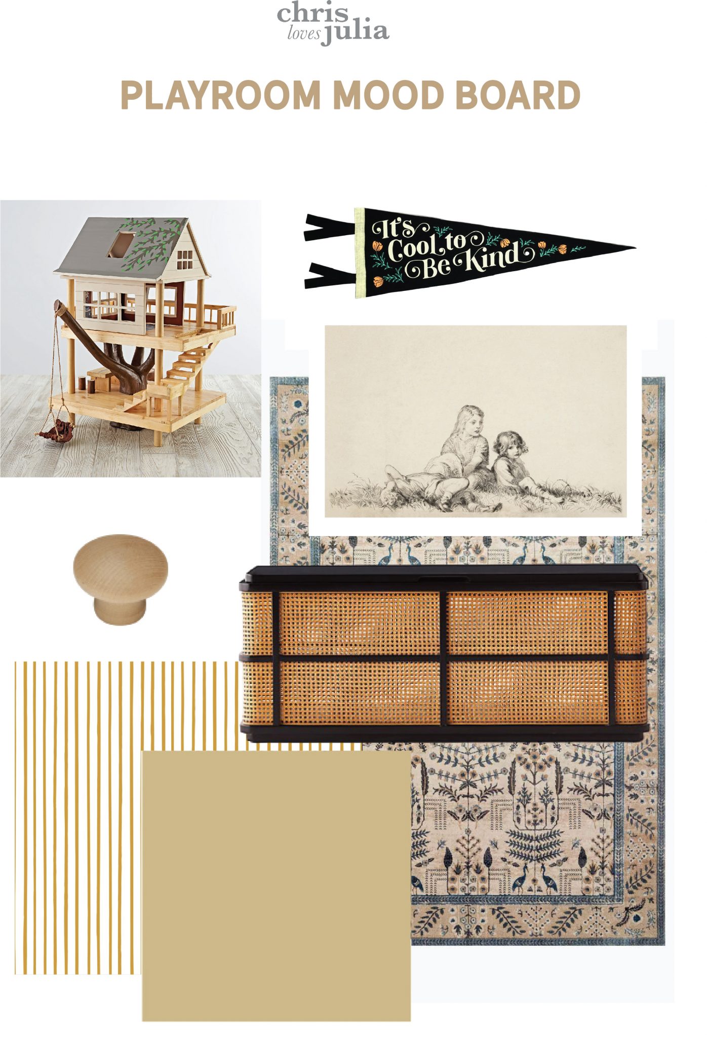
Sources:
- Wooden Treehouse Play Set
- Pennant
- “Sisters” Art Print by Juniper Print Shop
- Wooden Knobs
- Wallpaper
- Paint color: “Restrained Gold” by HGTV Sherwin Williams
- Rug
- Trunk
The modern cottage vibes will be alive and well in the playroom, right?! It’s so fun to transform room by room into a vibe that fits into the rest of the house. At first, a few spaces were sticking out in this home because we already added our spin and slowly, but surely, it’s transforming into the opposite–the spaces we haven’t touched are sticking out like a sore thumb and it’s feeling more and more like we belong here.
Leave a Reply
What do you think?
Previous Post
Next Post
Semihandmade
Our wood grain Shaker cabinet fronts were designed for busy, high-traffic homes like ours. Clad with durable textured thermofoils, this line is compatible with Sektion, Akurum, Godmorgon, and Besta cabinets from IKEA. It's the perfect, practical way to add the warmth of wood to all the rooms of your home.
Collaborations
learn more

next
Loloi
We have teamed up with Loloi to create a line of rugs that are as affordable as they are beautiful. This collection houses a great mix of traditional and modern rugs, in cottage-y colorways, as well as vintage-inspired beauties that you’ll want to roll out in every room.
Collaborations
learn more

next
STUGA
We partnered with Stuga on a line of hardwood floors — The Ingrid is really livable, and the color is very neutral. It doesn’t lean warm or cool, it’s that just right in-between. We have really loved putting it everywhere in our house. It’s the best jumping-off point for design, no matter your interior style. In addition to being beautiful, Ingrid is really durable — we have three kids, and we always have a home construction project going on. Ingrid stands up to it all.
Collaborations
learn more

next
SHop all
What We're Right Now
What We're Right Now
Looking for our favorite things? A place to shop our home room by room, or just catch up on what Julia's wearing / loving right now? Browse the CLJ shop.
Loving


Portfolio


Design
Befores, afters, mood boards, plans, failures, wins. We’ve done a lot of projects, and they’re all here.
BROWSE BY CATEGORY
let's break this thing up
We have a long-standing relationship with DIY, and love rolling our sleeves up and making it happen.
Projects
Even when you don’t want to rip down a wall, you can make that space in your home better. Right now.
read more
read more
read more
02
01
03
looking for inspiration?
A reader recently asked me if I’m starting to fully embrace traditional style and whether we still consider our house to be a “modern Colonial” and why. It was a really great question and so timely — I had really just been thinking about my approach to this home and how my style has changed […]


SEARCH THE BLOG
We've been doing this since 2009 and we've posted a whopping 24145+ blog posts and counting. You might need a little help searching, huh?
looking for something?
find stuff like:
")
Can We Send You Our Love Letter?
Another way for us to stay in touch! Joining our weekly newsletter gives you access to exclusive content, never-before-seen photos, your questions answered, and our favorite DIYs. Sign up below!
Follow Along on Instagram
Welcome to our online community where we've posted home, DIY, style, renovations, and family since '09. Renovating our #cljmoderncottage in Idaho and headed for new adventures in Raleigh, NC. #cljfam #cljtransformations
@chrislovesjulia


Links
Get Around
Make yourself right at home
Portfolio
Design
Casual Friday
Projects
Lifestyle
Gift Guides
All Posts
Shop
Love where you live.
Social
RivrLinks
Links
Get Around
Make yourself right at home
Portfolio
Design
Casual Friday
Projects
Lifestyle
Gift Guides
All Posts
Shop
Love where you live.
Social
RivrLinks
The yellow is so pretty! Thanks for sharing your painting technique on Insta, especially caulking the seam at the top. I was wondering if you added a board or filled in the gaps in the cabinetry at the bottom? I noticed in your after pic you couldn’t see the gaps. Thanks for always inspiring!
Yes! A straight board painted the same color as the cabinetry.
Yellow is super not my favorite color, so I am astonished with how you’ve made a plan for a room where that is a major component and I absolutely love it. So good.
I forgot to take note of the stuff you used to fill the gaps behind trip before caulking in the playroom. Could you remind me what it was called?
Huh, it seems several posters commenting missed the nice ‘It’s cool to be kind’ sign in the mood board. Odd.
Anyhoo, I love the design. I’m quite certain Julia and Chris have a better sense of what their girls will love than some random stranger on the internet.
I love the design! And I am feeling vindicated since that color is almost exactly the color I have in my dining room. Have been thinking of repainting it for years, but perhaps I’m more on trend than I thought ;-)
I’m curious whether there’s any way to add another window in there, at the end? Or maybe add a skylight? The small, oddly placed window doesn’t seem to bring in much natural light. Maybe a mirror could help make it feel more balanced? Otherwise I think the space seems great for a play room!
It’s really tucked in there and I’m so grateful for the window we do have! But I don’t think there’s another way to add another.
Yellow is my favorite color (just take one look in my closet!) and I am SO excited to see this space come together!
We hope to turn our spare room into a playroom in about a year. To me, this is great inspiration! A few friends have brightly coloured playrooms and they’re lovely, but they also have quite rambunctious kids so the bright colours make sense. My children are quite chilled and both like to dig stuff with their toy diggers, colour in, role play, and sit examining little ‘fiddle toys’ or figuring out how things ‘work’. For them, more muted colours totally make sense, so I totally see this space as designed for the children who will use it, by a mother who knows them and also knows how to make spaces look great. This mood board makes me see that I can achieve something calm in their play space but still with elements I would consider ‘childish’ like narrow stripes and colours I wouldn’t have in the rest of the house. We have a huge climbing room in the garden our boys can go mad in, so really their space in the house will be for when they fancy some quieter ‘me’ time. Personally, I’m really inspired by this post and mood board and am now excited to start!
Might just be my fav for far!
The most beautiful yellow color! This room will be peaceful yet playful. I remember just getting lost looking at the blocks in my grandmother’s quilts. That rug has the same pull to imagination that I felt as a child. Bravo!
Lizzi, Jessica’s answer actually sounds like the least offensive one on this chain of comments about the topic. You called Julia’s design which she is obviously excited about “drab” and also said that it was *obvious* (to whom? You, me, complete internet strangers?) the girls (you have never met) want brighter colors in their spaces. To any mother that comment alone is deeply hurtful, insinuating that she doesn’t care about her daughters opinions and that you know them better than her. Julia has explained herself gracefully many times before and it is ridiculous that this even needs to be said again. It is her house, her daughters and she is free to design their spaces however she sees fit. Would you say any of your remarks to someone in person if they showed you their plans for their home? I doubt it. And on top of that, Julia didn’t ask for any opinions on this post. She has been dealing with a lot these past two years and I think we all agree that there is no need to put people in a negative headspace just because of our personal preferences in interior design.
Not related to the (v cute) play room, but OMG I just saw you in my Lands’ End catalog! So cute, and those pieces look *comfy.* Yay for modeling for a local (well to me) company!
It was such a fun experience!!! (my first time!)
You looked great!
Is there a reason you would put such an expensive piece of furniture in a kid’s play space? I would be so worried that it would get damaged if I’m spending $500 on it. Especially with what looks like caning which is usually quite fragile.
Our girls have free reign of the whole house! Of course accidents happen, but they treat furniture with care.
You have so much grace Julia! Honestly. Kudos to you :)
That is a beautiful yellow! I really enjoy watching you design this home bc it is always so lovely and almost always surprising.
I would love to see how this hallway is connected to the rest of the hallway. I’m imagining that it T’s off so there is a logical place for the paint/wallpaper to end?
Is the penant from Oxford Penants? I just ordered a different item from them and it is so great!
yup!
Hi Julia. Looks great–I can’t wait to see it come together! The link to your tutorial reminded me of a question I have had for a while–would the tutorial work for laminate/fake wood cabinets? And, if so, any changes you would make to it?
The only change I would make is I would probably use an oil based primer. It will be very stinky but will adhere better to plastic.
Would you ever do a makeover on the girl’s IKEA play kitchen? I would love to see your spin on it!
I’ve dreamt about it so many times, but there are so many other things that need my attention and they love it as is.
Hi Julia! I love this mood board! Yellow was my favorite color growing up (although it was WAY louder than this) :) I really love how it’s kid friendly AND sophisticated. I have a little store on Ebay and thought this would be great for them to write on and will bring in another black element but with earthiness (from the paper). I also have a smaller one that can sit on a table.
https://www.ebay.com/itm/NEW-Wall-Mounted-Metal-Kraft-Paper-Holder-FREE-SHIPPING/133471374159?hash=item1f13838b4f:g:tSUAAOSweZhfF3GY
How did you go about selecting the paint color? Did you attempt to color match to the wallpaper? If not, what’s the best process to select the ride tone/saturation to ensure they wouldn’t clash?
Woops, meant *right tone
I actually talked about that on my Instagram Stories. Check out the “playroom” highlight.
It’s going to be amazing
Ah! So sweet. I have been wondering why you haven’t used that Sisters print yet! I think of you guys Everytime I see it on Juniper Print Shop!
I was just waiting for the perfect opportunity. :)
I love it! The yellow paint that you picked looks great with the blue in the rug. I’m definitely getting the cottage vibes! I can also see the space transitioning to a library/reading/sitting room, when they’re older, by just adding a couple of cozy leather armchairs.
Ooh. I love this idea. As my kids have turned to teens, they love having someplace they can sit comfortably and hide away with a good book.
Oh my goodness I just love it so much! That is the most perfect tone of yellow. I love how your home has evolved to be neutral and muted but also have these beautiful peekaboo moments of color happening. Swooning!
Looks great! Can’t wait to watch it come to life in your stories.
This looks like a grandma space.. why would you not add color for your girls? I hardly doubt this is the kind of play space any kid would want.
You don’t see the yellow?
Don’t you also see the pennant?! Maybe read it :)
A little kindness goes a long way.
Maybe my perspective is skewed, but my kid definitely cares more about the items within the room than the room itself. I think Julia has attempted to create a space that feels connected to the rest of the home (since this isn’t a closed off room, but rather a side room off the hall) while injecting a fun yellow to dominate the space.
This comment literally made me LOL. It’s bright yellow! I think any kid would be estatic to have this space to play in. The girls will be over the moon!
This is how they’ve always designed kid spaces—from nurseries, to bunk rooms, to kid bathrooms. They have said before that their girls aren’t super into interior design, so they go for what they (the parents) prefer. It’s not my kid decorating philosophy (which is probably why our kid spaces are very clearly designed by chaotic preschoolers who choose art from the thrift store and where to hang it), but they’ve consistently been doing this for kid spaces from the beginning. I’m sure the girls will still use the space as their own with all their toys, just like the sophisticated black outdoor play structure. The usage doesn’t change for the kids and the parents get to have the design how they like it.
Alyssa, If you don’t have anything nice to say, how about just restraining? The space is actually very colorful ????
My grandma had great taste – just sayin’. And I see color. It’s just not in-your-face, vibrant, primary colors. It won’t be overwhelming, it’ll be calming and magical. I have no doubt her girls will see and appreciate the beauty in it.
I agree Alyssa, it looks quite drab to me. I remember Greta asking for a light blue or peach bathroom last year, so it’s obvious she likes some brighter colors. I’m sure that the girls would love to see some more color infused into this space with a multicolored rug or a colorful dollhouse since the walls & cabinets will be more subdued.
Why would you think that you know the opinion of their children better than their parents? It’s fine if you wouldn’t do this for your own children or you don’t like the design but stop assuming they aren’t doing the right thing for their kids. It’s so disrespectful.
Hi Jessica, I see what you are saying and I agree that I worded that incorrectly. However, the way you responded would not sit well with anyone. Please be respectful of other people’s opinions.
Lizzy What looks drab? – the existing room? Yes I agree that looks drab. The painted cabinets or the room is not shown as far as I can tell so hard to say if it looks drab or not at this point. Light blue and peach are hardly strong or bright colors. Actually to me the gold seems pretty bright. I bought a house with restrained gold in the bedroom and repainted over it because I found it to be too bright.
The gold would not be my choice, but so are many of the other colors in the house, but I still think they look good in their house. I don’t live there or even have to live with those colors so …
My first reaction was exactly the same – most of the house is muted, so I hoped the kids’ play space would have a more playful palette.
I’m in love with the design! The sisters print, rug, and trunk are perfect additions.