


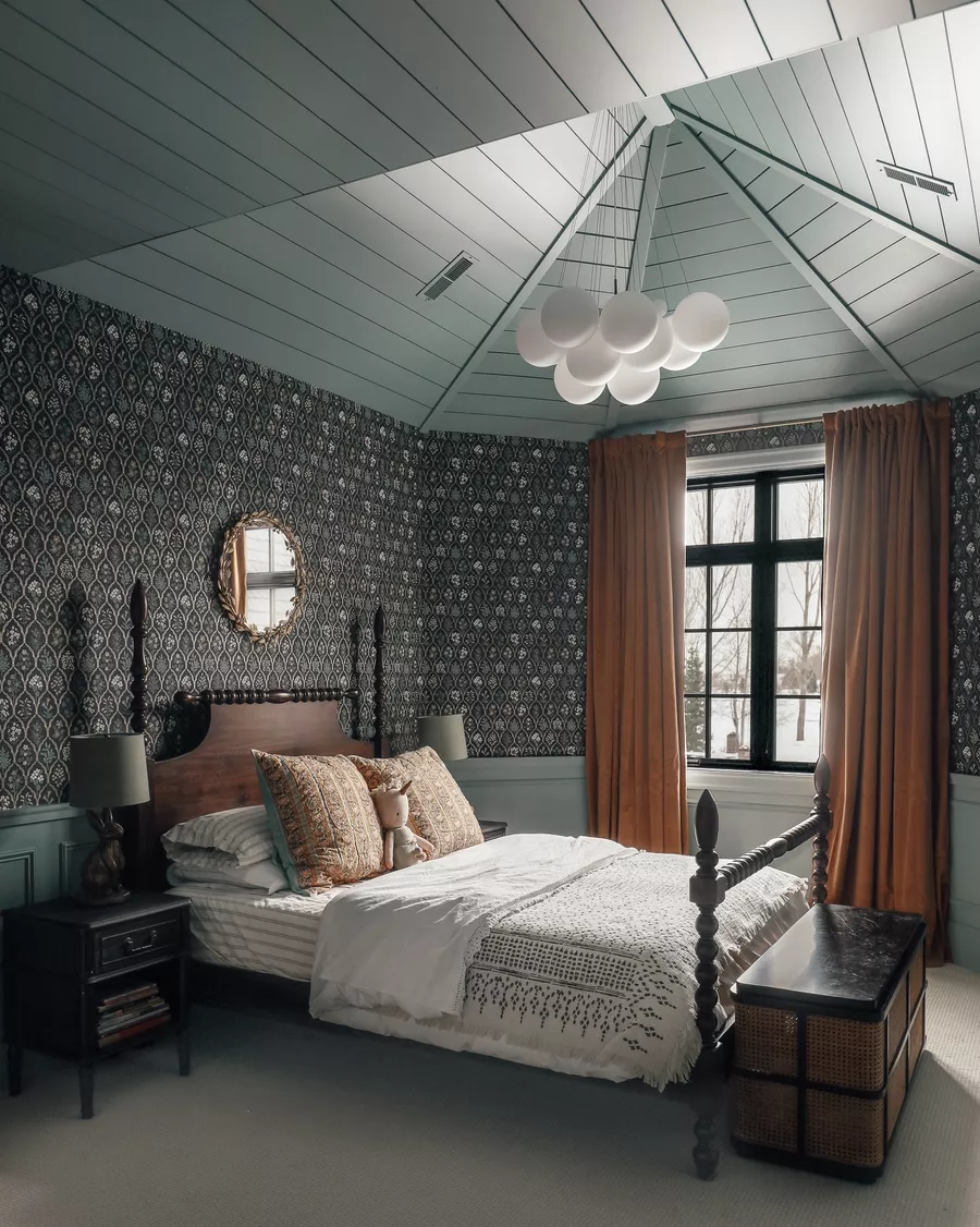
It’s dark and moody, but the undertones keep it friendly. In fact, I loved it so much that I didn’t stop with just the one wall (as you can kind of see in the above photo). In a quick, last minute message to Chris at work, I said, “we gotta do all three walls.” To which he replied without hesitation (the man tru-usts me), “go for it!” And I did. Without equal hesitation and no regrets, the wall with the large window got a coat of Crave:

And also the third wall that makes up the living room:

The paint job has completely transformed the room from our original purple paint job.

And it is eons better than our big, boring beige mistake we tried out last week:

We can now look at the room and sigh and say, “Of course!” Like we finally pinpointed what we wanted the room to feel like all along.

We would still love to add some paneling to the wall down the road, but the new darker color (especially now that there are three walls of it) really needs no additional accent. So, we are going to focus on rebuilding the room and continue to think about the paneling.
It was a risky move, we realize. And maybe a color (tone?) that isn’t for everyone and definitely not for every room. But for us, the risk paid off. Big time. Are you digging the new darker digs? Or maybe you have already unsubscribed from future posts out of fear. Ha! We can’t wait to add some accessories in here and really make the room sing.
Happy Weekend!
Leave a Reply
What do you think?

Semihandmade
Our wood grain Shaker cabinet fronts were designed for busy, high-traffic homes like ours. Clad with durable textured thermofoils, this line is compatible with Sektion, Akurum, Godmorgon, and Besta cabinets from IKEA. It's the perfect, practical way to add the warmth of wood to all the rooms of your home.
Collaborations
learn more

next
Loloi
We have teamed up with Loloi to create a line of rugs that are as affordable as they are beautiful. This collection houses a great mix of traditional and modern rugs, in cottage-y colorways, as well as vintage-inspired beauties that you’ll want to roll out in every room.
Collaborations
learn more

next
STUGA
We partnered with Stuga on a line of hardwood floors — The Ingrid is really livable, and the color is very neutral. It doesn’t lean warm or cool, it’s that just right in-between. We have really loved putting it everywhere in our house. It’s the best jumping-off point for design, no matter your interior style. In addition to being beautiful, Ingrid is really durable — we have three kids, and we always have a home construction project going on. Ingrid stands up to it all.
Collaborations
learn more

next
SHop all
What We're Right Now
What We're Right Now
Looking for our favorite things? A place to shop our home room by room, or just catch up on what Julia's wearing / loving right now? Browse the CLJ shop.
Loving


Portfolio


Design
Befores, afters, mood boards, plans, failures, wins. We’ve done a lot of projects, and they’re all here.
BROWSE BY CATEGORY
let's break this thing up
We have a long-standing relationship with DIY, and love rolling our sleeves up and making it happen.
Projects
Even when you don’t want to rip down a wall, you can make that space in your home better. Right now.
read more
read more
read more
02
01
03
looking for inspiration?
A reader recently asked me if I’m starting to fully embrace traditional style and whether we still consider our house to be a “modern Colonial” and why. It was a really great question and so timely — I had really just been thinking about my approach to this home and how my style has changed […]


SEARCH THE BLOG
We've been doing this since 2009 and we've posted a whopping 24145+ blog posts and counting. You might need a little help searching, huh?
looking for something?
find stuff like:
")
Can We Send You Our Love Letter?
Another way for us to stay in touch! Joining our weekly newsletter gives you access to exclusive content, never-before-seen photos, your questions answered, and our favorite DIYs. Sign up below!
Follow Along on Instagram
Welcome to our online community where we've posted home, DIY, style, renovations, and family since '09. Renovating our #cljmoderncottage in Idaho and headed for new adventures in Raleigh, NC. #cljfam #cljtransformations
@chrislovesjulia


Links
Get Around
Make yourself right at home
Portfolio
Design
Casual Friday
Projects
Lifestyle
Gift Guides
All Posts
Shop
Love where you live.
Social
RivrLinks
Links
Get Around
Make yourself right at home
Portfolio
Design
Casual Friday
Projects
Lifestyle
Gift Guides
All Posts
Shop
Love where you live.
Social
RivrLinks
To all who are confused about where to find Kwal-Crave through Sherwin Williams: They can search their computer system for competitive brands by product manufacturer (Kwal) and color (Crave)- then it tells them how to convert the color to make their own version for you, exactly the same way.
Hey! It looks awesome. Can you tell me the name of the paint ?
It’s the Kwal paint line. Color is “Crave”
Very dark and sophisticated.
That looks SO GOOD! I love the window wall in that color as well. Cant wait to see what you guys do to decorate in there!
So sophisticated and cozy. You’re making me wish my house got as much natural light as yours to pull this off. Great space! :)
Looks awesome! Glad is came out looking so good!
We’re thinking 2nd year molars? She is miserable especially without tylenol. But she also seems to have a head cold. It’s a very snuggly mystery.
It’s perfect!!! I think it works to go that dark because of all the natural light that comes through that front window. I definitely don’t dig closed off dining rooms with dark colors on the walls. It closes the room in and makes it feel small. THIS is the way to do dark on walls. I can see us doing something like this in our future house.
Why was Greta sick??? Cold? Stomach bug??? Poor girl. We LOOOOVE kipper :-) he’s the best.
Gorgeous, gorgeous, gorgeous. With all the light you get in that room, and with the light ceilings and floors, it’s perrrrrrfect.
it’s looking GREAT!
you guys are awesome at getting things done…way to go!
so sorry your girlie’s sick. =[
So classy and clean, this is so my style, I’m a lurrrrrvin it too. I say full speed ahead to paneling!
It looks stunning!
Looks great, and I loved all those inspiration photos you shared last week. Has me itching for a dark wall myself.
I’m craving some Crave! The room is beautiful now, very dark and cozy but not cave-like at all! Good choice :)
I LOVE IT. I’m a big fan of the dark. I like the purple, too, but this suits your home more and is coherent with the vibe in the rest of the house. :)
I was reading House Beautiful the other day and there was an article about colors that bloggers, designers, and readers choose for the home. There was a big long list, but no designers/bloggers chose purple for their living room. I thought to myself, “No wonder Julia is changing! She has designer in her blood.” Nice work, girl. I love it.
Love it! Looks great.
That looks AMAZING. Seriously so so good. I can’t believe how much it changed the look of the whole room. And I am equally amazed that you got that done in an afternoon!!! What I would give to paint as quickly as you. Sorry your little girlie is sick…no fun!
i LOVE it! it’s so moody and delicious. It reminds me of the martha stewart’s seal color that we used on our dining room!
Looks great to me!
It makes the room look BIGGER!
I really love it!! And thank you for answering my paint question yesterday!!
Fantastic!
I love it! It’s so dramatic! Right now it looks super dark, but once you guys get it decorated and lights in I know it’ll be amazing!
Oh my goodness. I came here through the link on YHL. I love this color! I’m in the process of picking colors for our whole house and I think this is the perfect shade for our currently eggplant with orangey-trim dining room. A similar deep gray with white trim it is!! Absolutely beautiful. It is so calming and cuddly. This rich shade will really make the built ins pop! Especially when they’re painted lighter. And art in white frames… mmhmm.Thank you for the inspiration! You just got yourself a new follower :)