


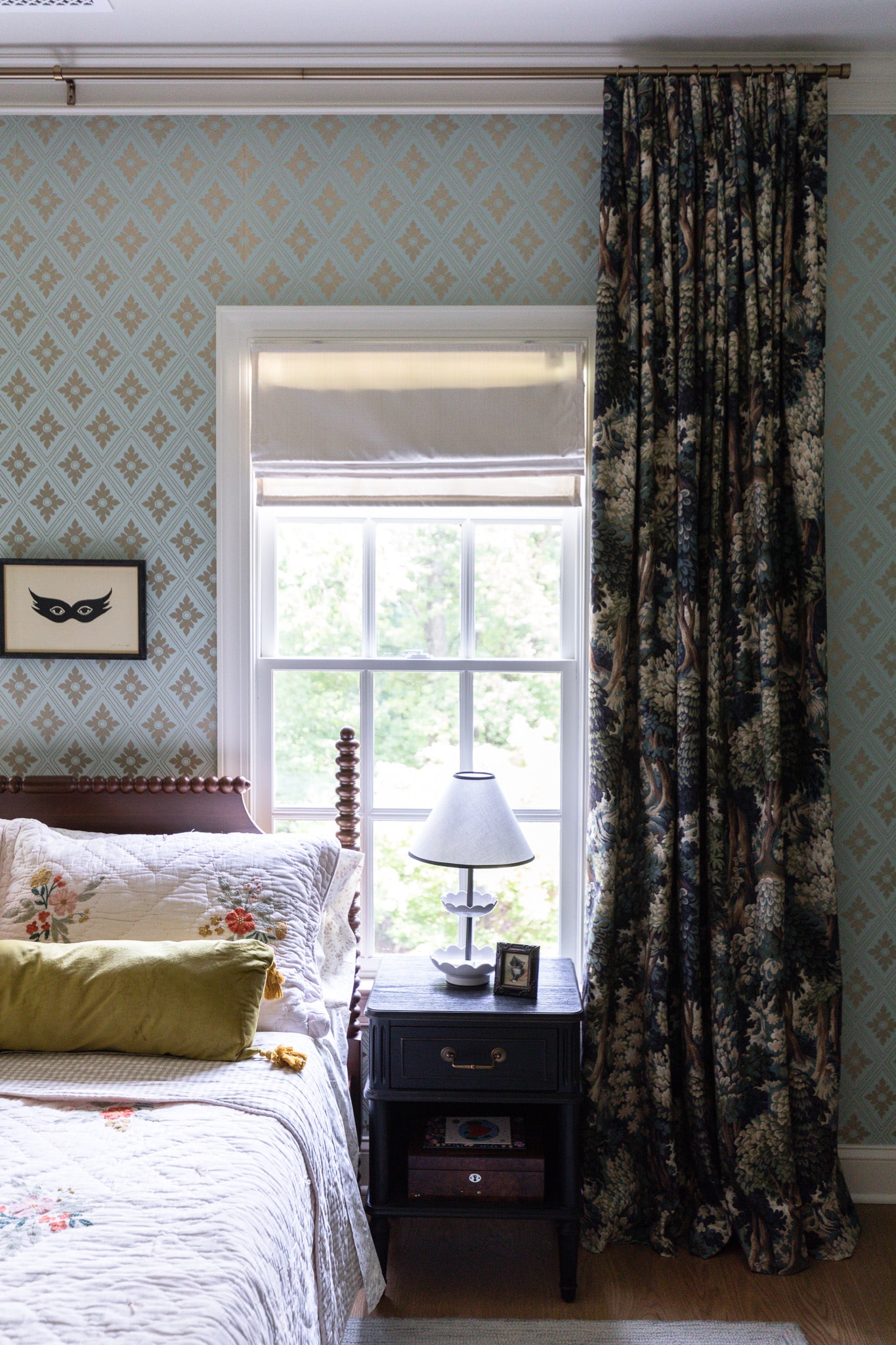
Deciding to add these built-ins was 100% a necessity for the study. When we moved in, this was somewhat of a formal sitting room. Really it was just a box of a room with no character beyond the crown molding. At first, we pictured this room as a music room, but once we decided it would serve better as a study, we realized at some point, we would need to add some more storage. Enter in this high gloss, custom built-in cabinetry.
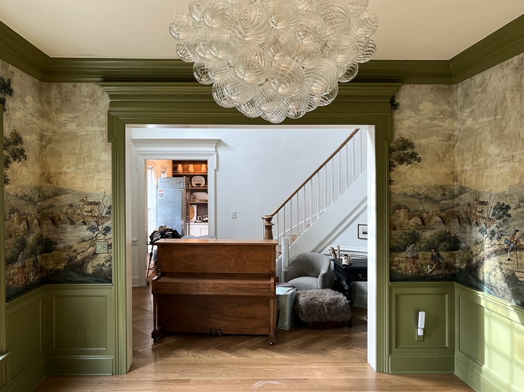
Here’s what the opening looked like before deciding to narrow it, add built-ins, and pocket doors.
Before
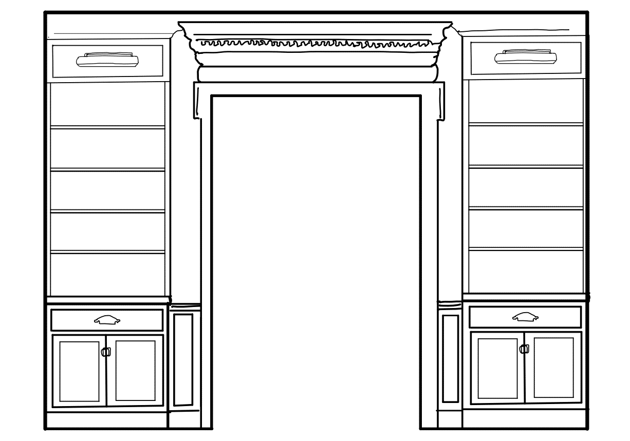
We spent a lot of time sketching things up before making any decisions and landed on this design.
Sketch
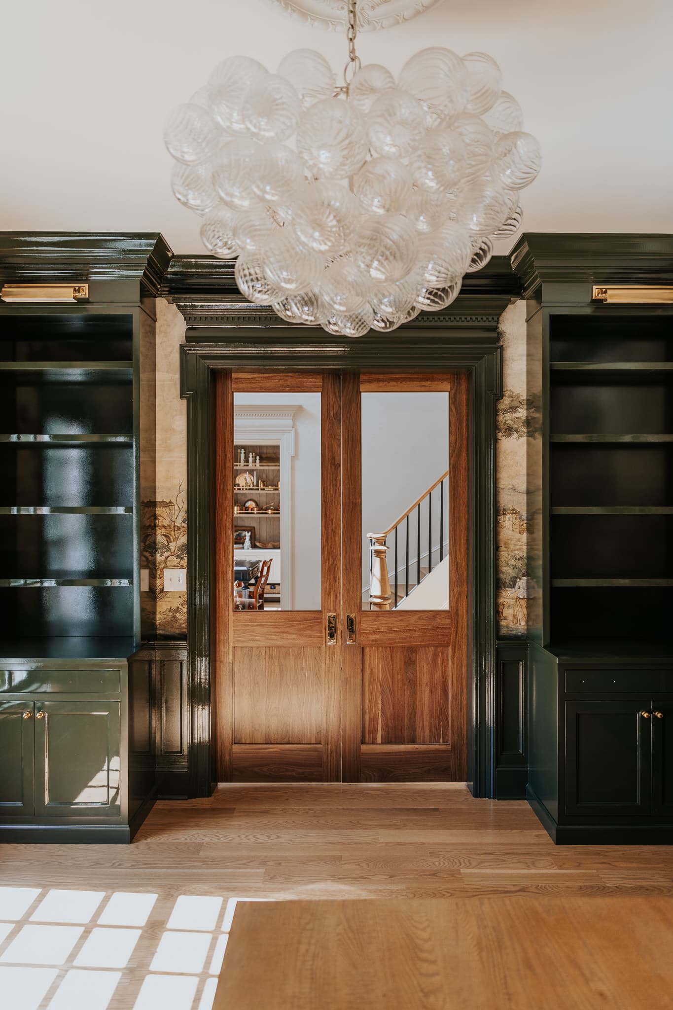
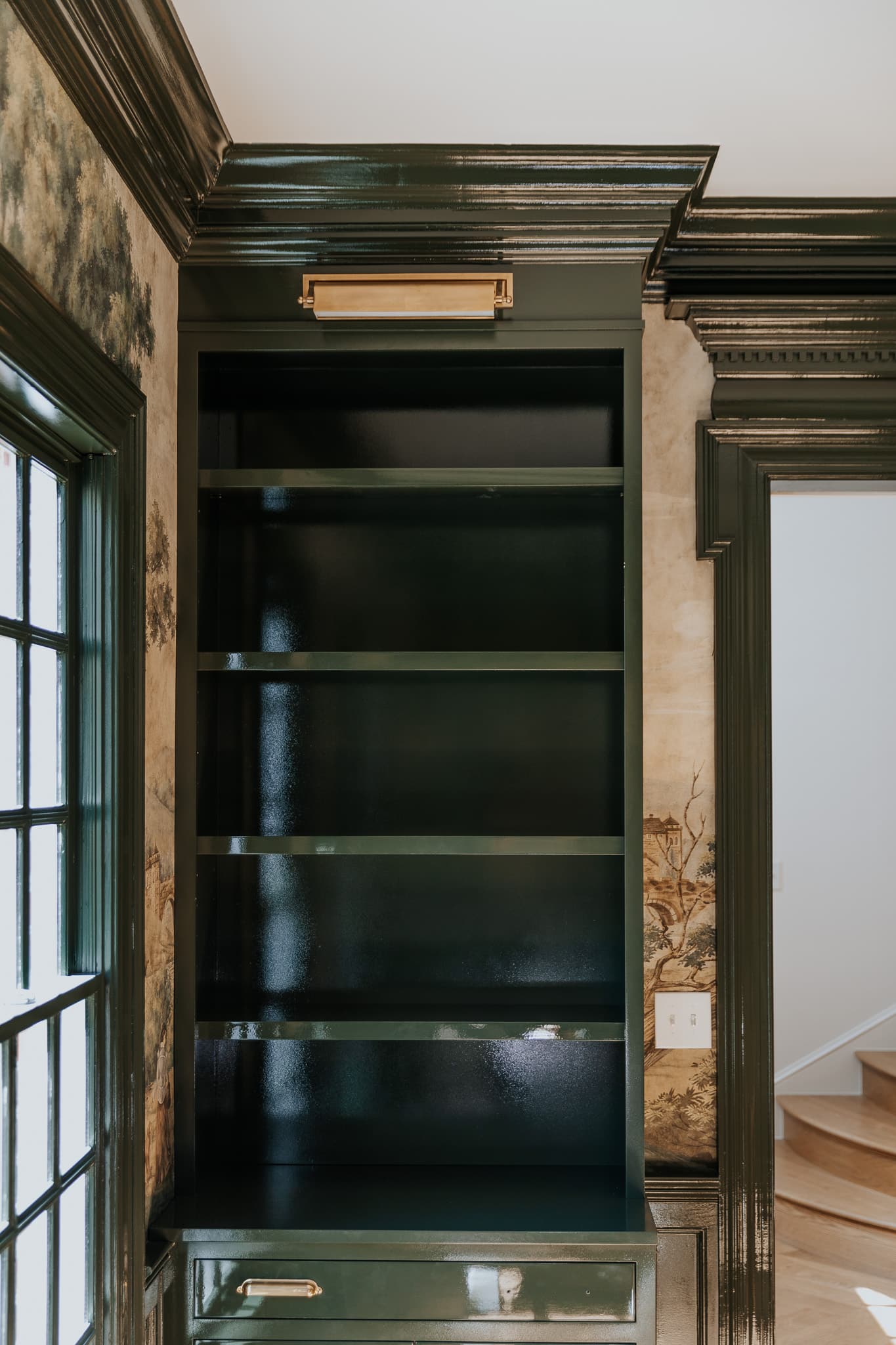
After
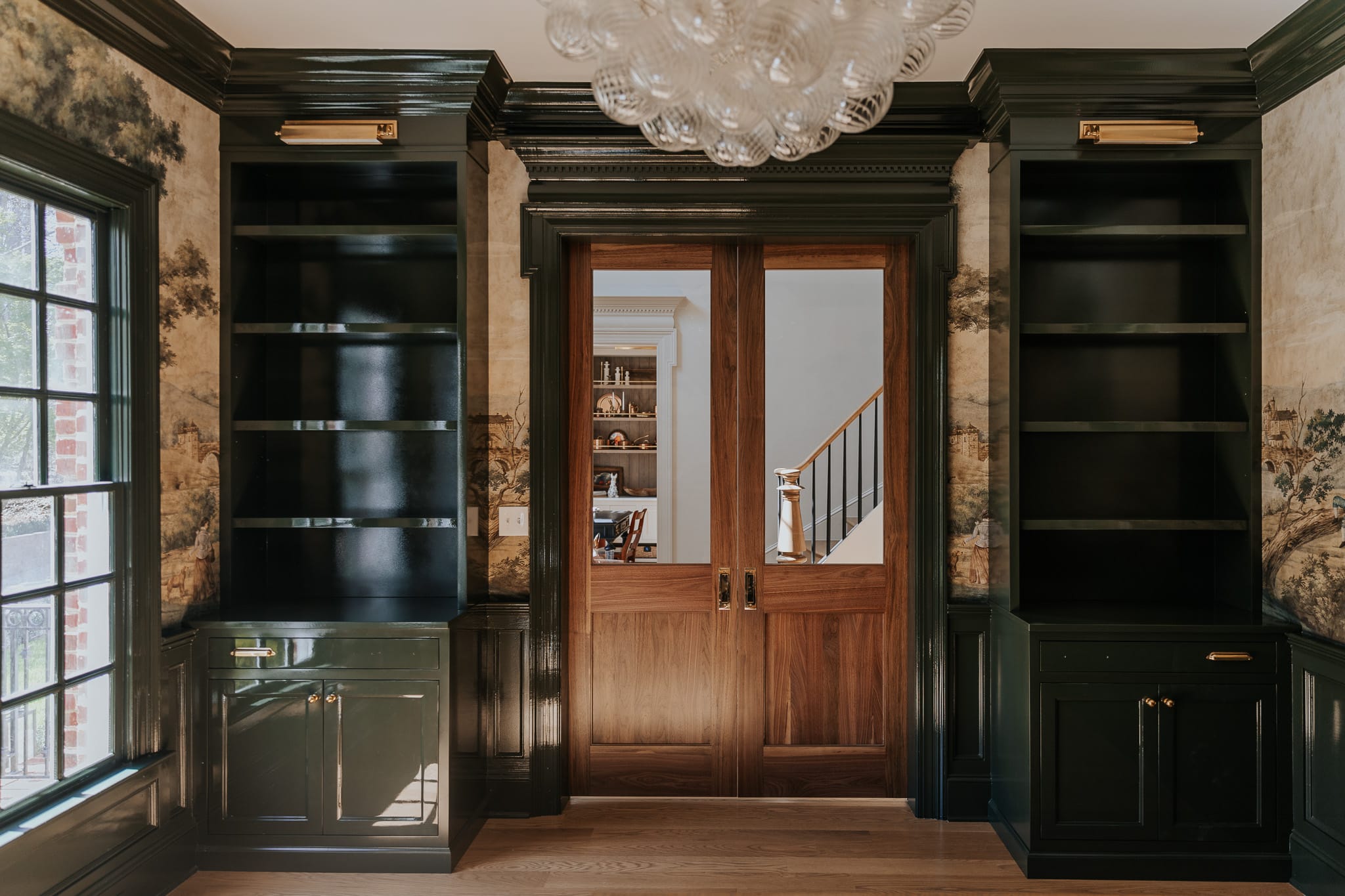
My jaw cannot be picked up. What once was a blank white box is now dripping in color and character, and of course, I’m just dying to style those shelves and get all settled into this practically new space! As you can see, we need just a few more pieces of hardware to arrive for the drawers, and actually, our dedicated painters want to do just one more coat on those shelves before we start “moving in.”
But in case you’re wondering, I could not be happier with my choice of the Topsoil by Benjamin Moore paint color or the high gloss finish. Our painters color matched in the Milesi brand, and it’s actually a waterborne lacquer, which gives it that hard enamel finish! I really wanted to add some charm and character to this space, and they both contribute to accomplishing exactly that.
Designing the built-in cabinetry
As for the custom built-in cabinetry, these towers were designed to optimize function in this study. Believe it or not, we’ve lived in this house for just shy of two years, and we still have boxes of unpacked books that are awaiting a home. Of course, I’ll be styling them with other decor because I love my home to be both functional and aesthetic.

The drawers will serve as storage for cords, scissors, pens, pencils, sticky notes, and all things “office.” And the cabinets are actually more than just “cabinets.” One side is actually a pull-out filing cabinet, and the other has a pull-out for our printer. Love being able to tuck away all those “ugly” but necessary things.
Hardware for the cabinet towers
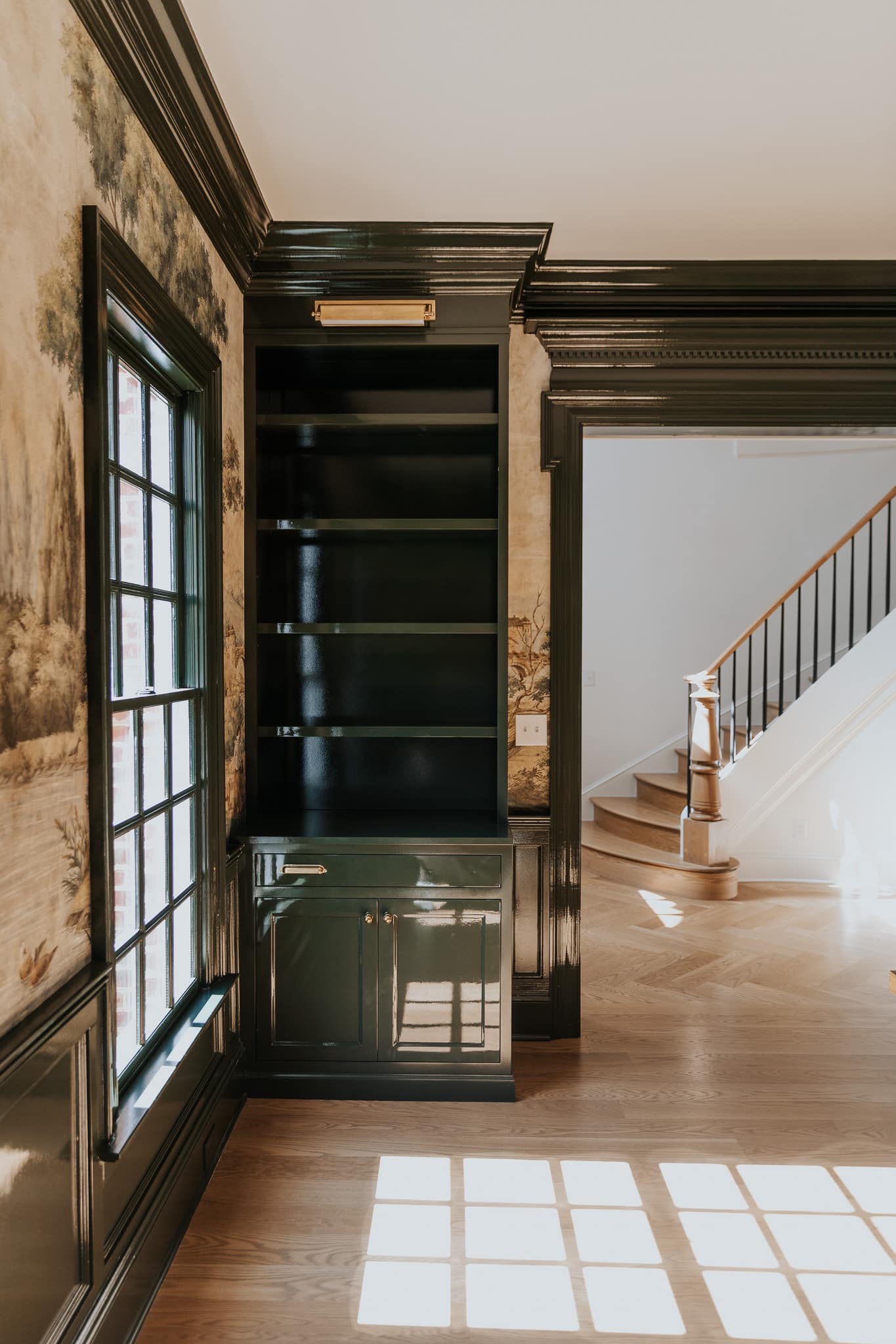
I’ve never seen a picture light I don’t like, so it’s not shocking that I jumped at the opportunity to add some secondary lighting to this space. These are hardwired, and I can’t wait to see them in action. If you’re looking for a full guide on picture lights, check out this post!
The knobs and the pulls are both from Rejuvenation and although we’re still waiting on a couple of pulls to arrive, I’m really happy with the placing. There’s not really a rule of thumb, but when it came to deciding on the placement of the pulls, I rely a lot on that gut feeling of what “looks right.” To me, they didn’t look right centered to each cabinet front, so I inched them a bit closer to the outer edge. Perfecto.
We’re visiting family in Idaho this week, but by the time we get back, the study should be ready for “move-in,” and I’m itching to do so. Stay tuned!
Other posts related to the study
7 dark green paint colors for interiors
Leave a Reply
What do you think?
Previous Post
Next Post

Semihandmade
Our wood grain Shaker cabinet fronts were designed for busy, high-traffic homes like ours. Clad with durable textured thermofoils, this line is compatible with Sektion, Akurum, Godmorgon, and Besta cabinets from IKEA. It's the perfect, practical way to add the warmth of wood to all the rooms of your home.
Collaborations
learn more

next
Loloi
We have teamed up with Loloi to create a line of rugs that are as affordable as they are beautiful. This collection houses a great mix of traditional and modern rugs, in cottage-y colorways, as well as vintage-inspired beauties that you’ll want to roll out in every room.
Collaborations
learn more

next
STUGA
We partnered with Stuga on a line of hardwood floors — The Ingrid is really livable, and the color is very neutral. It doesn’t lean warm or cool, it’s that just right in-between. We have really loved putting it everywhere in our house. It’s the best jumping-off point for design, no matter your interior style. In addition to being beautiful, Ingrid is really durable — we have three kids, and we always have a home construction project going on. Ingrid stands up to it all.
Collaborations
learn more

next
SHop all
What We're Right Now
What We're Right Now
Looking for our favorite things? A place to shop our home room by room, or just catch up on what Julia's wearing / loving right now? Browse the CLJ shop.
Loving


Portfolio


Design
Befores, afters, mood boards, plans, failures, wins. We’ve done a lot of projects, and they’re all here.
BROWSE BY CATEGORY
let's break this thing up
We have a long-standing relationship with DIY, and love rolling our sleeves up and making it happen.
Projects
Even when you don’t want to rip down a wall, you can make that space in your home better. Right now.
read more
read more
read more
02
01
03
looking for inspiration?
A reader recently asked me if I’m starting to fully embrace traditional style and whether we still consider our house to be a “modern Colonial” and why. It was a really great question and so timely — I had really just been thinking about my approach to this home and how my style has changed […]


SEARCH THE BLOG
We've been doing this since 2009 and we've posted a whopping 24145+ blog posts and counting. You might need a little help searching, huh?
looking for something?
find stuff like:
")
Can We Send You Our Love Letter?
Another way for us to stay in touch! Joining our weekly newsletter gives you access to exclusive content, never-before-seen photos, your questions answered, and our favorite DIYs. Sign up below!
Follow Along on Instagram
Welcome to our online community where we've posted home, DIY, style, renovations, and family since '09. Renovating our #cljmoderncottage in Idaho and headed for new adventures in Raleigh, NC. #cljfam #cljtransformations
@chrislovesjulia


Links
Get Around
Make yourself right at home
Portfolio
Design
Casual Friday
Projects
Lifestyle
Gift Guides
All Posts
Shop
Love where you live.
Social
RivrLinks
Links
Get Around
Make yourself right at home
Portfolio
Design
Casual Friday
Projects
Lifestyle
Gift Guides
All Posts
Shop
Love where you live.
Social
RivrLinks
Stunning!!! This is absolutely the right color for this room.
It’s beautiful. And the view out the pocket doors to your staircase doesn’t seem too bad either!
I’d love for you to share your thoughts or any rules of design you follow for mixing wood types and finishes. Noticing your walnut doors against your (I believe) light oak floors and how you married the combo so well!
Hi Julia i’m in love with the shiny effect of the cabinets but i’m trying to understand the color, isn’t it just topsoil in high gloss finish? Have you mixed it with anything else? And one more thing. Sience the room is definetely a study now are you desining a new dinning room? love and greetings from Greece
I’m not a fan of the color or the gloss but I’m a fan of you fearlessly doing what you love in your own home, regardless of how it would effect resale (picking something that doesn’t appeal to the majority of buyers). We have moved so many times that it’s hard to tell anymore whether I’m making choices because I really love them or because I know they have a mass appeal. This is a very bold choice- good job following your inner desires no matter what others may think.
Oh my gosh, this is FANTASTIC! I cannot wait to see what you pick for the new light switch. ;)
Wow!! Looks great – so much progress. The color is stunning, definitely the best of the 3, I’m still not loving the gloss – but that doesn’t matter. Just wondering you’ll get brass plates for the light switches? Or mural Mod Podge the plates to blend in…?
Absolutely stunning! Love the BM Topsoil soooo much! Perfection with the wallpaper! 💖
My favorite version of it yet! The doors matching the pantry was perfect. How did they save the wallpaper?
Bravo. I think what you’ve done makes it look so timeless. Has it been there for a month or was it always this way? I love it and I think you have given this room a beautiful story. My new fave room in your house.
I’m dying over that finish – your painters are so talented!
I really enjoy the Topsoil colour. Please can I ask what effect the glosss finish has on the light coming into the room? Does this make it bonus around significantly over the previous Matt finish? Thanks 🙂
I was one who (privately in my head lol) felt you should leave the ceiling blue. Now seeing this room together, I see how much that would have distracted from this really stunning glossy green and the mural. Well done, you guys. What a show stopper of a room.
How were they able to save those strips of mural to the right and left of the door trim? It looks amazing!!
Lovely. It turned out so good!
This green is so, so lovely. It grounds the mural perfectly. The blue was a pretty color, but I think subconsciously it never felt quite right because it was a sky color under the “ground” of the mural. Topsoil a real stunner. Good for you for changing your mind when things weren’t quite right.
The color! The gloss! The pocket doors! The mural!!! The bubble light! It’s magnificent!