


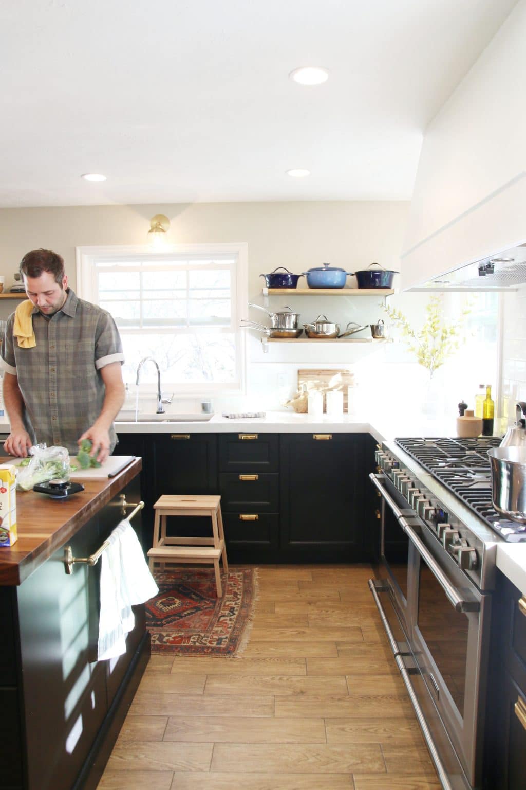
I’ve been thinking for some time it might be nice to have a piece of art hanging on the range hood cover we DIYed last year. It’s a large, 60″ wide hood that we added some slim, pencil trim to, but other than that it’s pretty simple. On one hand, I don’t think everything needs something on it. A place for eyes to rest in a room is welcomed, in my opinion.
However, I’ve been casually looking and gathering up all of my favorite pieces the last few weeks and now I’ve narrowed it down to six options, with the seventh option being leaving it bare.
Here they are in a gold-framed, GIF parade on the hood for you to get a visual.
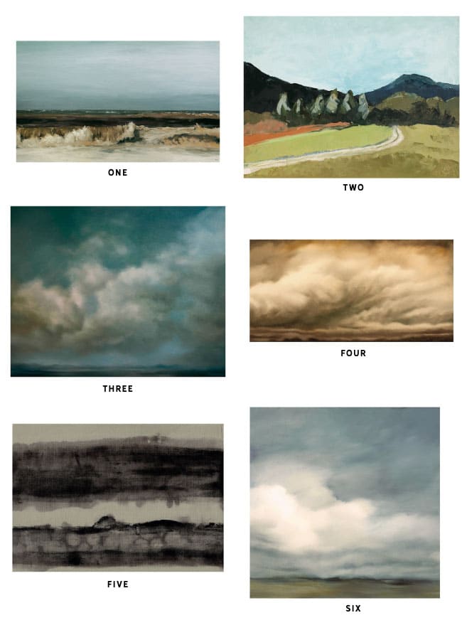
one / two / three / four / five / six
As you can see, I am drawn to landscapes for this spot. Even five is an abstract landscape. They feel timeless and organic and like something I could happily look at every day. But I can’t hang all six! Weigh in with your favorite option in the comments below.
See more about our kitchen, plus all of the sources, right here.
Leave a Reply
What do you think?

Semihandmade
Our wood grain Shaker cabinet fronts were designed for busy, high-traffic homes like ours. Clad with durable textured thermofoils, this line is compatible with Sektion, Akurum, Godmorgon, and Besta cabinets from IKEA. It's the perfect, practical way to add the warmth of wood to all the rooms of your home.
Collaborations
learn more

next
Loloi
We have teamed up with Loloi to create a line of rugs that are as affordable as they are beautiful. This collection houses a great mix of traditional and modern rugs, in cottage-y colorways, as well as vintage-inspired beauties that you’ll want to roll out in every room.
Collaborations
learn more

next
STUGA
We partnered with Stuga on a line of hardwood floors — The Ingrid is really livable, and the color is very neutral. It doesn’t lean warm or cool, it’s that just right in-between. We have really loved putting it everywhere in our house. It’s the best jumping-off point for design, no matter your interior style. In addition to being beautiful, Ingrid is really durable — we have three kids, and we always have a home construction project going on. Ingrid stands up to it all.
Collaborations
learn more

next
SHop all
What We're Right Now
What We're Right Now
Looking for our favorite things? A place to shop our home room by room, or just catch up on what Julia's wearing / loving right now? Browse the CLJ shop.
Loving


Portfolio


Design
Befores, afters, mood boards, plans, failures, wins. We’ve done a lot of projects, and they’re all here.
BROWSE BY CATEGORY
let's break this thing up
We have a long-standing relationship with DIY, and love rolling our sleeves up and making it happen.
Projects
Even when you don’t want to rip down a wall, you can make that space in your home better. Right now.
read more
read more
read more
02
01
03
looking for inspiration?
A reader recently asked me if I’m starting to fully embrace traditional style and whether we still consider our house to be a “modern Colonial” and why. It was a really great question and so timely — I had really just been thinking about my approach to this home and how my style has changed […]


SEARCH THE BLOG
We've been doing this since 2009 and we've posted a whopping 24145+ blog posts and counting. You might need a little help searching, huh?
looking for something?
find stuff like:
")
Can We Send You Our Love Letter?
Another way for us to stay in touch! Joining our weekly newsletter gives you access to exclusive content, never-before-seen photos, your questions answered, and our favorite DIYs. Sign up below!
Follow Along on Instagram
Welcome to our online community where we've posted home, DIY, style, renovations, and family since '09. Renovating our #cljmoderncottage in Idaho and headed for new adventures in Raleigh, NC. #cljfam #cljtransformations
@chrislovesjulia


Links
Get Around
Make yourself right at home
Portfolio
Design
Casual Friday
Projects
Lifestyle
Gift Guides
All Posts
Shop
Love where you live.
Social
RivrLinks
Links
Get Around
Make yourself right at home
Portfolio
Design
Casual Friday
Projects
Lifestyle
Gift Guides
All Posts
Shop
Love where you live.
Social
RivrLinks
A Landscape is a lovely choice for that spot. I prefer 2 due to the pop of color it provides. #1 is my second choice. However I would prefer a larger (wider) picture to fill the width a bit more and feel more intentional for that spot. But I am all about using what you have. Another thought is to try 3 smaller pieces to fill that width.
I’m new to blogs and podcasts.. loving yours. Do you have a post in how you built your current vent a hood?
I love this! My vote is for #4 or 5. The black/gray/sepia tones go well with the colors you have in there already.
I adore art in unexpected places. I really like each piece you chose, but the second painting is especially nice close-up and from far away. Art on a large open white space will only enhance the look of an already beautiful kitchen!
Vote for #2
No 7 all the way. The hood is beautiful just as it is.
It’s amazing to see all the different opinions! Personally, I think a framed print would look wonderful ! My first choice is number 3 and my second choice is number 1. Good luck deciding!
I cast my vote for something there, but not a framed print. Maybe something seasonal or as others have said, more organic? The framed art there seems forced to me. Just my .02.
Far from the first to say this, but I love a wreath there! Maybe something made out of sage, or some other herb! That would be kitcheny and classy.
I vote to leave it bare.
These are great. I like 3, 4, 5,… LOOOVING 5!
I’m also on the no art train. Maybe a leafy wreath?
2 for sure!
Bare, nothing there is better.
That has to be the worst place for a painting – it will get destroyed with grease and steam. It also is visually distracting. I don’t think this will have the sophisticated effect that you are trying to go for.
There are so many great examples of this done right. I do agree that a one of a kind painting–terrible spot for it. But a framed print? Why not? Of course there is also the option to leave it bare, but to each his own, right?
Can you share some real-life examples that you like/don’t like?
Love these : https://www.pinterest.com/pin/104356916344466556/
https://www.pinterest.com/pin/104356916344466552/
https://www.pinterest.com/pin/439241769889436903/
These aren’t my style: https://www.pinterest.com/pin/143622675590666431/
https://www.pinterest.com/pin/382594930817710901/
https://www.pinterest.com/pin/297941331580562667/
I really like that first one you posted, I’m digging the ledge!
(no reply button on your post w/the links so i replied to this comment)
I tend to agree here — if you want something in that spot, it will need to be clean-able or disposable!
Option #7, definitely. It’s a great space to decorate seasonally, but I think for every day use it looks best blank. After all, it’s gorgeous in it’s own right… no need to cover it up!
If you go with art in that space, I would personally choose Four or Five. Both are landscape orientated, and while the monochromatic art (Five) blends in the color of Four gives a subtle pop that draws the eye.
*My two cents*
#7 no art. How would you keep it clean anyway?
I just the occasional wipe down, like I do with the range hood.
I haven’t read all the comments so if this was already mentioned please forgive me. But your hood has a slant to it. If you place a picture up there it will lean back. Weird…no? The picture would have to be large enough for it to be visible also.
Have you done a test run with some 3M strips maybe to see if you mind the leaned picture?
Bare. No question.
No art, there is alot of other visual interest in the space, it looks too busy
I vote either no art or something less “stiff” looking. A unique wreath or branches. Some wood slice . Something more organic like that.
My fave is #6. My aunt and uncle have a very simile landscape on their hood too. It is so divine!
I’d vote for no art but possibly painting or adding some sort of paneling (wood? copper?) to make it stand out.
It looks like there’s already some trim on the bottom, maybe beef up the top with some molding and paint the body of the hood the color of the cabinets?
I love number 6! It’s a beautiful piece! Landscapes are a favorite of mine too. I think art expands the space like a window view would. Since art is so personal whatever speaks to your heart will be the best one for your kitchen! Have fun choosing!
It needs something round to soften the edges. I like the idea of a very simple, thin heather or twig wreath there. Something that can be left up all year but decorated for the holidays.
Definitely bare! Love the above idea about something seasonal or a different shape, but they all look too small and don’t fit the space well. It also seems a bit awkward to hang a smaller pic so high, when all other art around the home seems more at an eye level (although you are such a tall family!).
I like the aspect ratio of #1 or #4 best for this space.
Agreed. Those were my two picks as well.
Bare best, but loving #6 hard! Anything will look great though, it’s all about what you want to look at everyday : )
Please leave it bare! It is so classy and simple now and it seems busy and cluttered with the picture. The painting will also be on a strange angle (upwards), which will make it more awkward to look at.
Love 1 or 5 :)
I don’t think that’s a place I’d hang a picture. I’d leave it bare, or, if you really want something on there, I’d maybe look for your initials cut out of sheet metal in black or a raw iron look. Or in brass, to match your drawer pulls! Maybe even “C & J”? Or the Initial of each family member? I had a single ampersand that had magnets on its back sticking to the front of my last fridge (a red one), and really liked the look and contrast of the shape against a large flat backdrop.
#3 or #4
You should check out Emily Jeffers. She is right up your alley. A little abstract and totally gorgeous landscapes.
Love #1
#6 all the way!
My choice would be #7. I agree with you that not everything has to have something on it. And I feel like this is one of those places. It feels like a weird place to put a piece of art to me (although I agree with what somebody above said about loving the wreath you had on there for Christmas)!
I definitely understand the dilemma though. My husband is an artist and we both love art. We have so many pieces and I can’t even hang them all up if I covered every wall…and loving good white space makes the choice that much harder. If I had to choose one of your above, I’d go with #1.
i love #2 or none at all
I am torn between one and five!
xoxo
The Pattern Collective
http://www.thepatterncollective.com
I have no idea how GIF’s work – but if it isn’t too hard it might be helpful to add the no art option to your GIF – I think the GIF is super helpful (seeing them all in the same pic one after another is a great visual, at least for me!) – so maybe if you add the bare hood option to the GIF it will help you make a final art or no art decision?! Which I feel like is as hard as the “which art” decision!
Whatever you go with will look fab, of course!
Oh! I totally should have!
I prefer #1. I like that the blue plays off your blue cookware and the blue rug in the living room area, but also has warm colors in the waves that repeat in the wood tones of the island and the table. Plus, the bits of black give it just a bit of contrast. I prefer a rectangle over a square for the spot as well. All of them are lovely, but one, three, and four have the nicest balance between movement and a sense of calm.
I agree! I feel like a rectangle makes more sense for the space, so I like 1 for that reason. I like that it has blue to kind of tie in to the living room, too. If you picked a square one, maybe you could pair it with another (compatible) square one to create a more rectangular shape :)
I like number 4! The length of the frame fits the hood better then a square, I would even go a little bigger with a horizontal frame. Love the idea of landscapes though! <3
Definitely on the no-art train….especially in that location where steam/grease/etc could get on the art!
But of those options, 6 is my favorite.
I think I prefer no art, but of the choices I like #2 because it’s wider and seems to fit the size of the hood more. Can’t wait to see what you decide, I always love what you do!
I agree with this one :)
I like two because it reminds me of my time in Tuscany.
#4. It’s dramatic and subtle all at the same time!
I’m leaning towards option #7, leaving it bare. I love it clean best, but I did love when you had a simple wreath on there for the Christmas season!
I agree! I like it best bare, but then maybe seasonally something super simple like the wreath. Have you thought about something not as square/boxy, but more organic/unconventional in a different shape? Like a banner or a branch or gold letters or something?
Yes. Bare!
I think option 7 too! I love art in a kitchen but for some reason can’t wrap my head around hanging it above a stove?
I feelin’ six and one the best. Something about the colors and just the way those two play with the rest of the kitchen I really like them.
#6
Two! I like that it adds a bit more color yet it’s nice and subtle.
2!
I am for sure on the “no art” train…seems like such an odd place to have a painting? What about a wooden tray, something that would give interest but not be so detailed.
I’m in love with #6!
I like three and four the most tell me which you chose if you chose already!
#3 or #5 get my vote. I am not a fan of the super heavy ornate gold frame so that might be throwing it off for me. I would do a more simple frame.
Your kitchen is amazing! I’d leave it plain, but if I had to choose a picture it could be #3 just because of the color in this print. The Pittsburgh remake was beautiful – would love to copy that kitchen in my home.
I agree with Trish, I don’t think art is the answer
I like #1 best, but the size of #4! #1 pulls in the colors from the dark cabinets + gold hardware and adds a pop of blue. Perfect!
I do like it plain but if I had to choose I would go with 2 and then 6 as my second choice. I like that they are a little brighter/happier, the others feel a little too stormy for a kitchen imo.
I do agree with a few other readers that I think I would like it better with a simpler wooden frame or even something else of visual interest that is less rectangular. I would say wreath but you said in response to another comment you aren’t about the all year wreath. What about a bundle of lavender or something similar?
Hmm… all seem a bit off to me. What if you put something structural there instead? It would be more dynamic but still airy and light.
A bunch of choices:
http://www.overstock.com/Home-Garden/Argento-Wall-Decor/5179426/product.html?refccid=EKK63D572MGJ3USCTH5LUD2YT4&searchidx=59
http://www.overstock.com/Worldstock-Fair-Trade/Hand-Carved-Tiki-Mask-Indonesia/8271426/product.html?refccid=5ABRXOPZLGJY4SCHTECR7LARCA&searchidx=81 (a bit cheeky)
http://www.kirklands.com/product/Art-Wall-Decor/Clocks/Addison-Open-Face-Clock/pc/2283/c/2304/167959.uts
http://www.overstock.com/Home-Garden/Uttermost-Josiah-Square-Wooden-Wall-Art/7902805/product.html?recset=33d9566e-5623-4633-9b41-2c5d2671c108&refccid=62Z26DEYD5S3MUSGTGLLHFRYCI&recalg=870,839&recidx=1
I would say number 2! I love the subtle bits of color. Hang it with command hooks so you can always take it down with little worry! :-)
I really like it plain. There’s already so much visual interest in your kitchen! If you really wanted a painting, I like five or six best, but I might personally like it with a less ornate frame. Perhaps a simple wooden frame that would echo the island top, but that’s just me!
I did love the wreath you had up there over the holidays though, which is I think of the paintings I’m drawn to the ones with the simplest palette.
I vote to leave it plain. Also, since the vent cover is on a slant, wouldn’t any artwork hang awkwardly?
It’s slightly slanted, but we had a wreath hanging over the holidays and it didn’t look mega slanted or awkward at all.
If I’m remembering correctly, there was a wreath on it for the holidays? I think that was a better option than a piece of art! If you had something simple like a boxwood wreath, I could see that working year-round. Otherwise I vote to leave it bare.
Do you have a tutorial on how you made the hood range cover? I want to make one for my up & coming kitchen remodel.
My first choice would be to leave it bare, BUT I do love art piece #1. The scale and colors are perfect, enough blue to stand out with just enough neutrals to ground it. Also, there’s something about cresting waves that relaxes me, like 100% of the time. I could imagine you “having a day” ( like we all do!), and suddenly your eyes find the waves and you think, “Ahh, yeah, I can feed my children now.” ;)
Yes! hahaha
Something with the proportions of #4 but with different colors. Or leave it plain.
I like the longer shape of 1 and 4, but I like the colors that are introduced in 2. Although my vote may be 7/bare!
I love all the art you’ve chosen, but my vote would be a circular object of some sort. There are a lot of rectangles and right angles in your kitchen, so my instinct is to offset that with something softer. Maybe a clock? Or as Johanna said above, something kitcheny? Even something textural but painted the same white might be nice to provide another layer of interest without adding visual “clutter.”
I like it plain best. If I’m choosing one of the art pieces, I like the shape/size of #1 best. I think I’m being thrown off by the Photoshop frames.
Would you consider making a piece to put up there? Then you could pick whatever size/proportion/colors you wanted!
I’m working on a few pieces for somewhere else in our home, and I’m extremely self-conscious of having too much of my own art around.
I love number 3, however I’m nit a fan of the golden frame. I would go With something more plain. Like oak, perhaps. I would also consider something else instead of art. Something “kitcheny” and with texture. Could you put some flat copper vessels or antique wooden trays?
That’s an idea!
I think #5 for the complementary colors and the shape is perfect. But, I also like the hood plain. What a conundrum this is!!!
I also vote to leave it plain, but what about hanging art above the stove/under the hood on the backsplash? A long rectangular piece could look fabulous there.
Another option would be to get some deer antlers/faux taxidermy to hang on the hood as opposed to art.
1) “I” would leave it as-is.
2) If pressed, “I” would choose #6. The clouds are so dreamy, and the little bit of color is gorgeous. I may just buy it for my own house!
3) But it’s not my house… it’s yours! And I’m guessing #1 has the most lasting power with you, since it’s Kai Samuels-Davis. :)
I’m pretty sure you couldn’t mess this one up, though. They’re all such lovely pieces!
You know I love Kai! I have that print in our basement already and can’t. get. enough. Also, I’m definitely not pressed to put anything here, but I can’t get the idea out of my mind.
I agree with leaving it plain as another commenter mentioned, but add some natural shades to the flanking windows. I’m not necessarily anti-range hood art in general, but the fact that yours is angled and not parallel to the walls would make upwards-tilted art a little “off.”
My vote is plain. I think I recall you posting awhile back that you liked the idea of a wreath? I like that idea much better. Something simple. I think the paintings are still too busy, will be at a slant and at a very awkward height. Love your kitchen!
We put a wreath up at Christmas and it was so charming! But I’m not a year-round wreath kind of gal.
What about a Himmeli wreath like this one? http://www.vintagerevivals.com/product/solid-brass-geometric-himmeli-wreath-2-0-kit
I love the idea of a wreath because you still get some of the white open-ness (if that makes sense) of the bare range hood.
That said, I love #4 if you’re set on art! :)
I don’t know if I’m a wreath every day kind of gal.
Doesn’t anyone like #2 like I do? The road leading to the mountain gives so much depth. ANd the green looks so good with the black tones in the cabinets. I think that’s the print you will keep going back to and finding something new in every time you look at it.
I love #2 best as well! But #1 has a better scale for the range hood. Personally I wouldn’t put anything up there but I think either of the first two paintings would reflect the Marcums very well!
Thanks Julia and Chris for the constant joy and inspiration! My daily commute is a lot happier now that you’ve started a podcast! :)
Ahhh! So good to hear, thank you!
My preference is number 6 but I also have a question. I have looked back to see if I missed a DIY on your hood cover but I don’t think you did one. I am curious what hood vent you used under the cover. I am trying to make one for my kitchen but would like to know which you used and if you like it. Thanks! Love your blog and pod casts!
Thanks Stephanie! We didn’t do a post on the range hood because it was so incredibly customized for our kitchen and the range hood we chose–it’s a 48″ Electrolux insert with a remote blower up in the attic which keeps it nice and quiet, while still really powerful. Originally we were going to get two 30″ vents and build a big 60″ cover over both of them, but this 48″ was almost double the exhaust power, so we went with it and are so happy with it!
I did put a little instagram tutorial up for the range hood when we did it, under the tag #cljkitchenreno.
Thank you!!!
I like number 4 :)
I’m definitely in the “leave it as-is” camp.
First of all, I have to say that I love seeing photos of you in action with the kids. So sweet!
And second, I vote for no art on the range hood. It seems like a strange place to put art.
5 is gorgeous, but plain looks best. the scale of the art doesn’t work for me with your hood.
thank you for the endless inspiration, you and your podcast make me and my home so, so happy :)
Aw, thank YOU!
Love 4…the length of it.
I’m in love with #5
Definitely 4.
Personally, I’d leave it plain, but–if I was forced to choose–I’d pick 2 just for the pop of colour it adds. The cloudy/stormy motif in all the others just seems a bit sombre for that space too, imo.
#6 definitely speaks to me the most. I love the subtle colors.
I would leave it plain. It’s a weird place to hang a piece of art – way above eye level for most people (apart from NBA players) and sure to collect dust and grease.
I’ve seen so many examples of art on the range hood I love!
#6 has my vote for the shape and color, but all beautiful in their own way!
Number 6!
Loving #5! Can I just have your entire house please? Love your blog and podcast!
I’ll leave the keys in the mailbox ;)
but…. the artwork would get destroyed up there… between the heat and gunk and changing humidity…. you’re making my art conservator brain spin
Hahaha, it would be framed.
that would not help the temperature or humidity issue in the least… so don’t put anything up there that you care about
I can see your point about the hood being a little plain. I love all the paintings you chose, but I think the answer isn’t hanging art over the hood which will look orphaned among all that white and probably get a little yucky from grease, etc. (Can Chris come and cook dinner at my house – I’m so jealous!!!) You can paint or add some brass details to the hood that pick up the finish on your gorgeous accent lights. And then add the color/texture/pattern you are craving in the form of faux or full roman shades on the windows. Your design instincts are right – it’s too much white and needs breaking up. These are the things we learn as we live with new design. P.S. We are getting a couch like yours downstairs. Luckily we live in Chicago and can go to the shop. So exciting. Even though it’s in our city, we never would have known about it if it weren’t for you. Thanks so much!!!
Oh man, you’re going to love it!
one is my favorite
5! Complimentary tones + colors… and the size fits nicely.
I’d definitely go for number one. It has the right tall/width ratio, and the balance of composition and colors in the painting works well in the space (an injection of blue is always welcome in a kitchen like yours, I think). I would want the picture a bit larger than shown in the mockup, but that’s a personal preference.
My first choice is #6, but I might need to have a second one that I switch out now and again for interest. That second one would be #2.
I like the shape of four the best and the colors in three. Basically, I’m no help!
Hey! You narrowed it down to less than 6, which is better than I could do.
I like six. While looking at your photos and liking the clementine lime arrangement, I thought that something colorful like that would be lovely. Have you considered your kids’ art? Bright, lively, and would bring a little crazy to your kitchen!
I like 1 and 3. I like the shape of 1 better than 3. They are both beautiful?
Four!
I love three – I was considering a really similar Kelly Money print to go above our sofa but I like it more on a small scale – it would be lovely on your hood.
I rounded up a bunch of other options, just in case you’re interested :) …
http://www.livingprettyblog.com/2016/06/art-to-hang-over-large-sofa.html?m=1
My vote is no art.. I think your kitchen is perfect just the way it is!!
Thank you!
I like it plain!
I like it bare. I think the artwork distracts from the (good) simplicity of the light fixtures in the kitchen.