Several weeks ago, we posted a photo over on Instagram of a few swatches painted on our great room walls. We stared at them for a while, probably too long because we ran out of time to actually paint the walls before our Halloween party. Now the project has resurfaced again and with Thanksgiving next week, I am absolutely getting it done this week.

From top to bottom: Aloof Gray, Gray Owl, Horizon, and Silver Thistle Down. And yes, I always paint my swatches in alphabetical order so I can be sure to keep track. Horizon was immediately nixed for being too light; something we’re trying to get away from. The truth is we like our current color (Clark+Kensington’s Richland) that we picked out and painted over dark dark brown/black just over a year ago. It’s a warm and neutral off-white. It brightens our whole house without feeling cold. However, something we didn’t anticipate is how incompatible our very light walls are with our big, dare I say dirty?, dog and children. Charly loves snuggling up to certain walls and I found myself scrubbing them/painting them too frequently. Do people with dogs and children and light walls just spend their days washing walls? Finally, I threw my hands up in the air and decided I would much rather paint the main area in our house a couple shades darker than continually babysit the walls. White walls are pretty, but I have learned the hard way, they are not for us at this time in our lives.
So the hunt started. I pulled a couple swatches and got samples up on the wall for us to decide and I wanted to share another tip about choosing a paint color besides alphabetizing your paint swatches on the wall. Ha!
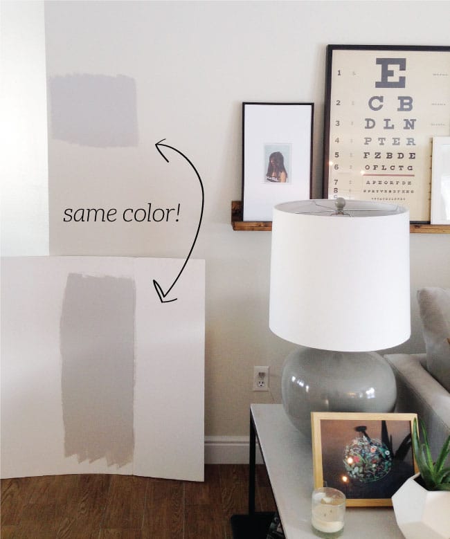
Above, we have a sample of Repose Gray painted on the wall and a large piece of poster board. Isn’t it crazy that both are the same gray?! The one on the wall looks purple-y and the one on the poster board looks like a perfect muddy gray. The difference is our walls have warm yellow undertones which are making the gray look purple because the two are complementary colors. Super quick art lesson:

When complementary colors are placed next to each other, they create the strongest contrast and will start making other colors look like their complement or opposite. If you put a neutral next to something orange-y, even wood trim!–it might look a little blue. This is the reason coppery eye-shadow is perfect for bringing out blue eyes. It’s the reason gray paint often turns purple if your baseboards are more yellow than white.
Side note: Another cool thing about complementary paint colors is they are great for toning one another. My mother in law recently picked a coral for one of her guest rooms and a teal for the other. The teal was perfect, but once she started painting the coral bedroom it was neon! She panicked and asked me is she could lighten it with some white. The thing is, white wouldn’t change the vibrancy. She was apprehensive, but I poured a little bit of the teal into the coral bucket and it toned the neon paint down into the coral she was originally hoping for. A knowledge of complementary colors is power when it comes to paint colors!
Back to the picking-a-gray task at hand. If your trim is white, painting a swatch on a white board instead of the wall will give you a more accurate idea of what the end color will look like. Take it a step further and paint a poster board the color of your trim first and then paint a swatch on the board if you’re unsure. I came across a blog post recently where a blogger had painted a gray swatch on a piece of white poster board and she liked it and then when she painted the whole room, it looked blue/purple. What she didn’t take into account was her ivory trim. She ended up repainting the whole room. Of course light has a lot to do with how a paint color looks, too, which is why it is important to choose a color in the room you’ll be painting. Let’s save the light color chat for another post, ‘kay?
Hopefully I’ll have photos of a freshly painted great room to share with you in the next few days! Any guesses as to which one we went with?


Do you have a recommendation of a gray that will still look like a cool toned gray (Not too dark) against a yellowy/creamy trim? Most everything I’ve tried has ended up looking too blue for my preference. And unfortunately we’re working with a lot of red in the hardwood stain, and some orangey tones with the kitchen cabinetry.
Trying to keep the projects to a minimum and just paint the walls, but I’m wondering if we might have to end up taking on more of a renovation in order to make it look ok.
Hoping you can give me some advice…we recently moved into a new house and our master bath has old yellowed tile. I want to paint until we can save up for major changes, but am not sure what color undertones would help make the tile look more neutral? Is yellow undertones the correct answer? Thanks Julia!
yellow or green–something warm, is your best bet!
I recently painted the stairway walls sherwin Williams light French gray in our living room and the rest of the walls are super tall and they are painted Navajo white so I don’t want to mess with this. The problem is the light French gray looks so blue next to the Navajo white. The rooms recieves light from the east and west and even a little south. What gray undertones will work with Navajo white which is very yellow gold? I’m having trouble figuring it out. Should I choose a warm gray? thanks!!
Yup! You want to go with a warm gray like classic gray or edgecomb gray (those are both on the light side)
I’m wondering a similar thing to Ann – I just painted my kitchen and living room repose grey! I’m wondering about what colour to do the baseboards. I’d like to know how to make the room look the warm grey but yet go with off whites, taupes and greys as throw cushions? we have a dark brown leather sectional.
I’m having such a hard time with white, I painted my girls room simply white and it has a green yellow glowing look. What undertone white would work better? It’s a northwest facing room with lots of trees outside. I can’t figure out how the color wheel would help me
From Jules: “She might have a better result with Benjamin Moore White Dove and its yellow undertones.” Hope this helps! :)