


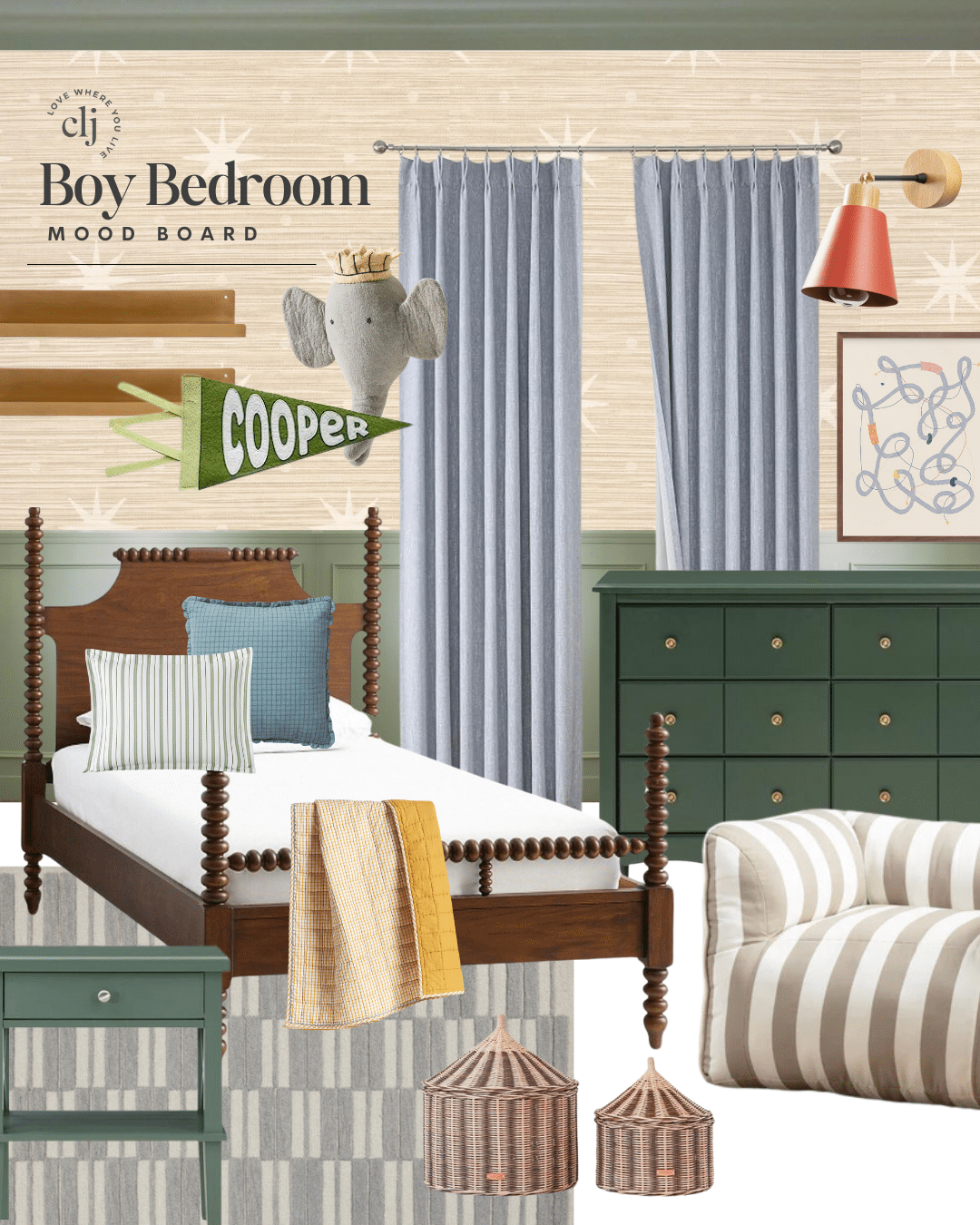
We’re slowly getting started on Greta’s room. I thought for a long time about it, and I interviewed her about what she wanted (not a ton of help there!). Haha. And ultimately, I decided to go for a feminine schoolhouse feel. Of course some of this could evolve as we start putting things together, but here’s a mood board of where we’re headed:
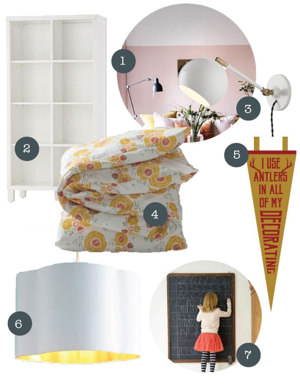
1. I love the idea of doing 2/3 painted walls in her room, painting the top 1/3 the same fresh white as the ceiling. For the bottom part, we’re thinking a dusty blush color, but we’re waiting to see the duvet in person before we choose a paint color. It could end up yellow or sage green (oooo!) or even navy. Who knows!
2. Greta has proved that she is old enough to handle having some books and toys in her room without being up all night. We were just reminiscing on the days when we had to clear out all the toys every night and even unscrew her lightbulb so she would turn it on and off for hours. To celebrate, a bookshelf for storing some toys and books has her (and us) very excited!
3. We are moving her bed against the wall for more play space and love the idea of her having a wall lamp above her bed. She’s been asking for a lamp for a couple months, and this feels like a way that she can have one without me worrying about her knocking it over. Am I worrier? Maybe. I love this white one with gold accents.
4. This duvet was what started the whole room design. It has all of Greta’s favorite colors in it and it’s floral and it has a vintage flare to it. So sweet.
5. Obviously Greta isn’t representing any school just yet, but I love, love LOVE this pennant. My sister in law designed it in partnership with Oxford Pennants (so proud of her). It’s also a little whimsical as it is a nod to the good folks at Disney that helped to make all of us who we are today. Am I right?
6. I am going back and forth between a schoolhouse style light and this lovely white pendant with a gold interior. I am sure you understand the struggle.
7. A chalkboard is a must. I love how this one is lined for easy letter practice! I can’t wait to see Greta and her friends play school with it.
So that’s where we’re headed. We’re all ready to say goodbye to the blue walls in there and implement something more suitable for our girl. Can’t wait!
Leave a Reply
What do you think?

Semihandmade
Our wood grain Shaker cabinet fronts were designed for busy, high-traffic homes like ours. Clad with durable textured thermofoils, this line is compatible with Sektion, Akurum, Godmorgon, and Besta cabinets from IKEA. It's the perfect, practical way to add the warmth of wood to all the rooms of your home.
Collaborations
learn more

next
Loloi
We have teamed up with Loloi to create a line of rugs that are as affordable as they are beautiful. This collection houses a great mix of traditional and modern rugs, in cottage-y colorways, as well as vintage-inspired beauties that you’ll want to roll out in every room.
Collaborations
learn more

next
STUGA
We partnered with Stuga on a line of hardwood floors — The Ingrid is really livable, and the color is very neutral. It doesn’t lean warm or cool, it’s that just right in-between. We have really loved putting it everywhere in our house. It’s the best jumping-off point for design, no matter your interior style. In addition to being beautiful, Ingrid is really durable — we have three kids, and we always have a home construction project going on. Ingrid stands up to it all.
Collaborations
learn more

next
SHop all
What We're Right Now
What We're Right Now
Looking for our favorite things? A place to shop our home room by room, or just catch up on what Julia's wearing / loving right now? Browse the CLJ shop.
Loving


Portfolio


Design
Befores, afters, mood boards, plans, failures, wins. We’ve done a lot of projects, and they’re all here.
BROWSE BY CATEGORY
let's break this thing up
We have a long-standing relationship with DIY, and love rolling our sleeves up and making it happen.
Projects
Even when you don’t want to rip down a wall, you can make that space in your home better. Right now.
read more
read more
read more
02
01
03
looking for inspiration?
A reader recently asked me if I’m starting to fully embrace traditional style and whether we still consider our house to be a “modern Colonial” and why. It was a really great question and so timely — I had really just been thinking about my approach to this home and how my style has changed […]


SEARCH THE BLOG
We've been doing this since 2009 and we've posted a whopping 24145+ blog posts and counting. You might need a little help searching, huh?
looking for something?
find stuff like:
")
Can We Send You Our Love Letter?
Another way for us to stay in touch! Joining our weekly newsletter gives you access to exclusive content, never-before-seen photos, your questions answered, and our favorite DIYs. Sign up below!
Follow Along on Instagram
Welcome to our online community where we've posted home, DIY, style, renovations, and family since '09. Renovating our #cljmoderncottage in Idaho and headed for new adventures in Raleigh, NC. #cljfam #cljtransformations
@chrislovesjulia


Links
Get Around
Make yourself right at home
Portfolio
Design
Casual Friday
Projects
Lifestyle
Gift Guides
All Posts
Shop
Love where you live.
Social
RivrLinks
Links
Get Around
Make yourself right at home
Portfolio
Design
Casual Friday
Projects
Lifestyle
Gift Guides
All Posts
Shop
Love where you live.
Social
RivrLinks
oh! yellow and pink…such a fun color palette!
I absolutely love the pendant! Every time we watch Beauty and the Beast my husband belts out that line in the song. I’m thinking I’ll be making a purchase soon :)
Love this! Sophisticated but fun :)
I love the direction the room is heading!! Do you have a source for the first image? I would like to see how they handle the baseboards with the split wall color.
Yes! So sorry. Here it is: http://decor8blog.com/2014/01/21/how-to-decorate-radiant-orchid/
Thanks!
The mood board looks great! Navy paint doesn’t sound great. That is a pretty duvet. We painted the whole house the way you describe and brought the paint color of the ceiling down the wall 8 inches. The ceiling is just lighter than the walls, same color but more white added. And we installed trim at the meeting point, painting the trim the same color as the walls. You won’t be sorry if you do it. It looks great. It helps low ceiling not look so low. I kinda felt sorry for Greta being stuck in the basement away from you and in a sparse blue room. I am glad you are doing her room. No offense intended. Have fun with it.
I love the duvet ! We actually did it backwards with the painting…. I painted her ceiling and a 12″ border (where ceiling meets wall) of the same Light Pink color – then the bottom walls I mixed the same Light Pink color in with White (a lot more White) – so it’s a very very light subtle “Is it White, or is it Pink?” color. And my daughter and ALL her friends LOVE it !! She says she feels like she is inside of a Pink Bubblegum Cupcake…. LOL We kept all the furniture white, so it worked well.
Love the direction you are going here ! :)
cute!
Lovely! Just curious, do you use a particular program to create your mood boards?
I use photoshop to clear out the background of photos/products and then illustrator to put it all together. I know you probably could use photoshop for all of it, but I am not totally comfortable with the program. :)
Ok, now I want to redecorate the girls room! and I seriously want that duvet for MY bed! So beautiful!