Design

It’s Curtains.

July 8, 2015

We believe we should all love where we live.

We’re a couple of homebodies, working to uncover the home our home wants to be. And we’re so happy to have you here. 

Portfolio

Projects

Design

We're Chris + Julia

read more

What we're                   right now

Loving

browse the shop

Befores, afters, mood boards, plans, failures, wins. We’ve done a lot of projects, and they’re all here. 

We have a long-standing relationship with DIY, and love rolling our sleeves up and making it happen. 

Even when you don’t want to rip down a wall, you can make that space in your home better. Right now.

browse all

browse all

browse all

02

01

03

Popular Posts

1.

2.

3.

Top Categories

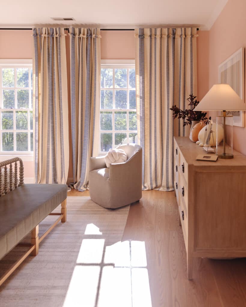
The other day I was trying to decide what curtains to hang in our master bedroom–very serious stuff–and I couldn’t make a decision by looking at them laying on my bed. And there was no one home (tall enough) to hold them up for me to squint endlessly while I decide, so I did the only logical thing and hung them each up and took a slew of photos so I could maybe make a decision once and for all.

The decision is between two sets of curtains we already have and they couldn’t be more opposite. The first one is a charcoal set from Martha & Ash. We originally got them for our great room area, but when we added a window to the living room, we went with simple white linen drapes to keep things light. In here, they are moody and sophisticated and just a few shades darker than the walls.

IMG_6589

The drapes barely skim the ground, which makes the room feel more tailored and is a nice contrast to the more disheveled looking bedding (who has time to iron a duvet?).

IMG_6593

I love the drama they add, and they are heavily lined in case we ever get the chance to close them and sleep in. (Ha! Hahahaha!)

On the complete opposite end of the curtain spectrum are these ivory velvet curtains from West Elm we’ve had in storage. They drape so beautifully and the puddling on the floor feels a little romantic to me.

IMG_6605

The warm ivory also plays nice with the shag area rug and softens and lightens the whole room. They would easily play a supporting role to all the art we have planned for the room.

IMG_6613

Are you understanding my indecision?

dark-vs-light

There are pros and cons to both, but more than anything I can’t believe how much curtains can change the entire vibe of a room. From dramatic and sophisticated to romantic and serene–Incredible! I am leaning toward the ivory ones in here, but would love to hear your preference!

Leave a Reply

Your email address will not be published. Required fields are marked *

This site uses Akismet to reduce spam. Learn how your comment data is processed.

What do you think?

  1. Lauren Gilmore says:

    Where is the curtain rod from? Looking for a new one and this looks black or wrought iron?

  2. Jenn says:

    Love your style! Just wondering how much higher/wider you hung your curtains above the actual window. I’m contemplating hanging our curtains higher to make the windows look bigger in both our living room & bedrooms, but I’m nervous it will look odd.

    Thanks for the help! :)

  3. Susan says:

    I was going to purchase the blinds on Amazon via your link in where to shop, all the reviews state they do not come with directions, could you share how you installed them; top or side mount, etc

    • Julia says:

      We installed them top mount. It was really easy and self explanatory. Just screw the bolts into the wall and there are slits on the top of the blinds that rest on the bolts and you screw a little thing on to keep them secure

  4. Karen F says:

    the title of this post, and your subsequent absence, was giving my YHL flashbacks :/ Glad you’re back!

  5. Anna says:

    Are y’all OK? Hoping nothing is wrong and that you’re just taking a well-earned break.

  6. jen says:

    i like either set of curtains but would take a new look at them with the bamboo blinds and bedding removed. i’d guess either would work great and it would just depend on preference at that point. good luck!

  7. Meg says:

    Prefer the dark curtains but would switch out the shams:)

  8. Julia W. says:

    what is the deal here lately? you have been posting like once or twice a week. about to jump ship? probably going to lose some readers over this whatever it is you have going on. i for one and done giving you page clicks only to see nothing! buh-bye

    • Amanda B. says:

      Uh oh, did CLJ get hacked? Why ppl gotta be so rude?

      • Julia says:

        Ha. No. We didn’t get hacked. But there is a glitch in the commenting system where if someone comments as “Julia” and I wrote the post, it will automatically gray out their comment. But! You can tell it’s me because my comments will link back to the blog, whereas that comment’s email address is a fake one–although I don’t think you guys can see that. All is well over here! I added a W. to that person’s comment so it wouldn’t look like me until we can figure out the glitch.

    • Julia says:

      Our traffic hasn’t budged, but thanks for the concern!

  9. Christie says:

    Charcoal curtains for the win! The are perfectly moody and sensual for your lovely bedroom.

  10. Jennifer says:

    hanging* ( whomp whomp)

  11. Jennifer says:

    Dont leave us haning, we need an update haha ;)

  12. Meg says:

    Those blue pillows are so nice. I love the print. Keep the pillows or change them as needed. :)
    May I ask where they are from? Love the bed too!

  13. Darlene says:

    I like the darker ones much better. They look custom made for your window. Plus… I think dark and moody works well for a bedroom. :)

  14. Liz says:

    I prefer the grey with the white pattern. But, you didn’t give us a look when the drapes are drawn – what is that look? Is it still a strong grey or does the white design dominate?

    The bed frame/headboard is very tailored, the lamps are industrial, the table has a more masculine look. I like that look and it can be softened with feminine touches – the soft rug, the colors of the duvet and pillows, the art work and other accents.

    The art can give you the color inspirations for the accent pieces – are the colors strong jewel tones or deep rich tones?

    And I also like the idea of seasonal changing the drapes and bedding.

    On the length of the drapes – does that rug shed at all? My mom had a shag style accent rug in a room and it was always shedding, but there was more foot traffic. Do you want to be lifting the drapes to get the floor clean as well as having to vacuum the bottom of the drapes to get them clean?

  15. Krista says:

    I’d get white curtains with a grey pattern – the inverse of your current charcoal.
    The ivory make everything brighter but the puddling makes them look like they need hemming. Agree that the bamboo blind has to go – a white semi sheer blind would be better.

  16. Judith says:

    I like the dark drapes better in general, but I think they clash with the pattern on the blue pillows. Actually, I think it’s the pillows on the whole that clash with the room a bit, because the blue looks cool while the rest of the room is either neutral (walls, bed) or warm – the night stands and the wood-tiles especially, but the carpet is also a warm white. Could be an effect of how the colours play in the photo though, and look differently in person.

    So judging from the pictures, I’d use the dark patterned curtains but find some different pillows, some with colour strong enough to add some contrast, and a pattern that plays well with the curtains if another solid colour item would feel too bland.

  17. Anna says:

    While I generally prefer white(ish) drapes to patterned ones, here I’m definitely liking the gray curtains. I agree with various comments that it could be the ivory vs. the white of the duvet, that the gray would look better if the shams were changed & that the blinds are not doing it for me. I also like the comment/idea about changing out curtains by season, although I would switch things up before Nov. 1; I would think white for spring/summer (mid March to mid September?) & fall/winter (mid Sep. – mid Mar.). :)

  18. Love the moody black but agree with the few people that said with those the shams clash a bit! Easy fix though, the ivory and white duvet aren’t jelling for me, can’t wait to see what you choose!

  19. Natalie says:

    Ivory! I agree, the puddle is kind of romantic.

  20. angi says:

    I prefer the darker ones, i love a moody bedroom. i also bought this fabric and made these same curtains for our living room so I love it. I also feel like the ivory kinda looks like a dirty blonde next to the duvet cover and the rug, maybe thats in just pics tho.. GOOD Luck!

  21. Lindsay says:

    I think I like the darker ones– only because I don’t like the plain ivory ones. I think maybe light curtains with a pattern would be my ultimate choice because I don’t love the plain curtains with the plain duvet. Too much white!

  22. I love when curtains puddle! I think adds drama and flare to a room. I love the West Elm Ivory ones!

  23. jamie says:

    if there weren’t so many comments for ivory i wouldn’t comment – but GREY. The pattern, the ability to block light, the way they attach to the curtain rod (I’ve never been in love with the grommet style). I think the pattern on the curtain is the vibe you have in much of your home so it feels more like you ( i feel wierd saying that to a stranger???) also the pattern picks up the color on the wall.

    good luck! you have great taste regardless of our opinions!

  24. Sandra says:

    The ivory curtains and (whitish) bedding seem to compete and/or be in different color worlds. (I know some people do not mind mixing whites and creams, and for me, it just depends on the undertones.) I had not noticed it with the bedding and rug before. I like what the darker curtains do for pattern and interest and contrast, but they do make the room darker. I personally don’t mind darkening effect–great for sleep! Whatever you pick, I’m sure it will all come together. :)

  25. Lisa says:

    Dark ones very moody. Light ones pretty and as you say, considering your art… How do you like them drawn? Good luck!

  26. Maria says:

    Hi Julia,

    I have been silently following you and Chris through both of your houses and I haven’t been brave to comment yet, but I just have to comment on these curtains!
    I really really love the darker ones! They are so unique and embellish the room so much. However, I understand some of the other readers when they say that they white ones are crisp, clean and soothing. Whatever you chose, I’m sure is going to look great. This room is a hit!

  27. Haley says:

    I love the darker curtains! It looks so moody and sophisticated. The ivory curtains just feel generic and seem to clash with the duvet.

  28. Gretchen says:

    Totally fell for the charcoal! Even with the pattern, I think they’re subtle with the dark wall color.

  29. Tracy says:

    I like the dark drapes better because they add some contrast. The whites and creams are just blah and boring and not at all like the rest of your house. While I like the wall color, the bed kinda gets lost against the walls. Any plans to update the duvet?

  30. Angel says:

    Dark drapes, but repaint walls light.

  31. Linda says:

    Definitely those beautiful, high-end, room-darkening charcoal drapes!! The white are just too bland, white drapes are everywhere (blah…, and there is far too much other “whiteness” in the room with the duvet and the rug. The charcoal drapes make the room cozy and sophisticated. However, the navy shams would need to be exchanged for something else. I also think the bed linens need something added to make more of a statement… like maybe an interested throw folded on the foot of the bed.

  32. Liz says:

    My first vote was for the dark but I keep being drawn to the light. Can’t wait for it to all come together!

  33. Brooke says:

    I love and can totally see the positives and negatives of both. Would you consider hemming the ivory panels to achieve that tailored look and meet in the middle?

  34. Keegan R says:

    I would definitely go with the charcoal. I don’t like the look of the ivory with the white bedspread, it just makes the room look mismatched. The charcoal looks so tailored and finished, especially with how it only just skims the floor. However, if you’re going to hang heaps of art then ivory miiiight be the way to go (but that depends on if you’re bringing in heaps of colour or sticking with more muted tones in the artwork).

  35. Heather says:

    Charcoal is so much better. Change out the pillows on the bed. The ivory looks too plain and washed out with the white duvet.

  36. Rebecca says:

    I like the dark ones :) I feel like you went with dark paint for a moody vibe and the ivory curtains contradict that. Can’t wait to see what you pick and I know that it’ll look great no matter what you choose! Love your style so much!

  37. Eva Kellogg says:

    Fell in love with Charcoal! But hey you can keep one set up during summer and then change to the other during winter if you love them both.

  38. Courtney says:

    I definitely like the dark ones. Really love all the changes, so fun!

  39. Kirsten says:

    LOVE the moodiness of the charcoal! I agree that it clashes with the pillows a bit–the navy doesn’t seem to play well with all the grey, but I think they would look fabulous with some kind of airy abstract art over the bed to lighten things up. I’m also a super light sleeper, so anything that’s really good at blocking light is a plus in my book…

    I actually really don’t like the ivory as they are–just feels very blah to me and a bit washed out with all the grey, but I do think that it could look good with art to bring in a bit of color. It sounds like you have particular art in mind for the room, so you should do this again once it’s up!

  40. Sarah says:

    Love the dark ones. Go moody!

  41. Susan says:

    Use both! My Ma used to change out drapes/pillows/accessories to match the season.
    Darker colors and rugs down meant it was fall/winter ( we lived in NY btw). while lighter color/fabrics and bare wood floors meant summer was here!

    While velvet is not typically a summer fabric, that pale cream color would totally work during these months, then you could hang the dark ones after, say, Nov 1 :)

  42. Crystal says:

    I don’t like the gray curtains but I love the ivory just not with the white duvet, looks like too much solid color on solid color

  43. Evelina says:

    Ivory Ivory Ivory!!!! I think you should do ivory.

  44. Lindsay says:

    I love the gray in the second image, just the vignette of the bed, stand and lamp. But when you pull back and see them with the rest of the room, I don’t like them! Weird. I’m not a fan of the ivory at all though.

  45. AmandaH says:

    With the dark walls, I say continue with the dark/moody/sexy theme and go with the dark curtains…but just do white shams instead and I think it would look really, really beautiful to take down the bamboo blinds. Just try it with the curtains only. Beautiful room! Love your bed and lamps!!!

  46. Summer says:

    I vote ivory, but know you’ll make either look great. :-)

    I do think that the dark curtains look a little better with the duvet than the ivory ones do, but I prefer the overall look of the room with the ivory curtains. I’m with a few other commenters in that I’m not sure if the duvet and ivory curtains might just look every-so-slightly “off” in the photo but not in person — I’d be interested to hear if it all blends together well in person.

    If it doesn’t look quite right in person, I’m not sure if it might be possible/desirable to you to switch up the duvet? (I hesitate to suggest this as I think you said it’s new and you love it. I think it’s really nice, too–I love white or slightly off-white bedding, and I have a similar one myself. A strike against your duvet might be that you mentioned having to iron it — that sounds exhausting to me. Admittedly, I’m not the best ironer. Ha!)

    Anyhow, I like that you ask for readers’ input, but also that you ultimately follow your own heart (as well as Chris’s, I’m sure). Either pair of curtains will look great! Can’t wait to see the bedroom continue to evolve. Everything (especially the bed frame and rug) looks gorgeous!!!!

  47. Ana says:

    Looove the charcoal curtains, but maybe they’re better in another place because they make the room feel a bit heavy. I would go with the ivory velvet ones for this space.

  48. Michelle says:

    I would MUCH rather sleep in the room with the charcoal curtains.

  49. Steph Reiner says:

    I like the dark – bedrooms are for sleeping and even my 1 and 2 year olds know that sleep happens in dark rooms ;) Plus for some reason, it does look more grown up to have the darker colors, not sure why! I went for dark blackout drapes in our room and I LOOOOOVE it because it could be the middle of a summer day and I could take a nap in a cool, dark room. Not that I do with a bunch of toddlers around, but I COULD. :D

  50. Jackie says:

    Dark – here’s why:

    – For you to carry out the cream and white, I think you’d have to use a mix of wood tones, or lighter wood tones in things like frames, maybe have taupe or light gray pillows added in, maybe have an upholstered chair in a lighter fabric etc. I love the sounds of all of that – I think it would be beautiful- buuuuut…. when you think about amassing a collection of pieces that you’ll love forever, a la that post you did about throw pillows a couple months back, buying those types of things to carry out the full look doesn’t feel like a great long term solution and doesn’t feel like it’d be a natural fit into your overall collection of belongings.

    – The dark curtains are luxe and beautiful and again selected with that, ‘purposely buy, even if it’s slightly more money’ mentality and how great they look in the bedroom validates your justification for choosing them to begin with and why they were the right purchase. If the cream velvet curtains were purchased longer ago when you had a slightly less mature mentality, you shouldn’t let that seep back in when you’re just starting to do this room.

    I agree with one of the previous comments above that you do have a great taste for darker, masculine, high quality palettes that are much more unique compared to your average bear. So I say, listen to your artist within and stick with the dark – if not to just prevent you from amassing more ‘stuff’ if you go the route of the other option.

    Best,
    Jackie

  51. Emily says:

    I’m not a fan of curtains puddling on the ground due to the fact that they seems to collect dust and dog hair but maybe that is just my problem ha.

    Also, I love master bedrooms to be moody, dark, and sexy and I think the charcoal curtains are the ones that do that for you. Just a personal preferance though since we aren’t bedroom hanger outers but instead just use the bedroom for sleep and sexy time stuff ;)

  52. Katrina says:

    Why don’t you keep both, use the darker ones during winter and the lighter ones during summer? (or vice versa if you’re trying to darken the room during the lighter months)

  53. Amanda B. says:

    If the grey ones were navy, I’d vote for them right away. But I think they compete with the blue pillows for dominance. The ivory along with the all-white duvet seems kind of blank though. Add a textured throw to the end of the bed maybe?

  54. Kathy M. says:

    Charcoal!! We like our bedroom dark and moody!! Living room/kitchen…light and airy!!

  55. Mary says:

    Call me crazy but I think you should use both: charcoal on the ‘outside’, ivory on the ‘inside’. Like this: http://www.decobizz.com/pictures/20140103/magnificent-large-windows-white-green-color-curtain-ideas.jpg

  56. monica says:

    I prefer the white, however I suggest that you might use white in the summer and the darker ones in the winter1?

  57. Jayme T says:

    Charcoal for sure!!

  58. Kristen says:

    Grommets on curtains look cheap and outdated, no matter how lovely the fabric. The grey look look far more luxe. I

  59. Cair says:

    Oops, let me try that again. I loved the charcoal ones until I saw the velvet cream ones. Cream is my vote!

  60. Liz says:

    Normally, I’m all about the bold choice (especially when it comes to charcoal or navy), but I have to say ivory on this one!

  61. Cair says:

    I loved the charcoal ones until I say

  62. Erin says:

    I vote for the dark, all the way. The ivory feels a bit blah to me — layered with the white bedding and the light rug (both of which are fantastic). The gray adds another dimension, color, pattern, and allows the bedding and the rug to stand out more.

  63. Amy says:

    Charcoal in the winter…white in the summer. I love all your bedroom choices so far and would only suggest one thing. A BETTER MADE UP BED:) I keep it simple but it makes all the difference. It looks like you have everything already. I do 1. Fitted sheet/top sheet pulled all the way up & tucked in nice. 2. Thinner blanket on top of that pulled all the way up & also tucked in nice. 3. His/hers king pillows laid flat with 2 additional his/her pillows laid flat on top of that. 4. Take the comforter and fold it in half and lay at foot of bed. This would show off your awesome bed better I think and fit the more tailored modern look you have going on.

  64. Tanja says:

    I like the white… it feels so relaxing to me. The dark seems very serious, very “office-y”

  65. Victoria says:

    Two totally different vibes, for sure. I like the ivory in warm weather and a switch-out for the more masculine-looking curtains for fall and winter. That’s my choice: transitions.

  66. I love the charcoal – it looks so cozy and sophisticated, but I might change my mind with the artwork up. :)

  67. Lorilyn says:

    I think both are beautiful – so it just depends on the vibe you want. If this were my room I would go with the ivory – but again, understand if you choose the darker :)

  68. Cindy says:

    Dark all the way. The ivory ones seem to clash with the duvet cover (maybe it’s just the pictures?).

  69. Harper says:

    I’m on Team Charcoal. The struggle of the ivory panels and white duvet is real for me.

  70. Both are beautiful but I think I prefer the ivory too. I like it with the bamboo shades better as well. And with your comment about it supporting the art nicely, I think you have a winner! :)

  71. Sherry Potter says:

    I like the Ivory. And the bamboo. It gives a nice earthy/airy look.

  72. Jeanna says:

    Well kiddo, I’m not sure why you are asking, because I have yet to see you use any voting results you’ve ever asked for!! However, just to get my two cents in…………..for me, it would depend what vibe I was going for. I love the dark print. So much moodiness ;) But they don’t like your pillow shams at all. The white ones are so pretty, and they play well with your rug, and give the whole room such a light, carefree feel. Light and happy, or dark and moody? What say you?

    • AlisonG says:

      Ha! your first statement is too funny. :) and true it would seem. Fun to hear opinions just the same.

  73. Sherri says:

    I like the moodiness and drama of the charcoal ones. I actually have bright white similar curtains from Pottery Barn in my family room and kitchen and I love them. But in this space, I like the feeling of warmth and coziness the dark ones evoke. You can’t go wrong with either. Can’t wait to see the end result. Your taste is impeccable!

  74. BeccaS says:

    Love the dark ones!

  75. Lauren says:

    The dark ones for sure. But I don’t like them with the pillows.

  76. Julie says:

    Truth be told, I’m not a huge fan of white(ish) curtains, but I can’t deny how fantastic they look in this room. Ivory for sure.

  77. AlisonG says:

    The darker ones for sure. They look high end. I don’t think the ivory and white play well together. I would hang the darker curtains, darken the shade with shoe polish maybe? and change the bedding to ivory or a darker color with pillows that play well with the darker curtains.

  78. Rosalind says:

    I really like the ivory ones!! Feel like you could get away with more without the pattern of the darker curtains.

  79. Rachel says:

    Ivory, because they will allow the art to shine. While the patterned curtains look great in the space now, they may make the space too busy once you add art.

  80. Kari says:

    I can’t believe I’m going to say this (because my home is fillllled with white curtains) but I vote dark, 100%. This room is your place to relax and get away – the ivory brings a jolt of energy that bedrooms don’t need. They look like a Pinterest formula that just isn’t adding up this time (…she says as she side eyes two rooms with white curtains in her house and wonders what she’s doing with her life…).

  81. Abby J. says:

    I LOVE the darker patterned ones. They add SO much drama. The ivory isn’t even close for me.

  82. Christina W. says:

    I think the dark ones are gorgeous, plus a perfect length! Curtains that puddle always = dust bunny nightmare for me, but maybe I’m a jerk who doesn’t sweep enough haha. I’d def change out the throw pillows if you go with the dark curtains, though! Maybe something with a larger, simpler print in a contrasting color? Love your bedside lamp btw!

  83. Kelli says:

    I like/dislike both. I think the ivory for short term. But it just needs something. But maybe once the artwork is up. You will want the simplicity of the ivory…

    I like the charcoal curtains too. But I just don’t love it. Again maybe with the art work.
    I would love to see another comparison, once you get your accessorization on. :) I would love it just from a learning stand point.

    • Julia says:

      Once I had the photos, I was so impressed with how just changing the curtains seemed to change everything. A learning stand point, for sure!

  84. Stephanie says:

    Ivory for sure! And I think your bamboo blinds are beautiful as well.

  85. Emily says:

    The charcoal ones look more polished & sophisticated, even though they’re dark. The ivory ones just look kind of cheap & washed out in this space, maybe because of the light rug & duvet? Curtains are tough! I obsessed for months over our living room curtains. I think they change a space more than paint!

  86. Blair says:

    the charcoal drapes are GORGEOUS, i would choose those and then switch out the shams and maybe even the light bamboo blinds. no matter what you choose to do i’m sure it will be beautiful, good luck with making a decision!

  87. Rebecca says:

    Love the dark ones, nice and moody for the bedroom.

  88. Samantha says:

    Ivory, for sure! They’re gorgeous!

  89. Val says:

    #teamcharcoal

  90. I like the tailored/sophisticated look of the dark curtains. Although the rug is ivory, I feel like I can REALLY feel how ivory the rug/curtains are against your white duvet and the combo is just a little off…I know Ivory and white can play nice together, but in each of these separate divisions (floor-curtains-bed) I don’t feel as if they do. I agree with another commenter that I would change the shams/toss pillows on the bed if you went with the darker and would bring in another color that would blend and be soothing and sophisticated too. Depends what you do for art. Thanks for letting us weigh in! I do this in my own space all the time and it feels nice to give a “no pressure” opinion on someone else’s space!

  91. amy says:

    I vote for ivory on the condition that you can sleep in the morning without it being blinding in your room (although having a baby might make this point irrelevant!)

    We have dark curtains in our room just to block the light.

    They’re both really nice, but I think the ivory gives a soft relaxing vibe to your room!

  92. Christy says:

    Dark and tailored all the way! if you go with the ivory, you will definitely have to do something about that bedding situation. The white and ivory do not go together very well. And agree that the ivory curtains look a little sloppy. The draped/puddled look is a little dated. Are you sorry that you asked for opinions yet :)

  93. Stephanie says:

    I love the tailored look of the charcoal ones. I too think the ivory clashes with the bed cover. Either way, you have amazing taste and it is a pleasure to get to read your blog. Keep up the good work!

  94. Amanda says:

    dark ones! so much more sophisticated!

  95. Anne-Marie says:

    And another point, if you like the way the ivory ones pool at the bottom, perhaps you can just lower the curtain rod to get a similar effect with the charcoal ones!

  96. Jaimie says:

    I agree with Maria – I love the drama of the charcoal curtains and I really think they play with the wall and duvet covers better.

  97. Anne-Marie says:

    I’m surprising myself with this one, but I like the charcoal ones best. Especially with the already white/ivory shag carpet and bedding. But maybe I’d change my mind if I understand what art you are planning for the room?

  98. Maria says:

    Darker ones. The ivory ones seem to clash with the duvet…

  99. Caitlin says:

    I like the darker ones – I think the bedroom is a good place to add something a little darker since you are mainly sleeping in there, anyway. I would do those curtains and change out the big pillows to a more complementary pattern. Either will be great though when you’re done with them, I’m sure!

  100. Steph says:

    While I’m typically all about keeping things light and bright, I’m LOVING the dark patterned curtains. I think it better ties the room together. Feels more put together and sophisticated!

  101. Trista says:

    I like the charcoal ones. The ivory seems to clash with the duvet cover

    • Julia says:

      Our rug is more ivory, maybe that isn’t coming through in photos, so there IS a tie in there. Perhaps the duvet is too white!?

      • anonymous says:

        Yes, I think the duvet is too white. I like the ivory curtains better than the grey ones, but (in my opinion, which is very humble indeed) the ivory clashes with the white duvet. Perhaps this is not a problem in person, and is instead some weird photography-lighting phenomenon? I have no problem with white and ivory together, but I like it best when there are a few shades between them and the curtains and duvet (at least in these pics) look too similar in shade so that they clash instead of pairing well. But, maybe you have some art for the walls that includes white and cream tones, and that might help. Or maybe I’m just wrong! In any event, I prefer the ivory curtains.

  102. Britt says:

    I feel the darker ones make the room too dark and heavy, but the pattern and tailored look is what sets them apart!

    Maybe paint or add a pattern to the ivory ones? Something to make them less generic. I think the way it balances the room, at least in color, is great, but just lacks that pizzazz.

  103. Whitney says:

    Oo, tough one! Normally I’m all about white/ivory curtains, but with your rug being so simple, I think the patterned ones really pull the room together. Gives it a bit more sophistication! :-)

  104. Nikki says:

    Neither of them are doing it for me but if I have to choose than the dark would be my choice and ditch the bamboo blinds like everyone else suggests. Love the everything else going on though!

  105. Megan says:

    I LOVE the dark, moody ones. I like how they work with the lamps and make your bedroom a little more moody. I think there is too much light tones with the ivory.

  106. Sara says:

    I like them both. I think the dark ones definitely lend a more masculine vibe, while the ivory ones are more feminine. As many of the other elements in the room (sans art at the moment) lean masculine, maybe the ivory is a more balancing choice?

  107. ann says:

    without a doubt, the charcoal.

  108. Cara says:

    I like both but the darker ones look better with the white duvet. I feel like the duvet is making the ivory curtains look dirty. Could just be the photos though.

  109. Mara says:

    I love the dark ones. The light ones seem sloppy, for a lack of better words. The rest of the room is so polished, the dark curtains really pull the whole room together.

  110. Go with the dark ones!

  111. amanda says:

    I agree that the bamboo is throwing me off a little but only when they’re paired with the dark drapes, they look good with the ivory. It’s just that the dark drapes look urban and cool and seem extremely functional to boot. The ivory are making it look a little beachy and idk, remind me of a chic teen girl’s room? I think in person and paired with all your art/plans it will be a different story. I’m excited to see it all together!

  112. Kevin says:

    Charcoal! And as a parent with two young daughters, too, I LOL at your comment about sleeping in. :)

  113. Jenny says:

    I think the problem is that the bamboo shades are neither dramatic nor serene. Both options look better without the shades but I like the dark better.

  114. teri anderson says:

    I would go with the ivory one’s. They too look sophisticated and also romantic and to me they just look “right” in the room. I would also like to suggest that you might move the rug to just butt-up against the night stand legs, it would give you a bit more rug at the end of the bed and still give you rug to step on at the side of the bed. Right now my eye (which I always follow by the way) would like to just see that for more balance. This is just my opinion, you may have something else in mind. I love your style and and think you are great design build team. Oh and also chef. Thanks for everything. Teri

    • Julia says:

      So sweet. Thanks, Teri! We tried moving the rug down a little, but unfortunately, the doors to our room no longer opened! Hahaha. Looks like the rug has to stay right where it is.

      • Leigh says:

        if it looks better pulled out further from the wall, is shaving a little bit off the bottom of the door an option?

      • Julia says:

        Eh. It didn’t look that different to me, but planing the door is always an option.

  115. Tiffannie says:

    Maybe the art will be a game changer but right now I like the darker ones. The white ones make the room look so generic; too much like every other blogger/Pinterest bedroom out there. I love following CLJ because you don’t shy away from dramatic, moody, masculine, statement-making design choices.

    • Daniela says:

      I prefer the dark ones too, and I agree with Tiffannie – the light ones are a bit overdone, and the dark are very sophisticated and mature looking. Obviously you should go with whatever you love best, though!

    • Julia says:

      Such a great compliment, Tiffannie!

  116. Amber says:

    I like the black, which tie in with the lamps, but would get new shams to replace the navy ones–those patterns don’t play well together.

  117. Ange says:

    The ivory ones are the winner for me!!

  118. mary says:

    The ivory. Sew a contrasting band or ribbon for a bit of color if absolutely necessary. The grey pattern is just to “severe” for a bedroom.

  119. Beth says:

    ivory, no doubt!

  120. Anne S says:

    Ivory for the win. Can’t wait to see the finished room!

all the latest

We believe we should all love where we live.

We’re a couple of homebodies, working to uncover the home our home wants to be. And we’re so happy to have you here. 

HI! We're Chris + Julia

read more

Load More

Reader Faves

SHop all

What We're                     Right Now

What We're                 Right Now

Looking for our favorite things? A place to shop our home room by room, or just catch up on what Julia's wearing / loving right now? Browse the CLJ shop. 

Loving

looking for inspiration? 

A reader recently asked me if I’m starting to fully embrace traditional style and whether we still consider our house to be a “modern Colonial” and why. It was a really great question and so timely — I had really just been thinking about my approach to this home and how my style has changed […]

Can We Send You Our Love Letter?

Another way for us to stay in touch! Joining our weekly newsletter gives you access to exclusive content, never-before-seen photos, your questions answered, and our favorite DIYs. Sign up below!

Follow Along on Instagram

Welcome to our online community where we've posted home, DIY, style, renovations, and family since '09. Renovating our #cljmoderncottage in Idaho and headed for new adventures in Raleigh, NC. #cljfam #cljtransformations

@chrislovesjulia