Our New Darker Digs using Kwal's Crave

22

Friday, August 10, 2012

Yesterday, I shared that I was getting my paint on in the front room--which we always have trouble naming.  Front room? Living room? Sitting room?  Formal living room? Either way, it was getting painted yesterday.  My plan was to get the trimming done during Greta's nap and then roll the wall once she went to bed for the night. 


Although it is never fun to see your child sick, our usually energetic-bouncing-off-the-walls-Greta was not feeling well.  She took two naps (that hasn't happened since she was 11 months old) and laid on the couch for the rest of the time she was awake.  


All that to say, thanks to our under the weather little girl (cue guilt) I got the painting done in an afternoon, by myself, with British dog, Kipper, in the background. I went with a matte paint color I picked up at Kwal Paint called Crave. It is a very dark charcoal-almost-black warm blue undertones.  We luuurrrvvvee it.  


It's dark and moody, but the undertones keep it friendly.  In fact, I loved it so much that I didn't stop with just the one wall (as you can kind of see in the above photo).  In a quick, last minute message to Chris at work, I said, "we gotta do all three walls."  To which he replied without hesitation (the man tru-usts me), "go for it!"  And I did. Without equal hesitation and no regrets, the wall with the large window got a coat of Crave:


And also the third wall that makes up the living room:


The paint job has completely transformed the room from our original purple paint job.


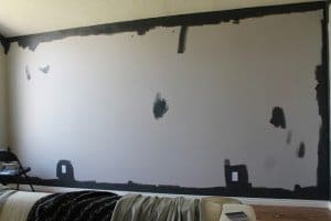
And it is eons better than our big, boring beige mistake we tried out last week:


We can now look at the room and sigh and say, "Of course!"  Like we finally pinpointed what we wanted the room to feel like all along.


We would still love to add some paneling to the wall down the road, but the new darker color (especially now that there are three walls of it) really needs no additional accent. So, we are going to focus on rebuilding the room and continue to think about the paneling.

It was a risky move, we realize.  And maybe a color (tone?) that isn't for everyone and definitely not for every room.  But for us, the risk paid off.  Big time.  Are you digging the new darker digs?  Or maybe you have already unsubscribed from future posts out of fear.  Ha!  We can't wait to add some accessories in here and really make the room sing.

Happy Weekend!

Psst.  A new painting was added our shop!! Check it out.

22 comments:

  1. melyssa.good12/31/2012 8:40 PM

    Oh my goodness. I came here through the link on YHL. I love this color! I'm in the process of picking colors for our whole house and I think this is the perfect shade for our currently eggplant with orangey-trim dining room. A similar deep gray with white trim it is!! Absolutely beautiful. It is so calming and cuddly. This rich shade will really make the built ins pop! Especially when they're painted lighter. And art in white frames... mmhmm.Thank you for the inspiration! You just got yourself a new follower :)

    ReplyDelete
  2. I love it! It's so dramatic! Right now it looks super dark, but once you guys get it decorated and lights in I know it'll be amazing!

    ReplyDelete
  3. I really love it!! And thank you for answering my paint question yesterday!!

    ReplyDelete
  4. Pattypoulsen12/31/2012 8:48 PM

    It makes the room look BIGGER!

    ReplyDelete
  5. Looks great to me!

    ReplyDelete
  6. i LOVE it! it's so moody and delicious. It reminds me of the martha stewart's seal color that we used on our dining room!

    ReplyDelete
  7. Jessie McKinley12/31/2012 8:53 PM

    That looks AMAZING. Seriously so so good. I can't believe how much it changed the look of the whole room. And I am equally amazed that you got that done in an afternoon!!! What I would give to paint as quickly as you. Sorry your little girlie is sick...no fun!

    ReplyDelete
  8. I LOVE IT. I'm a big fan of the dark. I like the purple, too, but this suits your home more and is coherent with the vibe in the rest of the house. :)

    I was reading House Beautiful the other day and there was an article about colors that bloggers, designers, and readers choose for the home. There was a big long list, but no designers/bloggers chose purple for their living room. I thought to myself, "No wonder Julia is changing! She has designer in her blood." Nice work, girl. I love it.

    ReplyDelete
  9. I'm craving some Crave! The room is beautiful now, very dark and cozy but not cave-like at all! Good choice :)

    ReplyDelete
  10. Looks great, and I loved all those inspiration photos you shared last week. Has me itching for a dark wall myself.

    ReplyDelete
  11. So classy and clean, this is so my style, I'm a lurrrrrvin it too. I say full speed ahead to paneling!

    ReplyDelete
  12. it's looking GREAT!
    you guys are awesome at getting things done...way to go!

    so sorry your girlie's sick. =[

    ReplyDelete
  13. Karlennsmith12/31/2012 8:53 PM

    Gorgeous, gorgeous, gorgeous. With all the light you get in that room, and with the light ceilings and floors, it's perrrrrrfect.

    ReplyDelete
  14. meaganbriggs312/31/2012 8:55 PM

    It's perfect!!! I think it works to go that dark because of all the natural light that comes through that front window. I definitely don't dig closed off dining rooms with dark colors on the walls. It closes the room in and makes it feel small. THIS is the way to do dark on walls. I can see us doing something like this in our future house.

    Why was Greta sick??? Cold? Stomach bug??? Poor girl. We LOOOOVE kipper :-) he's the best.

    ReplyDelete
  15. We're thinking 2nd year molars? She is miserable especially without tylenol. But she also seems to have a head cold. It's a very snuggly mystery.

    ReplyDelete
  16. Marissa Sullivan12/31/2012 8:55 PM

    Looks awesome! Glad is came out looking so good!

    ReplyDelete
  17. So sophisticated and cozy. You're making me wish my house got as much natural light as yours to pull this off. Great space! :)

    ReplyDelete
  18. Heather Gearhart12/31/2012 8:55 PM

    That looks SO GOOD! I love the window wall in that color as well. Cant wait to see what you guys do to decorate in there!

    ReplyDelete
  19. Victoria Bradley-Morris12/31/2012 8:55 PM

    Very dark and sophisticated.

    ReplyDelete

We can be chatty, but really, really hope you'll chat right back. Feel free to share your comments, ideas, links and questions in this comments' section where we can discuss all things decor or art or paint colors or toddlerdom or anything else--together. With that said, we like to keep it clean, friendly and drama free around here. Capiche?!

Chris Loves Julia
All rights reserved
© Blog Milk

 
Related Posts Plugin for WordPress, Blogger...