
We have changed the wall leading up to our staircase quite a bit. Probably more than any other place in our home, actually. Most recently, and the one that has stuck the longest was a grouping of three photos. We loved the simplicity of the black and white since there was so much color in the living and dining room surrounding this wall, but the frames felt lonely.

Eventually we planned to add more frames and make a big, fat gallery wall, and then I stumbled upon this inspiration photo a few weeks ago and shared with you our new plans to implement something similar in our stairway.

Last night, we finished up the project and are here to share with you a few details and a lot of photos. This wasn’t really a DIY project. We used two sizes of the Ribba photo ledges to create the perfect length for the wall. We could have saved half of the money spent and made our own ledges following the great Ana White tutorial, but Chris has been so busy lately and it was just easier to buy something already made. It is okay to do that sometimes, right?
Since there was no building involved, we just dragged the ladder up the stairs and screwed the ledges into anchors and gathered all of our grayscale photos and art we had around.

Oooo, a rare evening shot. About 10 minutes after this photo was taken one of the white Ribba frames on the bottom ledge toppled over, fell down the stairs and broke. Luckily, Ribba frames are abundant around here so I had a spare to replace it, but it did make us worry about future frames falling–especially those thick Ribba frames that are hard to lean. Our solution? Sticky tack.

At first, we planned on just adding the extra sticky help to the Ribba frames, but then we got carried away in our cautiousness and added it to the backs of all the frames. Chris also added some sticky tack to the frames in front where the bottom meets the ledge to help force them to lean.

Fast forward to this morning and here’s a detail shot of that:

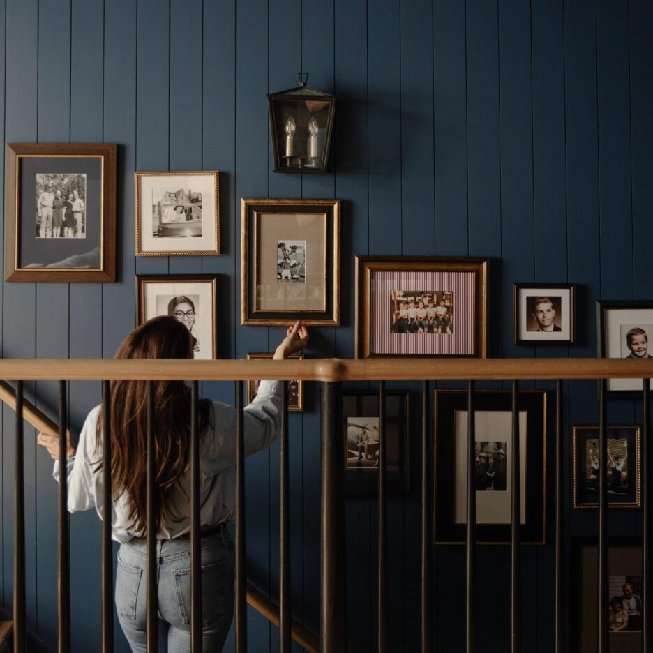
There have been no more falls since Sticky Tack came to the rescue and we’re hoping it stays that way. Actually putting the art and photos up took a little bit of time and shuffling until I got it looking balanced but not symmetrical. On the top row from left to right, we ended up with a 16×20 photo canvas of the three of us we got when Greta was just a baby, one of Greta’s paintings she did earlier this week, an aquatint print I did of my parents during college, my “Home Sweet Home” chalkboard drawing print and the photo of our house that was hanging on this wall previously.

On the bottom row from left to right, there is the photo of Chris and I dancing at our wedding, a large photo of our Greta Girl I had printed a couple weeks ago, a signed poster of Preston Pugmire (he is one of our favorite musicians), another one of Greta’s paintings from earlier this week, and another photo of the three of us.
Some tips if you want to do something similar in your home:
1. Gather lots of different sizes of frames. This would not work if all the frames were the same size even if I still used both black and white frames. The differing heights keep things interesting.
2. Have a few of the same frames. We have three white Ribba frames and three of the square frames (I got them at Ross forever ago) that add a sense of unity to the display.
3. Make sure to have some landscape and some portrait art and photos to create interesting negative spaces. Even though I used three of the same white Ribba frame, putting two in a horizontal position and the other in a vertical position is what visually worked best in the frame arrangement and created cool shapes with the wall space, too.
4. Lastly, pay attention to the colors you fill the frames with. “Color? These are all black and white.” They are mostly in gray scale, but some are cool toned, some are warm toned, some are a higher contrast, white Greta’s portrait is much lighter. For instance, the warmer tones in the Preston poster and the aquatint print are spaced out on both shelves. Also, the really dark picture of Chris and I dancing balances out the “Home Sweet Home” print. Even the family photos are balanced out on sides and shelves.
Now that all the details are taken care of, here’s how it looks from across the room:

And just for fun, I opened the door to snap a picture with our pop of red that makes me happy every time I see it.

Which got me wondering about painting the inside of the door. Probably not red, but another happy color could be fun.


We are both pretty happy with the way the vision played out and Greta even noticed the large photo of herself on the way to church and seemed excited for a few seconds. Dare I say, this display is a keeper?! For now–definitely.
Anyone else loving photo ledges lately? Are you shocked we didn’t DIY the whole thing? Or maybe you’re more surprised we used sticky tack after grade school. I gotta say–I have always been fond of sticky tack. :)

Love the picture ledge. Did you build them yourselves or did you buy them? If you built them please share how. If you bought them please tell me where. Thank You!!
Beautiful idea to display photos.
What are the dimensions? I’m stock on the Deep measurements.
[…] Source: […]
I like this it gave me some good ideas. We are downsizing with not to much wall space. I have a lot of family pictures and I don’t want to leave anyone out.
[…] White Shelves […]